Introduction
When it comes to visualizing data and making it easier to understand, charts are an invaluable tool. Google Sheets offers a user-friendly and versatile platform for creating, customizing, and sharing charts. Whether you need to visualize sales data, track project progress, or analyze trends, Google Sheets has you covered.
In this guide, we will walk you through the process of creating and customizing charts in Google Sheets. We will explore different chart types, formatting options, and advanced features that will help you effectively present your data. By the end of this article, you will have the skills to create visually appealing charts that convey your message with clarity and impact.
Whether you are a business professional, a student, or an avid data enthusiast, knowing how to create charts in Google Sheets will undoubtedly boost your productivity and make your data analysis more insightful. So, let’s dive in and explore the world of chart creation!
Getting Started
Before we begin creating charts in Google Sheets, let’s make sure we’re all on the same page. First and foremost, you’ll need access to a Google account. If you don’t already have one, you can easily create a free account by visiting the Google homepage and clicking on “Sign In” or “Create Account.”
Once you have your Google account set up, navigate to Google Sheets by either searching “Google Sheets” in your favorite search engine or accessing it directly from your Google Drive. Click on the “Blank” option to create a new spreadsheet.
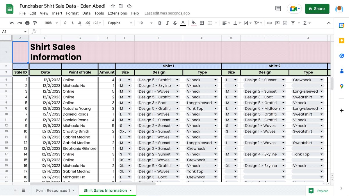
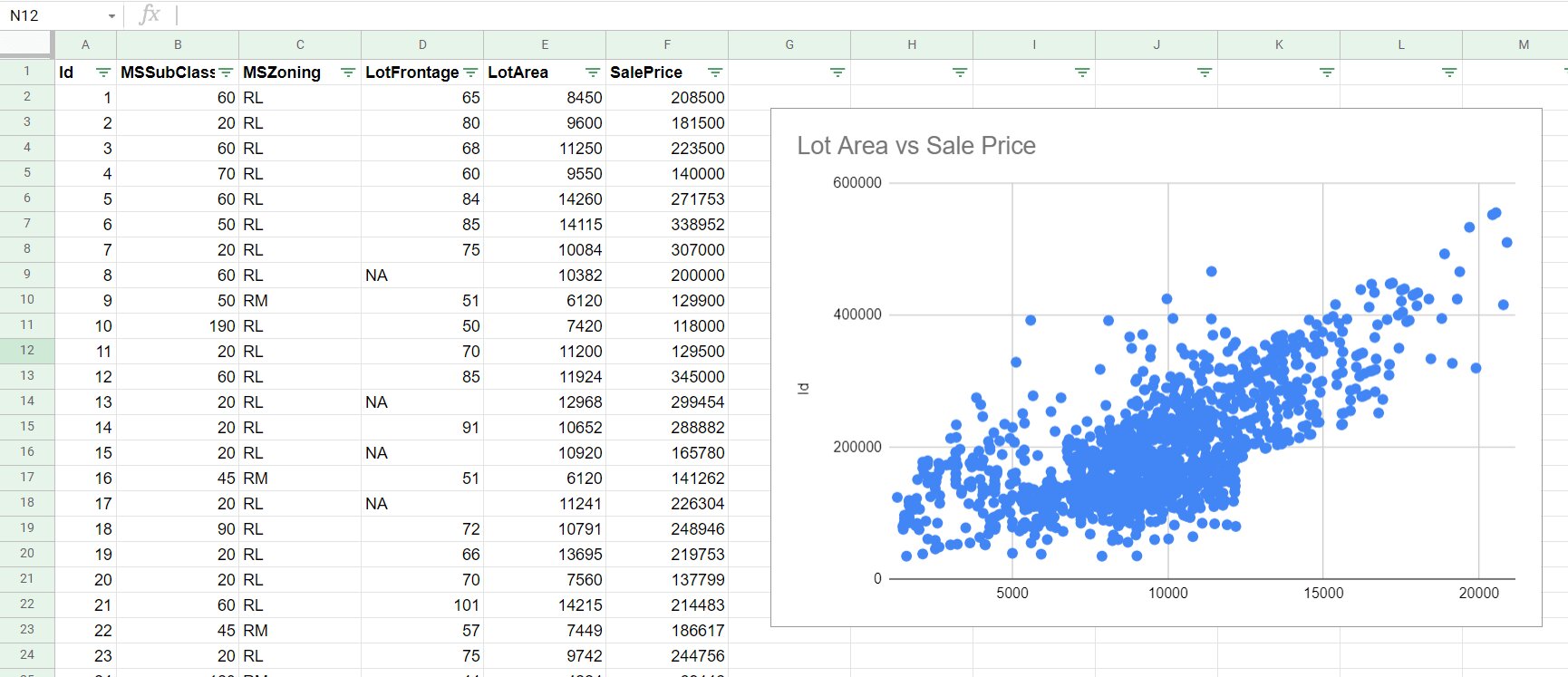
Now that you’re in Google Sheets, you’ll notice a grid of cells where you can input your data. This is where you’ll enter the information you want to visualize in your chart. You can manually type in your data or copy and paste it from another source such as an Excel file or a web page.
It’s important to note that to create a chart, you must have a set of data with at least two columns. The first column represents the X-axis or the horizontal axis, while the subsequent columns contain the data points for each respective series in your chart.
To select the range of data you want to use for your chart, click and drag your mouse over the cells that contain the data. You can also manually input the range in the format “SheetName!Range” in the chart editor.
Once you have your data selected, click on the “Insert” tab in the toolbar and select “Chart” from the dropdown menu. This will open the chart editor, where you can choose the chart type, customize its appearance, and more.
Now that you’re familiar with the basics of getting started with Google Sheets and selecting the data for your chart, we can move on to creating our first chart!
Creating a Basic Chart
Now that you have your data selected, it’s time to create a basic chart in Google Sheets. The chart editor is a powerful tool that allows you to choose from a variety of chart types and customize them to suit your needs.
To create a basic chart, follow these steps:
- With your data selected, click on the “Insert” tab in the toolbar and select “Chart” from the dropdown menu. This will open the chart editor.
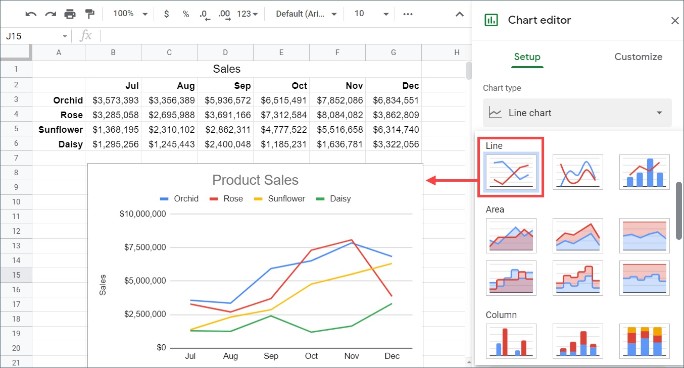
- In the chart editor, you’ll see a list of recommended chart types based on your selected data. You can choose from options such as bar charts, line charts, pie charts, and more. Click on the chart type that best represents the data you want to visualize.
- Once you select a chart type, a preview of the chart will appear on the right side of the chart editor. You can see how your data is being represented in real-time.
- Under the “Customize” tab in the chart editor, you can make further adjustments to your chart. You can modify the colors, fonts, and other visual elements to make your chart more visually appealing and in line with your presentation style.
- If you’re satisfied with your chart, click the “Insert” button in the bottom right corner of the chart editor. The chart will be inserted into your Google Sheets spreadsheet, and you can resize and move it as needed.
Creating a basic chart is a simple process, but it’s important to choose the right chart type that effectively represents your data. For example, if you’re comparing data across different categories, a bar chart might be more suitable than a line chart.
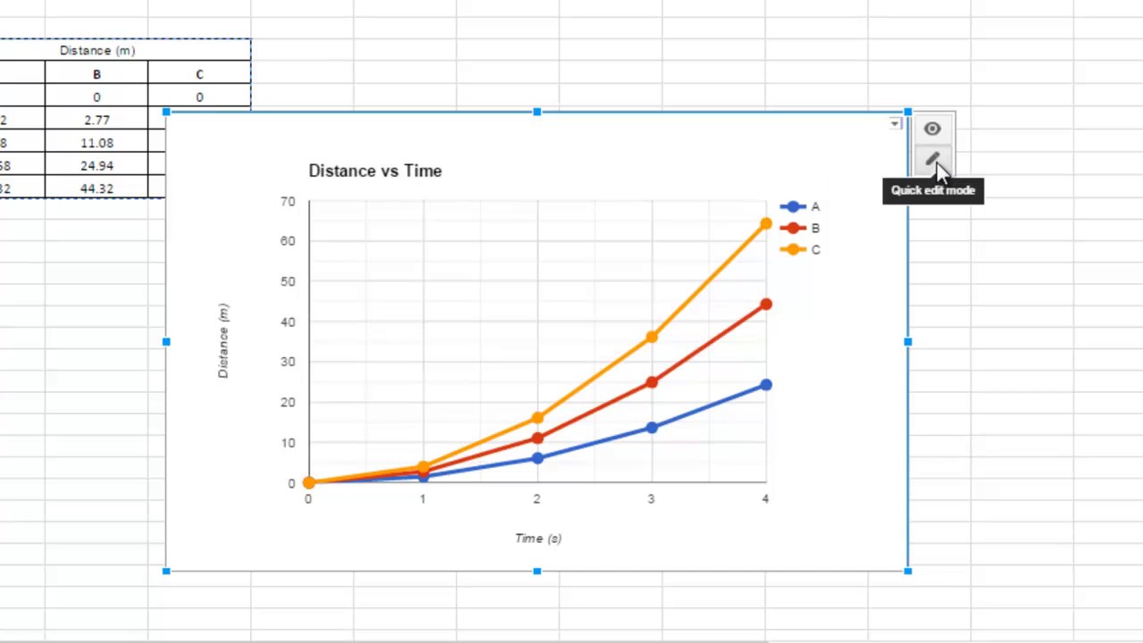
Remember, you can always modify and update your chart later by selecting it and clicking on the “Edit” button that appears in the top right corner of the chart. This will reopen the chart editor, allowing you to make any necessary adjustments.
Now that you know how to create a basic chart, let’s explore how to customize the chart type to better visualize your data!
Customizing the Chart Type
Google Sheets offers a wide range of chart types to help you effectively represent your data. While the default chart type chosen by Sheets based on your data can be a good starting point, customizing the chart type can often provide a clearer and more impactful visualization.
To customize the chart type in Google Sheets, follow these steps:
- Select your chart by clicking on it in your spreadsheet.
- Click on the “Chart types” button in the toolbar or right-click the chart and select “Change chart type.” This will open the chart editor.
- In the chart editor, navigate to the “Setup” tab. Here, you can explore different chart types in categories like “Column,” “Line,” “Pie,” and more.
- Hover over each chart type to see a preview, and click on the one that best suits your data.
- Once you’ve selected a new chart type, you can further customize the appearance and layout under the “Customize” tab. Here, you can modify the colors, axes, labels, and other visual elements of your chart to make it more visually appealing and informative.
- When you’re satisfied with the changes, click the “Insert” button to apply the new chart type. Your chart will be updated in the spreadsheet.
Customizing the chart type can be particularly useful when you have large datasets or complex data relationships. For example, if you have time-series data, a line chart can effectively show trends and patterns over time. On the other hand, if you have categorical data, a bar chart or a pie chart can help you compare different categories.
Remember, experimentation is key when customizing the chart type in Google Sheets. Don’t be afraid to try out different options and see which one best represents your data and conveys your message. You can always go back and make changes to the chart type if needed.
Now that you know how to customize the chart type, let’s move on to the next step – editing the chart data.
Editing Chart Data
Once you’ve created a chart in Google Sheets, you may need to make changes to the underlying data. Whether you want to add new data points, remove existing data, or update the values, Sheets makes it easy to edit the chart data directly within the spreadsheet.
Here’s how you can edit chart data in Google Sheets:
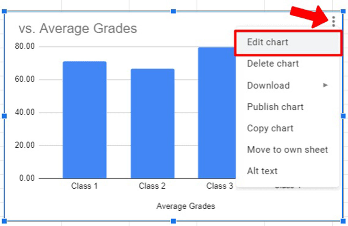
- Select the chart by clicking on it in your spreadsheet.
- Click on the small three-dot menu icon in the top right corner of the chart and select “Edit chart.”
- The chart editor will open, displaying your selected data range in the “Data” tab. To modify the chart data, either enter new values directly into the cells or adjust the range to include the desired data.
- As you make changes to the data, the chart preview on the right side of the chart editor will update in real-time, reflecting the modifications you’ve made.
- Once you’re satisfied with the changes, click the “Update” button to save the edits and apply them to the chart.
Editing chart data allows you to keep your visualizations up-to-date with the latest information. You can easily add new data points as your data evolves, remove irrelevant data, or correct any errors. The ability to update the chart data seamlessly within Google Sheets saves you time and ensures accuracy in your visualizations.
It’s important to note that if you want to add data from another sheet within the same spreadsheet, you can use cell references to pull the data dynamically. By referencing cells from another sheet, you can create charts that automatically update when the source data changes.
By being able to edit the chart data in Google Sheets, you have the flexibility to refine and customize your visualizations to best represent your insights. Now, let’s move on to the next step – formatting the chart to enhance its appearance.
Formatting the Chart
Formatting your chart in Google Sheets is an important step in enhancing its appearance and making it visually appealing. With the built-in formatting options, you can customize various aspects of the chart, such as colors, fonts, axis labels, and more.
Here’s how you can format your chart in Google Sheets:
- Select the chart you want to format by clicking on it in your spreadsheet.
- Click on the small three-dot menu icon in the top right corner of the chart and select “Edit chart.”
- In the chart editor, navigate to the “Customize” tab. Here, you’ll find a range of formatting options to modify the appearance of your chart.
- Adjust the colors by selecting a different color palette or customizing specific elements of the chart, such as data series, background, and gridlines.
- Modify the fonts by changing the font type, size, and formatting options for the chart title, axis labels, and data labels.
- Customize the axes by adjusting their titles, scale, tick marks, and other properties to ensure they accurately represent your data.
- Explore additional formatting options, such as data labels, tooltips, legends, and more, to further refine the appearance of your chart.
- Once you’re satisfied with the formatting changes, click the “Update” button to apply them to the chart.
By formatting your chart, you can align it with your branding, improve clarity, and make it visually appealing to your audience. However, it’s important to strike a balance between customization and readability – ensure that the formatting choices you make enhance the understanding of the data rather than overshadow it.
Experiment with different formatting options and styles to find the visual representation that best suits your data and effectively communicates your message. Remember, you can always go back and make adjustments to the formatting as needed.
Now that you know how to format your chart in Google Sheets, let’s move on to adding a chart title and axis titles for better context and understanding.
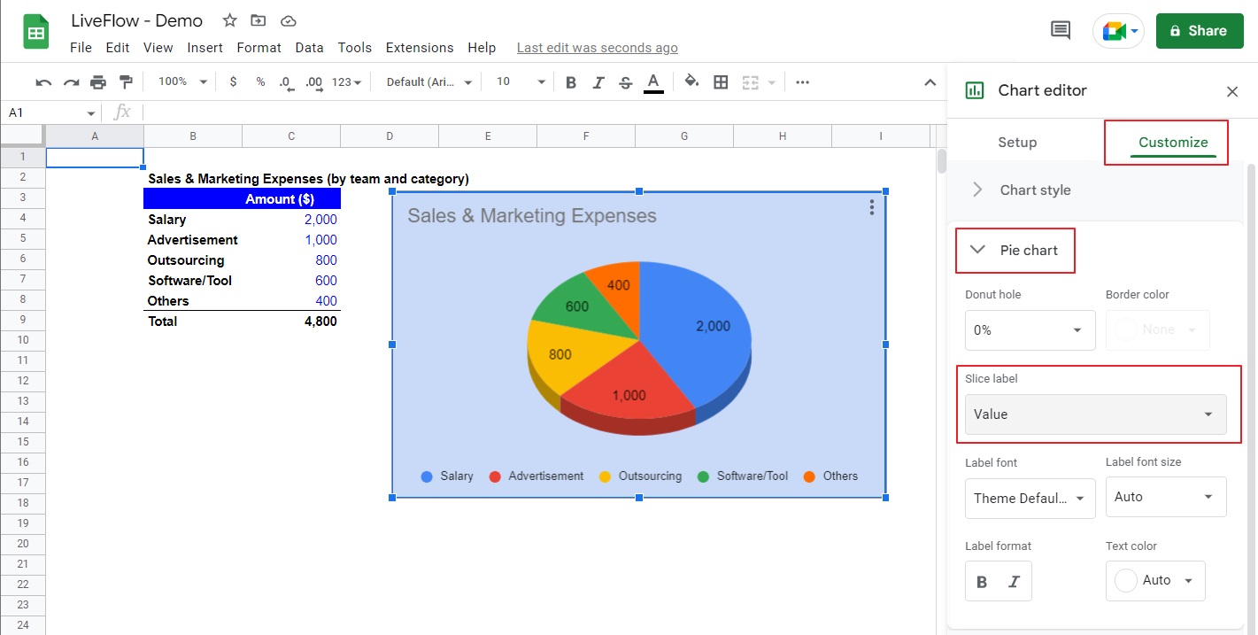
Adding a Chart Title and Axis Titles
To provide context and clarity to your chart, it’s essential to add a chart title and axis titles. These elements act as captions that help viewers understand the data being represented and the meaning behind the chart.
Here’s how you can add a chart title and axis titles in Google Sheets:
- Select the chart you want to add titles to by clicking on it in your spreadsheet.
- Click on the small three-dot menu icon in the top right corner of the chart and select “Edit chart.”
- In the chart editor, navigate to the “Customize” tab.
- Scroll down to the “Chart & axis titles” section.
- Toggle the “Chart title” switch to enable it and enter your desired title in the provided field.
- Toggle the “Horizontal axis title” or “Vertical axis title” switch to enable the respective titles, and enter the desired text for each axis.
- You can format the titles by adjusting the font, size, color, and alignment options available.
- Once you’re satisfied with the titles, click the “Update” button to apply them to the chart.
The chart title provides an overall description or summary of the data being presented. It should be concise, descriptive, and capture the main focus of the chart. Axis titles, on the other hand, provide specific information about the data represented on each axis, helping viewers understand the measurements or categories involved.
When adding chart and axis titles, consider the audience and the purpose of your chart. Make sure the titles accurately reflect the data and provide the necessary context for viewers to interpret the chart correctly. Additionally, formatting the titles to align with the overall aesthetic of your chart will enhance its visual appeal.
Now that you know how to add chart and axis titles in Google Sheets, let’s explore different chart styles to further enhance your visualizations.
Using Chart Styles
Chart styles can greatly enhance the visual appeal and impact of your charts in Google Sheets. With a wide range of pre-designed styles available, you can quickly transform the look and feel of your chart to best suit your data and presentation needs.
To use chart styles in Google Sheets, follow these steps:
- Select the chart you want to apply a style to by clicking on it in your spreadsheet.
- Click on the small three-dot menu icon in the top right corner of the chart and select “Edit chart.”
- In the chart editor, navigate to the “Customize” tab.
- Scroll down to the “Chart style” section.
- Explore the different styles available by clicking on the style thumbnails.
- The chart preview will update in real-time, allowing you to see how each style transforms the appearance of your chart.
- Once you find a style that you like, click the “Update” button to apply it to your chart.
Chart styles offer a quick and easy way to give your chart a professional and polished look. Whether you’re looking for a modern, minimalist design or a vibrant and colorful style, experimenting with different chart styles can help you find the ideal visual representation for your data.
Remember to choose a chart style that complements your data and presentation goals. Consider factors such as the audience, the purpose of the chart, and the story you want to convey. The use of appropriate chart styles can significantly enhance the visual storytelling of your data.
Using chart styles is just one of the many ways to customize the appearance of your charts in Google Sheets. In the next sections, we’ll explore additional techniques like adding trendlines and error bars, as well as updating charts automatically.
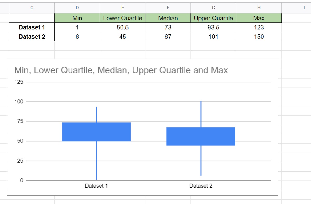
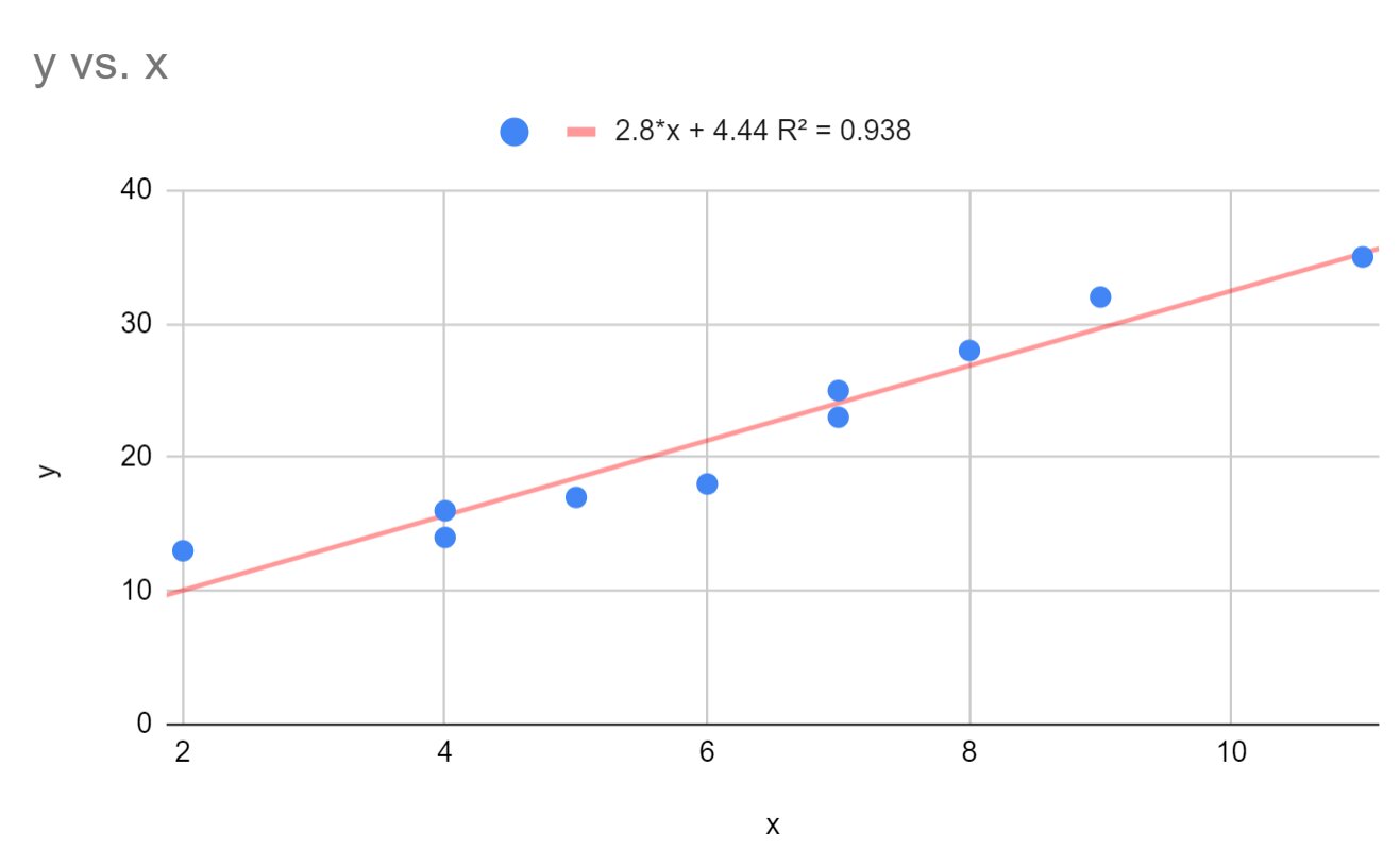
Adding Trendlines and Error Bars
When analyzing data trends or indicating potential variations in your chart, adding trendlines and error bars can provide valuable insights. Google Sheets offers the ability to easily incorporate these elements into your chart, enhancing its visual representation and making it more informative.
To add trendlines and error bars in Google Sheets, follow these steps:
- Select the chart you want to add trendlines or error bars to by clicking on it in your spreadsheet.
- Click on the small three-dot menu icon in the top right corner of the chart and select “Edit chart.”
- In the chart editor, navigate to the “Customize” tab.
- To add a trendline, scroll down to the “Trendline” section. Click on the trendline dropdown menu and select the desired trendline type, such as linear, exponential, polynomial, or moving average. The trendline will be added to your chart, visually representing the trend or pattern in your data.
- To add error bars, scroll down to the “Data series” section. Click on the “Error bars” dropdown menu and select either “Standard deviation” or “Custom.” Customize the error bars by selecting the data range for the error values or specifying custom positive/negative error amounts.
- You can further customize the appearance and style of the trendline or error bars by adjusting options like line color, thickness, or error bar type.
- Once you’re satisfied with the trendlines and error bars, click the “Update” button to apply them to your chart.
Trendlines and error bars add valuable context to your chart by visualizing trends and indicating the range of potential data variability. Trendlines provide insights into the direction and slope of your data, helping you identify patterns or forecast future trends. Error bars, on the other hand, represent the uncertainty or variability in your data, making it easier to understand the reliability of your measurements.
When using trendlines and error bars, ensure that they are relevant to your data and contribute to the overall understanding of your chart. Consider the purpose and audience of your chart, and choose the appropriate types and styles of trendlines and error bars that effectively communicate your insights.
In the next section, we will explore how to update your chart automatically, saving you time and effort in keeping your visualizations up-to-date.
Updating a Chart Automatically
Keeping your chart up-to-date with the latest data can be a time-consuming task, especially if your data is constantly changing. Fortunately, Google Sheets provides features that allow you to update your chart automatically, ensuring that your visualizations always reflect the most recent information.
To update a chart automatically in Google Sheets, follow these steps:
- Ensure that your chart is linked to a range of cells that contain your data. If your chart is not linked to a range, select the chart and click on the “Data” tab in the chart editor. Use the range selector to choose the appropriate data range.
- Whenever you update the data within the linked range, your chart will automatically update to reflect the changes. This means that any modifications or additions to the data will be instantly reflected in your chart.
- If you have data in another sheet within the same spreadsheet, you can use formulas or cell references to pull that data into the range linked to your chart. By doing so, any updates to that source data will automatically be reflected in your chart.
- You can also set up automatic data import from external sources by utilizing the import functions in Google Sheets. These functions allow you to establish a connection to an external data source, and the data will be updated automatically in your spreadsheet and, subsequently, in your chart.
- It’s important to periodically review your chart and ensure that the data is accurately reflected. If any issues arise, you can always go back to the chart editor and double-check the data range and linking to ensure everything is correct.
Updating your chart automatically saves you time and effort in manually adjusting and modifying your visualizations. By leveraging the dynamic nature of Google Sheets, you can maintain the accuracy and relevance of your charts as your data evolves.
By automatically updating your chart, you can confidently share the visualization with others, knowing that it reflects the most up-to-date information. Whether you’re collaborating with team members or presenting your findings to stakeholders, having an automatically updated chart ensures accuracy and consistency across your reports and presentations.
Now that you know how to update a chart automatically, you have the tools to effortlessly keep your visualizations in sync with your data.
Publishing and Collaborating on a Chart
Sharing your charts with others and collaborating on data visualizations is an essential aspect of working with Google Sheets. With the ability to publish your charts and collaborate in real-time, you can easily communicate your insights and work together with others to analyze and interpret the data.
To publish and collaborate on a chart in Google Sheets, follow these steps:
- Select the chart you want to publish by clicking on it in your spreadsheet.
- Click on the small “Publish chart” button that appears on the top right corner of the chart. This will open the publishing options.
- In the publishing options, choose whether you want to publish the chart as an image or an interactive HTML file. The interactive HTML file allows viewers to interact with the chart and explore the data further.
- Customize the publishing settings as desired, such as the size of the image or the level of interactivity for the HTML file.
- Once you’re satisfied with the settings, click the “Publish” button to generate the sharing link.
- Copy the generated link and share it with others. You can send it via email, embed it in a document or webpage, or share it through collaborative platforms like Google Drive or Google Docs.
- Collaborators who have access to the sharing link can view and interact with the chart. They can provide comments, make suggestions, or even edit the chart if they have appropriate permissions.
- In addition to publishing the chart, you can also enable real-time collaboration by sharing the entire Google Sheets document. This allows multiple users to work on the data and charts simultaneously, making it easy to collaborate and analyze the information together.
By publishing and collaborating on a chart, you can engage with others, gather feedback, and make informed decisions based on collective insights. Whether you’re working on a team project, sharing data with clients, or seeking input from stakeholders, the ability to publish and collaborate on your chart streamlines the communication process and fosters collaboration.
Make sure to regularly review and manage the sharing settings of your published chart to ensure the right level of access and security. This will help you maintain control over who can view and interact with your chart.
Now that you know how to publish and collaborate on a chart in Google Sheets, you can share your data visualizations with others and benefit from the collective knowledge and expertise of your team.
Conclusion
Creating and customizing charts in Google Sheets opens up a world of possibilities for visualizing and analyzing data. With its user-friendly interface and powerful features, Google Sheets provides a versatile platform for anyone to create impactful and informative charts.
In this guide, we explored the step-by-step process of creating a basic chart, customizing the chart type, editing chart data, formatting the chart, adding chart and axis titles, using chart styles, and incorporating trendlines and error bars. We also learned how to update a chart automatically and how to publish and collaborate on a chart in real-time.
By mastering these techniques, you can effectively communicate your data, uncover patterns and trends, and make data-driven decisions. However, it’s important to remember that creating great charts goes beyond technical skills. It requires a deep understanding of the data, the audience, and the story you want to convey.
As you continue your journey of creating charts in Google Sheets, keep experimenting with different chart types, styles, and formatting options. Consider the context and purpose of your data visualization, and always strive for clarity, accuracy, and visual appeal.
Now armed with the knowledge and tools to create stunning charts, go forth and transform your data into meaningful visualizations. Whether you’re preparing a business report, presenting research findings, or analyzing personal statistics, let your charts do the talking and bring your data to life.