Introduction
Welcome to the world of Google Sheets! Whether you are a student, professional, or just someone who loves to organize data, Google Sheets is a powerful tool that can help you effortlessly create and analyze spreadsheets. One of the key features of Google Sheets is its ability to generate visually appealing graphs and charts to represent data in an easy-to-understand manner.
In this article, we will explore how to create graphs in Google Sheets and customize them to meet your specific needs. We will cover everything from entering data and selecting the data range to inserting a chart and formatting it to your liking. You will also learn how to edit chart data, update the chart when the underlying data changes, and even embed the chart in a website.
With Google Sheets, you have a wide range of chart types to choose from, such as line graphs, bar graphs, pie charts, and more. You can also customize the chart options, including titles, axes labels, colors, and styles, to make your graphs visually appealing and accurate.
Sharing and collaborating on spreadsheets with others is another fantastic feature of Google Sheets. You can easily share your graphs with colleagues, collaborate in real-time, and even allow others to make edits or provide feedback. This makes it a great tool for team projects or presentations.
Throughout this article, we will provide step-by-step instructions and tips to help you make the most of Google Sheets’ graphing capabilities. So, let’s dive in and discover how to create stunning graphs in Google Sheets that effectively communicate your data!
Getting Started
Before we begin creating graphs in Google Sheets, it’s important to have a basic understanding of how to navigate the interface and access the necessary tools. If you don’t have a Google Sheets account, you can easily create one by signing up on the Google Sheets website. Once you have an account, follow these steps to get started:
- Access Google Sheets: Go to the Google Sheets website and sign in to your account. You can also access Google Sheets through the Google Drive platform.
- Create a new spreadsheet: Once you are signed in to your Google Sheets account, click on the “Blank” option to create a new spreadsheet. You can also choose from pre-made templates available to expedite your work.
- Navigate the interface: The Google Sheets interface consists of a menu bar at the top, a toolbar with various formatting options, and the spreadsheet itself, which is divided into rows and columns. Familiarize yourself with the different elements of the interface to easily navigate and make changes to your spreadsheet.
- Familiarize yourself with basic functions: Google Sheets provides a range of functions to perform calculations, manipulate data, and automate tasks. Take some time to explore the built-in functions and formulas available to you, as they will come in handy when creating graphs.
Once you are comfortable with the basics of using Google Sheets, you are ready to start creating graphs. In the next sections, we will explore the step-by-step process of entering data, selecting the data range, and inserting a chart. Let’s continue our journey and unlock the power of graphs in Google Sheets!
Creating a New Spreadsheet
To create a new spreadsheet in Google Sheets, follow these simple steps:
- Open Google Sheets: Launch your web browser and navigate to the Google Sheets website. Sign in to your Google account if you haven’t already.
- Create a new spreadsheet: Once you are signed in, click on the “Blank” option from the template gallery to create a new spreadsheet. Alternatively, you can access pre-made templates in the gallery and customize them to suit your needs.
- Set a name: By default, the new spreadsheet will be named “Untitled spreadsheet.” To give it a meaningful name, click on the tab at the bottom of the spreadsheet and enter the desired name.
- Format the spreadsheet: Before entering data, you may want to format the spreadsheet to your preferences. You can adjust the column widths, change the font style and size, and apply other formatting options using the toolbar at the top of the page.
- Save the spreadsheet: Google Sheets automatically saves your spreadsheet as you work. However, it’s a good practice to manually save the spreadsheet periodically. You can do this by clicking on the “File” option in the menu bar and selecting “Save” or by using the keyboard shortcut Ctrl/Cmd + S.
Now your new spreadsheet is ready, and you can start entering data and creating graphs. In the next section, we will explore how to enter data into the sheet and select the data range for chart creation. Let’s jump right in!
Entering Data into the Sheet
Now that you have created a new spreadsheet in Google Sheets, it’s time to start entering data. Follow these steps to enter data into the sheet:
- Select a cell: Click on the cell where you want to enter the data. The selected cell will be highlighted, and the contents can be entered.
- Type in the data: Once you have selected a cell, simply start typing in the data. Google Sheets automatically moves to the next cell in the same row once you have finished entering the data in the current cell. You can also use the Tab key to move to the next cell in the row.
- Move to different cells: To navigate to a different cell, you can use the arrow keys on your keyboard or click on the desired cell with your mouse. You can also use the Enter key to move to the cell below or Shift + Enter to move to the cell above.
- Enter different data types: Google Sheets accepts various data types, including numbers, text, dates, and formulas. You can enter numbers as they are or apply desired formatting such as currency or percentages. To enter text, simply start typing in the cell. Dates can be entered in a specific format or using the calendar function.
- Copy and paste data: If you have data in another location, you can easily copy and paste it into your spreadsheet. Select the cells containing the data, use the Ctrl/Cmd + C keyboard shortcut to copy, navigate to the desired location in the sheet, and use Ctrl/Cmd + V to paste the data.
- Manage and edit data: To edit or delete existing data, simply select the cell and make the necessary changes. You can also use functions and formulas in Google Sheets to manipulate and analyze the data.
By following these steps, you can efficiently enter data into your Google Sheets spreadsheet. In the next section, we will discuss how to select the data range for chart creation. Let’s move forward in our journey of creating visually appealing graphs in Google Sheets!
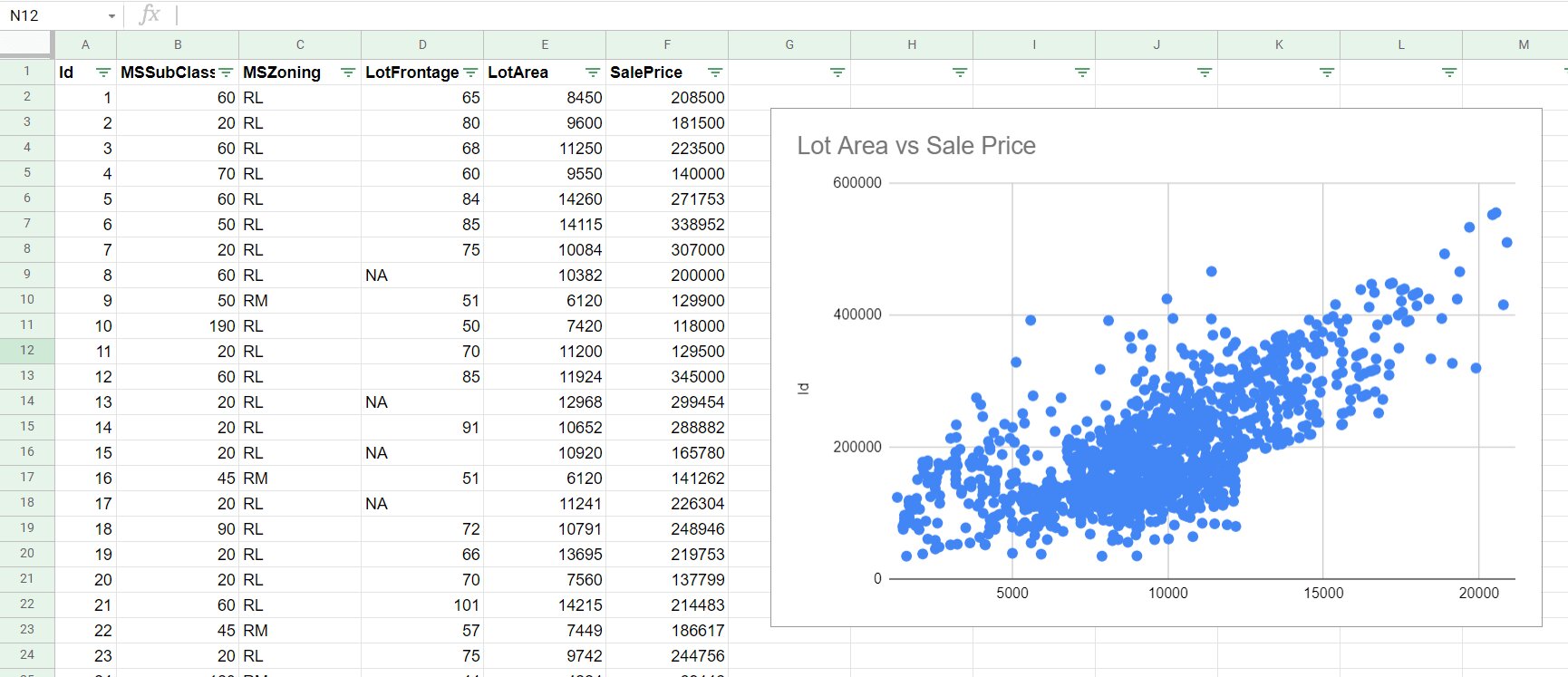
Selecting the Data Range
Selecting the appropriate data range is essential when creating a graph in Google Sheets. The data range determines which cells will be included in the chart and what data will be represented. Follow these steps to select the data range for graph creation:
- Select the first cell: Click on the cell that contains the first data point you want to include in your graph. This cell will serve as the starting point for selecting the data range.
- Drag to select the range: While holding down the mouse button, drag the cursor over the cells that you want to include in the data range. The selected cells will be highlighted as you drag, indicating the range you are choosing.
- Include column headers and labels: In most cases, it is advisable to include column headers and labels in your data range selection. This ensures that the graph is properly labeled and accurately represents the data.
- Select multiple columns or rows: If you want to include multiple columns or rows in your data range, press and hold the Ctrl/Cmd key on your keyboard while selecting the additional columns or rows. This allows you to create a more comprehensive graph that includes multiple sets of data.
- Extend the data range: If you have already created a graph but need to add more data to it, you can extend the data range easily. To do this, select the existing graph and click on the “Edit” button in the toolbar that appears. From there, you can adjust the data range to include the newly added data.
By following these steps, you can accurately select the data range for your graph in Google Sheets. In the next section, we will explore how to insert a chart based on the selected data range. Let’s continue our journey of creating engaging and informative graphs!
Inserting a Chart
Once you have selected the data range in Google Sheets, you can easily insert a chart to visualize the data. Follow these steps to insert a chart based on your selected data range:
- Select the data range: Start by selecting the cells containing the data you want to include in the chart. This can be done by clicking on the first cell and dragging the cursor to the last cell of the data range.
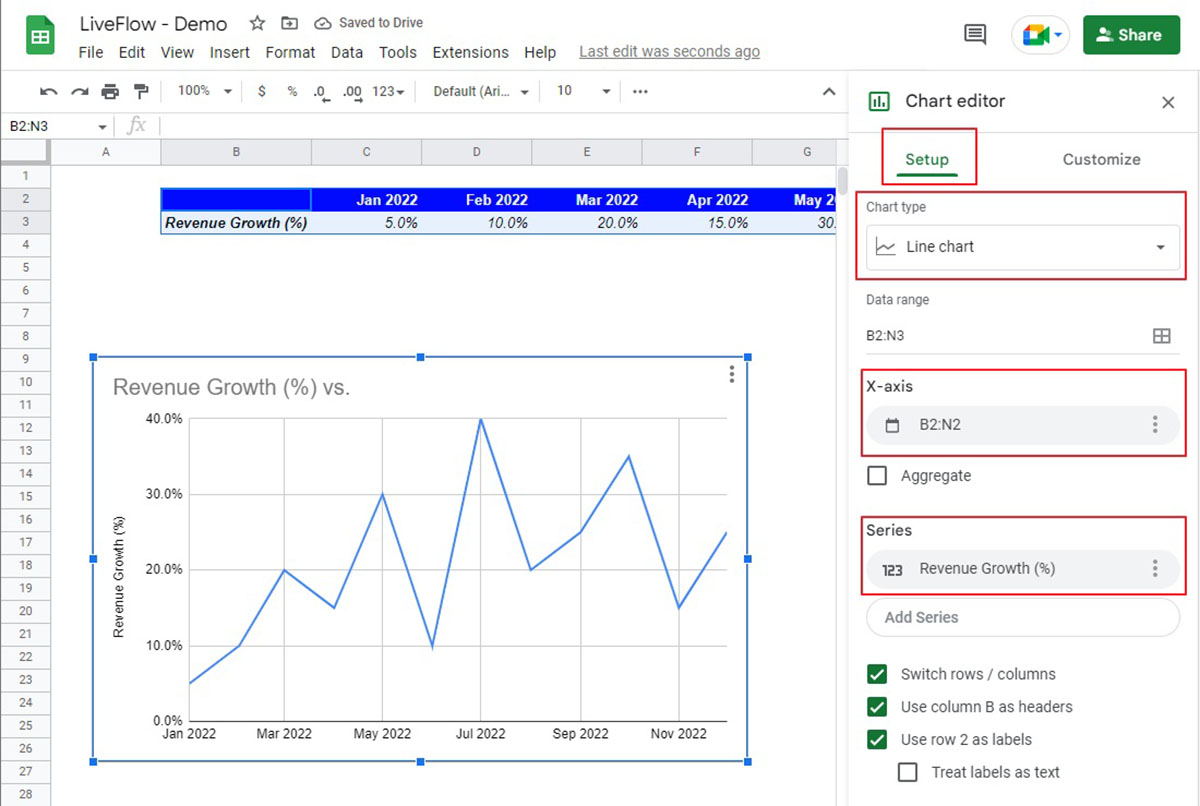
- Open the chart editor: Once the data range is selected, go to the “Insert” tab in the menu bar and click on the “Chart” option. This will open the chart editor on the right-hand side of the screen.
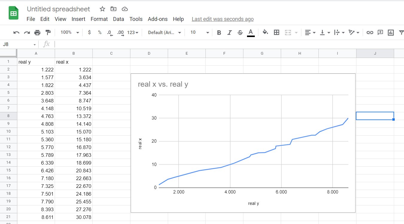
- Choose a chart type: In the chart editor, you will find a variety of chart types to choose from, such as line graphs, bar graphs, pie charts, and more. Browse through the options or use the search bar to find the chart type that best represents your data.
- Select the desired chart: Once you have chosen a chart type, click on the chart option to select it. You can preview the chart in the chart editor to get an idea of how it will look with your data.
- Customize the chart options: After selecting the desired chart type, you can further customize the chart by adjusting various options. This includes titles, axes labels, colors, styles, and more. Explore the customization options in the chart editor to make the chart visually appealing and accurate.
- Insert the chart: Once you are satisfied with the chart settings, click on the “Insert” button in the chart editor. The chart will be inserted into your Google Sheets spreadsheet, representing the selected data range.
By following these steps, you can quickly and easily insert a chart in Google Sheets based on your selected data range. In the next section, we will delve into the process of choosing a chart type that best suits your data. Let’s continue our journey and create stunning and informative graphs!
Choosing a Chart Type
Choosing the right chart type is crucial when it comes to effectively visualizing your data in Google Sheets. Each chart type has its own strengths and is best suited for representing different types of data. Follow these guidelines to help you choose the appropriate chart type for your data:
- Line chart: Use a line chart to show trends over time or to track changes in data over a continuous period. It is ideal for displaying data with multiple data series or for comparing data sets.
- Bar chart: Bar charts are great for comparing data across different categories or groups. They are especially useful for showing discrete data such as sales by month or survey responses by age group.
- Column chart: Similar to bar charts, column charts are effective for comparing data across categories. They work well when the x-axis labels are long or when there are many data points to display.
- Pie chart: Pie charts are useful for displaying proportions or percentages of a whole. They are visually appealing and are best suited for showcasing data with few categories or for illustrating market shares.
- Area chart: Area charts are perfect for visualizing trends and cumulative data over time. They are especially effective for displaying data that changes over time and for comparing multiple data series on a single chart.
- Scatter chart: Scatter charts are ideal for showing the relationship between two variables. They are useful for identifying patterns, correlations, and outliers in the data.
- Combo chart: A combo chart allows you to combine two or more different chart types onto a single chart. This is helpful when you want to compare different types of data on the same chart or when you have data with multiple scales.
When choosing a chart type, consider the nature of your data, the message you want to convey, and the visual representation that will best highlight the insights in your data. Experiment with different chart types to find the one that effectively communicates your data and insights. In the next section, we will explore how to customize chart options to enhance the visual appeal of your graph. Let’s continue our journey and create visually captivating graphs in Google Sheets!
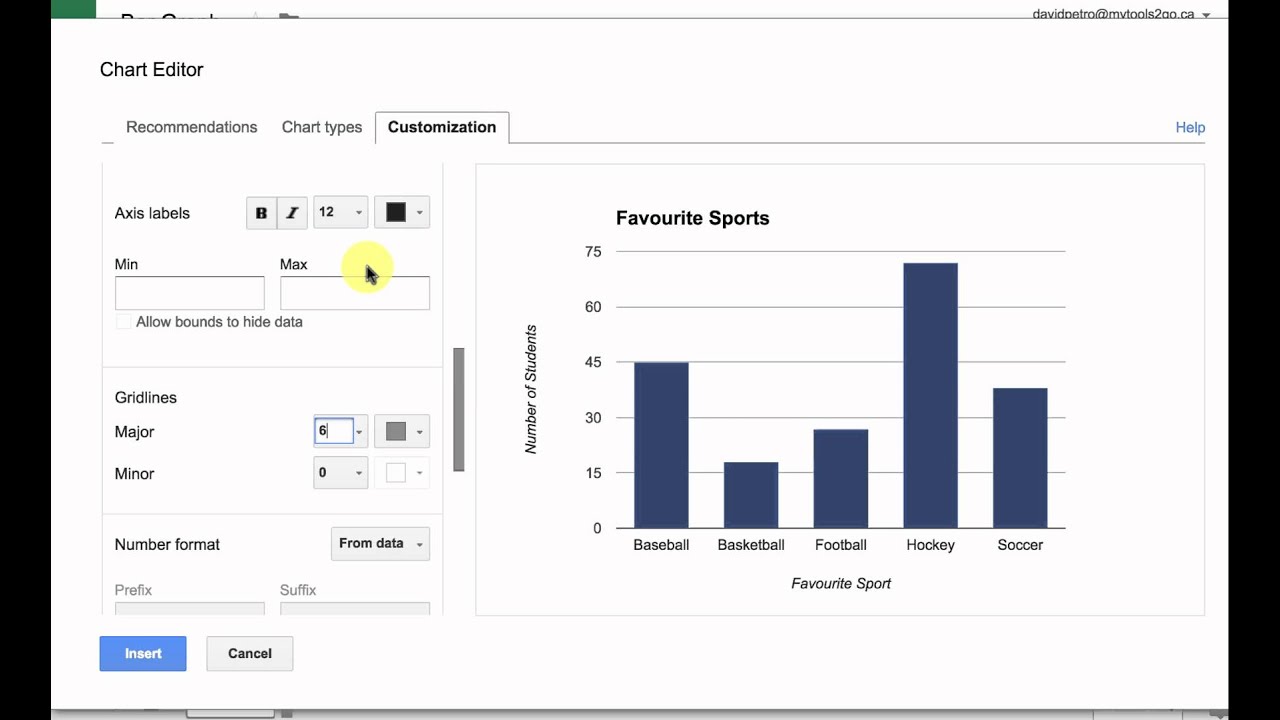
Customizing Chart Options
Customizing the chart options in Google Sheets allows you to tailor the appearance and behavior of your chart to meet your specific needs. By making use of the various customization options available, you can create visually appealing graphs that effectively communicate your data. Here are some key ways to customize your chart in Google Sheets:
- Title and Axis Labels: Give your chart a descriptive title that clearly indicates what the data represents. Additionally, customize the labels for the X and Y axes to provide more context for the data.
- Data Range: If you need to change the data range used in the chart, you can easily edit it through the chart editor. This allows you to update the chart if you have added or removed data from your spreadsheet.
- Chart Colors and Styles: Modify the colors, styles, and line thickness of the chart elements to enhance the visual appeal and make the information easier to understand. Experiment with different color schemes and styles to find the one that best fits the overall aesthetic of your presentation or report.
- Chart Layout: Adjust the layout of your chart by adding or removing elements such as a legend, data labels, or gridlines. These elements can provide additional context or help in interpreting the data.
- Chart Background: Customize the background color or add an image to the chart to make it visually engaging and aligned with your overall design theme.
To customize these options, simply select the chart, click on the chart editor icon, and navigate to the relevant customization tab. Within each tab, you will find various options to tweak and refine your chart until it accurately represents your data and conveys the message you want to deliver.
Remember, customization should enhance the clarity and impact of your graph, so avoid overcomplicating the chart with unnecessary visual effects or clutter. Focus on keeping your chart clean, clear, and visually appealing.
In the next section, we will delve into the process of formatting the chart in Google Sheets. Let’s continue our exploration and learn how to create polished and professional-looking graphs!
Formatting the Chart
Formatting the chart in Google Sheets is essential to make it visually appealing, easy to understand, and align with your overall design. By applying various formatting options, you can enhance the readability and impact of your graph. Here are some key formatting techniques to consider when working with your chart:
- Chart Styles: Experiment with different chart styles to find the one that best fits your data and presentation. Google Sheets offers a range of predefined styles that you can apply with just a few clicks.
- Color Palette: Choose an appropriate color palette that matches your branding or effectively represents the data. Use colors that contrast well and ensure clarity in differentiating data points or categories.
- Fonts and Typography: Consider the font style, size, and formatting of the chart’s title, labels, and data. Ensure readability by using legible fonts and appropriate font sizes.
- Data Labels: Displaying data labels can provide extra context and make it easier for viewers to interpret the chart. You can choose to display the values directly on the data points or as labels on the X or Y axes.
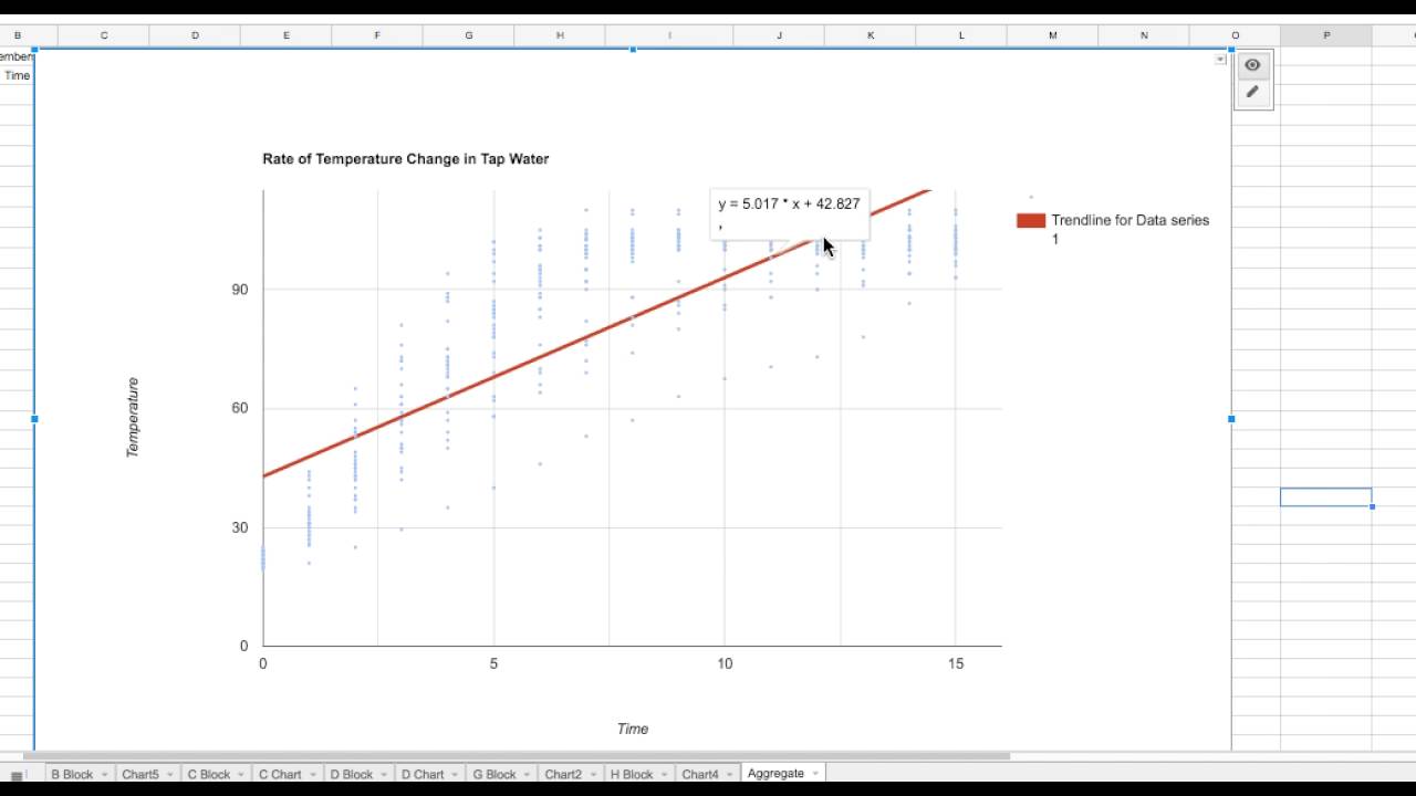
- Trendlines and Error Bars: Adding trendlines or error bars to your chart can provide additional insights into the data. Trendlines help visualize the overall trend, while error bars indicate the variation or uncertainty in the data.
- Axis Scaling and Tick Marks: Customize the axis scaling and tick marks to ensure that the chart accurately represents the magnitude and distribution of the data. Consider adjusting the range, interval, or logarithmic scale based on the nature of your data.
- Annotations and Callouts: Use annotations or callouts to highlight specific data points or draw attention to important information in the chart. This can help viewers easily identify key insights or trends.
To format your chart in Google Sheets, select the chart, click on the chart editor icon, and navigate to the “Customize” tab. Here, you will find various formatting options to modify the appearance and style of your chart. Don’t be afraid to experiment with different formatting techniques to create a chart that is both visually appealing and informative.
In the next section, we will explore how to add chart elements to provide additional clarity and context to your graph. Let’s continue our journey and create visually stunning and informative graphs!
Adding Chart Elements
Adding chart elements in Google Sheets can provide additional clarity and context to your graph, making it easier for viewers to understand the data. These elements can enhance the visual appeal and convey important information. Here are some key chart elements you can consider adding to your graph:
- Legend: Including a legend is useful when you have multiple data series or categories in your chart. The legend helps viewers understand the meaning behind different colors or symbols used in the chart.
- Data Labels: Displaying data labels on the chart can provide precise values or percentages for each data point. This can help viewers interpret the data more accurately and make comparisons between different categories or data series.
- Data Tables: Adding a data table below the chart can provide an organized view of the data used to create the graph. It complements the visual representation and allows viewers to examine the underlying values.
- Trendlines: Trendlines help visualize the overall trend in the data. Adding trendlines to your chart can highlight patterns, directionality, or tendencies within the data, making it easier to identify and analyze trends.
- Error Bars: Indicating error bars on the chart can give viewers an understanding of the degree of uncertainty or variability in the data. Error bars can represent standard deviation, confidence intervals, or other statistical measures.
- Annotations: Annotations or callout boxes allow you to add specific text or notes to highlight important data points or provide additional explanations. Annotations can draw attention to significant values or provide context for unusual or notable data points.
- Gridlines: Enabling gridlines on the chart can provide a reference for data points along the axes. Gridlines help viewers better understand the scale and magnitude of the data and can aid in making accurate interpretations.
To add these chart elements in Google Sheets, select the chart, click on the chart editor icon, and navigate to the “Customize” tab. From there, you can enable or disable specific elements and customize their appearance and positioning based on your preferences and the needs of your data presentation.
Remember, when adding chart elements, it’s essential to strike a balance between providing useful information and avoiding clutter. Choose elements that effectively enhance the understanding of the data and make the necessary adjustments to create a visually appealing and informative graph.
In the next section, we will explore how to edit chart data in Google Sheets. Let’s continue our journey and unlock the full potential of graphing in Google Sheets!
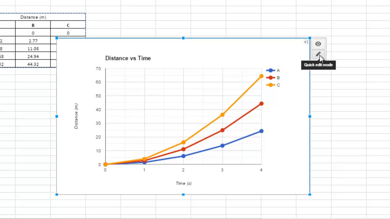
Editing Chart Data
Editing chart data in Google Sheets allows you to make changes to the underlying data that is being displayed in the chart. Whether you need to add new data, remove existing data, or make adjustments to the values, Google Sheets makes it easy to update and modify your chart data. Follow these steps to edit the chart data:
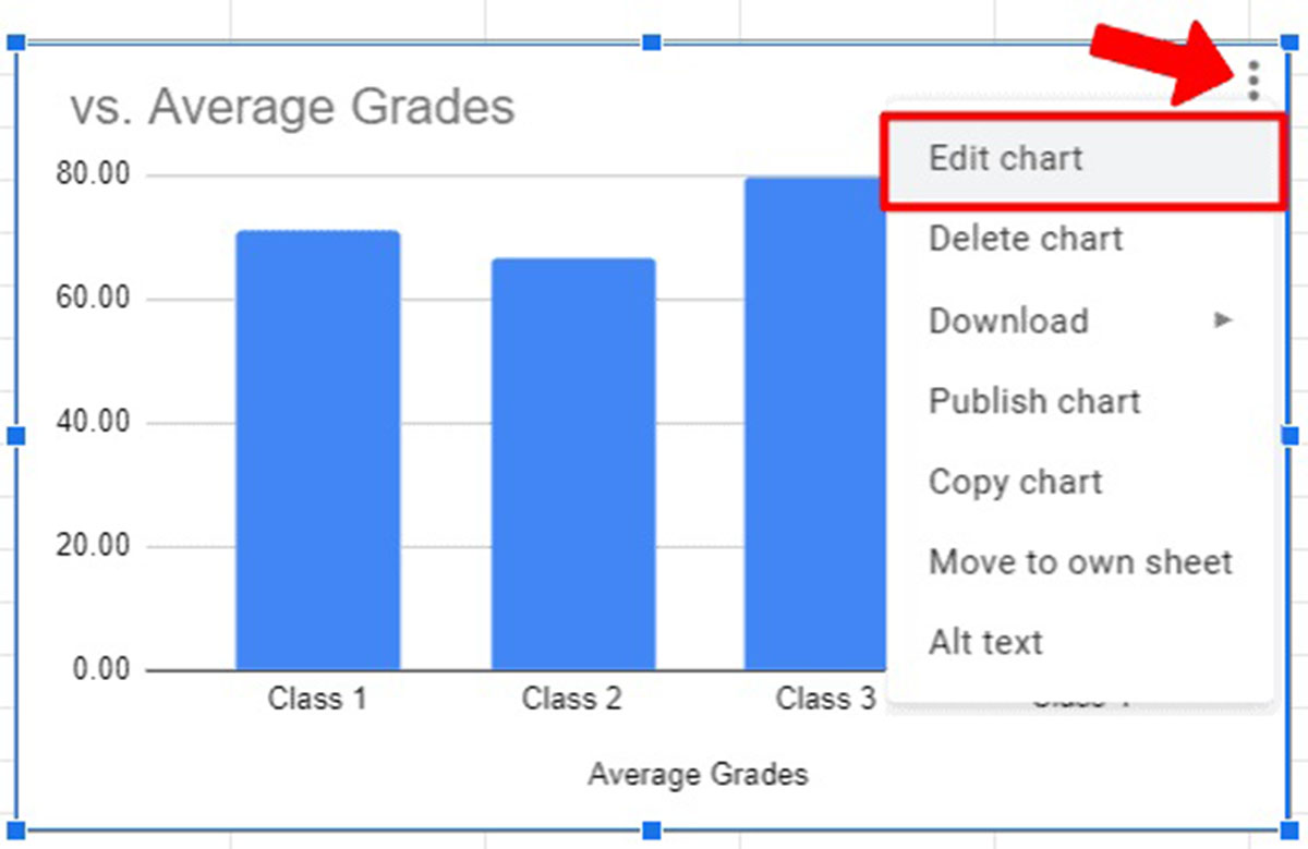
- Select the chart: Click on the chart to select it. The selected chart will be outlined, and you will see a small triangular icon in the top-right corner of the chart.
- Click on the Edit button: Click on the triangular icon in the top-right corner of the chart and then click on the “Edit Chart” option. This will open the chart editor on the right-hand side of the screen.
- Modify the data range: In the chart editor, navigate to the “Data” tab. You will see the current range of data that is being used for the chart. To modify the data range, either manually edit the range in the “Data range” box or click on the “Select Data Range” button to choose a new range from your spreadsheet.
- Update or adjust the values: If you need to make changes to the values themselves, go back to your spreadsheet and modify the data directly. The chart will automatically update to reflect the changes. You can add new rows or columns, delete existing rows or columns, or adjust any values as needed.
- Apply changes: Once you have finished making edits to the chart data, click on the “Update” button in the chart editor to apply the changes to the chart. The chart will now reflect the updated data.
By following these steps, you can easily edit your chart data in Google Sheets. This flexibility allows you to keep your chart up-to-date as your data changes and make necessary adjustments to accurately represent the information you want to convey.
In the next section, we will explore how to update the chart when the underlying data changes. Let’s continue our journey and learn how to ensure the accuracy and relevance of our graphs in Google Sheets!
Updating the Chart
Keeping your chart updated is crucial to ensure that it accurately reflects the most current data. Google Sheets makes it easy to update your chart when the underlying data changes. Follow these steps to update your chart in Google Sheets:
- Select the chart: Click on the chart to select it. The selected chart will be outlined, and you will see a small triangular icon in the top-right corner of the chart.
- Click on the Update button: Click on the triangular icon in the top-right corner of the chart and then click on the “Update” option. This will refresh the chart and incorporate any changes that have been made to the underlying data.
- Review the updated chart: Once you have updated the chart, take a moment to review it and ensure that it accurately reflects the new data. Check that the axes, data points, labels, and any other chart elements are correctly represented based on the updated data.
- Make additional changes: If needed, you can also make further adjustments to the chart settings, formatting, or other elements to enhance the visual appeal or clarity of the graph.
- Save or share the updated chart: After updating and reviewing the chart, you can save it to your Google Sheets account or download it in various file formats. You can also share the chart with others, either by providing them with access to the Google Sheets document or by exporting and sharing it as an image or PDF.
By following these steps, you can easily update your chart in Google Sheets to reflect any changes in the underlying data. Regularly updating your chart ensures that it remains relevant, accurate, and provides meaningful insights to your viewers.
In the next section, we will explore how to embed your Google Sheets chart in a website. Let’s continue our journey and discover how to showcase your graphs to a wider audience!
Embedding the Chart in a Website
Embedding your Google Sheets chart in a website allows you to share your graph with a wider audience and seamlessly integrate it into your website’s content. Google Sheets offers a simple and straightforward method to embed your chart. Follow these steps to embed your chart in a website:
- Select the chart: Click on the chart to select it. The selected chart will be outlined, and you will see a small triangular icon in the top-right corner of the chart.
- Click on the Publish button: Click on the triangular icon in the top-right corner of the chart and then click on the “Publish Chart” option. This will open the Publish Chart dialog box.
- Choose the embed option: In the Publish Chart dialog box, select the “Embed” tab. Here, you can customize the size of the embedded chart by adjusting the width and height values.
- Copy the embed code: Once you have configured the embed settings, click on the “Copy HTML” button. This will copy the embed code to your clipboard.
- Paste the embed code in your website: Navigate to your website’s content management system, HTML editor, or the desired webpage where you want to embed the chart. Paste the copied embed code into the appropriate location within the HTML code.
- Preview and publish: After pasting the embed code, preview your website to ensure that the chart displays correctly. If everything looks good, publish the webpage to make the embedded chart live for your website visitors.
By following these steps, you can easily embed your Google Sheets chart in a website. This allows you to share your graph with others, showcase important data, or present information in a visual format that complements your website’s content. Embedding your chart in a website provides a seamless viewing experience for your audience, enhancing engagement and understanding.
In the next section, we will explore how to share and collaborate on the Google Sheets document containing your chart. Let’s continue our journey and discover the collaborative features offered by Google Sheets!
Sharing and Collaborating on the Sheet
Google Sheets provides powerful sharing and collaboration features that allow you to work with others on the same spreadsheet containing your chart. By sharing your Google Sheets document, you can collaborate in real-time, collect feedback, and enable others to view or edit the chart. Here’s how you can share and collaborate on the sheet:
- Open the sharing settings: With the Google Sheets document open, click on the “Share” button in the top-right corner of the screen. This will open the sharing settings menu.
- Choose the sharing options: In the sharing settings menu, specify how you want to share the document. You can enter email addresses to invite specific people to view or edit the document. You can also select whether those people can only view the document or have editing privileges.
- Set permissions: You can further customize the permissions for each person by selecting whether they can edit, comment, or only view the document. You can also choose whether to allow anyone with the link to access the document or restrict access to specific individuals.
- Send sharing invitations: Once you have configured the sharing settings and permissions, click on the “Send” button to send the sharing invitations to the specified individuals. They will receive an email notification with the invitation to access the document.
- Collaborate in real-time: Users with editing privileges can collaborate with you in real-time, making changes and additions to the chart or the underlying data. You can see the edits happening in real-time, facilitating effective collaboration and streamlining the workflow.
- Collect feedback and comments: Users can leave comments or suggestions within the Google Sheets document, allowing for easy collaboration and feedback collection. This is particularly helpful when seeking input or discussing ideas related to the chart.
- Track changes: Google Sheets automatically tracks changes made by different collaborators, displaying the editor’s name and the timestamp. This makes it easy to identify and revert any unwanted modifications or backtrack to a previous version if needed.
By sharing your Google Sheets document and collaborating with others, you can foster a collaborative environment where multiple stakeholders can contribute and improve your chart. This approach ensures that your graph benefits from diverse perspectives and feedback, resulting in a more comprehensive and accurate representation of the data.
In the next section, we will conclude our journey and summarize the key points covered in this article. Let’s wrap up our exploration of creating graphs in Google Sheets!
Conclusion
Congratulations! You have now learned how to create stunning and informative graphs in Google Sheets. By following the step-by-step process outlined in this article, you can easily enter data, select the data range, and insert a chart. With a wide range of chart types available, you have the flexibility to choose the one that best represents your data and conveys your message effectively.
Remember to customize your chart by adjusting chart options, applying formatting techniques, and adding elements such as legends and data labels. These customization steps enhance the visual appeal and readability of your graph. And don’t forget, you can always edit and update your chart to keep it relevant as your data changes.
Furthermore, Google Sheets offers features for embedding your chart in websites, allowing you to share your graphs with a wider audience and integrate them seamlessly into your online content. You can also collaborate and share your Google Sheets document, enabling real-time collaboration, collecting feedback, and fostering a collaborative environment to refine your chart.
By harnessing the power of Google Sheets, you can create visually captivating graphs that effectively communicate your data and insights. So, dive in, explore your data, and let your creativity shine through as you craft compelling graphs in Google Sheets.