Introduction
Line graphs are an effective way to visualize data trends and patterns. Whether you’re analyzing sales figures, tracking website traffic, or monitoring stock prices, line graphs provide a clear and concise representation of data over time. Google Sheets, the popular online spreadsheet tool, offers a user-friendly interface that allows you to create and customize line graphs with ease.
In this article, we’ll walk you through the step-by-step process of making a line graph on Google Sheets. We’ll cover everything from entering data to customizing the graph’s appearance. By the end, you’ll have the skills needed to create professional-looking line graphs for your data analysis and presentations.
Don’t worry if you’re new to Google Sheets or if you don’t consider yourself a tech-savvy individual. This guide is designed to be beginner-friendly, providing clear instructions and tips to ensure your success. Let’s dive in and learn how to create compelling line graphs on Google Sheets!
Opening Google Sheets
To begin creating a line graph on Google Sheets, you’ll first need to access the online spreadsheet tool. If you already have a Google account, follow these simple steps:
- Open your web browser and navigate to Google Sheets.
- Sign in to your Google account. If you don’t have an account, you can create one for free by clicking on “Create account.”
- Once signed in, you’ll be directed to the Google Sheets homepage. Here, you can either create a new spreadsheet by clicking on “Blank” or open an existing one from your Google Drive.
- If you choose to create a new spreadsheet, a blank sheet will open, ready for you to enter your data.
- If you decide to open an existing spreadsheet, select it from your Google Drive, and it will open in a new tab.
Google Sheets provides a range of useful features that can enhance your data analysis. From collaborative editing and real-time updates to cloud storage and accessibility across devices, Google Sheets is a versatile tool that simplifies spreadsheet management.
Remember to save your work regularly as you go along to prevent any potential loss of data. You can do this by clicking on “File” in the navigation menu and selecting “Save” or using the shortcut (Ctrl+S for Windows, Command+S for Mac).
Now that you’re familiar with accessing Google Sheets let’s move on to entering data into the spreadsheet to create your line graph.
Entering Data into Google Sheets
Before you can create a line graph on Google Sheets, you’ll need to have your data entered into the spreadsheet. Here’s how to input your data:
- Locate the first cell where you want to enter the data. Typically, this is cell A1, located at the top-left corner of the sheet.
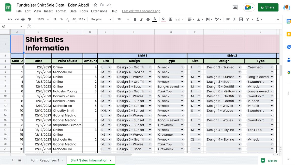
- Type your data values into the selected cell. For example, if you’re analyzing monthly sales data, you can enter the sales figures for each month in separate cells.
- Continue entering your data in the cells below or to the right, depending on how you want to organize your data. Use adjacent columns for additional sets of data.
- If you have numerical data, you can also use formulas to perform calculations. For instance, you can calculate the total sales by using the SUM function on the sales column.
- If applicable, include column headers to label your data. This will help you identify the information when selecting data for the line graph.
Remember to organize your data logically and consistently to ensure accurate analysis and interpretation. Keep in mind that Google Sheets supports a variety of data types, including numbers, dates, times, and strings (text).
As you enter data, Google Sheets automatically saves your progress, so you don’t have to worry about losing your work. However, it’s always a good practice to save your spreadsheet periodically by clicking on “File” in the navigation menu and selecting “Save” or using the shortcut (Ctrl+S for Windows, Command+S for Mac).
Now that you have your data entered into the spreadsheet, let’s move on to selecting the data to create your line graph.
Selecting Data for the Line Graph
Once you have your data entered into Google Sheets, the next step is to select the specific data range that you want to include in your line graph. Follow these steps to select the data:
- Click and drag your mouse over the cells that contain the data you want to include in the line graph. This will highlight the selected range of cells.
- Make sure to include all the necessary data for your line graph. Typically, the first column contains the x-axis values (e.g., time, date, or categories) and the subsequent columns contain the corresponding y-axis values (e.g., sales, revenue, or quantities).
- If you have column headers, make sure to include them in the selection so that Google Sheets can correctly interpret the data.
- Ensure that your selection includes all the relevant data points, and no extraneous cells are included.
Once you have selected the desired data range, it’s time to create the line graph based on this selection. Keep in mind that you can always adjust or modify the data selection later if needed.
Now that you have selected your data, let’s move on to creating the line graph in Google Sheets.
Creating the Line Graph
With your data selected in Google Sheets, you’re ready to create a line graph. Follow these steps to generate a line graph based on your data:
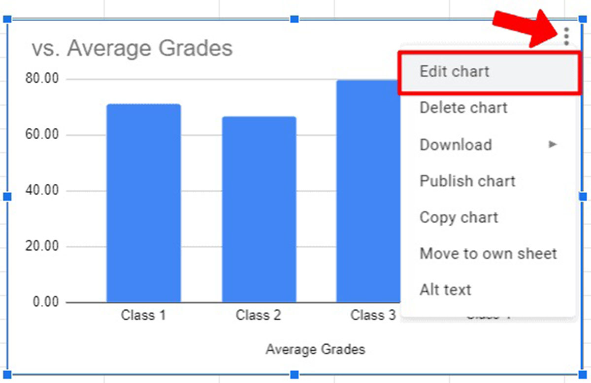
- Click on the “Insert” tab in the navigation menu at the top of the Google Sheets window.
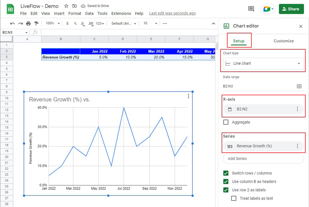
- In the dropdown menu, click on “Chart.” This will open the Chart Editor sidebar on the right side of the screen.
- In the Chart Editor sidebar, click on the “Chart type” dropdown menu to select the type of chart you want to create. In this case, choose “Line.”
- Google Sheets will automatically generate a line graph based on your selected data. Take a moment to review the initial graph layout and appearance.
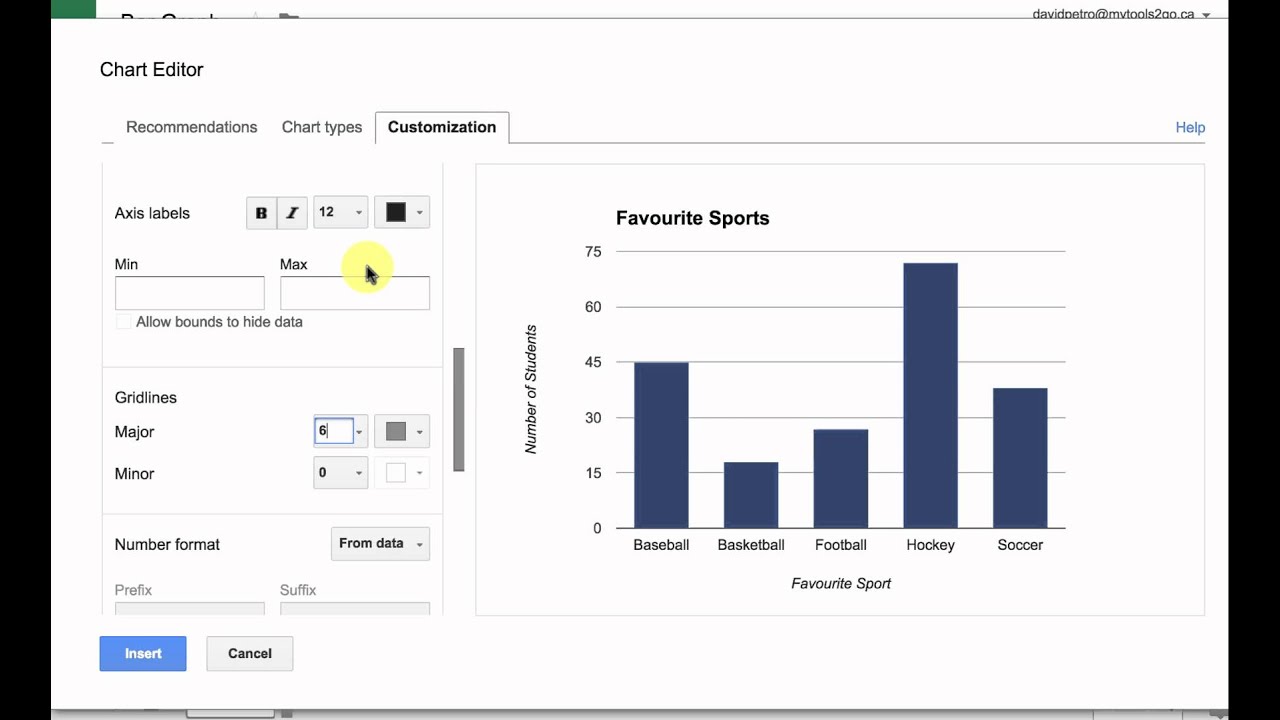
- To customize the line graph further, click on the options available in the Chart Editor sidebar. Here, you can modify the chart title, fonts, colors, axes, and more to suit your preferences or requirements.
Once you’re satisfied with the chart settings, click on the “Insert” button at the bottom of the Chart Editor sidebar to add the line graph to your Google Sheets spreadsheet.
At this point, you have successfully created a line graph in Google Sheets. However, the graph may not be perfect or fully customized to your needs just yet. In the next section, we will explore how to customize and enhance the appearance of your line graph to make it more visually appealing and informative.
Customizing the Line Graph
After creating a line graph in Google Sheets, you have the flexibility to customize and enhance its appearance. Here are some ways you can make your line graph more visually appealing and informative:
- To modify the chart title, axis titles, and other labels, click on the corresponding options in the Chart Editor sidebar. Use clear and descriptive titles to convey the purpose of the graph and the information being represented.
- Change the font style, size, and color of the text in the line graph. This can help improve readability and ensure that the graph aligns with your preferred visual style.
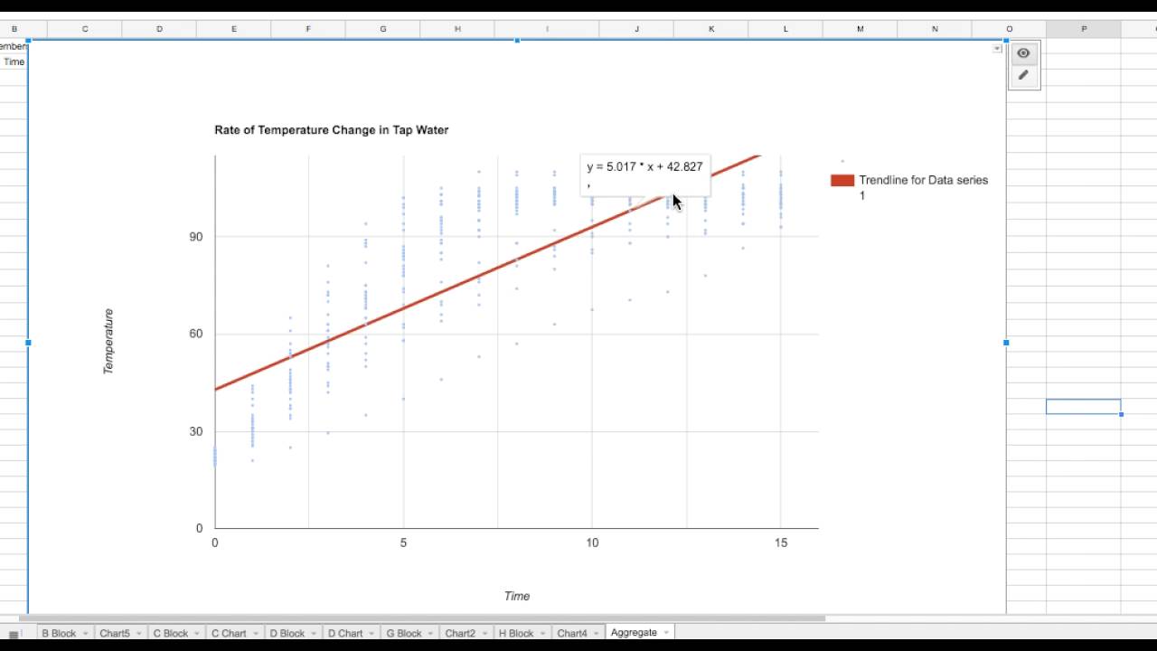
- Adjust the axis scales to ensure that the data is displayed appropriately. You can modify the minimum and maximum values, as well as the intervals, to accurately present your data.
- Add gridlines to guide viewers’ eyes across the graph. Gridlines can help with interpreting the data points and identifying trends or patterns.
- Consider adding data labels to the plot points of the line graph. Data labels show the exact values of each data point and can be useful for precise analysis and comparison.
- Include a legend if there are multiple data series in your line graph. The legend helps viewers understand what each line represents and provides clarity when interpreting the graph.
- Change the line style and thickness to distinguish between different data series or highlight specific trends. You can use dashed or dotted lines, or vary the thickness to create visual contrast.
- Experiment with color choices to make your line graph visually appealing. Avoid using too many colors, as it can become overwhelming. Stick to a cohesive color palette that enhances the readability and overall aesthetic of the graph.
Remember to strike a balance between customization and clarity. While visual enhancements can make your line graph more engaging, it’s important not to sacrifice the accuracy and readability of the data.
Take your time to explore the customization options available in Google Sheets and experiment with different settings until you achieve the desired look for your line graph.
In the next section, we will cover additional customization options, including adding titles and labels, adjusting the axis and gridlines, and changing the line style and colors.
Adding Titles and Labels
Titles and labels play a crucial role in providing context and clarity to your line graph in Google Sheets. Here’s how you can add and customize titles and labels:
- Chart Title: To add a title to your line graph, click on the “Customize” tab in the Chart Editor sidebar. Then, enter the desired title in the “Chart & Axis Titles” section. Write a clear and concise title that accurately depicts the information being showcased.
- Axis Titles: To add titles to the x-axis and y-axis, go to the “Customize” tab and scroll down to the “Horizontal Axis” and “Vertical Axis” sections. Enter the appropriate titles that describe the data represented on each axis.
- Data Labels: To include data labels on your line graph, navigate to the “Customize” tab and scroll down to the “Data Labels” section. Turn on the toggle switch to display the labels on each data point. You can customize the font size, color, position, and formatting of the data labels to suit your preferences.
- Legend: If your line graph has multiple data series, it’s important to include a legend to clarify the meaning of each line. In the Chart Editor sidebar, under the “Customize” tab, go to the “Legend” section and toggle it on. You can further customize the position, font style, and color of the legend.
Adding clear and informative titles and labels to your line graph will ensure that viewers can easily understand the data and draw insights from it. It’s important to use descriptive language and keep the text concise for optimal readability.
Now that you have added titles and labels to your line graph, let’s move on to adjusting the axis and gridlines for better visualization.
Adjusting the Axis and Gridlines
The axis and gridlines in your line graph can help viewers interpret and analyze the data accurately. Here’s how you can adjust them in Google Sheets:
- Axis Scale: To modify the scale of the x-axis or y-axis, click on the axis you want to adjust in the Chart Editor sidebar. In the “Axis” tab, you can manually set the minimum and maximum values, as well as the major and minor units. Consider the range of your data and choose appropriate intervals to ensure the graph accurately represents the information.
- Gridlines: Gridlines provide visual guidance and assist in comparing values on the graph. To add or modify gridlines, navigate to the “Customize” tab in the Chart Editor sidebar. Under the “Gridlines” section, you can toggle on the gridlines for the x-axis, y-axis, or both. You can also customize the style, thickness, and color of the gridlines to suit your preferences.
Properly adjusting the axis scale and adding gridlines can offer valuable insights into the data trends and make it easier for viewers to interpret the line graph. Keep in mind that the choice of intervals and gridline styles can vary depending on the nature of your data and the message you want to convey.
Now that you have adjusted the axis and gridlines, let’s explore further customization options, such as adding data labels and legends, and changing the line style and thickness.
Adding Data Labels and Legends
Data labels and legends play a pivotal role in enhancing the clarity and understanding of your line graph in Google Sheets. Here’s how you can add and customize data labels and legends:
- Data Labels: Data labels provide specific information about each data point on the line graph. To add data labels, click on the data points of your line graph and right-click. Select “Data labels” and choose the desired format, such as displaying the values or percentages. You can customize the font style, color, and position of the data labels by accessing the formatting options.
- Legends: Legends help viewers identify the different data series represented on your line graph. To add a legend, click on the chart, and within the Chart Editor sidebar, go to the “Customize” tab. Under the “Legend” section, toggle on the legend option. You can further customize the position, font style, color, and shape of the legend in line with your preferences.
By adding data labels and legends to your line graph, you provide viewers with vital information that assists in the interpretation and analysis of the displayed data. Ensure the labels and legends are clear, concise, and easily distinguishable.
With data labels and legends now incorporated into your line graph, let’s move on to exploring options for changing the line style, thickness, and color.
Changing the Line Style and Thickness
Customizing the line style and thickness in your line graph can help emphasize specific trends or highlight different data series. Here’s how you can modify the line style and thickness in Google Sheets:
- Line Style: To change the line style in your graph, click on a data series line, right-click, and select “Format data series.” In the “Line” section of the formatting options, you can choose from different line styles, such as solid, dashed, or dotted. Experiment with various line styles to find the one that best suits your visual preferences.
- Line Thickness: Adjusting the line thickness can make the lines in your graph more pronounced or subtle. To change the line thickness, click on a data series line, right-click, and select “Format data series.” In the “Line” section, you can adjust the line thickness by increasing or decreasing the value. Choose a thickness that provides clarity without overwhelming the graph.
By changing the line style and thickness, you can differentiate between different data series or bring attention to specific trends or patterns. It is important to strike a balance between aesthetics and clarity to ensure the line graph effectively communicates your data.
Now that you have customized the line style and thickness in your graph, let’s explore another aspect of customization—changing the background color.
Changing the Line Color
Changing the line color in your line graph can add visual appeal and help differentiate between different data series. Here’s how you can modify the line color in Google Sheets:
- Line Color: To change the line color, click on a data series line, right-click, and select “Format data series.” In the “Line” section of the formatting options, you can choose a new color for the line. Google Sheets provides a variety of predefined colors, or you can use the custom color picker to select a specific shade that suits your preferences or harmonizes with your overall design.
- Line Transparency: If you want to adjust the transparency (opacity) of the line, you can do so by modifying the transparency slider in the “Line” section of the formatting options. This can be useful if you want to create a more subtle or layered effect with your line graph.
Changing the line color can help each data series stand out and make it easier to visually differentiate between them. However, it’s important to be mindful of color choices to ensure that the graph remains readable and accessible for all viewers.
Experiment with different line colors and combinations to find the best visual representation of your data. Remember to consider the overall design, purpose, and target audience of your line graph when choosing the line colors.
Now that you have changed the line color in your graph, let’s move on to editing data directly on the line graph in Google Sheets.
Changing the Background Color
Customizing the background color of your line graph can enhance its visual appeal and make it more cohesive with your overall design. Here’s how you can change the background color in Google Sheets:
- Chart Background: To modify the background color of the entire chart, click anywhere on the chart and then click on the “Customize” tab in the Chart Editor sidebar. Under the “Chart Style” section, you will find options to change the chart’s background color. You can select a predefined color or use the custom color picker to choose a specific shade or tone.
- Plot Area Background: If you prefer to change only the background color of the plot area (the area where the line graph is displayed), click on the plot area of the chart and then navigate to the “Customize” tab in the Chart Editor sidebar. Under the “Chart Style” section, you will find options to modify the plot area’s background color. Select the desired color or use the custom color picker for more precise customization.
Changing the background color of your line graph allows you to create a more visually appealing and consistent presentation. Consider using colors that align with your branding or design scheme, or choose a neutral color for a clean and professional look.
When selecting the background color, keep in mind the readability of the data and any potential contrast issues. Ensure that the background color does not make it difficult for viewers to interpret the represented information.
Now that you have customized the background color of your line graph, let’s explore how to edit data directly on the graph for quick modifications.
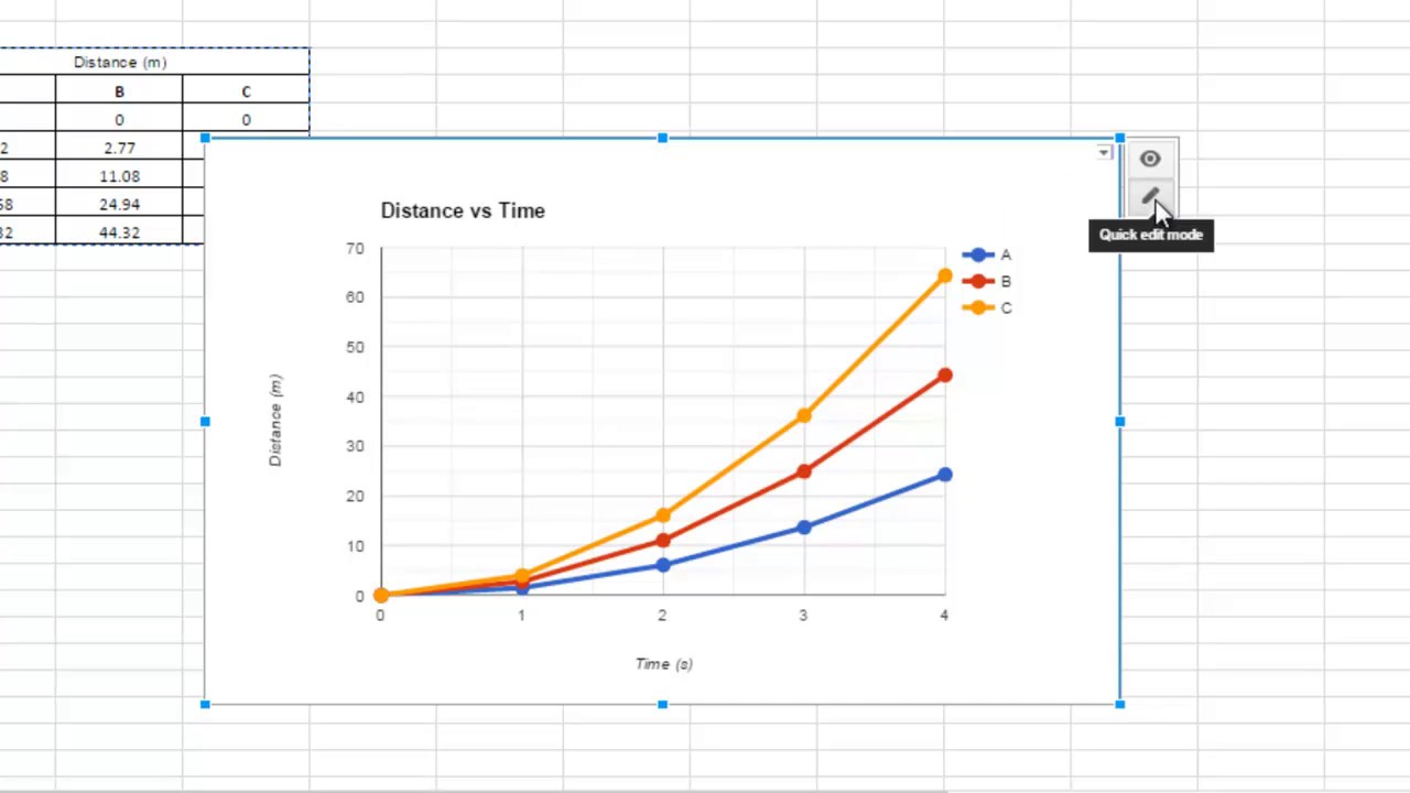
Editing Data on the Line Graph
Editing data directly on the line graph in Google Sheets can save you time and make quick modifications without having to go back to the spreadsheet. Here’s how you can edit data on the line graph:
- Single Data Point: To edit a single data point on the line graph, click on the point you want to modify and drag it to the desired value. This allows you to manually adjust the data point and instantly see the updated line on the graph.
- Multiple Data Points: If you want to edit multiple data points simultaneously, hold down the Shift key and click on each data point you want to modify. You can then drag the selected points to the desired values.
- Undo Changes: If you make a mistake or want to revert the changes, you can use the “Undo” option. Click on the “Edit” tab in the Google Sheets toolbar and select “Undo” or use the shortcut (Ctrl+Z for Windows, Command+Z for Mac). This will undo the last modification you made on the line graph.
Editing data directly on the line graph provides flexibility and speed when making adjustments or exploring different scenarios. It allows you to fine-tune the represented data without the need for manual input in the spreadsheet.
However, keep in mind that editing data on the line graph does not change the actual values in the underlying spreadsheet. It is a temporary modification for visual representation only. If you want to permanently update the data, you will need to make the changes in the original spreadsheet.
Now that you know how to edit data on the line graph, let’s explore how you can effectively utilize line graphs for analysis.
Using the Line Graph for Analysis
Line graphs are powerful tools for data analysis, allowing you to visualize trends, patterns, and relationships over time. Here are some key ways you can utilize line graphs for analysis in Google Sheets:
- Identifying Trends: Line graphs help you identify trends and patterns in your data. Look for upward or downward slopes, steep or gradual changes, and recurring patterns. These visual cues can provide insights into the behavior of your data and help you make informed decisions or predictions.
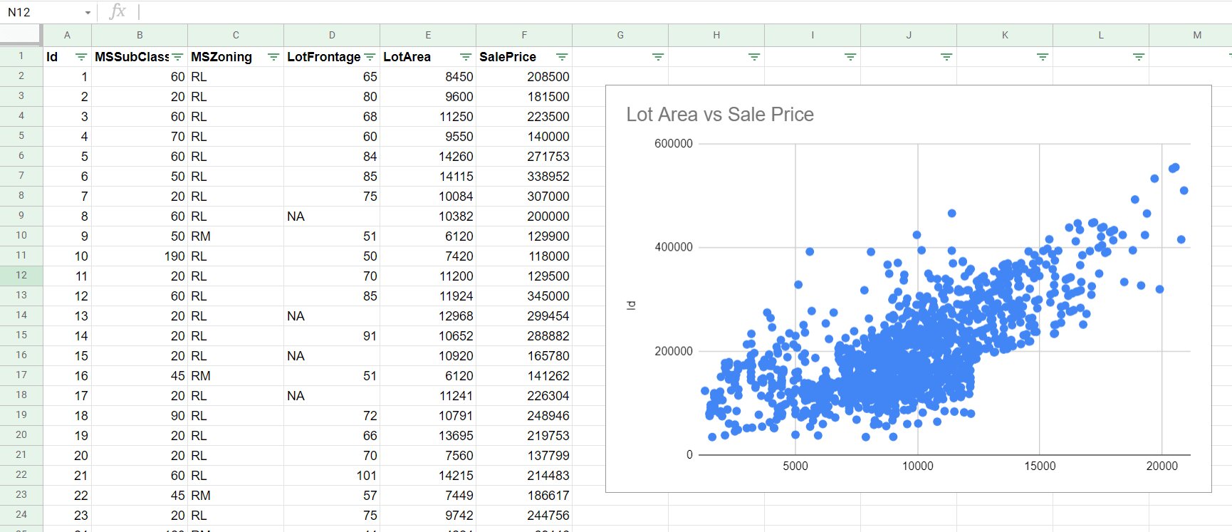
- Comparing Data Series: Line graphs allow you to compare multiple data series on the same graph. By plotting different lines representing different data sets, you can readily identify which series perform better or worse, spot relationships, and identify correlations.
- Spotting Anomalies: Analyzing a line graph can help you detect outliers or anomalies in your data. Sudden spikes, dips, or deviations from the overall trend can indicate unusual occurrences or errors. Such anomalies can be further investigated to uncover underlying reasons or potential issues.
- Forecasting: Line graphs can provide a basis for forecasting future trends or making predictions. By extrapolating the established trend lines, you can estimate future values and anticipate potential outcomes. However, exercise caution when relying solely on extrapolation, as it assumes the continuation of the existing trend.
- Tracking Progress: Line graphs are ideal for tracking progress over time. Whether you’re monitoring sales performance, website traffic, or project milestones, line graphs allow you to visualize progress and assess the effectiveness of your efforts. Use the graph to track improvements or setbacks and make data-driven decisions accordingly.
When analyzing data using line graphs, it’s important to consider the context, data reliability, and potential factors that may influence the observed patterns. Combine your line graph analysis with other analytical techniques and domain knowledge to gain a comprehensive understanding of the data.
With the ability to identify trends, compare data series, detect anomalies, forecast, and track progress, line graphs are invaluable tools for analysis and decision-making. By leveraging the power of line graphs in Google Sheets, you can gain deeper insights into your data and make informed choices.
Now that you have learned how to effectively analyze data using line graphs, let’s conclude our exploration of creating and customizing line graphs in Google Sheets.
Conclusion
Congratulations! You have now learned how to create, customize, and analyze line graphs in Google Sheets. By following the step-by-step process outlined in this guide, you can effectively visualize data trends, compare multiple data series, and gain valuable insights for decision-making.
Remember that the key to creating compelling line graphs is to ensure clarity, readability, and accuracy. Use clear titles and labels to provide context, customize colors and styles to enhance visual appeal, and adjust axis scales and gridlines for proper data interpretation. Additionally, don’t forget the importance of editing data directly on the graph for quick adjustments.
Line graphs are versatile and applicable to various fields, including business, finance, marketing, and more. Whether you’re analyzing sales figures, tracking website traffic, or monitoring project progress, line graphs in Google Sheets offer a user-friendly platform for data visualization.
As you continue to work with line graphs, explore additional features and customization options offered by Google Sheets to refine and personalize your graphing experience. Embrace creativity and experimentation, while also maintaining a balance between aesthetics and data representation.
Now armed with the knowledge of creating and utilizing line graphs effectively, you can present your data in a visually engaging and meaningful way. So, go ahead and start creating your line graphs in Google Sheets to unlock valuable insights and make better-informed decisions.