Introduction
Welcome to this guide on how to make a box and whisker plot in Google Sheets. Box and whisker plots are a powerful visualization tool used to display the distribution of a dataset. They provide a concise summary of key statistics such as the median, quartiles, and potential outliers.
Google Sheets is a popular, user-friendly spreadsheet program that offers numerous features for data analysis and visualization. Whether you are a teacher, student, researcher, or simply someone looking to explore their data, learning how to create a box and whisker plot in Google Sheets can greatly enhance your ability to interpret and communicate your findings.
In this guide, we will walk you through the step-by-step process of creating a box and whisker plot in Google Sheets. We will cover everything from entering your data to customizing your plot. By the end of this guide, you will have the knowledge and skills to effectively create and present box and whisker plots for your own data.
Before we dive into the steps, let’s briefly discuss what a box and whisker plot is and why it is a valuable tool in data analysis. A box and whisker plot visually represents the spread and skewness of a dataset. It consists of a rectangular box, which represents the interquartile range (IQR), and two whiskers, which show the minimum and maximum values (excluding outliers).
The box is divided by a vertical line at the median, which represents the middle value of the dataset. The lower and upper boundaries of the box represent the first quartile (Q1) and third quartile (Q3), respectively. The distance between the first quartile and the median is called the lower whisker, while the distance between the third quartile and the median is called the upper whisker.
Box and whisker plots are particularly useful when comparing multiple datasets side by side or when analyzing a single dataset for potential outliers. They provide a visual representation of the central tendency, spread, and variability of the data, making it easier to identify patterns and make informed decisions.
Now that we have a basic understanding of box and whisker plots and their importance, let’s get started with creating a box and whisker plot in Google Sheets!
Step 1: Open Google Sheets
The first step in creating a box and whisker plot in Google Sheets is to open the Google Sheets application. Google Sheets is a free online spreadsheet software provided by Google, and it is accessible through a web browser.
To open Google Sheets, follow these simple steps:
- Open a web browser such as Google Chrome, Mozilla Firefox, or Safari.
- Go to the Google homepage by typing “www.google.com” in the address bar.
- Click on the “Apps” button at the top right corner of the Google homepage. It looks like a grid of squares.
- Click on the “Sheets” icon from the available apps. It looks like a green spreadsheet.
- If you’re not already signed in to your Google account, enter your email address and password to sign in.
- Once you’re signed in, you will be taken to the main Google Sheets interface.
Alternatively, you can directly access Google Sheets by typing “sheets.google.com” into the address bar of your web browser. This will also take you to the main Google Sheets interface.
Once you have successfully opened Google Sheets, you will be ready to start working on your box and whisker plot. The Google Sheets interface is user-friendly and intuitive, making it easy for beginners to navigate and use.
Now that you have opened Google Sheets, let’s move on to the next step of entering your data.
Step 2: Enter your data
Now that you have opened Google Sheets, it’s time to enter your data. The data you enter will be used to create your box and whisker plot.
To enter your data into Google Sheets, follow these steps:
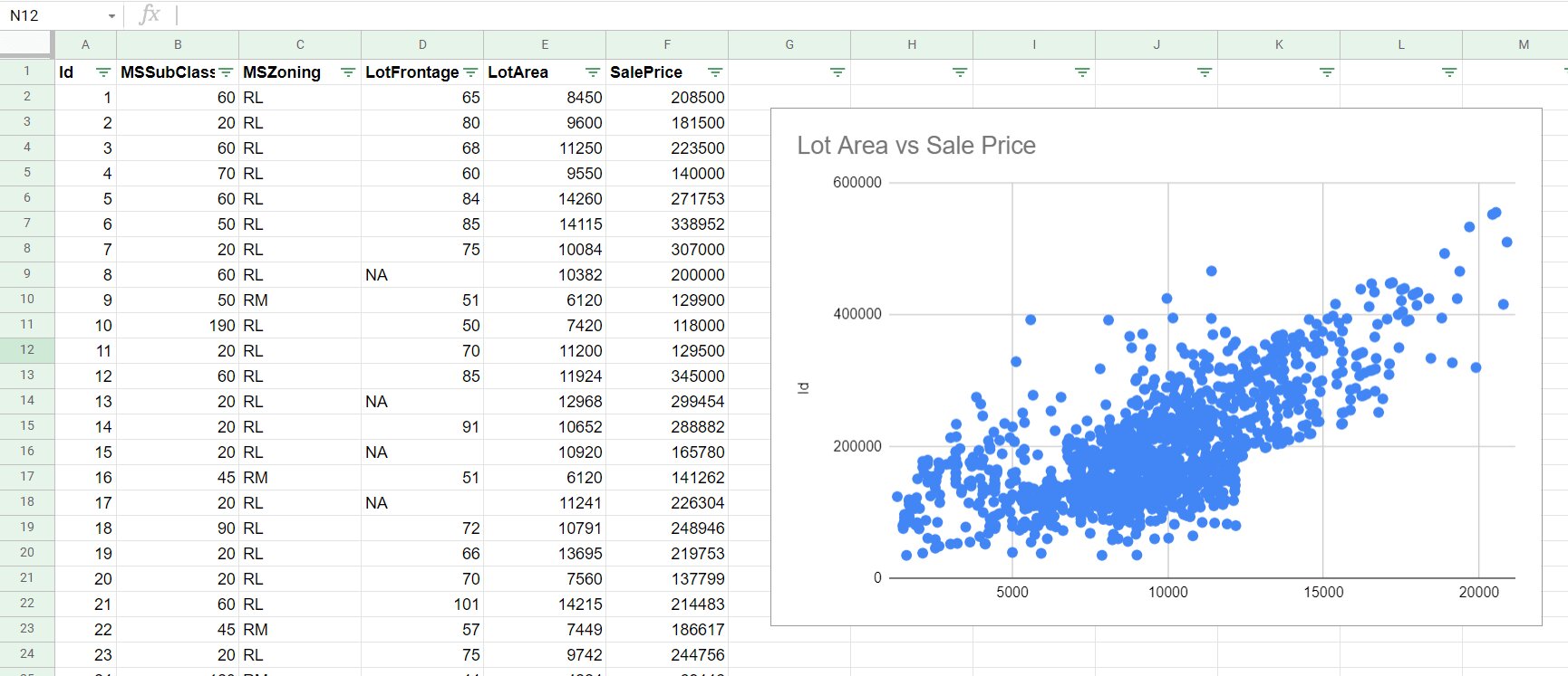
- In the first cell of your spreadsheet (typically cell A1), enter a title for your data, such as “Data Set”.
- In the cells below the title, enter your data points, with each data point in a separate cell. You can enter the data vertically or horizontally, depending on your preference.
- If you have multiple sets of data that you want to compare, you can enter them in different columns or rows. Make sure to label each set of data clearly.
- For example, if you have a set of test scores for different students, you can enter the student names in one column (e.g., column A) and their corresponding scores in another column (e.g., column B).
- If you have categorical data, such as different groups or categories, you can enter the categories in one column and the corresponding data in another column.
- Make sure to double-check your data for any errors or typos. Accuracy in data entry is crucial for the accuracy of your box and whisker plot.
Google Sheets provides various options for formatting your data, such as changing the font style, adjusting column width, and applying numerical formats. You can explore these options in the toolbar at the top of the Google Sheets interface.
Once you have entered your data, you are ready to move on to the next step of creating a new sheet for your plot.
Step 3: Create a new sheet for your plot
After entering your data in Google Sheets, the next step is to create a new sheet specifically for your box and whisker plot. This separate sheet will allow you to focus solely on your plot and keep your data organized.
Follow these steps to create a new sheet for your plot:
- Click on the “+” button located at the bottom-left corner of the Google Sheets interface. This will open a new sheet tab.
- Double-click on the new sheet tab and give it a descriptive name, such as “Box and Whisker Plot”.
- You can also right-click on the sheet tab, select “Rename”, and enter the desired name.
- Switch to the new sheet by clicking on the sheet tab with the given name.
Once you have created and switched to the new sheet, you can start working exclusively on your box and whisker plot without any interference from your raw data.
Creating a separate sheet for your plot also allows you to easily reference your data from the original sheet. You can use formulas or cell references to pull in the necessary data for your plot, ensuring that any changes or updates in the raw data are automatically reflected in the plot.
It is a good practice to keep your data separate from your visualizations to maintain clarity and simplify the organization of your spreadsheet.
Now that you have created a new sheet for your plot, it’s time to move on to the next step of calculating the quartiles and outliers in your data.
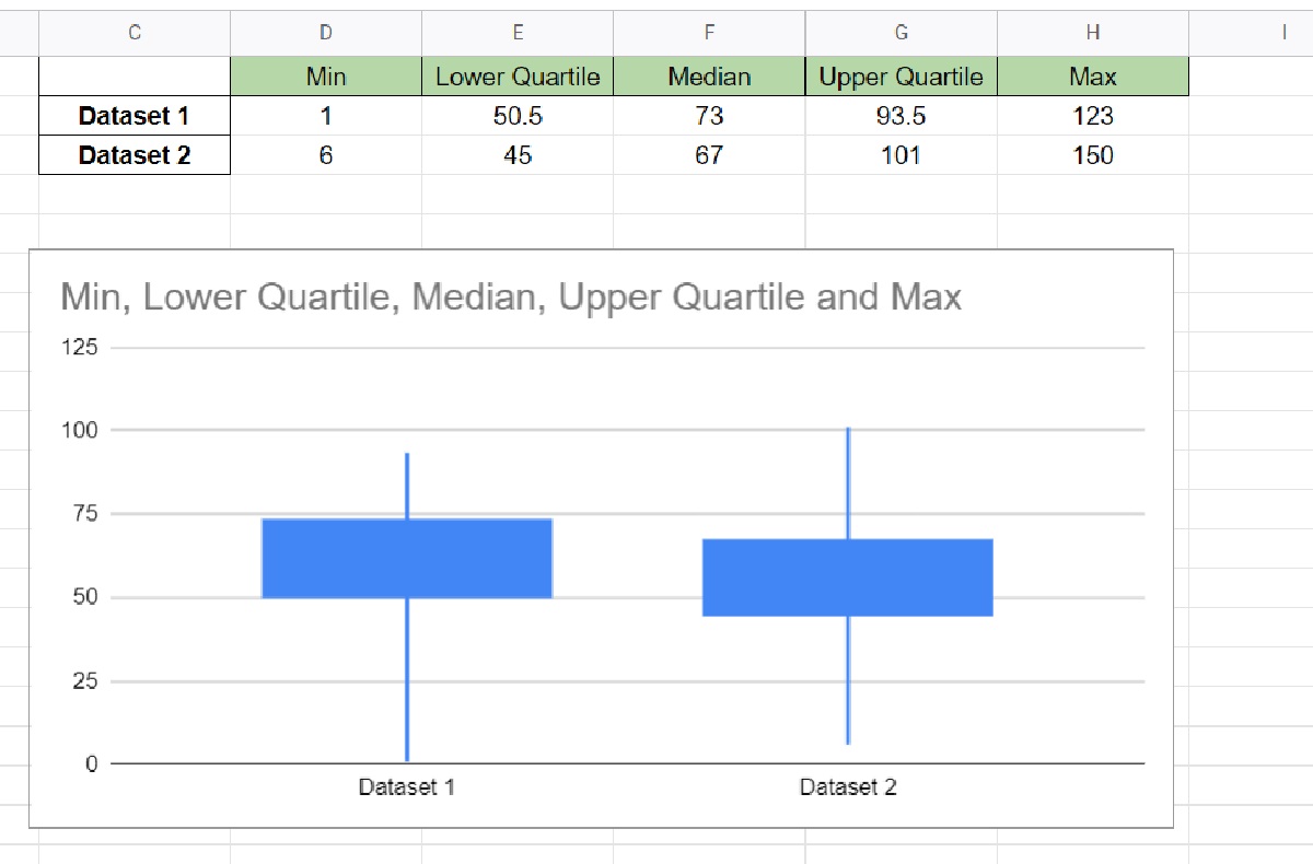
Step 4: Calculate the quartiles and outliers in your data
In order to create an accurate box and whisker plot, it is important to calculate the quartiles and identify any potential outliers in your data. Quartiles divide your dataset into four equal parts, providing insights into the distribution of your data.
Follow these steps to calculate the quartiles and identify outliers:
- Switch back to the sheet where your data is located.
- Select an empty cell where you want to display the quartiles. For example, you can select cell A1 of the new sheet.
- Use the built-in function QUARTILE() to calculate the quartiles. Enter the function as follows: =QUARTILE(range, quartile_number), replacing “range” with the range of your data and “quartile_number” with the desired quartile (1, 2, or 3).
- For example, to calculate the first quartile (Q1), enter =QUARTILE(range, 1).
- Repeat this step for the second quartile (median) and the third quartile (Q3).
- To identify potential outliers, calculate the following values: Q1 – 1.5 * IQR (Interquartile Range) and Q3 + 1.5 * IQR, where IQR = Q3 – Q1.
- Compare each data point to the upper and lower bounds calculated in the previous step. Any data point outside these bounds can be considered as a potential outlier.
- Note that the decision to consider a value as an outlier may depend on the specific context and the nature of your data.
Calculating quartiles and identifying outliers is crucial for accurately representing the distribution and potential extremes of your dataset in the box and whisker plot. This step allows you to gain insights into the variability and skewness of your data, aiding in the interpretation of the plot.
Now that you have calculated the quartiles and identified outliers, let’s move on to the next step of actually creating the box and whisker plot using this information.
Step 5: Create the box and whisker plot using the quartiles and outliers
Now that you have calculated the quartiles and identified any potential outliers in your data, it’s time to create the box and whisker plot in Google Sheets. The plot will visually represent the distribution and spread of your dataset using the quartiles and outliers.
Follow these steps to create the box and whisker plot:
- Switch back to the sheet where you created the new sheet for your plot.
- Select a range of cells where you want to create the box and whisker plot. This range should include the quartiles and any potential outliers.
- Go to the “Insert” menu at the top of the Google Sheets interface.
- Click on “Chart” from the drop-down menu.
- In the “Chart type” section, select “Box & Whisker” from the available options.
- Google Sheets will automatically generate a box and whisker plot based on your selected range.
- Review the generated plot and make any necessary adjustments using the options available, such as changing the title, axis labels, or formatting.
- If you have multiple sets of data to compare, you can add additional series to the plot by selecting the corresponding ranges.
- Customize the appearance of your plot by selecting options such as color, style, and orientation.
- Ensure that your box and whisker plot accurately represents the quartiles and outliers of your dataset.
The box and whisker plot provides a clear visual representation of the distribution, spread, and potential outliers in your data. It enables you to compare multiple datasets side by side or analyze a single dataset for potential extremes.
Experiment with different options and settings to create the most informative and visually appealing box and whisker plot for your data.
Now that you have successfully created the box and whisker plot, let’s move on to the next step of customizing your plot further to enhance its visual appearance and clarity.
Step 6: Customize your plot
Once you have created the box and whisker plot in Google Sheets, you have the option to customize its appearance to suit your specific needs and preferences. Customizing your plot can enhance its visual appeal and improve its clarity, making it easier to interpret and communicate your data.
Here are some ways to customize your plot:
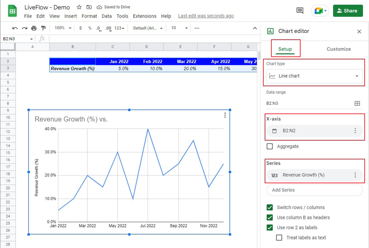
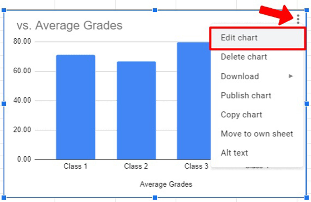
- Click on the chart to select it. You will notice that a side panel appears on the right side of the Google Sheets interface, providing various customization options.
- In the “Chart editor” panel, you can modify the chart type to a different visualization if desired. However, for a box and whisker plot, it is recommended to stick with the default “Box & Whisker” chart type.
- Adjust the overall style of the plot by selecting options such as color schemes, background color, and font styles. This can help make the plot more visually appealing and consistent with your document or presentation.
- Customize axis labels by changing the font size, orientation, or adding additional text to provide more context to the plot.
- Modify the legend position or hide it altogether if there is no need to display it.
- Change the axis scales or add gridlines to improve the readability of the plot.
- Experiment with different marker shapes, sizes, and colors to differentiate between data points or series if you are comparing multiple datasets.
- Use the “Chart style” option to apply pre-defined styles to the plot, or manually adjust fill color, line styles, and other visual elements.
- Customize tooltips or data labels to display specific information for each data point or series.
Remember to strike a balance between customization and clarity. While it’s important to make your plot visually appealing, it is equally important to ensure that the plot accurately represents the data and can be easily understood by others.
Take some time to explore the various customization options available in Google Sheets to create a box and whisker plot that best fits your needs. The more you experiment, the better you will become at creating visually compelling and informative plots.
Now that you have customized your plot, let’s move on to the next step of adding labels and titles to provide additional context and understanding.
Step 7: Add labels and titles
Adding labels and titles to your box and whisker plot in Google Sheets is an important step in providing context and understanding to your audience. Labels and titles help clarify the information presented in the plot and make it easier to interpret the data.
Follow these steps to add labels and titles to your plot:
- Click on the chart to select it. The side panel on the right side of the Google Sheets interface will appear.
- In the “Chart editor” panel, go to the “Customize” tab.
- Scroll down to find the “Titles” section.
- Add a title to your plot by entering it in the “Chart title” field. This should describe the overall purpose or summary of the plot.
- If applicable, add labels to the x-axis or y-axis by entering the desired text in the “Horizontal axis title” or “Vertical axis title” fields. These labels should provide information about the categories or values being represented in the plot.
- Consider adding a data label to each data point in the plot to display numerical values directly on the chart. This can help viewers easily identify specific values without referring to the raw data.
- Adjust the font size, style, and alignment of the labels and titles to ensure readability and a consistent visual style.
Titles and labels play a crucial role in guiding your audience’s understanding of the box and whisker plot. They provide important information about the data being visualized and help viewers make informed interpretations.
Make sure your titles and labels are clear, concise, and relevant to the data being represented. Avoid using jargon or technical terms that may confuse your audience.
Adding labels and titles to your plot is the final step in enhancing the clarity and communicative impact of your box and whisker plot. Now, your plot is ready to be shared and exported for various purposes.
Step 8: Share and export your plot
Once you have created and customized your box and whisker plot in Google Sheets, it’s time to share and export your plot for various purposes. Sharing your plot allows others to view and collaborate on your work, while exporting it enables you to use the plot in presentations, reports, or other applications.
Follow these steps to share and export your plot:
- Click on the chart to select it. The side panel on the right side of the Google Sheets interface will appear.
- In the “Chart editor” panel, go to the “File” tab.
- To share your plot with others, click on the “Share” button. This will open the sharing settings where you can enter the email addresses of the people you want to share the plot with and specify their access level (e.g., viewer, commenter, or editor).
- If you want to embed the plot in a website or document, click on the “Publish Chart” button. This will generate an HTML code or a link that you can use to embed the plot wherever you need.
- To export your plot as an image file, go to the “Download” section and select the desired image format, such as PNG or JPEG. Click on the “Download” button to save the plot to your device.
- You can also copy and paste the plot directly into other applications, such as word processors or presentation software.
By sharing and exporting your box and whisker plot, you can effectively communicate your data analysis findings, incorporate the plot into presentations or reports, or collaborate with others on data interpretation.
Before sharing or exporting the plot, double-check the formatting, labeling, and overall appearance to ensure that it accurately represents the data and conveys your intended message.
With these final steps, you have successfully completed the process of creating a box and whisker plot in Google Sheets and making it ready for sharing and exporting. Congratulations on your achievement!
Conclusion
Congratulations! You have now learned how to create a box and whisker plot in Google Sheets, a powerful tool for visualizing and analyzing data distributions. By following the step-by-step guide outlined in this article, you can effectively summarize and interpret the spread, skewness, and potential outliers in your dataset.
Throughout the process, you began by opening Google Sheets, entered your data, and created a new sheet specifically for your plot. Then, you calculated the quartiles and identified any outliers to ensure the accuracy of your box and whisker plot representation.
Next, you created the box and whisker plot using the quartiles and outliers information, allowing you to visually observe the distribution of your data. You then customized your plot by adjusting various elements such as colors, labels, and titles to improve its visual appeal and clarity.
Lastly, you learned how to share and export your plot, allowing you to collaborate with others or incorporate it into presentations, reports, or other applications.
By mastering the art of creating box and whisker plots in Google Sheets, you have added a valuable skill to your data analysis toolkit. Box and whisker plots provide meaningful insights into the distribution and variability of your data, facilitating better decision-making and effective communication of your findings.
So, go ahead and put your new knowledge into practice! Explore your datasets, create informative plots, and unleash the power of data visualization to unlock the hidden patterns and trends within your data.
Remember, practice makes perfect. The more you experiment with different data sets and customization options in Google Sheets, the more proficient you will become in creating visually appealing and informative box and whisker plots.
Thank you for joining us on this journey. We hope this guide has empowered you to confidently create box and whisker plots in Google Sheets and leverage them to make informed data-driven decisions!