Introduction:
Welcome to the wonderful world of Google Sheets! Whether you’re a data analyst, a researcher, or a student, Google Sheets is an essential tool for organizing and analyzing your data. One of the key features that can help you gain better insights from your data is the ability to add standard deviation bars.
Standard deviation is a statistical measurement that quantifies the amount of variability or dispersion in a dataset. It provides valuable information about the spread of data points around the mean value. By adding standard deviation bars to your charts in Google Sheets, you can visually represent the degree of uncertainty or variability in your data. This can be particularly useful when comparing and interpreting data points.
In this article, we will explore different methods to add standard deviation bars in Google Sheets. We will demonstrate step-by-step how to implement these techniques, whether you’re working with simple datasets or complex statistical analyses. By the end of this article, you will have a clear understanding of how to utilize this powerful feature effectively.
Google Sheets offers multiple built-in functions and features to help you calculate the standard deviation of your data and visualize it in a chart. We will cover several methods that cater to different needs and scenarios, allowing you to choose the most suitable approach for your specific requirements.
So, whether you want to create a bar chart, line graph, scatter plot, or any other type of chart in Google Sheets, keep reading to learn how to add standard deviation bars and unleash the full potential of this robust data analysis tool.
What is Standard Deviation:
Standard deviation is a fundamental concept in statistics that measures the variability or spread of data points around the mean (average) value. It provides essential information about the distribution of data and helps us understand how individual data points relate to the overall dataset.
Mathematically, standard deviation is calculated by taking the square root of the variance. Variance, in turn, is the average of the squared differences between each data point and the mean. By squaring the differences, we ensure that both positive and negative deviations from the mean contribute equally to the calculation.
A low standard deviation indicates that the data points are closely clustered around the mean. This suggests that the dataset has less variability, and the individual data points are similar to one another. On the other hand, a high standard deviation means that the data points are more spread out from the mean. This suggests greater variability and larger differences between individual data points.
The standard deviation is particularly useful in analyzing datasets with a normal distribution, also known as a bell curve. In this type of distribution, the majority of data points are located close to the mean, with fewer data points towards the extremes. By understanding the standard deviation, we can better interpret the significance of individual data points and identify any outliers or unusual patterns.
Standard deviation has applications in various fields, including finance, economics, science, and social sciences. It helps researchers and analysts make informed decisions based on data variability, perform hypothesis testing, determine confidence intervals, and more.
In the context of visualizing data in Google Sheets, adding standard deviation bars to your charts can enhance your understanding of the underlying dataset. These bars extend from each data point, reflecting the amount of uncertainty or variability associated with that point. By incorporating standard deviation bars, you can easily identify trends, compare data points, and draw meaningful insights from your charts.
In the following sections, we will explore different methods to add standard deviation bars in Google Sheets, empowering you to utilize this statistical measure effectively and elevate your data analysis skills.
Overview of Google Sheets:
Google Sheets is a web-based spreadsheet program offered by Google as part of the Google Drive suite of office productivity tools. It provides a user-friendly interface that allows users to create, edit, and collaborate on spreadsheets online. Google Sheets offers a wide range of features and functions that make it a powerful tool for data analysis, calculation, and visualization.
As a cloud-based application, Google Sheets allows users to access their spreadsheets anytime, anywhere, and from any device with an internet connection. It eliminates the need for traditional software installations and enables seamless collaboration among individuals or teams.
With Google Sheets, you can create and organize data within sheets, where each sheet represents a separate tab in a workbook. You can input data manually or import it from external sources, such as CSV files or other Google Sheets. The intuitive interface provides formatting options, including fonts, colors, and cell styles, to enhance the visual appearance of the data.
Google Sheets incorporates numerous built-in formulas and functions that allow users to perform calculations, statistical analysis, and complex operations on their data. These formulas can be used to perform basic calculations like addition, subtraction, multiplication, and division, as well as more advanced functions like conditional formatting, data filtering, and data validation.
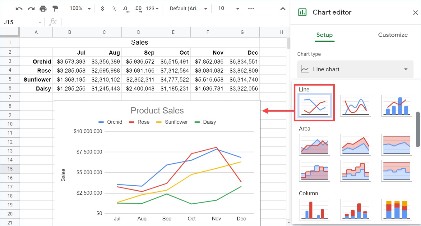
Additionally, Google Sheets offers a range of charting options to help users visualize their data effectively. Users can create various types of charts, such as bar charts, line graphs, scatter plots, pie charts, and more. These charts can be customized with colors, labels, and other formatting options to present data insights in a visually appealing manner.
Furthermore, Google Sheets has powerful collaboration features that allow multiple users to work on the same spreadsheet simultaneously. Users can share their spreadsheets with others, control access permissions, and track changes made by collaborators. This makes it an ideal tool for teamwork, data sharing, and real-time collaboration on projects.
In the upcoming sections, we will explore specific methods to add standard deviation bars in Google Sheets, enabling you to harness the full potential of this versatile spreadsheet tool for analyzing and visualizing your data.
Method 1: Using the STDEV Function:
One of the simplest and most straightforward ways to add standard deviation bars in Google Sheets is by utilizing the built-in STDEV function. The STDEV function calculates the standard deviation of a range of data points in a spreadsheet. By incorporating this function into your chart, you can easily display the variability in your data.
Here’s how you can use the STDEV function to add standard deviation bars:
- Select the range of data for which you want to calculate the standard deviation. This can include the values from which you want to generate your chart or a separate range of data.
- In an empty cell, enter the formula “=STDEV(range)” (without the quotation marks), where “range” is the actual range of data you selected in the previous step.
- Press Enter to execute the formula. The calculated standard deviation will be displayed in the cell.
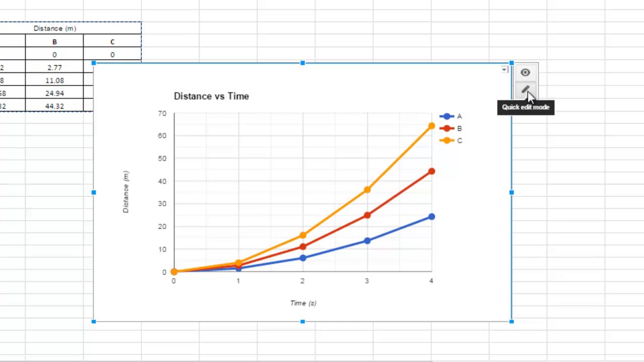
- Now, create the chart you want to add the standard deviation bars to. This can be a bar chart, line graph, or any other type of chart that best represents your data.
- Select the data points in your chart to which you want to add the standard deviation bars.
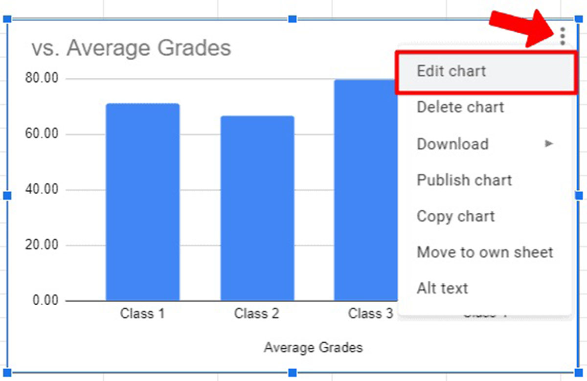
- In the toolbar, click on “Chart” and select “Customize”.
- In the customization options, navigate to the “Series” tab.
- Under “Error Bars”, select the “Use custom values” option.
- In the “Positive error value” field, click on the cell where you calculated the standard deviation using the STDEV function.
- Click on “Apply” to update the chart with the standard deviation bars.
By following these steps, you can easily incorporate the standard deviation bars into your chart based on the calculations made with the STDEV function. This visual representation of the variability in your data points will provide a clearer understanding of the distribution and spread of your dataset.
In the next section, we will explore another method to add standard deviation bars in Google Sheets, using the STDEVP function.
Method 2: Using the STDEVP Function:
Another method to add standard deviation bars in Google Sheets is by using the STDEVP function. This function calculates the sample standard deviation for a population, taking into account the entire dataset rather than just a subset. The STDEVP function is particularly useful when you want to incorporate the standard deviation bars into a chart based on the entire population data.
Here’s how you can utilize the STDEVP function to add standard deviation bars:
- Select the range of data for which you want to calculate the standard deviation. This can include the values from which you want to generate your chart or a separate range of data.
- In an empty cell, enter the formula “=STDEVP(range)” (without the quotation marks), where “range” is the actual range of data you selected in the previous step.
- Press Enter to execute the formula. The calculated standard deviation for the entire population will be displayed in the cell.
- Create the chart you want to add the standard deviation bars to, selecting the appropriate chart type for your data.
- Select the data points in your chart to which you want to add the standard deviation bars.
- In the toolbar, click on “Chart” and select “Customize”.
- Navigate to the “Series” tab in the customization options.
- Under “Error Bars”, select the “Use custom values” option.
- In the “Positive error value” field, click on the cell where you calculated the standard deviation using the STDEVP function.
- Click on “Apply” to update the chart with the standard deviation bars.
By following these steps, you can effectively incorporate the standard deviation bars in your chart based on the calculations made with the STDEVP function. This method allows you to account for the entire population data, providing a comprehensive view of the standard deviation and the variability in your dataset.
In the next section, we will explore another method to add standard deviation bars in Google Sheets, using confidence intervals.
Method 3: Using Confidence Intervals:
Adding standard deviation bars to your charts in Google Sheets can also be accomplished by utilizing confidence intervals. Confidence intervals provide a range of values around the mean that is likely to contain the true value of the population parameter. By incorporating confidence intervals into your chart, you can effectively represent the variability in your data and the level of uncertainty associated with each data point.
Here’s how you can incorporate confidence intervals as standard deviation bars:
- Select the range of data for which you want to calculate the confidence interval. This can include the values from which you want to generate your chart or a separate range of data.
- In an empty cell, enter the formula “=CONFIDENCE(alpha, standard_deviation, sample_size)” (without the quotation marks), where “alpha” is the significance level (e.g., 0.05 for 95% confidence), “standard_deviation” is the standard deviation of your data, and “sample_size” is the size of your sample.
- Press Enter to execute the formula. The calculated confidence interval will be displayed in the cell.
- Create the chart you want to add the standard deviation bars to, selecting the appropriate chart type for your data.
- Select the data points in your chart to which you want to add the standard deviation bars.
- In the toolbar, click on “Chart” and select “Customize”.
- Navigate to the “Series” tab in the customization options.
- Under “Error Bars”, select the “Use custom values” option.
- In the “Positive error value” field, click on the cell where you calculated the confidence interval using the CONFIDENCE function.
- Click on “Apply” to update the chart with the standard deviation bars.
By following these steps, you can effectively incorporate confidence intervals as standard deviation bars in your chart. This method provides a range around each data point that reflects the variability and uncertainty associated with the data. It allows you to visualize and interpret the level of confidence you have in the measurements or observations.
In the next section, we will explore another method to add standard deviation bars in Google Sheets, using custom error bars.
Method 4: Using Custom Error Bars:
If you have specific standard deviation values that you want to incorporate as error bars in your chart, you can use custom error bars in Google Sheets. This method allows you to have complete control over the size and placement of the standard deviation bars, making it ideal for precise data visualization.
Here’s how you can add custom error bars as standard deviation bars:
- Create the chart you want to add the custom error bars to, selecting the appropriate chart type for your data.
- Select the data points in your chart to which you want to add the standard deviation bars.
- In the toolbar, click on “Chart” and select “Customize”.
- Navigate to the “Series” tab in the customization options.
- Under “Error Bars”, select the “Use custom values” option.
- In the “Positive error value” field, enter the values of the standard deviation for each data point, separated by commas.
- Click on “Apply” to update the chart with the custom error bars.
By following these steps, you can easily incorporate custom error bars as standard deviation bars in your chart. You can manually input the specific standard deviation values that you want for each data point, allowing you to have precise control over the representation of variability in your data.
It’s worth noting that this method requires you to have the individual standard deviation values determined beforehand. If you don’t have the standard deviation values readily available, you can calculate them using functions like STDEV or STDEVP in Google Sheets.
In the upcoming sections, we will summarize the various methods we discussed in this article and provide some final thoughts on adding standard deviation bars in Google Sheets.
Conclusion:
In conclusion, Google Sheets provides several methods to add standard deviation bars to your charts, allowing you to visually represent the variability and uncertainty in your data. By incorporating these bars, you can enhance the interpretation and analysis of your datasets, making it easier to identify trends, compare data points, and draw meaningful insights.
Throughout this article, we explored four different methods to add standard deviation bars in Google Sheets:
- Method 1: Using the STDEV function: This method calculates the standard deviation of a range of data points and incorporates it as error bars in your chart.
- Method 2: Using the STDEVP function: This method calculates the sample standard deviation for the entire population and adds it as standard deviation bars in your chart.
- Method 3: Using Confidence Intervals: This method utilizes confidence intervals to represent the variability and uncertainty in your data points.
- Method 4: Using Custom Error Bars: This method allows you to manually input specific standard deviation values as custom error bars in your chart.
Each method offers its own advantages and is suitable for different scenarios and preferences. Choose the method that best fits your data and visualization requirements.
By utilizing these methods, you can effectively communicate the spread and variability of your data, enabling better decision-making, hypothesis testing, and data analysis. Whether you are analyzing financial data, conducting scientific research, or presenting data-driven insights, incorporating standard deviation bars can add clarity and depth to your visualizations.
So, the next time you’re working with Google Sheets and want to display the standard deviation in your charts, remember these methods. Experiment with them to find the most suitable approach for your specific needs.
With the ability to add standard deviation bars in Google Sheets, you can take your data analysis and visualization to the next level, gaining valuable insights and making more informed conclusions about your data.