Introduction
Welcome to this comprehensive guide on how to create a scatter plot in Google Sheets. If you are working with data and want to visualize the relationship between two variables, scatter plots are an excellent tool to use. Whether you are an analyst, researcher, or simply someone with an interest in data analysis, understanding how to create and interpret scatter plots can significantly enhance your ability to derive valuable insights.
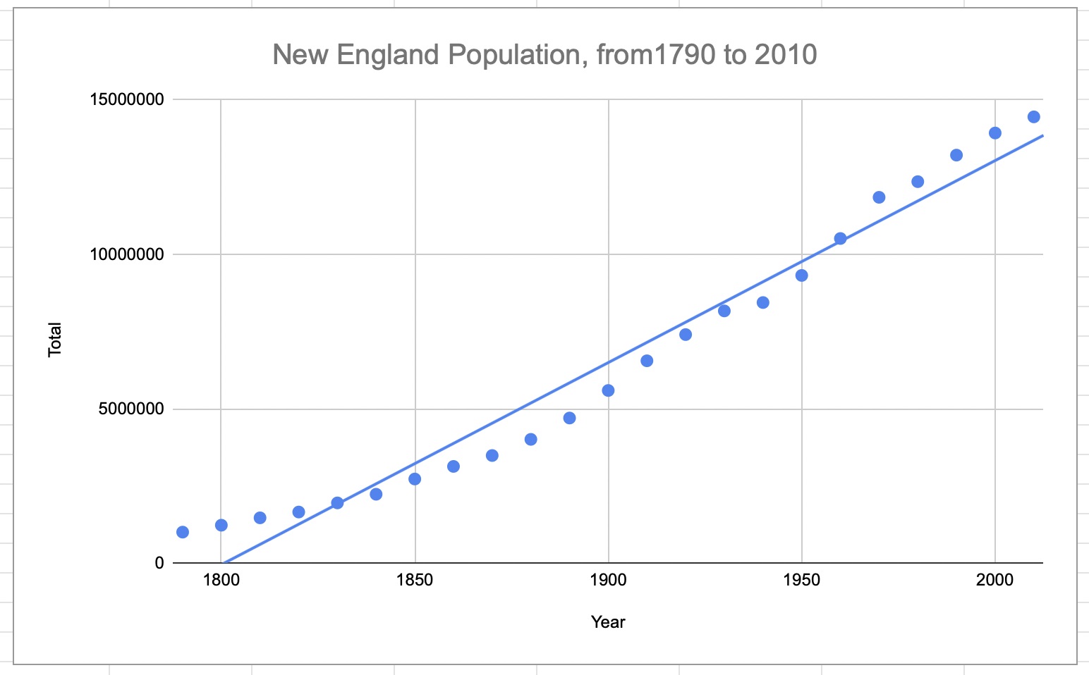
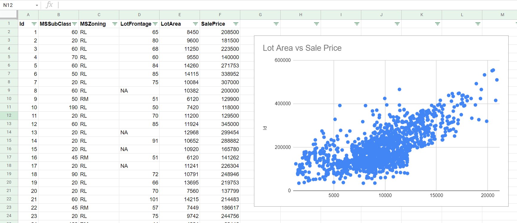
A scatter plot, also known as an XY plot, is a graphical representation that displays the relationship between two numerical variables. It consists of points plotted on a horizontal and vertical axis, with each point representing a data point for the respective variables. Scatter plots are particularly useful in identifying patterns, trends, and correlations between variables, making them widely utilized in various fields such as statistics, economics, and social sciences.
By creating scatter plots in Google Sheets, you can easily analyze and visualize your data without the need for complex software or programming skills. Google Sheets provides a user-friendly interface and a range of customization options, allowing you to tailor your scatter plot to suit your specific needs.
In this guide, we will walk you through the step-by-step process of creating a scatter plot in Google Sheets. We will cover everything from setting up the data to customizing and analyzing the plot. So let’s dive in and discover the power of scatter plots in data analysis!
What is a Scatter Plot?
A scatter plot, also referred to as a scatter diagram or scatter graph, is a visual representation of the relationship between two variables. It is a type of mathematical chart that uses Cartesian coordinates to plot data points on a graph.
The horizontal axis, known as the x-axis, represents one variable, while the vertical axis, known as the y-axis, represents the other variable. Each data point on the graph corresponds to a specific value of the two variables. The position of the data point on the graph indicates the values of the variables for that particular data point.
The main purpose of a scatter plot is to show how the two variables are related to each other. It allows us to identify any patterns, trends, or correlations between the variables. Scatter plots are particularly useful for visualizing the relationship between continuous or numerical variables, such as age, income, temperature, or sales.
The shape and direction of the scatter plot reveal the nature of the relationship between the variables. A scatter plot can have three types of relationships:
- Positive Correlation: In a positive correlation, the variables move in the same direction. This means that as one variable increases, the other variable also tends to increase. The data points on the scatter plot will form a pattern that slopes upwards from left to right.
- Negative Correlation: In a negative correlation, the variables move in opposite directions. This means that as one variable increases, the other variable tends to decrease. The data points on the scatter plot will form a pattern that slopes downwards from left to right.
- No Correlation: In a scenario where there is no relationship or correlation between the variables, the data points on the scatter plot will appear random and scattered. There will be no discernible pattern or trend.
Benefits of Using Scatter Plots in Data Analysis
Scatter plots offer a range of benefits and insights when utilized in data analysis. They are a valuable tool for understanding relationships, identifying trends, and providing visual representations of data. Here are some key benefits of using scatter plots:
- Identifying Relationships: Scatter plots allow you to quickly identify relationships between two variables. By examining the shape and direction of the plotted points, you can determine if there is a positive, negative, or no correlation between the variables. This information helps in understanding the nature of the relationship and making informed decisions.
- Spotting Trends: By analyzing the pattern formed by the data points, scatter plots enable you to identify trends over time or across different groups. This can be especially useful in fields such as finance and economics, where trends in variables like stock prices or consumer spending can provide valuable insights.
- Visualizing Outliers: Outliers, or extreme values, can have a significant impact on data analysis. Scatter plots make it easy to visually identify outliers that fall far away from the general pattern of the data. This allows for further investigation into these outliers and understanding their potential impact on the overall analysis.
- Detecting Patterns: Scatter plots can help uncover patterns that might not be apparent when looking at raw data. These patterns can be used to make predictions or support decision-making processes. For example, in marketing, scatter plots can provide insights into the relationship between advertising spending and sales, helping companies optimize their marketing strategies.
- Communicating Insights: Scatter plots offer a clear and concise visual representation of data. They are widely understood and easily relatable, making them effective tools for communicating insights to a wide range of audiences. Whether it is presenting findings to colleagues, clients, or stakeholders, scatter plots can help convey complex information in a visually appealing and accessible format.
By leveraging the benefits of scatter plots in data analysis, you can uncover hidden patterns, understand relationships, and make more informed decisions based on data-driven insights.
Step-by-Step Guide to Creating a Scatter Plot in Google Sheets
Creating a scatter plot in Google Sheets is a straightforward process that requires just a few simple steps. Follow this step-by-step guide to create your own scatter plot:
- Step 1: Setting up the Data
- Step 2: Inserting a Scatter Plot Chart
- Step 3: Customizing the Scatter Plot
- Step 4: Adding Labels, Titles, and Axis Labels
- Step 5: Formatting the Scatter Plot
- Step 6: Analyzing the Scatter Plot Data
Open your Google Sheets document and enter the data for the two variables that you want to plot on the scatter plot. Make sure each variable is in a separate column, with corresponding values listed vertically.
Select the data range that you want to include in the scatter plot. Go to the “Insert” menu at the top of the Google Sheets interface, then click on “Chart.” In the chart editor window that appears, select “Chart types” on the left-hand side, choose “Scatter,” and select the desired scatter plot style.
After inserting the scatter plot chart, you can customize its appearance to suit your needs. Use the chart editor to modify the colors, markers, and other visual elements of the scatter plot. You can also adjust the axes, gridlines, and legend to enhance the clarity and readability of the chart.
To make your scatter plot more informative, add labels, titles, and axis labels. These help provide context and clarity to the chart. Use the chart editor to add a chart title, axis labels, and data point labels if necessary. You can also format the font styles, sizes, and colors to make the labels more visually appealing.
Further customize the appearance of your scatter plot by adjusting the formatting options in the chart editor. You can modify the gridlines, chart background, chart area, and other visual elements to ensure that the scatter plot aligns with your desired visual style.
Once your scatter plot is complete, take the time to analyze the data and draw insights from the chart. Look for patterns, trends, or correlations between the variables plotted on the scatter plot. Consider any outliers or unusual data points that may require further investigation. Use the scatter plot as a tool to support your data analysis process.
By following these simple steps, you can create a visually appealing scatter plot in Google Sheets and gain valuable insights from your data.
Setting up the Data
The first step in creating a scatter plot in Google Sheets is to set up your data. Here’s how to do it:
1. Open a new or existing Google Sheets document and enter your data. Each variable should be in a separate column, with corresponding values listed vertically. Make sure there is at least one column for the x-axis variable and another column for the y-axis variable.
2. Label the columns clearly to indicate which variable each column represents. This will help you stay organized and ensure accuracy when creating the scatter plot.
3. Ensure that your data is organized and complete. Check for any missing values or outliers that may affect the integrity of your analysis. Cleaning and preparing your data before creating the scatter plot will help you obtain reliable and accurate insights.
4. If you have a large dataset or would like to include additional variables in your scatter plot, you may want to consider using filters or sorting options in Google Sheets to manipulate and view specific subsets of data.
5. Double-check that your data is in numerical format. Scatter plots require numerical values on both the x-axis and y-axis. If any of your data is in non-numerical or text format, you may need to convert it to numbers before creating the scatter plot.
By setting up your data correctly and ensuring its accuracy and completeness, you will be well-prepared to create an informative and meaningful scatter plot in Google Sheets.
Inserting a Scatter Plot Chart
Once you have set up your data in Google Sheets, the next step is to insert a scatter plot chart. Follow these steps to create your scatter plot:
1. Select the range of data that you want to include in the scatter plot. This should include both the x-axis and y-axis variables. You can click and drag your mouse to cover the desired range, or manually enter the range into the formula bar at the top of the Google Sheets interface.
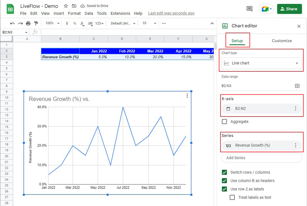
2. After selecting the data range, go to the “Insert” menu at the top of the Google Sheets interface. From the dropdown menu, click on “Chart.” This will open the Chart Editor on the right-hand side of your screen.
3. In the Chart Editor, navigate to the “Chart types” tab on the left-hand side. Scroll down and select “Scatter” as the chart type for your plot. Google Sheets offers various scatter plot styles, such as scatter with straight lines, scatter with smooth curves, or scatter with data points only. Choose the style that best suits your data and visualization needs.
4. Once you have selected a scatter plot style, you will see a preview of the scatter plot in the Chart Editor. Take a moment to review the chart and ensure that it accurately represents your data. You can also experiment with different chart styles or customize the chart further using the options in the Chart Editor.
5. After reviewing the scatter plot, click the “Insert” button in the Chart Editor to insert the chart into your Google Sheets document. The scatter plot will appear in your document, positioned based on where your cursor was located when you clicked the “Insert” button.
6. You can now resize and reposition the scatter plot as needed. Click and drag the edges of the chart to adjust its size, or click and drag the chart itself to move it to a different location within your document.
By following these steps, you can easily insert a scatter plot chart into your Google Sheets document and visualize the relationship between your variables in a clear and intuitive manner.
Customizing the Scatter Plot
After inserting a scatter plot chart in Google Sheets, you have the option to customize its appearance to better suit your data and presentation needs. Follow these steps to customize your scatter plot:
1. Select the scatter plot by clicking on it. You will see blue handles around the chart indicating that it is selected.
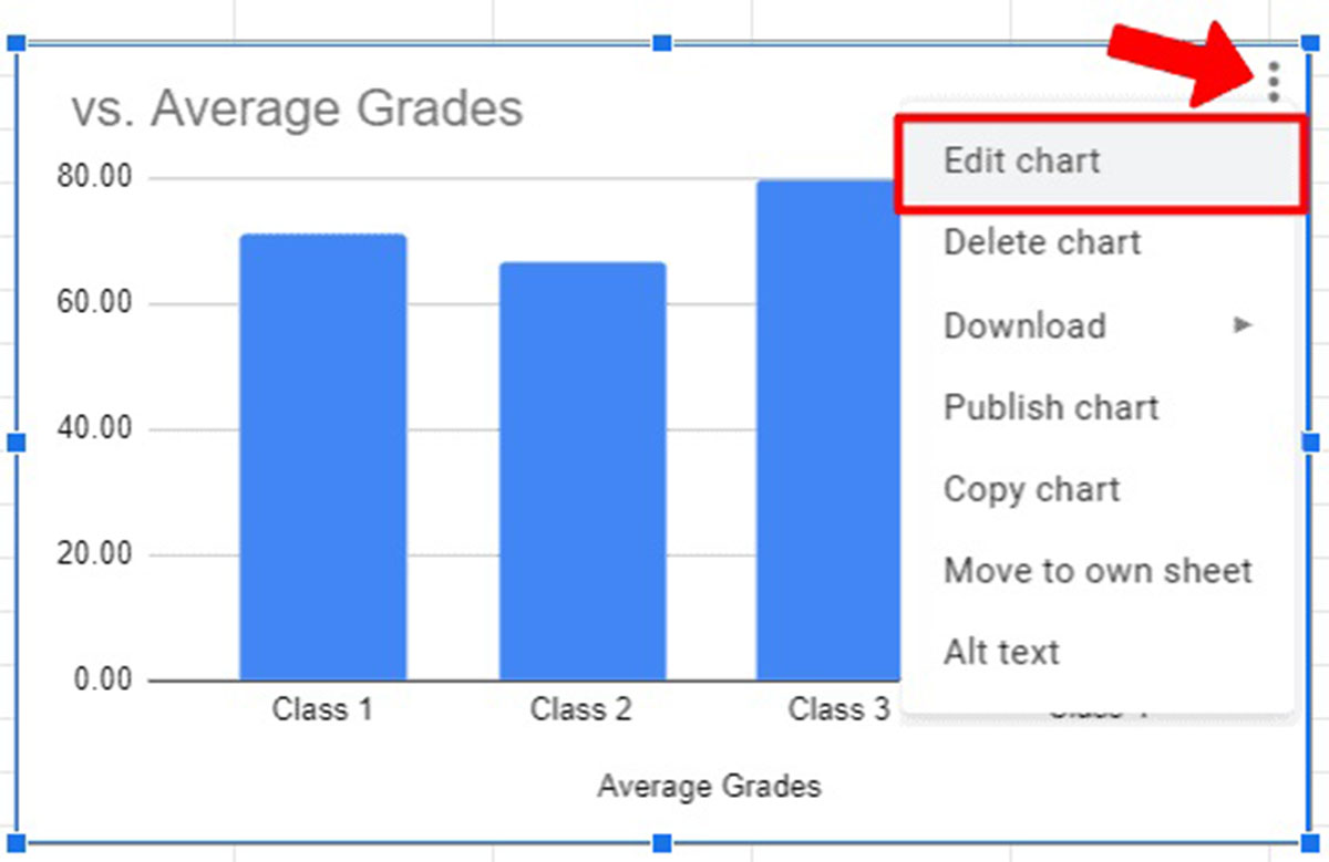
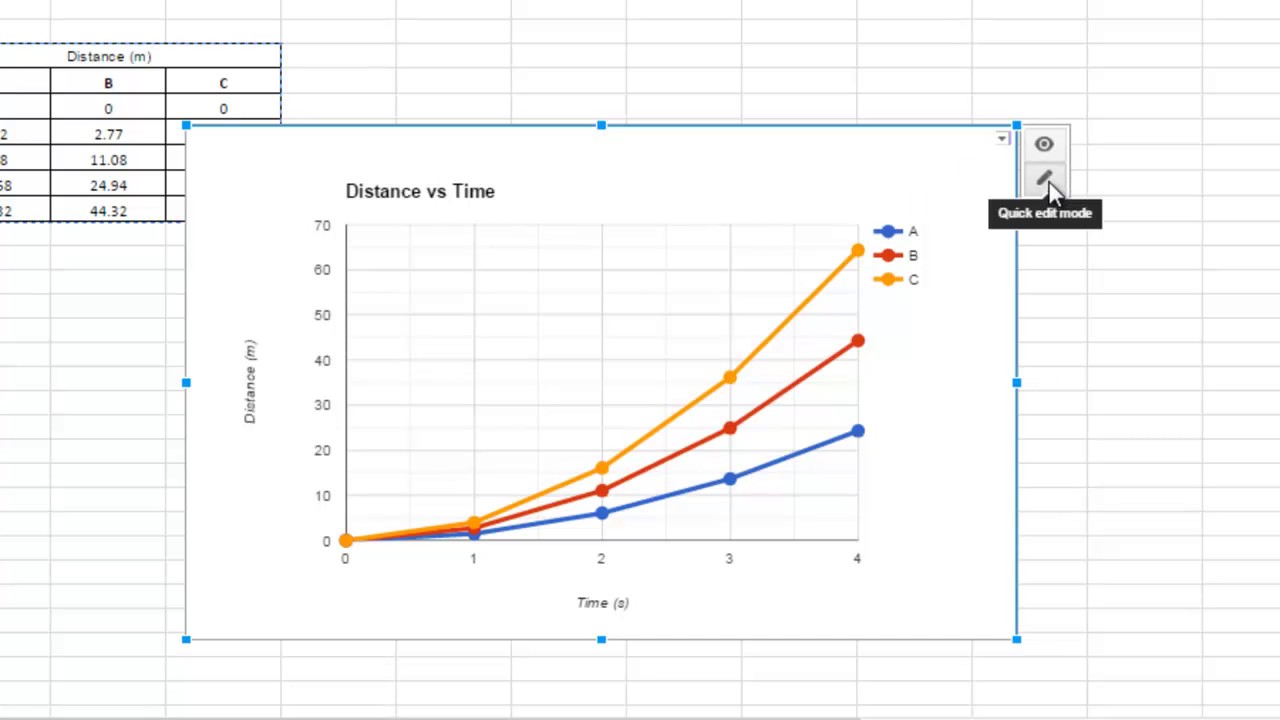
2. Right-click on the scatter plot and choose “Advanced edit” or click on the three vertical dots in the upper-right corner of the chart and select “Edit chart”. This will open the Chart Editor on the right-hand side of the Google Sheets interface.
3. In the Chart Editor, you will find various customization options. To modify the colors, markers, and style of the scatter plot, navigate to the “Customize” tab. Here, you can choose from different marker shapes, change the color of the data points, and adjust the size of the markers.
4. To modify the axes, gridlines, and legend of the scatter plot, navigate to the “Chart & axis titles” tab. Here, you can customize the title of the chart, add axis labels, change the tick marks, and adjust the range and scale of the axes.
5. If you have multiple series of data in your scatter plot, you can customize each series individually by selecting it from the drop-down menu in the Chart Editor. This allows you to apply specific formatting to different sets of data within the scatter plot.
6. Experiment with different customization options to find the visual style that best represents your data and enhances the clarity of your scatter plot. You can preview the changes in the Chart Editor and make adjustments until you are satisfied with the look of your scatter plot.
7. Once you have made all the desired customizations, click the “Apply” button in the Chart Editor to save the changes and update your scatter plot in the Google Sheets document.
By taking advantage of the customization options in Google Sheets, you can create a visually appealing and informative scatter plot that effectively communicates the relationship between your variables.
Adding Labels, Titles, and Axis Labels
Adding labels, titles, and axis labels to your scatter plot in Google Sheets helps provide context and clarity to your data visualization. Follow these steps to add labels and titles:
1. Select the scatter plot by clicking on it. The blue handles around the chart indicate that it is selected.
2. Right-click on the scatter plot and choose “Advanced edit” or click on the three vertical dots in the upper-right corner of the chart and select “Edit chart”. This will open the Chart Editor on the right-hand side of the Google Sheets interface.
3. In the Chart Editor, go to the “Chart & axis titles” tab. Here, you have options to customize the chart title, horizontal axis title, and vertical axis title. Click on each field to enter the desired text for the titles.
4. You can format the font style, size, and color of the titles using the options available in the Chart Editor. Experiment with different font settings to ensure that the titles stand out and are easily readable.
5. If you want to add axis labels to provide additional information about the variables represented on the scatter plot, check the “Axis labels” box in the Chart Editor. This will display the labels along the respective axes of the scatter plot.
6. Customize the axis labels by entering the desired text in the provided fields in the Chart Editor. You can also format the font style, size, and color of the axis labels to make them more visually appealing.
7. Once you are satisfied with the labels, titles, and axis labels, click the “Apply” button in the Chart Editor to save the changes and update your scatter plot in the Google Sheets document.
By adding labels, titles, and axis labels to your scatter plot, you provide clear explanations and make it easier for viewers to understand the data being represented. This enhances the communicative power of your scatter plot and enables better comprehension of the information presented.
Formatting the Scatter Plot
Formatting your scatter plot in Google Sheets allows you to customize its appearance and make it more visually appealing. Follow these steps to format your scatter plot:
1. Select the scatter plot by clicking on it. The blue handles around the chart indicate that it is selected.
2. Right-click on the scatter plot and choose “Advanced edit” or click on the three vertical dots in the upper-right corner of the chart and select “Edit chart”. This will open the Chart Editor on the right-hand side of the Google Sheets interface.
3. In the Chart Editor, you will find numerous formatting options. To modify the background color of the scatter plot, navigate to the “Chart style” tab. Here, you can choose from pre-defined color palettes or customize the background color to your preference.
4. If you want to modify the appearance of the chart area, including the fill color and border, select the “Chart & axis” tab in the Chart Editor. Adjust the settings to achieve the desired look.
5. To format the gridlines of the scatter plot, navigate to the “Gridlines” tab. Here, you can choose to display horizontal and/or vertical gridlines, customize their color and style, and change the spacing between gridlines.
6. Experiment with different formatting options to enhance the overall aesthetics of your scatter plot. You can modify the font style, size, and color of the title, axis labels, and data labels using the available options in the Chart Editor.
7. As you make formatting changes, you can preview the appearance of the scatter plot in the Chart Editor. This allows you to iterate and adjust until you achieve the desired visual style.
8. Once you are satisfied with the formatting changes, click the “Apply” button in the Chart Editor to save the changes and update your scatter plot in the Google Sheets document.
By formatting your scatter plot, you can create a visually appealing and professional-looking chart that effectively presents your data and makes it more engaging for viewers.
Analyzing the Scatter Plot Data
Once you have created and customized your scatter plot in Google Sheets, the next step is to analyze the data presented and draw meaningful insights. Here are some key steps to analyze the scatter plot data:
1. Examine the pattern or trend: Look at the overall pattern formed by the data points on the scatter plot. Determine whether the points have a positive, negative, or no correlation. A positive correlation indicates that as one variable increases, the other variable tends to increase. In contrast, a negative correlation suggests that as one variable increases, the other variable tends to decrease. No correlation implies that there is no apparent relationship between the variables.
2. Identify outliers: Outliers are data points that deviate significantly from the general pattern of the scatter plot. These points may indicate unusual or extreme values. Identify any outliers and consider their potential impact on the analysis. Outliers may require further investigation to determine the underlying reasons for their presence and their implications for the variables being studied.
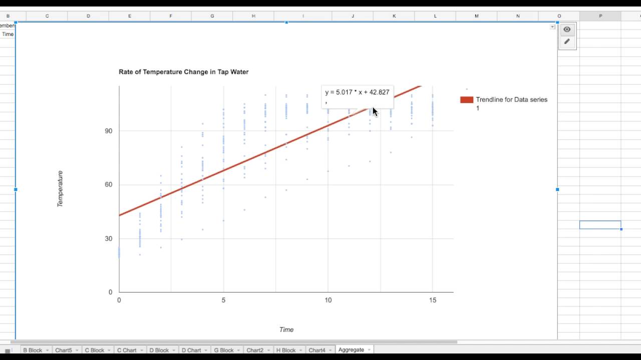
3. Determine the strength of the relationship: Assess the strength of the relationship between the variables by evaluating how closely the data points cluster around the trend line, if applicable. If the points are tightly clustered around the trend line, it suggests a strong relationship. If the points are more scattered, it implies a weaker relationship.
4. Look for non-linear relationships: While scatter plots primarily depict linear relationships, they can also reveal non-linear relationships. Non-linear relationships may be indicated by patterns such as curves, clusters, or other distinctive shapes formed by the data points. Consider whether a non-linear relationship might be present and whether it requires further investigation or analysis.
5. Consider additional factors: In some cases, the scatter plot may not provide all the information needed to fully understand the relationship between variables. Consider other factors that may influence the observed pattern or trend. Explore whether there are any underlying variables or conditions that could explain the relationship illustrated by the scatter plot.
6. Interpret the findings: After analyzing the scatter plot data, interpret the findings and draw meaningful insights. Consider the implications of the relationship between the variables for the specific context or problem you are analyzing. Use the insights gained to inform decision-making, develop strategies, or further explore the underlying factors driving the observed patterns.
By systematically analyzing the scatter plot data, you can gain valuable insights into the relationship between variables and use those insights to make informed decisions or drive further analysis.
Conclusion
Creating scatter plots in Google Sheets is a valuable skill that can enhance your data analysis and visualization capabilities. Scatter plots provide a visual representation of the relationship between two variables, allowing you to identify patterns, trends, and correlations. By following the step-by-step guide outlined in this article, you can easily create and customize scatter plots in Google Sheets while adding labels, titles, and other visual elements to enhance clarity and understanding.
The benefits of using scatter plots in data analysis are numerous. They enable you to identify relationships, spot trends, detect outliers, and communicate insights effectively. Scatter plots help you make data-driven decisions, understand the impact of variables on one another, and uncover hidden patterns that may not be apparent in raw data. With the customization options in Google Sheets, you can create visually appealing scatter plots tailored to your specific needs or audience.
Analyzing scatter plot data requires careful examination of the patterns, identification of outliers, assessing the strength of the relationships, and considering additional factors. By interpreting the findings and drawing meaningful insights, you can make informed decisions, develop strategies, and further explore the underlying factors driving the observed patterns.
By utilizing the features and functionalities Google Sheets provides, such as customization options and easy sharing capabilities, you can present your scatter plot findings to colleagues, clients, or stakeholders with ease, aiding in effective communication and collaboration.
Now that you have a solid foundation in creating and analyzing scatter plots in Google Sheets, you can apply this knowledge to a wide range of data analysis projects. Take advantage of the power of scatter plots to gain valuable insights from your data and support evidence-based decision-making.