Introduction
Google Sheets is a powerful tool for managing and analyzing data. One of the key functionalities it offers is the ability to calculate and visualize the slope of a data set. The slope, also known as the gradient or the rate of change, represents the steepness or incline of a line on a graph.
Understanding the slope is crucial in various fields, such as economics, physics, and engineering, as it helps in identifying patterns, making predictions, and analyzing trends. Whether you need to determine the slope of a sales chart, track the growth rate of a company’s revenue, or analyze the relationship between variables, Google Sheets provides a straightforward way to calculate and visualize this important metric.
In this article, we will explore two methods for finding the slope in Google Sheets: using the SLOPE function and manually calculating it. We will also learn how to create a graph from the data and add data labels to enhance the visual representation.
By the end of this tutorial, you will have a clear understanding of how to find the slope in Google Sheets, allowing you to effectively analyze data and make informed decisions based on the trends and patterns you uncover.
Let’s dive into the world of slope calculations in Google Sheets and unlock the power of data analysis.
What is slope?
In mathematics, slope refers to the measure of how steep a line is. It represents the rate of change between two points on a graph or a line. The slope can be positive, negative, zero, or undefined, depending on the direction and magnitude of the line.
The slope is often denoted by the letter “m” and is calculated by dividing the change in the y-coordinates (vertical change) by the change in the x-coordinates (horizontal change) between two points on the line. This is commonly represented by the formula:
m = (y2 – y1) / (x2 – x1)
Where (x1, y1) and (x2, y2) are the coordinates of two points on the line.
If the slope is positive, it means that the line is increasing as it moves from left to right. A negative slope indicates a decreasing line, while a slope of zero represents a horizontal line. An undefined slope occurs when the line is vertical, which means that there is no change in the x-coordinate.
Slope is a fundamental concept in mathematics and has wide-ranging applications in various fields. In geometry, it helps determine the angle and direction of a line. In calculus, it is used to calculate derivatives and rates of change. In statistics, it is used to analyze data and identify relationships between variables.
Understanding the concept of slope is essential for interpreting graphs, making predictions, and analyzing data. By knowing how to calculate the slope, you can gain valuable insights into the patterns and trends present in a dataset.
Now that we have a clear understanding of what slope is and its significance, let’s explore how to find the slope in Google Sheets using the built-in SLOPE function and manual calculations.
Using the SLOPE function
Google Sheets provides a convenient function, called SLOPE, that allows you to calculate the slope of a dataset with ease. The SLOPE function takes two parameters: the y-values and the x-values.
Here’s how to use the SLOPE function:
- Select an empty cell where you want the slope result to appear.
- Type =SLOPE( (without the angle brackets).
- Select and highlight the y-values range, which represents the dependent variable data.
- Press the comma key (,) to separate the parameters.
- Select and highlight the x-values range, which represents the independent variable data.
- Close the parentheses ) and press Enter.
The result will be the calculated slope of the dataset.
For example, let’s say you have a dataset representing the number of hours studied (x-values) and the corresponding test scores (y-values). You want to find the slope to determine how much the test scores increase per hour of study.
Assuming the hours studied are in column A and the test scores are in column B, you would select an empty cell and enter the formula =SLOPE(B2:B10, A2:A10), replacing the range with your specific dataset. The cell will then display the calculated slope.
The SLOPE function in Google Sheets provides a quick and efficient way to find the slope of a dataset without the need for manual calculations. It simplifies the process and allows you to analyze the relationship between variables effortlessly.
Now that you know how to use the SLOPE function, let’s move on to creating a graph to visualize the data and slope.
Creating a graph
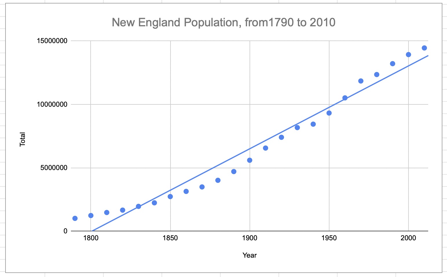
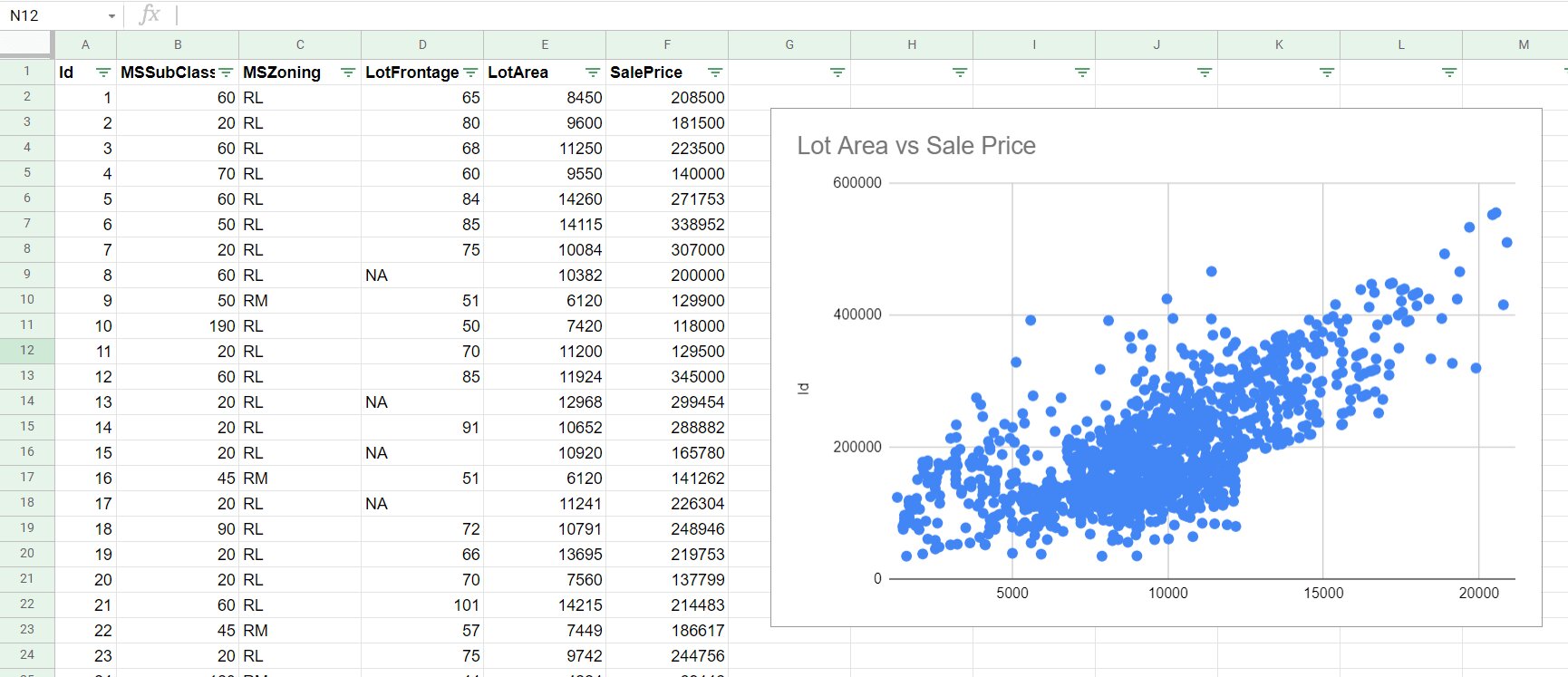
Visualizing data through a graph can provide a clearer understanding of the relationship between variables and the slope of a dataset. Google Sheets offers a variety of graphing tools that make it easy to create visually appealing and informative graphs.
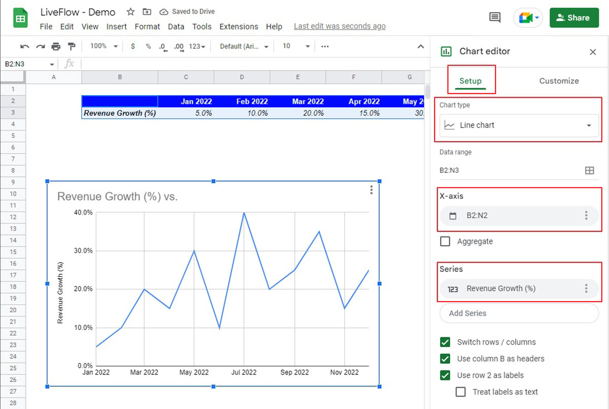
Here’s how to create a graph in Google Sheets:
- Select the data range that you want to include in the graph, including both the y-values and x-values.
- Click on the Insert tab in the menu bar at the top of the Google Sheets window.
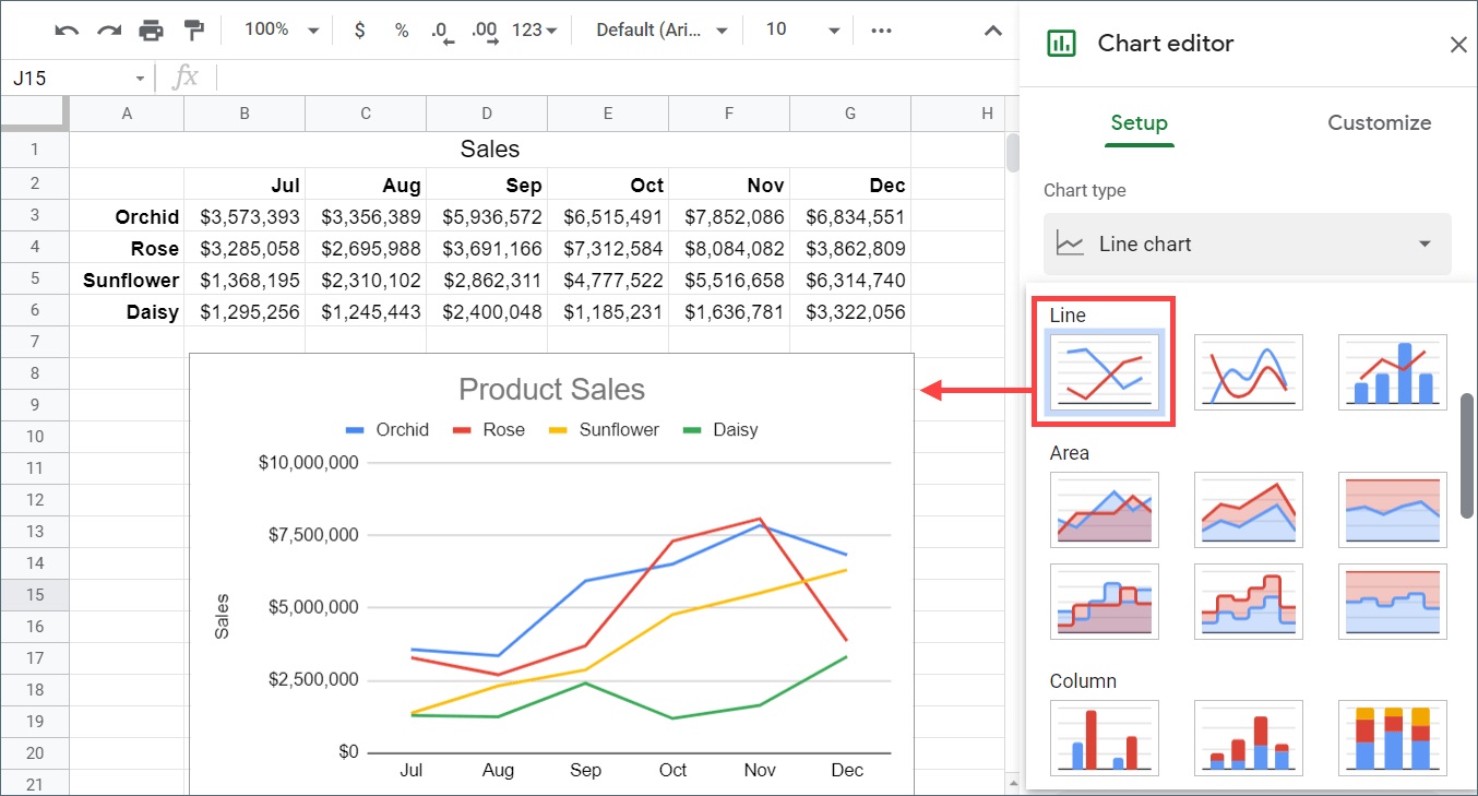
- From the dropdown menu, select the type of graph you want to create, such as line graph, scatter plot, or bar graph.
- A graph will be inserted into your worksheet, displaying the selected data.
You can further customize your graph by adjusting various options such as titles, labels, colors, and gridlines. Simply right-click on specific elements of the graph and select the appropriate options from the context menu.
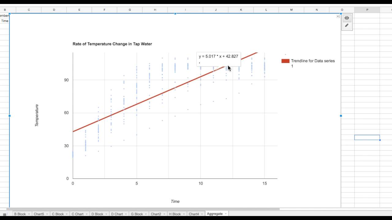
By creating a graph, you can visually observe the relationship between the variables in your dataset and the slope of the line. A positive slope will result in an upward-sloping line on the graph, while a negative slope will show a downward-sloping line. A slope of zero will indicate a horizontal line.
In addition to visualizing the data, a graph allows you to identify any outliers or patterns that may not be apparent from a table of values alone. It provides a visual representation that can aid in interpreting and analyzing the dataset.
Now that you have created a graph to visualize the data and slope, let’s explore how to add data labels to enhance the understanding of the graph.
Adding data labels to the graph
Data labels provide additional information and context to the data points on a graph. They can be useful in conveying specific values or identifying particular data points that are of interest. Google Sheets offers various options for adding data labels to your graphs.
Here’s how to add data labels to a graph in Google Sheets:
- Click on the data series or data point on the graph to which you want to add data labels.
- Right-click on the selected data series or data point.
- From the context menu, choose Add data labels.
Google Sheets will automatically display the data labels on the graph, usually next to the corresponding data points. You can customize the appearance of the data labels by right-clicking on them and selecting various options, such as font size, color, or data format.
Data labels can be particularly helpful when analyzing the slope of a graph. They allow you to identify the specific values associated with each data point, providing a clearer understanding of the relationship between the variables. You can compare the data points and their corresponding data labels to identify any patterns or trends that may be present.
Furthermore, data labels can also aid in presentations or reports where you need to share your findings with others. They make it easy for the audience to interpret and comprehend the information presented on the graph.
By adding data labels to your graph in Google Sheets, you can enhance the visual representation of your data and provide valuable insights into the relationship between variables and the slope.
Now that we have explored how to add data labels to the graph, let’s move on to another method of calculating slope: manual calculations.
Calculating slope manually
In addition to using the built-in SLOPE function, you can also calculate the slope manually using the formula mentioned earlier. Manual calculations can be useful when you want to have a deeper understanding of the underlying mathematical concepts or if the SLOPE function is not available for some reason.
To calculate the slope manually, follow these steps:
- Identify two points on the line for which you want to find the slope.
- Assign the coordinates of the first point as (x1, y1) and the coordinates of the second point as (x2, y2).
- Substitute the values into the slope formula m = (y2 – y1) / (x2 – x1).
- Perform the arithmetic operations to calculate the slope.
For example, let’s say you have the coordinates of two points: (2, 5) and (5, 12). To manually calculate the slope, substitute the values into the formula:
m = (12 – 5) / (5 – 2) = 7 / 3 ≈ 2.333
The result, in this case, is approximately 2.333.
By manually calculating the slope, you can gain a deeper understanding of the relationship between the variables and the mathematical principles involved. It allows for more flexibility and control over the calculations, providing you with a hands-on approach to analyzing the data.
However, manual calculations can be time-consuming and prone to human error, especially when dealing with larger datasets. In such cases, utilizing the SLOPE function or graphing tools can be more efficient and accurate.
Now that you’ve learned how to calculate the slope manually, you have a choice between using the SLOPE function or manual calculations based on your specific needs and preferences.
Conclusion
Understanding how to find and interpret the slope of a dataset is a valuable skill for data analysis. In this article, we explored two methods for finding the slope in Google Sheets: using the SLOPE function and calculating it manually.
The SLOPE function provides a quick and straightforward way to calculate the slope of a dataset in Google Sheets. By using this built-in function, you can efficiently analyze the relationship between variables and make data-driven decisions based on the trends and patterns you uncover.
Creating a graph in Google Sheets allows you to visualize the data and observe the slope visually. By adding data labels to the graph, you can enhance its understanding and communicate specific values or data points to your audience effectively.
For those who prefer a deeper understanding of the underlying mathematics, manually calculating the slope using the slope formula provides a hands-on approach to data analysis. This method gives you more control over the calculations and allows for a deeper exploration of the mathematical concepts involved.
Whether you choose to use the SLOPE function or calculate the slope manually, Google Sheets offers powerful tools for analyzing and interpreting data. By understanding and interpreting the slope, you can uncover meaningful insights and make informed decisions in various fields.
Now armed with the knowledge of finding the slope in Google Sheets, you can confidently analyze data and unlock the power of data-driven decision-making.