Introduction
When it comes to presenting data visually, pie charts are an excellent choice. They provide an easy-to-understand representation of proportions and percentages, making complex data sets more accessible. If you’re looking to create a pie chart, Google Sheets offers a simple and effective solution. In this article, we’ll guide you through the step-by-step process of making a pie chart on Google Sheets.
Google Sheets is a powerful online spreadsheet application that enables you to create, edit, and analyze data in real-time, all within your web browser. It’s a popular choice for individuals or teams working collaboratively, as it allows for seamless data sharing and easy integration with other Google Workspace applications like Google Docs and Google Slides.
Whether you’re a business professional, a student, or simply someone who wants to visually organize data, Google Sheets provides a user-friendly platform to create professional-looking charts and graphs. By following the steps outlined in this article, you’ll be able to visualize your data in a meaningful way and showcase important insights.
So, if you’re ready to unleash the power of Google Sheets and create stunning pie charts, let’s get started with the step-by-step process.
Step 1: Access Google Sheets
To begin creating your pie chart on Google Sheets, you’ll need to access the platform. Here’s how:
- Open your preferred web browser and navigate to Google Sheets.
- If you already have a Google account, sign in with your credentials. If not, click on the “Create account” button to set up a new Google account.
- Once you’re signed in, you’ll be redirected to your Google Sheets homepage.
Google Sheets is a web-based application that can be accessed on various devices, including computers, laptops, tablets, and smartphones, as long as you have an internet connection.
If you’re collaborating with a team, you can easily share the Google Sheets document with your colleagues by clicking on the “Share” button located at the top-right corner of the page. Simply enter the email addresses of the individuals you want to collaborate with and choose the appropriate sharing permissions.
Now that you’ve accessed Google Sheets, you’re one step closer to creating your pie chart. Continue reading to learn how to open a new spreadsheet and input your data.
Step 2: Open a new spreadsheet
Before you can input your data and create a pie chart on Google Sheets, you need to open a new spreadsheet. Follow these simple steps to get started:
- On your Google Sheets homepage, click on the “+” button or the “Blank” option to create a new spreadsheet.
- A new blank spreadsheet will open in a new tab or window.
Alternatively, you can also choose from various pre-made templates provided by Google Sheets. These templates are designed for different purposes and can help you save time creating specific types of spreadsheets.
Once you have opened a new spreadsheet, you’ll have a blank canvas to input your data and create your pie chart. The cells in the spreadsheet are organized in rows and columns, forming a grid structure. You can input text, numbers, and formulas into the cells to organize and analyze your data.
If you already have existing data in a different file format, such as a CSV or Excel file, you can easily import that data into your Google Sheets spreadsheet. Simply click on “File” in the menu bar, select “Import,” and choose the file you want to import from your local storage or Google Drive.
Now that you have a new spreadsheet ready, it’s time to move on to the next step and input your data.
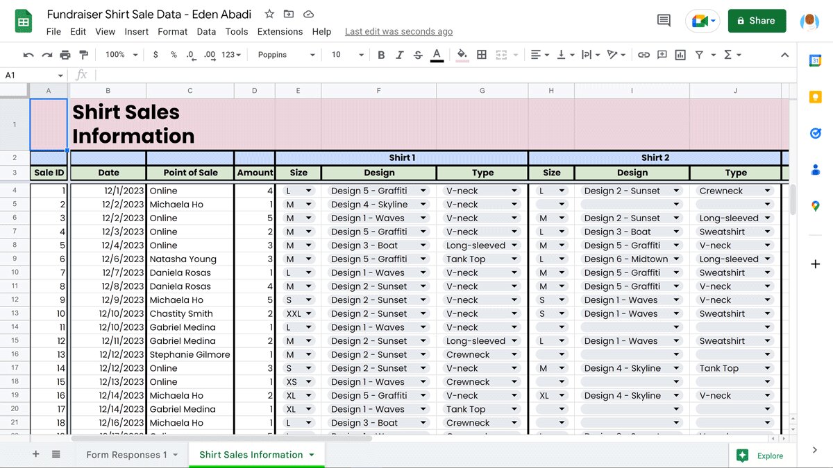
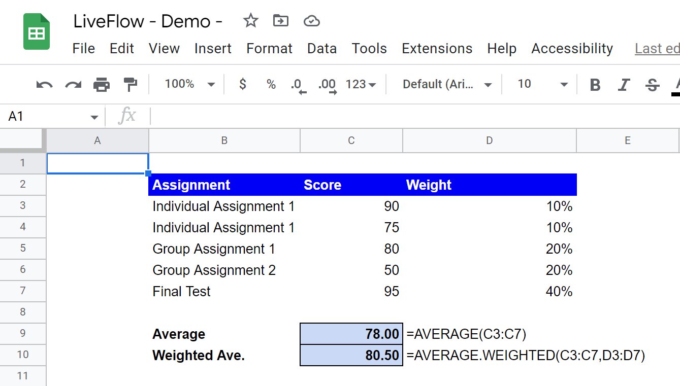
Step 3: Input your data
Now that you have a new spreadsheet open in Google Sheets, it’s time to input your data. Follow these steps to enter your data accurately:
- Identify the cells where you want to input your data. You may choose to have your data in a single column or row, or you may have multiple columns or rows depending on the complexity of your data.
- Click on the first cell where you want to input your data and start typing. If you have a large dataset, you can scroll down or across the spreadsheet to find the exact cell you wish to input your data in.
- Repeat this process for all the cells where you want to input your data, filling in the relevant information for each cell.
- If you need to enter numerical data, you can format the cells as numbers for easier calculations. To do this, select the cells you want to format, click on the “Format” menu, choose “Number,” and select the desired format, such as decimal places, currency, or percentage.
Remember, the accuracy and organization of your data will directly impact the effectiveness and clarity of your pie chart. Make sure to double-check your data entry to avoid any mistakes that could lead to inaccurate representations. Additionally, it’s good practice to include clear labels for your data to ensure easy comprehension.
Once you have entered your data, you are ready to move on to the next step, where you will select the data range for your pie chart.
Step 4: Select the data range
After inputting your data into the Google Sheets spreadsheet, the next step is to select the data range that you want to use for creating your pie chart. Follow these steps to select the data range:
- Position your cursor anywhere within the data range you want to include in the pie chart.
- Click and drag your cursor to highlight the desired range of cells. Make sure to include all the data you want to visualize in the pie chart.
- You can also hold down the “Shift” key on your keyboard and use the arrow keys to extend the selected range.
- If you have a large dataset and want to select the entire column or row, click on the column or row letter/number to highlight the entire column or row.
It’s essential to select the correct data range for your chart to ensure accurate representation of the information you want to visualize. Double-check your selection to ensure you have included all the necessary data.
Once you have selected the data range, you are now ready to proceed to the next step, which involves inserting a pie chart into your Google Sheets spreadsheet.
Step 5: Insert a pie chart
With the data range selected in your Google Sheets spreadsheet, you are now ready to insert a pie chart. Follow these steps to insert a pie chart:
- Click on the “Insert” tab in the menu bar at the top of the Google Sheets interface.
- Select “Chart” from the drop-down menu.
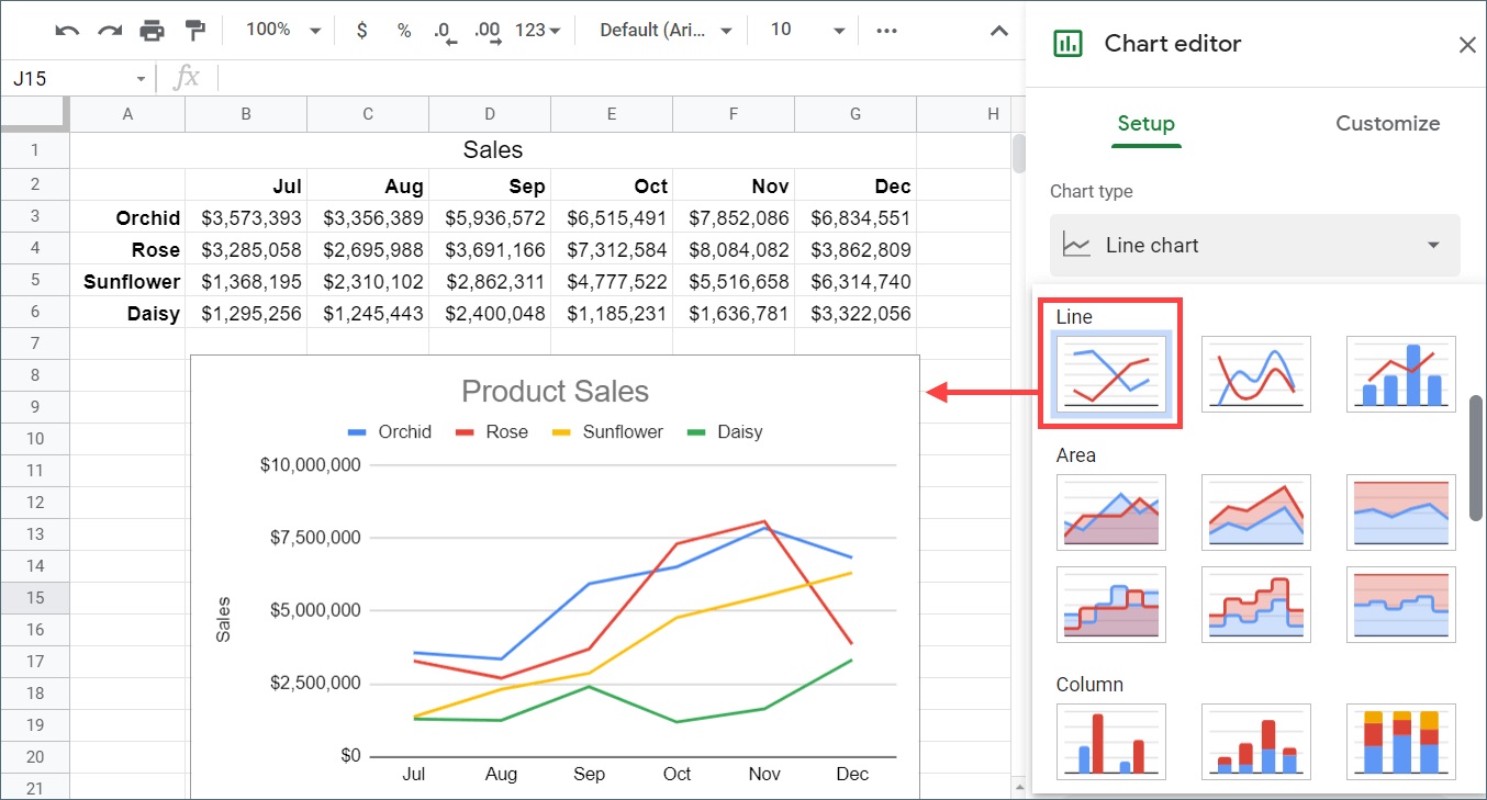
- A new window will appear with different chart options. Choose “Chart types” and select “Pie chart.”
- Google Sheets will automatically generate a basic pie chart using the selected data range. The chart may appear directly on your spreadsheet or in a separate window depending on your specific settings.
The pie chart will provide a visual representation of the data you selected, showing the proportions and percentages of each data category. The size of each pie slice will correspond to the percentage or value it represents in relation to the whole.
At this stage, the inserted pie chart will likely be a default representation of your data. In the next step, you will learn how to customize the chart to better suit your needs and make it visually appealing.
Now that you have successfully inserted a pie chart, it’s time to move on to the next step and make the necessary customizations to enhance your chart’s appearance and readability.
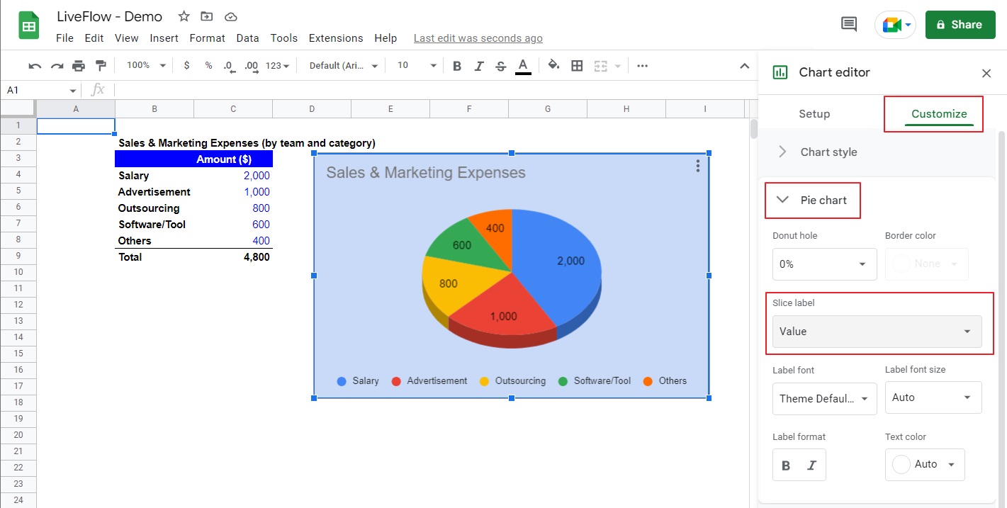
Step 6: Customize the pie chart
After inserting a default pie chart into your Google Sheets spreadsheet, you have the option to customize it to your liking. Follow these steps to customize your pie chart:
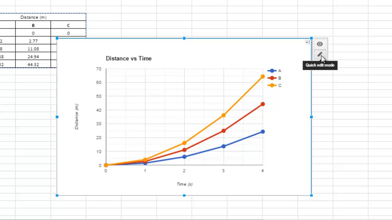
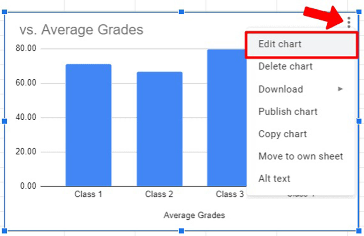
- Click on the pie chart to select it. You will notice small blue squares or handles around the chart, indicating that it is selected.
- Right-click on the chart, and a context menu will appear with various customization options.
- From the context menu, you can choose options such as “Chart style,” “Chart and axis titles,” “Chart and axis font,” and more.
- Experiment with different chart styles to find the one that suits your data and presentation needs the best.
- You can also customize the colors used in your pie chart to make it visually appealing and distinct. This can be done by selecting individual slices or the entire chart and choosing a new color scheme.
- Consider customizing the slice label positions to increase readability. You can choose to display labels inside the slices, outside the slices, or even remove them altogether.
By customizing the pie chart, you can create a visual representation that effectively communicates your data and helps convey the intended message. The customization options in Google Sheets provide flexibility for tailoring the chart to your specific requirements.
With the pie chart customized, the next step is to add a title and labels to further enhance the understanding of your data. Continue reading to learn how to do this in the next step.
Step 7: Add a chart title and labels
To provide context and clarity to your pie chart, it’s important to add a title and labels. Follow these steps to add a chart title and labels to your pie chart:
- Click on the pie chart to select it.
- In the chart toolbar that appears at the top of the Google Sheets interface, click on the “Chart editor” icon (it looks like a small pencil).
- A sidebar will appear on the right-hand side of the screen. In the “Chart editor” sidebar, select the “Chart & axis titles” tab.
- To add a title to your chart, enter the desired text in the “Chart title” field. Make sure to choose a clear and descriptive title that accurately represents the data being visualized.
- You can also add labels to your chart to identify the different categories or data points. To do this, tick the checkbox for “Data Labels” in the “Chart & axis titles” tab.
- Google Sheets provides various options for customizing the appearance and positioning of your labels. Experiment with different label options such as displaying values, percentages, or custom text labels.
- Adjust the font size, color, and other formatting options to make sure the labels are legible and enhance the overall chart presentation.
Adding a chart title and labels will help viewers understand the key insights and information conveyed by your pie chart with ease. It provides important context and aids in data interpretation.
With the title and labels in place, you’ll now learn how to add a legend to your pie chart in the next step.
Step 8: Add a legend
A legend provides a key to understanding the different categories or data points represented in your pie chart. Adding a legend can help viewers interpret the information more effectively. Follow these steps to add a legend to your pie chart in Google Sheets:
- Click on the pie chart to select it.
- In the chart toolbar at the top of the Google Sheets interface, click on the “Chart editor” icon (represented by a small pencil).
- In the “Chart editor” sidebar that appears on the right-hand side of the screen, select the “Chart & axis titles” tab.
- Scroll down to find the “Legend” option.
- Tick the checkbox for “Legend” to show the legend on your pie chart.
- By default, the legend will appear at the side or bottom of the chart. You can adjust its position by choosing “Position” and selecting options such as “Right,” “Left,” “Top,” or “Bottom.”
- If desired, you can further customize the legend’s appearance by adjusting the font size, color, or other formatting options.
Adding a legend to your pie chart helps clarify the different categories and their corresponding colors or patterns. It improves the overall readability and understanding of the chart, making it easier for viewers to interpret the data.
Now that you’ve added a legend to your pie chart, it’s time to move on to the next step and explore additional settings to optimize your chart.
Step 9: Adjust chart settings
Customizing your pie chart goes beyond adding titles, labels, and a legend. Google Sheets provides a range of additional settings that allow you to fine-tune your chart to suit your needs. Follow these steps to adjust the settings of your pie chart:
- Click on the pie chart to select it.
- In the chart toolbar at the top of the Google Sheets interface, click on the “Chart editor” icon (represented by a small pencil).
- In the “Chart editor” sidebar on the right-hand side of the screen, select the different tabs to explore various settings.
- In the “Customize” tab, you can adjust elements such as the chart area, background color, gridlines, and more.
- In the “Chart style” tab, you can experiment with different color schemes, chart themes, and visual effects to enhance the aesthetics of your pie chart.
- In the “Series” tab, you can modify individual data series, such as adjusting colors, line thickness, or adding data labels.
- Make sure to preview your changes as you adjust the settings to ensure you achieve the desired appearance and functionality for your pie chart.
By adjusting the chart settings, you can create a visually appealing and informative pie chart that effectively communicates your data. Experiment with the various options available to achieve the desired presentation and visual impact.
Now that you have fine-tuned your pie chart, it’s time to move on to the final step and learn how to publish and share your chart with others.
Step 10: Publish and share the pie chart
After creating and customizing your pie chart in Google Sheets, you may want to share it with others or embed it in a website or document. Follow these steps to publish and share your pie chart:
- Ensure your pie chart is saved and up-to-date with the latest data.
- Click on the pie chart to select it.
- In the chart toolbar at the top of the Google Sheets interface, click on the “Chart editor” icon (represented by a small pencil).
- In the “Chart editor” sidebar on the right-hand side of the screen, click on the “Publish” tab.
- Select the “Embed” option if you wish to embed the chart in a website or document.
- Adjust the settings, such as size and interactive features, to fit your requirements.
- Click on the “Publish” button to generate the embed code.
- Copy the provided embed code and paste it into your preferred website or document editor.
- If you want to share the chart as a standalone link, select the “Link” option in the “Publish” tab. This will generate a shareable link that grants access to the chart.
- Copy the link and share it with others via email, messaging apps, or social media platforms.
By publishing and sharing your pie chart, you can effectively communicate your data and insights to a wider audience. Whether it’s for presentations, reports, or online articles, sharing your chart allows others to interact with and understand your data visually.
Remember to regularly review and update the published chart if there are any changes to your underlying dataset. This ensures that viewers always have the most accurate and up-to-date information.
Congratulations! You have successfully completed all the steps to create, customize, and share your pie chart using Google Sheets.
Conclusion
Creating a pie chart on Google Sheets is a straightforward process that allows you to visualize and communicate your data effectively. By following the step-by-step guide outlined in this article, you’ve learned how to access Google Sheets, open a new spreadsheet, input your data, select the data range, insert a pie chart, and customize it with titles, labels, legends, and various settings. Additionally, you’ve discovered how to publish and share your pie chart with others.
Google Sheets provides a user-friendly platform for data analysis and visualization, making it a valuable tool for professionals, students, and anyone who wants to present data visually. The ability to customize the appearance and style of your pie chart enables you to create captivating visuals that enhance data comprehension.
Remember to think critically about the data you’re presenting and ensure its clarity and accuracy. Carefully choose labels, titles, and colors that effectively represent the information you want to convey. Regularly update and revise your chart to reflect any changes in the underlying data.
Whether you’re using pie charts for business reports, academic presentations, or personal projects, Google Sheets allows you to create professional-looking charts that encapsulate data insights in a visually appealing manner.
Now that you have mastered the art of making pie charts on Google Sheets, go forth and visualize your data with confidence!