





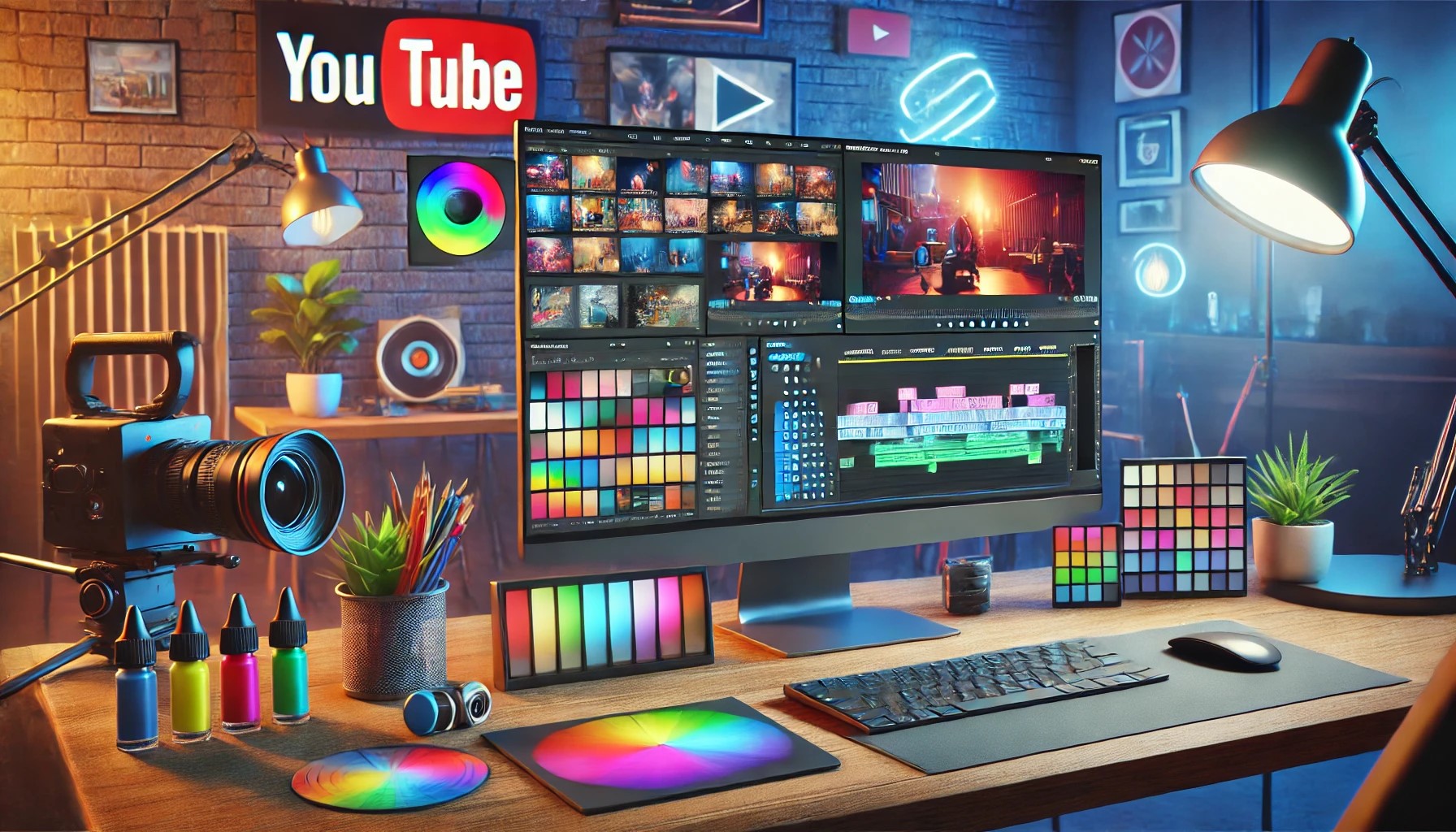
The best color palette for YouTube videos is one that aligns with your channel’s emotional message and brand identity, there isn’t a single universal winner, but four proven combinations consistently deliver results: red and yellow for energy, black and yellow for modern authority, blue and white for trust, and green and white for health and positivity. To evoke the right emotions and keep your content professional, you need a palette that matches your niche and then apply it consistently across every clip, which is where AI color-matching tools become essential.
What is the best color palette for YouTube videos?
Color choices shape how viewers feel before they even absorb your words. A well-selected palette sets the mood, reinforces your channel’s personality, and makes your content instantly recognizable in a crowded feed. While topic, audio, and editing often get priority, color is the silent layer that defines emotional flow, warm tones energize, cool tones calm, and high-contrast pairings grab attention. The best palette for you depends on your content type, but the following four combinations cover the most common YouTube niches with proven psychological impact.
Red and yellow
Red and yellow is one of the most visually striking combinations among bright colors, and it works by triggering immediate emotional responses. Red signals passion, speed, and movement, while yellow adds warmth and cheerfulness, together they create a sense of urgency and joy that feels almost irresistible. This palette is ideal for travel, entertainment, and lifestyle channels, where high energy and positive vibes keep viewers engaged. A real-world example is McDonald’s branding, which uses red and yellow specifically because the combination stimulates hunger and enjoyment, showing how color can directly influence audience behavior.
Black and yellow
Black and yellow is widely regarded as a modern, bold design choice that conveys sophistication with an edge. The dark base adds weight and seriousness, while the yellow accent injects brightness and alertness, giving content a polished, high-end feel. This palette suits tech channels, videos on technical subjects, and any content that aims for high polish and expertise. The contrast also creates a slight “shock” or “bite” that makes viewers sit up and pay attention, which is why it works so well for product reviews, tutorials, and explainer videos that need to project authority.
Blue and white
Blue is associated with calmness, trust, and reliability, making it the go-to choice for educational and informational channels. When paired with white, the combination enhances feelings of purity and brightness, creating a clean, open visual space that feels credible and approachable. Facebook’s branding is a prime example, the blue and white scheme suggests competence and a friendly environment, which is exactly the tone you want for teaching, news, or how-to content. This palette helps you build a believable brand image because it’s light, simple, and easy on the eyes over long viewing sessions.
Green and white
Green represents health, nature, and growth, making it a popular choice for channels focused on fitness, wellness, and greenery-related topics. When combined with white, the green feels even cleaner and fresher, amplifying a sense of positivity and vitality. This palette works well for workout routines, healthy cooking, meditation guides, and outdoor lifestyle vlogs, where the visual cues of nature reinforce the content’s core message. The white space prevents the green from feeling overwhelming, ensuring your videos look inviting rather than overly saturated.
How YouTube’s own branding uses a powerful color palette
YouTube’s official brand colors are a masterclass in contrast and simplicity, featuring Red (#FF0000 or #FF0033), White (#FFFFFF), and Black (#282828 or #212121), along with various grays. The red draws immediate attention and signals excitement, while the white and black provide balance and readability across thumbnails, logos, and interface elements. Creators can manage their own channel identity assets, profile pictures, banner images, and video watermarks, through YouTube Studio’s “Customization” section under the “Branding” tab. By studying how YouTube uses this palette, you can learn to combine a bold accent color with neutral tones for maximum impact without visual chaos.
How to match colors across your clips for a consistent palette
Consistency is what separates amateur-looking videos from professional ones, and AI color-matching tools make this achievable even if you shoot in different locations or lighting conditions. The goal is to ensure every clip shares the same overall color palette, so your video feels like one cohesive piece rather than a patchwork of mismatched scenes. Tools like Filmora’s AI color match feature automatically adjust brightness, contrast, and saturation across clips, saving you hours of manual correction. Here’s the simple process to apply your chosen palette uniformly:
- Open Filmora, create a new project, and import your video files into the media library.
- Drag both your reference video (the one with the desired color) and your target video onto the timeline.
- Select the first video, navigate to the Color panel, and click on Color Match to activate the feature.
- In the Reference Preview box, use the playback control to select the exact frame with the color you want to match.
- Click Match to apply the reference video’s color settings to your current clip, then repeat for any other clips that need adjustment.
This process extracts the color settings from one clip and applies them to others, giving your entire video a unified look. You can also choose from presets or adjust the match level to add creative variation while maintaining consistency.
The visual impact of a good color palette
Color is one of the most important structural elements in video because it defines tone and feel before a single word is spoken. Hollywood productions follow color theory in their poster designs, using specific hues to instantly communicate a film’s nature, thrillers lean dark and desaturated, comedies use bright and warm tones, and dramas favor muted blues. When you apply color purposefully, it leaves a lasting impression on viewers and makes your content memorable. Color blocking is another powerful technique: by placing large, contrasting color areas in your video sequences, you create strong visual impact that guides the eye and reinforces your brand identity. The right palette doesn’t just look good, it actively shapes how your audience perceives your message and whether they trust your channel enough to return.
Choosing the best color palette for YouTube videos is ultimately about matching your emotional goals with your niche, then executing that vision consistently across every clip. Red and yellow energize, black and yellow project authority, blue and white build trust, and green and white promote health, each serves a distinct purpose. With AI color-matching tools, you can achieve professional-grade consistency without manual guesswork, ensuring your videos look intentional and polished. When your colors align with your content’s message, viewers feel the difference, and that emotional connection is what turns casual watchers into loyal subscribers.



![7 Best AI Video Upscaling Software [Free & Paid]](https://robots.net/wp-content/uploads/2023/12/Guy-in-headphones-editing-video-with-astronauts-for-space-blog-in-professional-program.jpeg)