Introduction
Creating a bar graph can be a powerful visualization tool to represent and analyze data effectively. Whether you’re a student looking to present your research findings or a professional needing to showcase business metrics, Google Sheets provides a simple yet robust platform to create stunning bar graphs.
In this tutorial, we will walk you through the step-by-step process of making a bar graph in Google Sheets. You don’t need to be an expert in data analysis or have advanced technical skills to follow along. With just a few clicks and some customization, you’ll be able to create a visually appealing and informative bar graph that suits your specific needs.
Before we dive into the step-by-step guide, let’s clarify what a bar graph is and why it’s such a valuable tool. A bar graph is a representation of data using horizontal or vertical bars, where the length or height of each bar corresponds to the value it represents. It allows you to compare data across different categories or groups, making it easier to identify patterns, trends, and discrepancies.
Whether you want to compare sales figures for different months, track the performance of multiple marketing campaigns, or visualize survey results across various demographics, a bar graph is an ideal choice. Google Sheets offers a user-friendly interface and a wide range of customization options to help you create professional-looking bar graphs that effectively communicate your data.
Now that we have a clear understanding of what a bar graph is and its importance, let’s get started with the step-by-step process of creating one in Google Sheets.
Step 1: Setting up the data
The first step in creating a bar graph in Google Sheets is to set up the data that you want to represent. Before you start, ensure that you have a clear understanding of the information you want to visualize.
To begin, open a new or existing Google Sheets document and enter your data into the cells. The data can be numeric values, dates, or any other relevant information that you want to display in your bar graph. Make sure that each data category or group is organized in a separate column, with each row representing a specific data point or observation.
For example, if you are creating a bar graph to compare monthly sales figures for different products, you would enter the product names in one column and the corresponding sales numbers in another column.
It’s important to note that Google Sheets can handle large datasets, so feel free to include as many rows and columns as needed to accommodate your data. Additionally, ensure that the data is accurate and formatted properly to ensure accurate visualization.
If you have data already stored in another file, such as a CSV or Excel sheet, you can easily import it into Google Sheets by going to the “File” menu, selecting “Import,” and choosing the appropriate file format. This allows you to seamlessly transfer your existing data into Google Sheets for further analysis and visualization.
Once you have entered or imported your data into Google Sheets, you are ready to move on to the next step of creating your bar graph. In the following steps, we will guide you through selecting the data range, inserting the bar graph, customizing its appearance, and adding labels and titles to make it more informative and visually appealing.
Step 2: Selecting the data range
After setting up your data in Google Sheets, the next step in creating a bar graph is to select the data range that you want to include in your graph. The data range defines the specific cells or columns that will be used to generate the visual representation.
To select the data range, follow these steps:
- Click and drag your cursor to highlight the cells or columns that contain the data you want to include in the bar graph. Make sure to select all the relevant cells to accurately represent the information.
- Alternatively, you can select an entire column or row by clicking on the corresponding column or row header. To select multiple columns or rows, hold the Shift key while clicking.
- If your data is in a continuous range, you can select it all at once by clicking on a cell and then pressing Ctrl + Shift + Right Arrow (for a row) or Ctrl + Shift + Down Arrow (for a column).
Once you have selected the desired data range, you will notice that the selected cells are highlighted. This indicates that the data is ready to be used for creating the bar graph.
It’s important to ensure that the selected data range includes all the necessary information and does not contain any extraneous cells or columns. This will help you create a clear and concise bar graph that accurately represents the data you want to visualize.
Now that you have successfully selected the data range for your bar graph, you are ready to move on to the next step of inserting the actual graph into your Google Sheets document. In the following steps, we will guide you through the process of inserting the bar graph, customizing its appearance, and adding labels and titles.
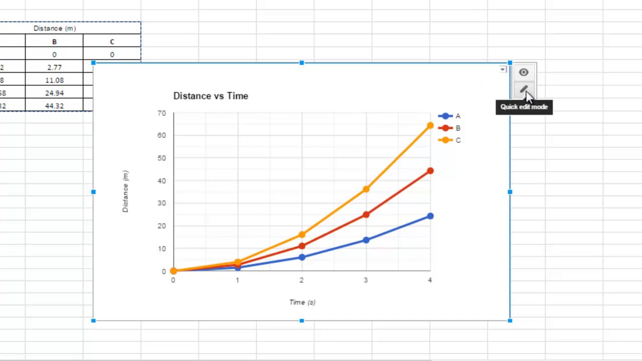
Step 3: Inserting the bar graph
Once you have selected the data range for your bar graph, the next step is to insert the actual graph into your Google Sheets document. Google Sheets offers a built-in chart feature that allows you to create various types of graphs, including bar graphs, with just a few clicks.
To insert the bar graph, follow these steps:
- Select the “Insert” menu at the top of the Google Sheets document.
- Click on the “Chart” option from the drop-down menu. A sidebar will appear on the right side of the document.
- In the sidebar, click on the “Chart type” tab to display the available chart types. Select the “Bar” chart option.
- Google Sheets will automatically generate a basic bar graph using the data range you previously selected. The bar graph will be inserted into the document, replacing the sidebar.
You can now see the bar graph representation of your data in the Google Sheets document. The graph is interactive, allowing you to customize its appearance and modify various settings to suit your preferences.
It’s worth noting that Google Sheets also offers a preview of your bar graph in the sidebar, allowing you to visualize how different changes will affect the appearance of the graph in real-time. This enables you to experiment and fine-tune the graph until you achieve the desired visual representation.
Now that you have successfully inserted the bar graph into your Google Sheets document, you can proceed to the next step of customizing its appearance. In the following steps, we will guide you through the process of customizing the bar graph, adding labels and titles, changing the bar colors, and formatting the axis.
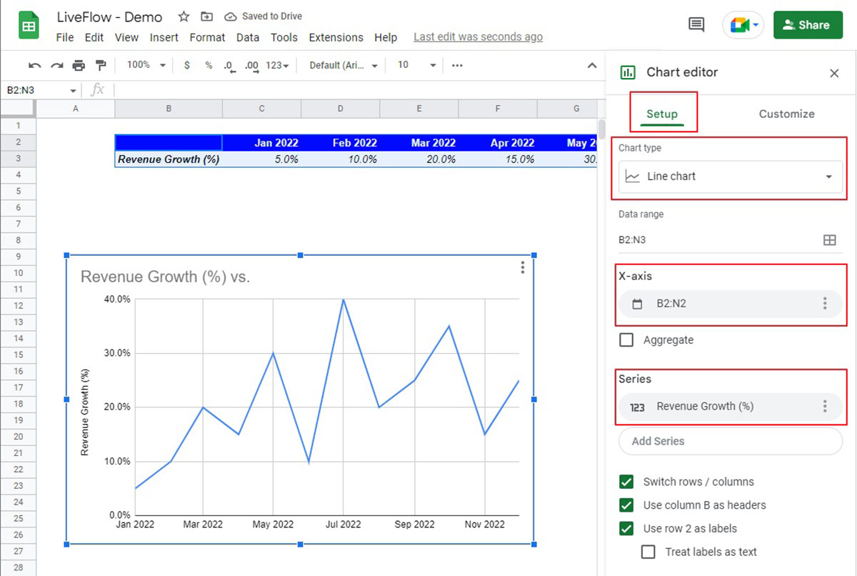
Step 4: Customizing the bar graph
Once you have inserted the bar graph into your Google Sheets document, you can customize its appearance to make it more visually appealing and engaging. Google Sheets offers a range of customization options that allow you to modify the colors, styles, and layout of the graph.
To customize the bar graph, follow these steps:
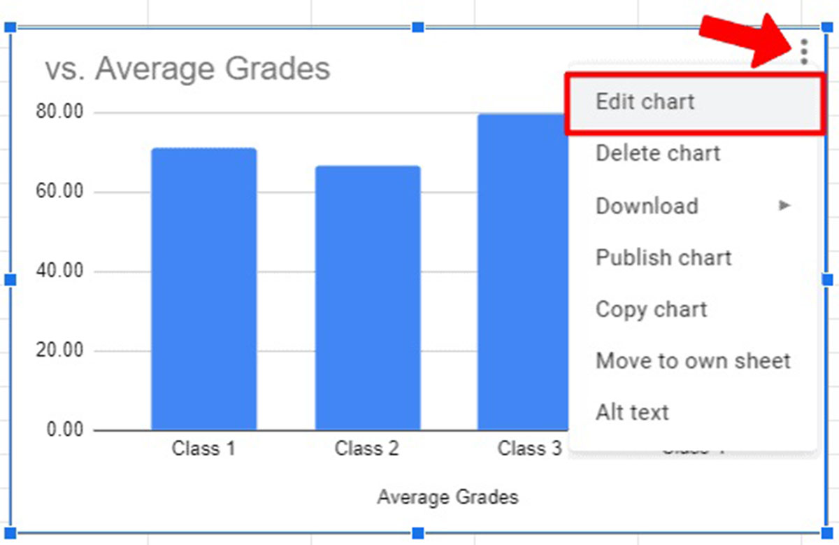
- Click on the bar graph to select it. Handles will appear around the graph, indicating that it is selected.
- Right-click on the bar graph and select the “Customize” option from the context menu. A customization sidebar will appear on the right side of the document.
- Browse through the customization options in the sidebar to make changes to the graph. You can modify the colors, fonts, labels, axis titles, and other visual elements.
- As you make changes, the bar graph in the document will update automatically, allowing you to preview the modifications in real-time.
Some of the customization options available in Google Sheets include:
- Colors: You can change the color of the bars, background, and font to match your desired aesthetics or brand colors.
- Font styles: Google Sheets allows you to customize the font type, size, and formatting of the text used in the graph.
- Axis settings: You can adjust the scaling, labeling, and positioning of the X and Y axes to make the graph more readable and informative.
- Data labels: You can enable or disable data labels that display the exact values of the bars within the graph.
- Legend: You can add a legend to the graph to indicate the different categories or groups represented by the bars.
By customizing the bar graph to suit your specific needs, you can effectively convey your data and engage your audience. Take the time to experiment with different customization options and find the settings that best showcase your data in a clear and visually appealing manner.
Now that you have customized the appearance of your bar graph, you can proceed to the next step of adding labels and titles to make it more informative. In the following steps, we will guide you through the process of adding labels and titles, changing the bar colors, and formatting the axis.
Step 5: Adding labels and titles
Adding labels and titles to your bar graph is an essential step in making it informative and easy to understand. Labels provide context and identify the different categories or groups represented by the bars, while titles give an overall description of what the graph is visualizing.
To add labels and titles to your bar graph in Google Sheets, follow these steps:
- Click on the bar graph to select it. Handles will appear around the graph, indicating that it is selected.
- Right-click on the bar graph and select the “Customize” option from the context menu. A customization sidebar will appear on the right side of the document.
- In the sidebar, navigate to the “Chart & axis titles” section.
- Enter a title in the “Chart title” field to give an overall description of the graph. This title should provide a clear and concise summary of what the graph represents.
- Scroll down to the “Horizontal axis” and “Vertical axis” sections to customize the labels for each axis.
- Enter a label in the “Title” field for each axis to describe the data being represented. For example, if the X-axis represents different product categories, you might enter “Product Category” as the label.
- Customize other options such as font style, size, and position to make the labels and titles visually appealing and readable.
By adding labels and titles to your bar graph, you provide clarity and make it easier for readers to understand the data being presented. The labels help them identify the different categories or groups represented by the bars, while the titles provide a brief context and purpose for the graph.
Remember to keep the labels and titles concise and descriptive. Avoid using jargon or overly technical terms that might confuse your audience. The goal is to provide clarity and make it easy for viewers to interpret the information presented.
Now that you have added labels and titles to your bar graph, you can proceed to the next step of changing the bar colors. In the following steps, we will guide you through the process of customizing the color scheme of the bars to make your graph visually appealing.
Step 6: Changing the bar colors
Changing the bar colors in your bar graph can add visual appeal and help emphasize different categories or groups within the data. Google Sheets provides easy-to-use customization options that allow you to modify the colors of the bars to suit your preferences or align with your branding.
To change the bar colors in your bar graph, follow these steps:
- Click on the bar graph to select it. Handles will appear around the graph, indicating that it is selected.
- Right-click on the bar graph and select the “Customize” option from the context menu. A customization sidebar will appear on the right side of the document.
- In the sidebar, navigate to the “Series” section.
- Click on the color picker next to “Fill color” to open the color options.
- Choose a color from the palette or enter a specific color code in the color picker. You can also use the “Custom” option to create a custom color.
- As you make changes, the bar colors in the graph will update accordingly, allowing you to preview the modifications in real-time.
Experiment with different color combinations to find the one that best suits your data and enhances the overall visual impact of your bar graph. Keep in mind that selecting colors that have good contrast and are visually appealing can help make your graph more engaging and easy to interpret.
When choosing colors, consider using a consistent color scheme throughout the graph to maintain consistency and continuity. This can help viewers identify and associate specific colors with certain categories or groups within the data.
Now that you have changed the bar colors, you can proceed to the next step of formatting the axis. In the following steps, we will guide you through the process of customizing the appearance of the X and Y axes to make your graph more visually appealing.
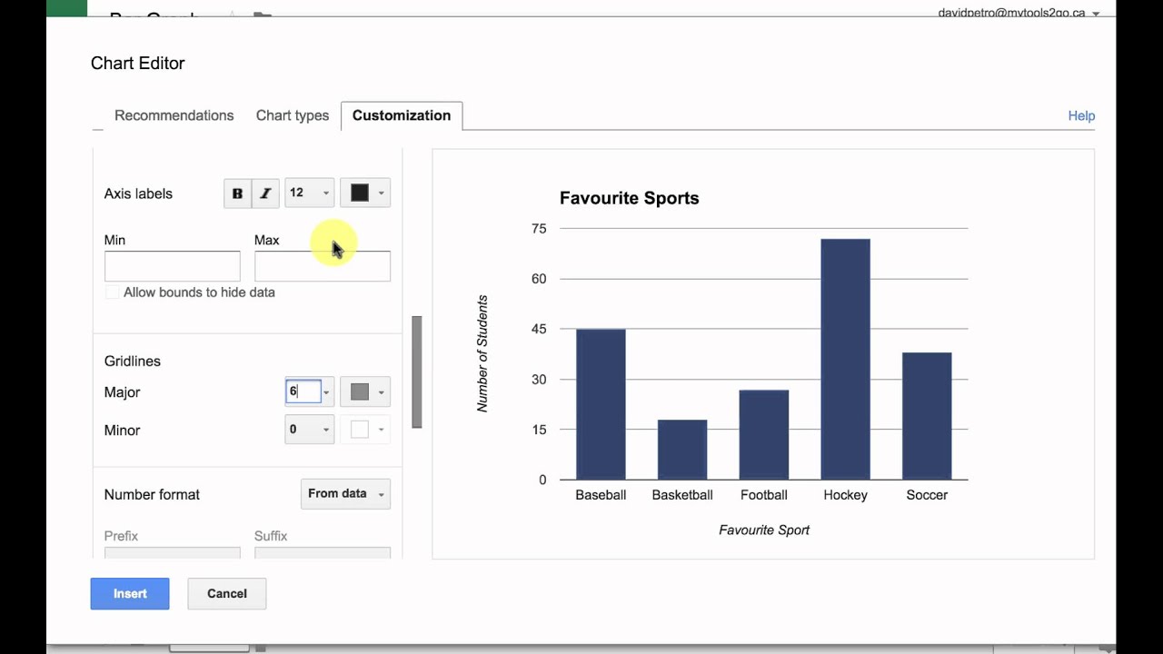
Step 7: Formatting the axis
Formatting the axis in your bar graph is essential for enhancing readability and ensuring that the data is presented accurately. Google Sheets provides various customization options that enable you to format the X and Y axes to suit your preferences and make your graph visually appealing.
To format the axis in your bar graph, follow these steps:
- Click on the bar graph to select it. Handles will appear around the graph, indicating that it is selected.
- Right-click on the bar graph and select the “Customize” option from the context menu. A customization sidebar will appear on the right side of the document.
- In the sidebar, navigate to the “Horizontal axis” or “Vertical axis” section, depending on the axis you want to format.
- Adjust the customization options available, such as the range, scaling, labeling, and positioning of the axis.
- You can modify the axis title, font style, size, and position to make it clearly visible and complement the overall design of your graph.
- Preview the changes in real-time as you make adjustments to ensure that the formatting aligns with your intentions.
When formatting the axis, consider the context of your data and the audience you are trying to communicate with. Ensure that the labels and values on the axis are clear and appropriately scaled for easy interpretation. Pay attention to font sizes and spacing to maximize readability.
Additionally, take advantage of the customization options for the axis title to provide additional context and clarity to your graph. A well-formatted and clearly labeled axis helps viewers understand the data being represented and makes your graph more informative.
Now that you have formatted the axis in your bar graph, you can proceed to the final step of adding annotations. In the following step, we will guide you through the process of adding annotations to provide additional insights and context to your graph.
Step 8: Adding annotations
Adding annotations to your bar graph can provide valuable insights and additional context to help viewers understand the data more effectively. Annotations allow you to highlight important points, explain unusual trends, or provide any other relevant information that enhances the interpretation of the graph.
To add annotations to your bar graph in Google Sheets, follow these steps:
- Click on the bar graph to select it. Handles will appear around the graph, indicating that it is selected.
- Right-click on the bar graph and select the “Customize” option from the context menu. A customization sidebar will appear on the right side of the document.
- In the sidebar, navigate to the “Annotations” section.
- Click on the “Add” button to create a new annotation.
- Enter the text of the annotation in the provided field. You can include any relevant information, explanations, or insights.
- Adjust the position, size, font style, and color of the annotation to make it visually appealing and readable.
- You can add multiple annotations by clicking the “Add” button again and repeating the process.
Annotations can be used to describe outlier data points, highlight significant changes, point out correlations, or provide any other relevant information that helps viewers interpret the graph accurately. They add a layer of context and narrative to the visualization, making it more meaningful and insightful.
When adding annotations, keep them concise and focused on the most important aspects of the data. Avoid overcrowding the graph with excessive text to maintain clarity and readability. Each annotation should provide a clear and concise explanation that adds value to the viewer’s understanding of the graph.
Now that you have added annotations to your bar graph, you have successfully completed all the steps necessary to create a visually appealing and informative graph in Google Sheets. Take some time to review and refine your graph, ensuring that it effectively communicates your data and insights to the intended audience.
Conclusion
Creating a bar graph in Google Sheets is a straightforward process that can greatly enhance the visual representation of your data. By following the step-by-step guide outlined in this tutorial, you can create professional-looking bar graphs that effectively communicate your information.
We started by setting up the data in Google Sheets, ensuring that it is organized and accurate. Then, we moved on to selecting the data range and inserting the bar graph into the document. We learned how to customize the appearance of the graph, including changing the bar colors, formatting the axis, and adding labels and titles.
Furthermore, we explored the importance of annotations to provide additional insights and context. By leveraging the customization options in Google Sheets, you can create bar graphs that suit your specific needs and preferences, making your data visually appealing and more meaningful to your audience.
Remember to keep the graph design clean and uncluttered, ensuring that the data is easy to interpret at a glance. Consider your audience and what information they need to derive from the graph, and customize accordingly.
Now that you have completed this tutorial, you are well-equipped to create impressive bar graphs in Google Sheets. Experiment with different features, styles, and layouts to find the best representation for your data, and continue refining your graphs to effectively communicate your insights.
So, go ahead and unleash the power of bar graphs in Google Sheets to present your data with clarity, impact, and visual appeal!