Introduction
Google Sheets is a powerful spreadsheet software that allows users to organize, analyze, and visualize data. One useful feature of Google Sheets is the ability to switch axis, which can be handy when you need to change the orientation of your data for easier analysis or presentation purposes.
Switching axis in Google Sheets refers to the process of rearranging the rows and columns of a dataset. By switching the axis, you can transform a horizontal dataset into a vertical one, or vice versa, making it easier to compare and analyze data.
This tutorial will guide you through the step-by-step process of switching axis in Google Sheets. We will explore three different methods that will allow you to achieve this functionality with ease. Whether you need to flip your data for better visualization or reorganize it for a specific analysis, these methods will enable you to manipulate your data efficiently.
Whether you are a professional data analyst, a student working on a project, or an individual managing personal finances, learning how to switch axis in Google Sheets can greatly enhance your data management skills and make your tasks more efficient.
So, let’s dive in and explore the various methods available to switch axis in Google Sheets!
Why would you want to switch axis in Google Sheets?
Switching axis in Google Sheets can offer several benefits and advantages in data analysis and presentation. Here are a few reasons why you might want to switch axis:
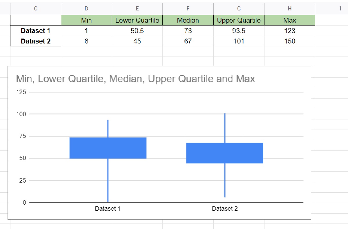
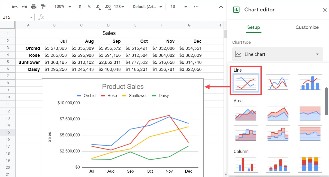
- Better data visualization: Switching axis allows you to change the orientation of your data, making it easier to visualize and interpret. By rearranging rows and columns, you can create charts, graphs, and visual representations that present your data in a more meaningful way.
- Comparing data more efficiently: Sometimes, it is easier to compare data when it is presented in a different orientation. By switching axis, you can reorganize your data to make comparisons, identify trends, and analyze patterns more effectively.
- Cleaning up messy datasets: If you have a dataset where certain values are spread across multiple rows or columns, switching axis can help you clean up and reorganize the data. This can lead to a more structured and organized dataset, making it easier to perform calculations and analysis.
- Adapting to different report formats: In some cases, you may need to present your data in a specific format or layout for reporting purposes. Switching axis allows you to transform your data to fit the required report format, ensuring that it is visually appealing and easy to understand.
- Facilitating data analysis: Switching axis can simplify data analysis by allowing you to manipulate the data in a way that suits your needs. Whether you are performing calculations, sorting, or filtering, switching axis can provide a more convenient and structured format for analysis.
By understanding the advantages of switching axis, you can harness the full potential of Google Sheets and optimize your data management and analysis processes.
Step-by-step guide on how to switch axis in Google Sheets
Switching axis in Google Sheets can be accomplished using various methods, depending on your specific needs. In this section, we will provide you with a detailed step-by-step guide on three different methods for switching axis in Google Sheets.
Method 1: Using the TRANSPOSE function
- Select an empty cell where you want your transposed data to start.
- Type
=TRANSPOSE(range), replacingrangewith the range of cells you want to transpose. - Press
Ctrl+Shift+EnterorCommand+Shift+Enter(on Mac) to enter the formula as an array formula. - You will now see your data transposed, with rows becoming columns and columns becoming rows.
Method 2: Using Copy and Paste Special
- Select the range of cells you want to switch axis.
- Right-click on the selected range and choose Copy.
- Right-click on an empty cell where you want your transposed data to start and choose Paste Special.
- In the Paste Special dialog box, check the Transpose box and click OK.
- Your data will now be transposed, with rows becoming columns and columns becoming rows.
Method 3: Using the Pivot Table feature
- Select the range of cells you want to pivot.
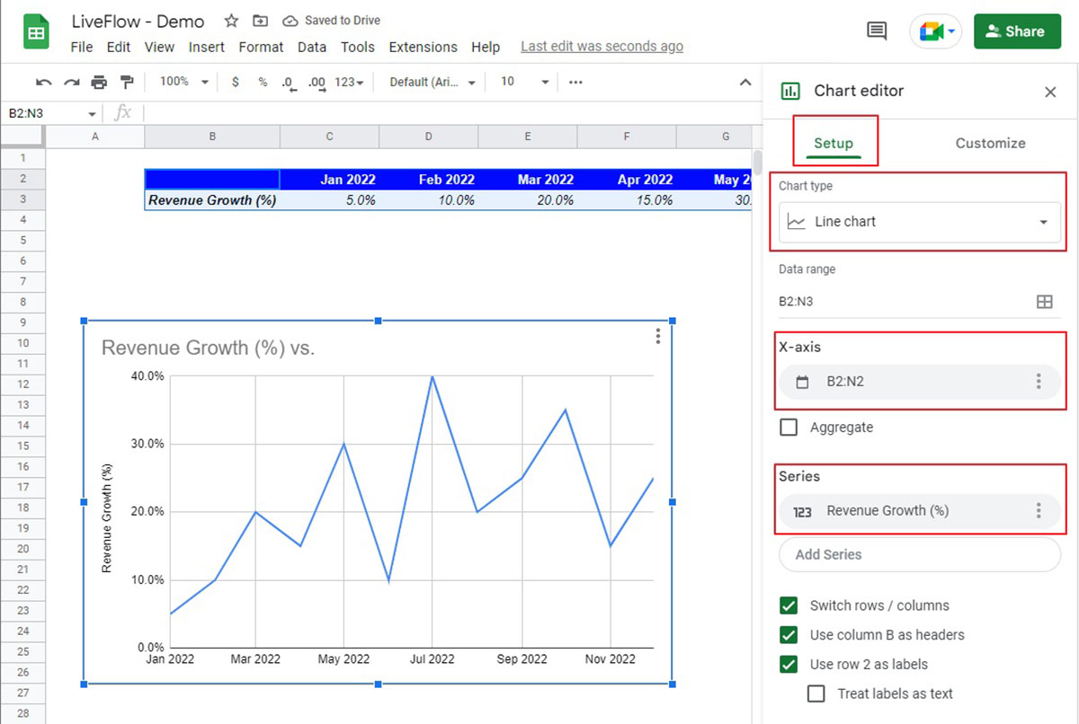
- Go to the Data menu and choose Pivot Table.
- In the Pivot Table Editor sidebar, drag the column that you want to become rows to the Rows field, and the column that you want to become columns to the Columns field.
- Now you have your data switched axis in a pivot table format.
By following these step-by-step instructions, you can easily switch the axis of your data in Google Sheets using any of the three methods described above. Choose the method that suits your requirements and start manipulating your data in a new orientation.
Method 1: Using the TRANSPOSE function
One of the simplest and most straightforward methods to switch axis in Google Sheets is by using the TRANSPOSE function. This function allows you to transpose a range of cells, meaning it will convert rows into columns and vice versa.
Follow these steps to switch axis using the TRANSPOSE function:
- Select an empty cell where you want your transposed data to start. This cell should be outside the range of the original data.
- Type
=TRANSPOSE(range)into the selected cell, replacingrangewith the range of cells you want to transpose. For example, if your data is in cells A1:D4, you would enter=TRANSPOSE(A1:D4). - Instead of pressing Enter to finalize the formula, press
Ctrl+Shift+EnterorCommand+Shift+Enter(on Mac). This will enter the formula as an array formula, which is necessary for the TRANSPOSE function to work properly. - You will now see your data transposed, with rows becoming columns and columns becoming rows, starting from the cell where you entered the formula.
The TRANSPOSE function is particularly useful when you need to switch axis for a specific range of cells. It can be used to quickly rearrange your data and make it more suitable for further analysis or presentation.
Remember that if your original data changes, the transposed data will not automatically update. You will need to re-enter the TRANSPOSE formula to reflect any changes in the original data.
This method is especially beneficial when dealing with smaller datasets or when you want to manually control the transposed data’s position on the sheet. It offers flexibility and allows you to switch the axis with just a few simple steps.
Method 2: Using Copy and Paste Special
Another effective method to switch axis in Google Sheets is by using the Copy and Paste Special functionality. This method allows you to copy a range of cells and paste it in a new location while transposing the data.
Follow these steps to switch axis using Copy and Paste Special:
- Select the range of cells that you want to switch axis.
- Right-click on the selected range and choose Copy from the context menu, or press
Ctrl+C(Windows) orCommand+C(Mac) to copy the data. - Now, right-click on an empty cell where you want your transposed data to start. Alternatively, you can select the desired cell and use the paste shortcut (
Ctrl+VorCommand+V) to paste the data. - In the context menu that appears, choose Paste Special.
- In the Paste Special dialog box, check the Transpose box, and then click OK.
- Your data will now be transposed, with rows becoming columns and columns becoming rows, starting from the cell where you pasted the data.
Using the Copy and Paste Special method is especially useful when you have a large dataset or want to quickly switch the axis without using formulas. It offers a simple and intuitive way to rearrange your data with just a few clicks.
It’s important to note that when you use Copy and Paste Special, the original data will remain in its original location. This means that any changes made to the transposed data will not affect the original data, and vice versa.
By using this method, you can easily switch the axis of your data in Google Sheets and quickly reorganize it for better analysis or presentation purposes.
Method 3: Using the Pivot Table feature
The Pivot Table feature in Google Sheets provides an efficient method to switch axis and analyze data in a more organized and summarized format. This method is particularly effective when dealing with large datasets that require comprehensive analysis.
Follow these steps to switch axis using the Pivot Table feature:
- Select the range of cells that you want to pivot.
- Go to the Data menu at the top of the Google Sheets interface and choose Pivot Table from the dropdown.
- A Pivot Table Editor sidebar will appear on the right side of the screen.
- In the Pivot Table Editor sidebar, drag the column that you want to become rows to the Rows field.
- Next, drag the column that you want to become columns to the Columns field.
- You can also add additional fields to the Values field if you want to display aggregated values.
- As you drag and drop the fields, your data will automatically rearrange, switching the axis to the desired layout.
The Pivot Table feature allows you to summarize and group your data based on different criteria, providing a comprehensive view of your dataset. It enables you to switch axis and analyze data from multiple dimensions, making it easier to identify trends, patterns, and relationships.
Furthermore, you can customize the Pivot Table layout by rearranging the rows, columns, and values fields according to your specific analysis requirements.
Using the Pivot Table feature is particularly useful when you need to aggregate data, perform calculations, or generate reports based on different combinations of information.
By utilizing this method, you can effectively switch the axis of your data in Google Sheets and gain valuable insights from your dataset.
Tips and tricks for switching axis effectively
Switching axis in Google Sheets can greatly enhance your data analysis and presentation capabilities. Here are some helpful tips and tricks to consider when switching axis:
- Choose the right method: Consider the size and complexity of your dataset when choosing the method to switch axis. The TRANSPOSE function is ideal for smaller datasets, while Copy and Paste Special and Pivot Tables are better suited for larger datasets or when you need more control over the transposed data.
- Plan your data arrangement: Before switching axis, think about how you want your data to be organized and presented. Having a clear plan will ensure that the transposed data serves your analysis or presentation goals effectively.
- Keep original data intact: When switching axis, it’s crucial to keep the original data intact. This allows you to maintain a reference for future analysis and ensures that any changes made to the transposed data won’t affect the original dataset.
- Check for data inconsistencies: After switching axis, double-check your data for any inconsistencies or errors. Transposing data can sometimes lead to unintended changes or formatting issues, so it’s important to verify the accuracy of the transposed data.
- Utilize formatting options: Take advantage of Google Sheets’ formatting options to enhance the visual appeal of your transposed data. Apply appropriate cell formatting, create charts or graphs, and use conditional formatting to highlight important information.
- Automate data updates: If your dataset is dynamic and changes frequently, consider automating the process of switching axis. Explore tools and scripts in Google Sheets that can help you streamline this process, allowing for seamless updates to the transposed data.
- Document your process: To ensure consistency and facilitate future analysis, document the steps you followed to switch axis. This will help you recreate the process or share it with others who may need to work with the transposed data in the future.
By following these tips and tricks, you can effectively switch axis in Google Sheets and optimize your data analysis workflows. Experiment with different methods, remain organized, and leverage the features available in Google Sheets to make the most out of your transposed data.
Conclusion
Switching axis in Google Sheets is a valuable skill that can enhance your data analysis and presentation capabilities. Whether you need to rearrange rows and columns for better visualization, compare data more efficiently, or clean up messy datasets, the methods we covered in this guide offer simple and effective ways to achieve your goals.
We explored three different methods for switching axis: using the TRANSPOSE function, Copy and Paste Special, and the Pivot Table feature. Each method has its own advantages and is suitable for different scenarios and dataset sizes.
By using the TRANSPOSE function, you can easily rearrange a range of cells, converting rows into columns and vice versa. Copy and Paste Special provide a quick way to transpose data without using formulas, making it ideal for larger datasets.
The Pivot Table feature, on the other hand, allows for comprehensive data analysis by summarizing and grouping information based on different criteria. It offers flexibility and customization options to create meaningful insights from complex datasets.
Throughout the guide, we provided tips and tricks to help you switch axis effectively. Planning your data arrangement, keeping the original data intact, and utilizing formatting options can optimize the outcome of your efforts. Additionally, automating data updates and documenting your process can streamline future analysis workflows.
Now that you have learned how to switch axis in Google Sheets, you can apply this knowledge to various scenarios, including data analysis, report generation, and organizing your information effectively.
So, start leveraging the power of Google Sheets and explore the different methods to switch axis. By doing so, you will enhance your data management skills and improve your ability to derive valuable insights from your datasets.