Introduction
Welcome to this tutorial on how to add a line of best fit in Google Sheets. Google Sheets is a powerful spreadsheet tool that offers various features to analyze and visualize data. One such feature is the ability to add a line of best fit, which is a straight line that represents the trend or relationship between two sets of data points.
Adding a line of best fit in Google Sheets can be useful when you want to identify the overall direction and pattern of your data. It can help you evaluate the strength and direction of the relationship between variables and make predictions based on the data trends.
Whether you are analyzing sales figures, tracking progress, or conducting scientific experiments, adding a line of best fit can provide valuable insights into your data. This tutorial will guide you through the steps to add and customize a line of best fit in Google Sheets.
Before we begin, make sure you have a Google Sheets document with the data you want to analyze. If you don’t have one yet, you can easily create a new spreadsheet or open an existing one. Once you have your spreadsheet ready, let’s jump into the steps!
Step 1: Accessing Google Sheets
To add a line of best fit in Google Sheets, the first step is to access your Google Sheets account. Follow these simple steps to get started:
- Open your preferred web browser and go to Google Sheets.
- If you already have a Google account, sign in by clicking on the “Sign In” button located at the top right corner of the page. If you don’t have a Google account, you can create one by clicking on the “Create account” button.
- Once signed in, you will be redirected to the Google Sheets homepage.
- From the homepage, you can choose to create a new spreadsheet by clicking on the “+ Blank” button or open an existing spreadsheet by selecting it from the “Recent spreadsheets” section.
Google Sheets is a cloud-based tool, which means you can access your spreadsheets from anywhere with an internet connection. It also allows for real-time collaboration, so you can work on your spreadsheets simultaneously with team members or share the document with others for viewing or editing.
By accessing Google Sheets, you are now ready to start adding a line of best fit to your data. In the following steps, we will guide you through the process of selecting the data, inserting a chart, and customizing it to include the line of best fit. Let’s move on to step 2!
Step 2: Selecting Data
Once you have accessed your Google Sheets account, the next step is to select the data that you want to include in your chart and add a line of best fit. Follow these steps to select your data:
- Open the spreadsheet containing the data you want to analyze.
- Click and drag your mouse to select the range of cells that contain the data you want to include in your chart. For example, if your data is in columns A and B, you can select the range A1:B10.
- Make sure to include the column headers, as they will be used as labels in your chart.
Google Sheets also allows you to select non-adjacent ranges of cells if your data is not in a continuous range. To do this, hold down the Ctrl key (Windows) or Command key (Mac) and click on the individual cells or ranges you want to include in your selection.
Once you have selected your data, you are now ready to insert a chart in Google Sheets. In the next step, we will guide you through the process of inserting a chart and customizing it to suit your needs. Let’s move on to step 3!
Step 3: Inserting Chart
After selecting your data in Google Sheets, the next step is to insert a chart to visualize your data. Follow these steps to insert a chart:
- With your selected data still highlighted, click on the “Insert” menu at the top of the Google Sheets toolbar.
- A dropdown menu will appear. Select “Chart” from the options.
- A chart editor sidebar will appear on the right side of your screen. Choose the type of chart you want to create. You can select options like “Column Chart,” “Line Chart,” or “Bar Chart,” depending on the visualization that best suits your data.
- Click on the chart type to insert it into your spreadsheet.
Google Sheets will automatically generate a basic chart using the selected data. The chart will appear in your spreadsheet, and you can adjust its size and position as needed. You will also see a chart editor sidebar that allows you to customize various aspects of the chart, including titles, axis labels, and data ranges.
Great! Now that you have inserted a chart in Google Sheets, let’s move on to the next step to add a line of best fit and enhance the visualization of your data.
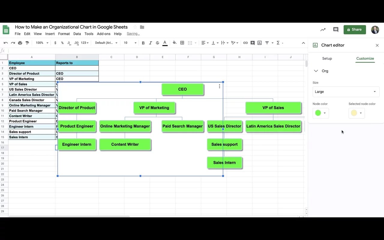
Step 4: Customizing Chart
Once you have inserted a chart in Google Sheets, you can customize it to enhance its appearance and make it more insightful. Follow these steps to customize your chart:
- Click on the chart to select it. You will notice that the chart editor sidebar appears on the right side of your screen.
- In the chart editor sidebar, you can modify various elements of the chart, such as the title, axis labels, data labels, and colors.
- To change the chart title, click on the “Chart title” section in the sidebar and enter a new title that accurately represents the data being visualized.
- To customize the axis labels, click on the “Axis” tab in the sidebar. Here, you can modify the labels for the X-axis and Y-axis, as well as the intervals and scaling.
- To add or remove data labels, click on the “Data labels” tab in the sidebar. You can choose to display labels for each data point, series, or total values.
- To change the colors of your chart, click on the “Customize” tab in the sidebar. Here, you can modify the colors of the chart elements, such as bars, lines, or data points.
By customizing the chart, you can highlight specific data points, emphasize trends, and make your visualization more visually appealing. Take some time to experiment with different options and find the combination that best presents your data.
Now that you have customized your chart, it’s time to add a line of best fit. In the next step, we will guide you through the process of adding and editing a line of best fit in Google Sheets. Let’s move on to step 5!
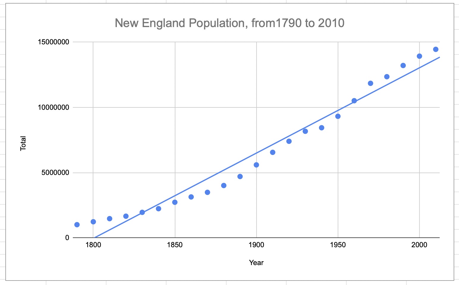
Step 5: Adding a Line of Best Fit
Adding a line of best fit in Google Sheets allows you to visualize the overall trend or relationship between two sets of data points. Follow these steps to add a line of best fit to your chart:
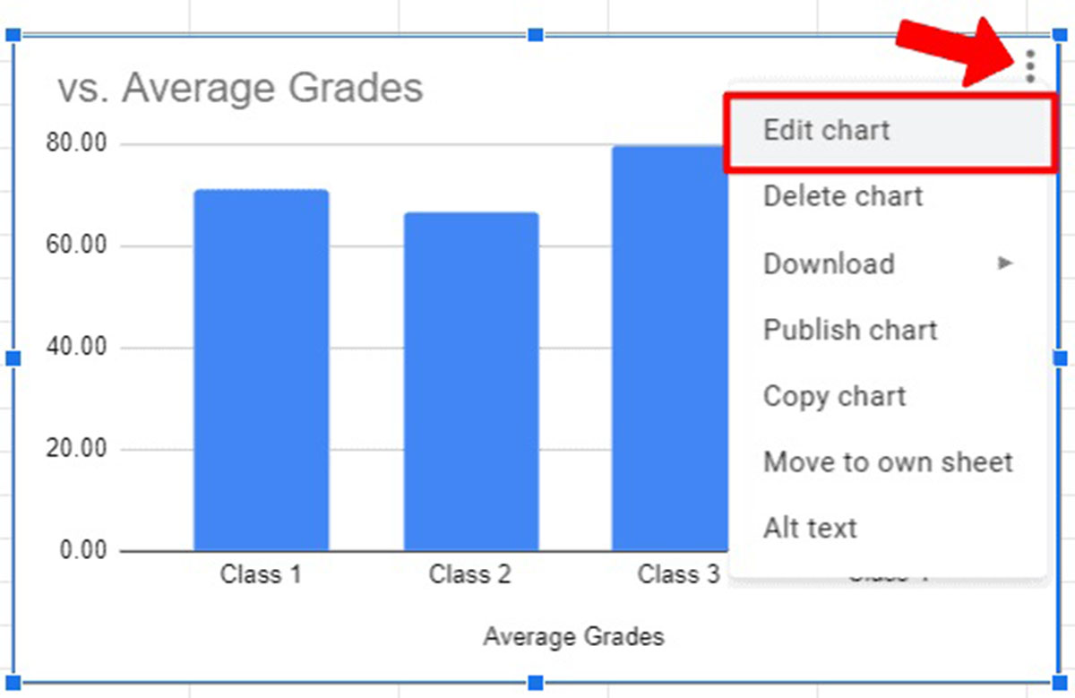
- Click on the chart to select it. The chart editor sidebar should appear on the right side of your screen.
- In the chart editor sidebar, click on the “Customize” tab.
- Scroll down to find the “Trendline” section. Here, you can enable the trendline for your chart by clicking on the toggle switch.
- By default, Google Sheets will add a linear trendline to your chart. However, you can choose different types of trendlines, such as exponential, logarithmic, polynomial, or moving average, by clicking on the “Trendline type” dropdown menu.
- Once you have selected the trendline type, Google Sheets will automatically calculate and add the line of best fit to your chart.
The line of best fit represents the trend or relationship between your data points. It helps you identify the direction and strength of the correlation, which can be useful for making predictions or analyzing data trends.
Remember that the line of best fit is based on mathematical calculations and assumes that there is a linear relationship between the variables. If your data suggests a different type of relationship, such as exponential or logarithmic, you can choose the appropriate trendline type to better represent your data.
Now that you have successfully added a line of best fit to your chart, let’s move on to step 6 to learn how to edit and customize the line to suit your needs.
Step 6: Editing Line of Best Fit
After adding a line of best fit to your chart in Google Sheets, you have the option to edit and customize it further. Follow these steps to modify the line of best fit:
- Click on the chart to select it. The chart editor sidebar should appear on the right side of your screen.
- In the chart editor sidebar, click on the “Customize” tab.
- Scroll down to find the “Trendline” section. Here, you will see options to customize the appearance and behavior of the line of best fit.
- To change the color of the line, click on the “Line color” dropdown menu and select a different color.
- To adjust the thickness or style of the line, click on the “Line style” dropdown menu and choose the desired options.
- You can also modify the transparency of the line by adjusting the “Transparency” slider.
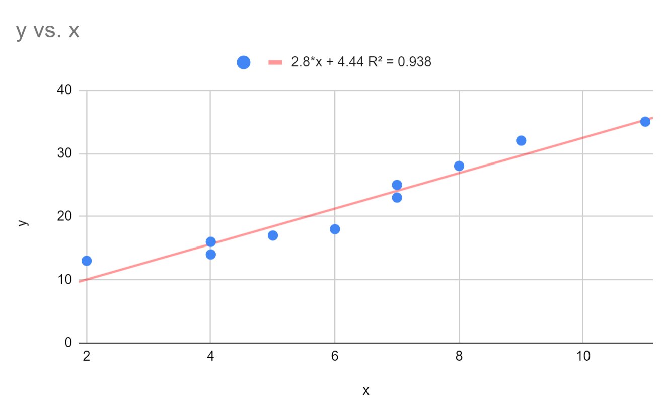
Additionally, Google Sheets allows you to enable or disable the display of the equation and the R-squared value of the trendline. The equation represents the mathematical equation of the line, while the R-squared value indicates the goodness of fit, or how well the line represents the data points.
By editing the line of best fit, you can make it more visually appealing and align it with your preferred chart aesthetics. You can also adjust its behavior to emphasize specific aspects of your data or remove the equation and R-squared value if they are not relevant to your visualization.
Take some time to experiment with different customization options and find the settings that best suit your needs. Now that you have edited the line of best fit, let’s move on to step 7 to learn how to remove it if needed.
Step 7: Removing Line of Best Fit
If you have added a line of best fit to your chart in Google Sheets and later decide that you no longer need it, you can easily remove it. Follow these simple steps to remove the line of best fit:
- Click on the chart to select it. The chart editor sidebar should appear on the right side of your screen.
- In the chart editor sidebar, click on the “Customize” tab.
- Scroll down to the “Trendline” section.
- Toggle off the trendline by clicking on the toggle switch next to “Trendline”.
Once you have disabled the trendline, the line of best fit will disappear from your chart.
Removing the line of best fit can be useful if you no longer require it or if it is not relevant to your current data analysis. It allows you to focus on other aspects of your chart or make room for additional elements or visualizations.
Remember, removing the line of best fit does not delete or affect your original data. You can always add the line of best fit again later if needed.
Now that you know how to remove the line of best fit, you have completed all the necessary steps to work with a line of best fit in Google Sheets. Feel free to explore further customization options and chart features to enhance your data visualization.
Conclusion
Adding a line of best fit in Google Sheets can greatly enhance your data analysis and visualization. By following the steps outlined in this tutorial, you can easily insert a chart, select the data you want to analyze, and customize the chart to suit your needs. The inclusion of a line of best fit helps to identify trends and relationships between variables, providing valuable insights into your data.
Google Sheets offers a range of trendline options, allowing you to choose the best fit for your data. Whether it’s a linear, exponential, logarithmic, polynomial, or moving average trendline, you can select the appropriate type to accurately represent your data and analyze the correlation between variables.
Furthermore, the ability to customize the appearance and behavior of the line of best fit allows you to create visually appealing and informative charts. You can modify the line’s color, thickness, style, and even choose whether or not to display the equation and R-squared value.
If at any point you no longer need the line of best fit, you can easily remove it without affecting your original data. This flexibility allows you to focus on other aspects of your chart or make room for other visualizations.
By utilizing the features and steps outlined in this tutorial, you can effectively utilize Google Sheets to add a line of best fit and gain deeper insights into your data. Whether you’re analyzing sales data, tracking trends, or conducting scientific experiments, the line of best fit is a valuable tool for understanding the relationship and direction of your data points.
Now that you have mastered the process of adding and customizing a line of best fit, you can apply this knowledge to analyze and visualize your data with greater accuracy and clarity in Google Sheets.