Introduction
Welcome to this guide on how to create an org chart in Google Sheets! An organizational chart is a visual representation of a company’s structure, outlining the relationships and hierarchy between different positions and departments. It serves as a useful tool for understanding the organization’s hierarchy, facilitating communication, and providing clarity on roles and responsibilities.
Whether you’re a small business owner, a team leader, or an HR professional, Google Sheets provides a convenient and accessible platform to create and manage org charts. With its collaborative features and customizable options, you can easily create a visually appealing org chart that suits your organization’s needs.
In this guide, we will walk you through the process of creating an org chart in Google Sheets, step by step. We will cover everything from setting up the org chart template to formatting and customizing the layout. By the end of this guide, you will have the skills to create professional-looking org charts that convey a clear representation of your organization’s structure.
So let’s dive in and get started with creating your own org chart in Google Sheets!
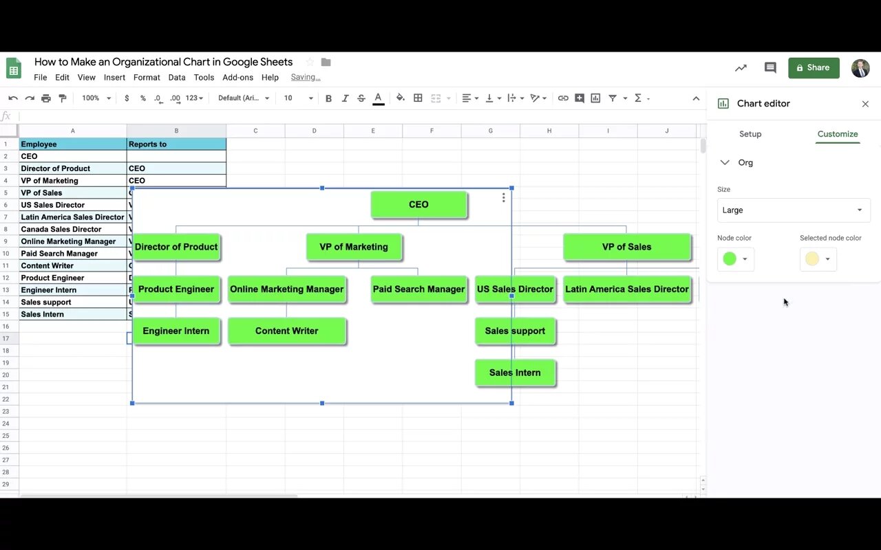
Creating the Org Chart Template
The first step in creating an org chart in Google Sheets is to set up the template. This template will serve as the foundation for your org chart, providing the structure and layout for the chart. Here’s how you can create the org chart template:
- Open a new Google Sheets document: Start by opening Google Sheets and creating a new blank document. This will be where you will build your org chart.
- Add column headers: In the first row of your spreadsheet, add the necessary column headers for your org chart. Typical headers include ‘Name,’ ‘Position,’ ‘Department,’ and ‘Reporting To.’ You can customize these headers based on the specific information you want to include.
- Set up the hierarchy: In the ‘Reporting To’ column, start by entering the top-level position or the CEO of your organization. Leave the cells blank under the ‘Reporting To’ column for now, as you will fill in this information later when entering employee data.
- Format the template: You can now format the template to make it visually appealing. You can change the font style, size, and color, adjust the column widths to accommodate the text, and add any additional formatting that suits your organization’s branding or style.
Remember, the template is the backbone of your org chart, so spending some time to customize and design it to reflect your organization’s aesthetics and preferences is important. Once you have set up the template, you can move on to entering the employee data and building the org chart.
Entering Employee Data
Once you have created the org chart template in Google Sheets, the next step is to enter the employee data. This involves filling in the relevant information for each employee in your organization. Here’s how you can enter the employee data:
- Start with the top-level position: Begin by entering the details for the top-level position or the CEO. Fill in the employee’s name, position, department, and leave the ‘Reporting To’ field blank, as this is the highest position in the organization.
- Fill in subsequent positions: Move down the hierarchy and enter the details for the remaining positions in the organization. For each employee, enter their name, position, department, and specify who they report to in the ‘Reporting To’ field. This establishes the relationships and hierarchy within the organization.
- Add additional columns: Depending on your organization’s requirements, you can add additional columns to include other relevant information, such as contact details, email addresses, or employee IDs. Simply insert additional columns next to the existing ones and label them accordingly.
As you enter the employee data, Google Sheets will automatically adjust the size of the cells to fit the content. You can also apply formatting options to enhance the readability and visual appeal of the org chart. For instance, you can bold the headers, use different font colors for different departments, or apply conditional formatting to highlight specific positions.
Continue entering the employee data until you have included all the relevant positions in your organization. Remember to save your progress regularly as you go along. Once you have entered all the employee data, you are ready to move on to formatting and designing the org chart layout.
Formatting the Org Chart
After entering the employee data in Google Sheets, the next step is to format the org chart to make it visually appealing and easy to understand. Here are some key formatting options you can consider:
- Adjust the row height: By default, Google Sheets automatically adjusts the row height based on the content. However, you can manually adjust the row height to ensure that all the text is visible without any truncation or overlapping.
- Apply background colors: To differentiate between departments or positions, you can apply different background colors to specific rows or cells. This can make the org chart visually appealing and help to highlight important sections or individuals.
- Use fonts and text styles: Experiment with different font styles and sizes to make the org chart easy to read. It’s a good idea to use a consistent font across the entire chart and consider using bold or italicized text for important information.
- Add borders: Adding borders to cells can help visually separate different sections or positions in the org chart. You can apply borders to specific cells or even draw lines to create a clear visual hierarchy.
- Merge cells: If a position or department has multiple employees, you can merge cells to create a visual representation of a group. This can help reduce clutter and make the org chart more organized.
Remember, the goal of formatting the org chart is to make it visually appealing and easy to interpret. Consider the branding and style guidelines of your organization when selecting colors, fonts, and other formatting options.
Once you have formatted the org chart to your satisfaction, it’s time to move on to designing the layout and adding connecting lines to visually represent the reporting relationships.
Designing the Org Chart Layout
Designing the layout of your org chart in Google Sheets is an essential step to ensure clarity and ease of understanding. A well-designed layout can help visually depict the reporting relationships and the overall structure of your organization. Here are some tips to consider when designing the org chart layout:
- Organize positions horizontally or vertically: Decide whether you want to organize your org chart horizontally or vertically. Horizontal layout works well for small organizations, while vertical layout is suitable for larger organizations with many positions.
- Use indentation or alignment: To represent hierarchy, indenting or aligning positions is effective. Hierarchically superior positions should be aligned to the left or top, while subordinate positions should be indented or aligned to the right or below.
- Arrange positions symmetrically: Create a balanced and visually pleasing layout by arranging positions symmetrically. This helps create a professional and organized org chart.
- Group positions by departments: If your org chart includes multiple departments, consider grouping positions of each department together. This makes it easier to identify and understand departmental structures.
- Consider the chart size: Adjust the size of the org chart to fit all the positions and departments without overwhelming the layout. You may need to adjust the column widths or row heights to ensure everything fits comfortably.
Remember, the main goal of designing the layout is to make the org chart visually clear and easy to interpret. Experiment with different layout options to find the one that best suits your organization and its unique structure.
Once you have finalized the layout, it’s time to add connecting lines to represent the reporting relationships and visually clarify the hierarchy within the org chart.
Adding Connecting Lines
Adding connecting lines to your org chart in Google Sheets is a crucial step in visually representing the reporting relationships and the flow of authority within your organization. These lines provide a clear and intuitive understanding of the hierarchy. Here’s how you can add connecting lines to your org chart:
- Select the appropriate line tool: Google Sheets offers various line tools that you can use to draw connecting lines. Click on the ‘Insert’ menu and select the ‘Line’ option.
- Draw lines between positions: Starting from the top-level position (CEO) or any other position you choose, click and drag the line tool to draw a line connecting the superior position and the subordinate position. Repeat this process for all reporting relationships in your org chart.
- Customize the lines: You can customize the lines in terms of color, weight, style, and arrowheads. Experiment with different line options to make them visually appealing and easy to follow.
The connecting lines play a vital role in showcasing the reporting relationships and hierarchy within the org chart. They help users quickly understand the flow of authority and the chain of command. Take your time to ensure that the lines are accurately placed and that they align with the positions and departments.
By adding these connecting lines, your org chart will be even more informative and user-friendly. However, don’t forget to put the finishing touches on your org chart by customizing the colors, fonts, and other design elements.
Next, we will explore how you can further customize your org chart by choosing colors and fonts that align with your organization’s branding and style.
Customizing Colors and Fonts
Customizing the colors and fonts in your org chart is a great way to add a touch of personalization and align it with your organization’s branding and style. Google Sheets offers a range of customization options that allow you to make your org chart visually appealing and consistent with your organization’s aesthetics. Here’s how you can customize the colors and fonts:
- Choose a color scheme: Select a color scheme that reflects your organization’s branding or preferences. You can apply different colors to different departments or positions to visually differentiate them. To change the color of a cell or a range of cells, select the desired cells and use the fill color tool.
- Experiment with fonts: Google Sheets provides a variety of fonts to choose from. Find a font that is legible and visually pleasing. Consider using a consistent font throughout the org chart to maintain a professional look. Use the font menu to select the desired font for your org chart.
- Apply text formatting: Enhance the readability of your org chart by applying text formatting options such as bold, italic, or underline. You can use these formatting options to emphasize important information or highlight specific positions.
- Consider conditional formatting: You can use conditional formatting in Google Sheets to automatically apply specific colors or font styles based on certain criteria. For example, you can highlight positions with certain job titles or department names in a different color.
Remember to strike a balance between customization and clarity. While it’s important to add your organization’s branding, it’s equally crucial to ensure that the org chart remains easy to read and understand.
Once you have customized the colors and fonts to your liking, take a moment to review and fine-tune your org chart. Make sure that the colors and fonts enhance the overall visual appearance and convey the desired information effectively.
Now that your org chart is complete, it’s time to explore the options for exporting or printing it for sharing within your organization.
Exporting or Printing the Org Chart
Once you have created and customized your org chart in Google Sheets, you may want to share it with others or use it in presentations or reports. Google Sheets provides several options for exporting or printing your org chart. Here are the ways you can export or print your org chart:
- Export as PDF: To save your org chart as a PDF file, go to the ‘File’ menu and select the ‘Download’ option. Choose the ‘PDF Document’ format, and Google Sheets will convert your org chart into a PDF file that you can save and share with others.
- Print directly from Google Sheets: If you prefer a physical copy of your org chart, you can easily print it directly from Google Sheets. Go to the ‘File’ menu, select the ‘Print’ option, and configure the print settings according to your preferences. Ensure that you select the appropriate paper size and orientation to fit the org chart properly on the printed page.
- Take a screenshot: If you only need a visual reference of your org chart and don’t require a digital or physical file, you can capture a screenshot. Use the appropriate screenshot tool for your operating system or a browser extension to capture the org chart from Google Sheets. You can then save and share the screenshot as needed.
- Embed in presentations or reports: If you want to include your org chart in a presentation or report, you can copy and paste it directly from Google Sheets into your preferred document editor or slide presentation software. Ensure that the formatting and alignment remain intact during the transfer.
Choose the method that best suits your needs and the intended use of the org chart. Consider factors such as file formats, portability, and the level of customization required when making your decision.
Before finalizing the exporting or printing process, double-check the org chart for any errors or inconsistencies. Making sure the org chart is accurate and up to date will help you present your organization’s structure effectively.
Now that you have successfully created, customized, and exported or printed your org chart, you have a valuable tool for communicating your organization’s structure and hierarchy.
Conclusion
Creating an org chart in Google Sheets can be a straightforward and effective way to visually represent your organization’s structure and hierarchy. By following the steps outlined in this guide, you can create a professional and informative org chart that accurately represents the relationships between positions and departments.
Starting with setting up the org chart template and entering employee data, you can customize the layout, format the chart, and add connecting lines to clarify reporting relationships. By customizing colors and fonts, you can align the org chart with your organization’s branding and style. Finally, you have the option to export or print the org chart for sharing or inclusion in presentations or reports.
Remember that the org chart should be kept up to date as your organization evolves and as new positions or departments are introduced. Regularly reviewing and updating the org chart ensures that it remains a valuable tool for communication and clarity within your organization.
Now that you have the knowledge and skills to create an org chart in Google Sheets, go ahead and start creating your own org charts. Whether you’re a small business owner, a team leader, or an HR professional, a well-designed org chart can significantly contribute to understanding your organization’s structure and fostering effective communication.
So, embrace the power of Google Sheets and create org charts that bring clarity, alignment, and insight to your organization’s hierarchy.