


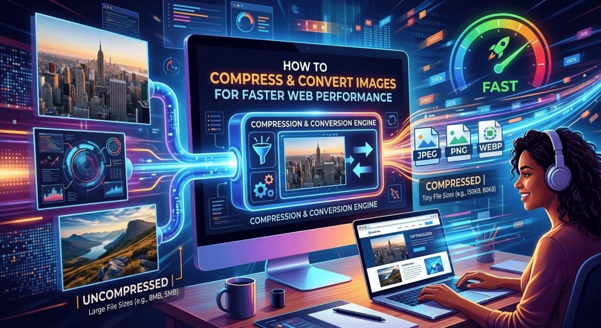
Slow websites lose visitors fast. Most people don’t realize the culprit is hiding in plain sight: oversized image files. A single uncompressed JPG from a modern smartphone camera can weigh 8MB or more. Multiply that across a page with a hero banner, a dozen product photos, and a handful of thumbnails, and you’ve quietly built a site that crawls. The fix isn’t complicated, but it does require understanding what’s actually happening under the hood, and then taking a few targeted steps to correct it.
Key Points:
- Unoptimized image files are one of the leading causes of slow load times, often adding several seconds to a page’s response before a user sees anything.
- JPG compression reduces file size significantly without visible quality loss when done with the right tool and settings.
- Matching image dimensions to the platform or screen size you’re targeting matters just as much as trimming raw file weight.
Why Image File Size Is a Bigger Problem Than You Think
Page speed is not just a convenience metric. It directly affects search rankings, bounce rates, and conversion. Google’s Core Web Vitals, specifically Largest Contentful Paint (LCP), measure how fast the largest visible element on a page loads. In most cases, that element is an image.
Studies from web performance researchers consistently show that images account for the majority of total page weight on most websites. A well-built page with clean, minimal HTML and CSS can still fail on performance if the images haven’t been optimized. It’s one of the highest-return fixes available, and it’s often one of the most overlooked.
Here’s what makes it worse: most developers and content managers upload images straight from design tools or phone libraries without thinking twice. Design exports at full resolution are meant for print or high-fidelity screens. They are not meant to be served over the web to users on mobile connections. A 4MB image that looks identical to a 300KB compressed version is costing you three seconds of load time for zero visual gain.
The Format Question: JPG vs. Everything Else
Before compressing anything, it helps to understand why format choice matters.
JPG (or JPEG) is a lossy compression format. That means it discards some image data to reduce file size. For photographs and complex visuals with gradients, this loss is nearly invisible at well-chosen quality settings. JPG is the right format for most real-world photography used on websites.
PNG preserves every pixel (lossless), which is ideal for logos, icons, and images with sharp edges or transparency. But for photos, PNG files are almost always much larger than their JPG equivalents with no perceptible quality gain.
WebP is a newer format from Google that offers excellent compression for both lossy and lossless images. Browser support is now nearly universal. But it’s not always supported by every CMS, social platform, or email client. Knowing where your image will live matters.
AVIF is newer still, with even better compression ratios. Support is growing but not complete. For now, JPG and WebP cover the vast majority of use cases.
How JPG Compression Actually Works
JPG compression works by grouping pixels into blocks and reducing the amount of color information stored per block. Human eyes are more sensitive to brightness than to color, so JPG compression prioritizes brightness detail while reducing color precision. At quality settings above 70 to 80 percent, most people cannot tell the difference between the original and the compressed version.
The important thing to know is that not all compression tools are equal. Some tools apply aggressive filters that introduce artifacts, blurring, or banding that shows up at certain zoom levels or on high-resolution screens. Others apply too little compression and leave you with a file that’s still too large.
A reliable browser-based tool to compress JPG files without noticeable quality loss handles this correctly, letting you control the output quality while showing a before-and-after preview. No software installation required. You upload, compress, and download. That accessibility matters when you’re optimizing a batch of images across multiple contributors or machines.
A Practical Workflow for Web Image Optimization
Getting this right doesn’t require a dedicated DevOps pipeline. For most sites and teams, a consistent manual process is more than enough. Here’s a reasonable starting point:
- Resize before compressing. There’s no point compressing a 4000px wide image if it’s going to display at 800px. Resize first using your image editor, then compress the resized file.
- Target a quality setting between 70 and 85 percent. This range handles most use cases. Go lower for background textures and decorative images. Stay higher for product photos where detail matters.
- Check the output file size. For most web images, aim for under 200KB. Hero images can reasonably sit between 200KB and 400KB. Thumbnails should be under 50KB.
- Use lazy loading in HTML. Even well-compressed images benefit from loading only when they enter the viewport. This is a code-side complement to file-side optimization.
- Set correct cache headers. If your images rarely change, tell the browser to cache them for longer periods. This reduces repeat load times for returning visitors.
Platform-Specific Dimensions Are Half the Battle
File size is one dimension of the problem. Physical dimensions are the other. Serving a 2400px wide image to a mobile user who will only see it at 375px wide wastes bandwidth and processing time, even if the file is well-compressed.
This gets more complex on social platforms, where each channel has different display sizes and aspect ratio requirements. An image optimized for a Twitter card looks wrong on LinkedIn. A Facebook cover photo gets cropped differently depending on whether it’s viewed on desktop or mobile. Getting those wrong means your content looks unprofessional, or worse, gets auto-cropped in ways that cut out your subject entirely.
Referencing a current guide to social media image sizes before exporting is worth the time. These specs change periodically as platforms update their layouts, and building your export workflow around accurate dimensions from the start saves you from re-editing later.
The same logic applies to app icons, Open Graph thumbnails, and email headers. Every surface has a spec. Working to those specs means you’re sending the smallest file that still looks pixel-perfect for its context.
Common Mistakes That Undo Your Optimization Effort
Even teams that invest time in image optimization often undercut their own work with a few recurring mistakes. Watch for these:
- Re-uploading an already-compressed JPG. Every time you compress a JPG and then save and re-compress it, you lose quality. Always work from the original source file.
- Ignoring images added by third-party plugins. Your hero image might be perfectly optimized, but a review widget or chat plugin may be loading uncompressed assets you have no control over. Audit third-party scripts too.
- Forgetting about retina displays. Retina and high-density screens expect images at 2x the display size. If you serve a 400px image in a 400px container on a retina device, it looks blurry. Serve at 800px and compress heavily.
- Skipping SVG for the right use cases. Icons, logos, and simple illustrations are almost always better as SVGs. They scale infinitely, compress well, and can be styled with CSS.
- Not auditing after CMS uploads. Many content management systems apply their own resizing or compression logic, which sometimes produces worse results than your original file. Test what actually gets served, not just what you uploaded.
Measuring the Impact Before and After
You can’t improve what you don’t measure. Before and after any image optimization pass, run your pages through a performance testing tool. Google PageSpeed Insights and WebPageTest both give you detailed breakdowns of image-related issues, including which specific files are too large and by how much.
Pay attention to the “Opportunities” section in PageSpeed Insights. It will tell you roughly how many seconds could be saved by properly sizing and compressing images. That number is the clearest argument you can make to a stakeholder who thinks image optimization isn’t a priority.
For teams managing large image libraries, integrating compression into the upload step itself is worth considering. Some CMS platforms support plugins or pipeline hooks that auto-compress on upload. That way, optimization becomes the default rather than a manual step someone has to remember.
For hands-on guidance across a broader set of optimization tasks, a collection of step-by-step guides covering software tools and web workflows can fill in the gaps beyond just image handling.
Getting It Right Before You Hit Publish
Image optimization isn’t a one-time task. It’s a habit. The sites that consistently load fast are the ones where the team treats image quality and file size as two separate but equally important concerns. The visual quality question asks whether the image looks good. The file weight question asks whether it loads fast.
Both questions deserve an answer before an image goes live. Compression tools, dimension specs, and format selection are the three levers you control. Pull them in the right order, and the difference shows up immediately in load time, bounce rate, and search performance. The goal isn’t pixel perfection in a vacuum. It’s a fast, sharp-looking page that doesn’t make users wait.


