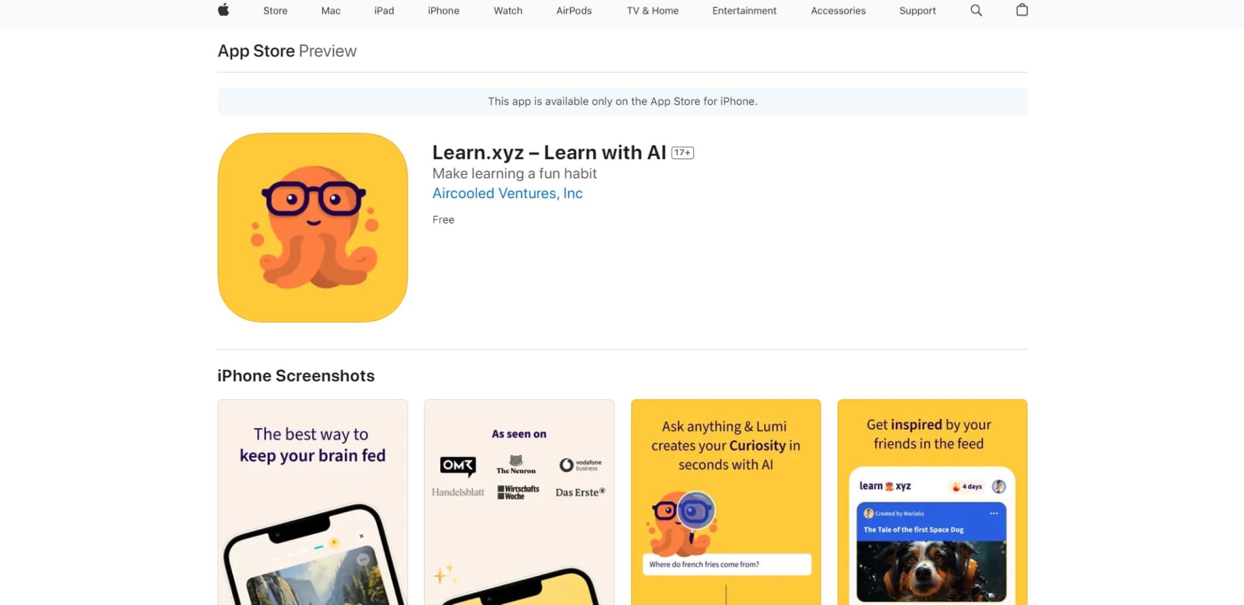
Learn.xyz, a company that aims to automate educational content creation through the use of artificial intelligence, recently closed a successful $3 million seed round. The company’s pitch deck showcased their vision and solution, highlighting key elements that contributed to their fundraising success. However, there were also areas that could have been improved. Let’s dive into the details.
Key Takeaway
Learn.xyz’s pitch deck successfully portrayed their vision and solution, with a joyful design and a clear problem statement. Their impressive user engagement demonstrated traction. However, there were areas for improvement, such as providing more information on key metrics and separating solution and problem slides.
Three things to love
Joyful design
The animated nature of Learn.xyz’s pitch deck initially raised concerns about the use of animations in presentation materials. However, the deck struck a perfect balance, with a design language that evoked a sense of joy and simplicity. The use of screenshots, character design, and language all contributed to the company’s goal of bringing joy to learning.
Clear problem statement
The problem of creating educational content at scale was effectively conveyed in Learn.xyz’s deck. The slide illuminated the pain points of content creation and highlighted the potential of AI-generated content to revolutionize the process. By recognizing and addressing this issue, Learn.xyz positioned itself as a solution-oriented company that could bring significant value to the market.
Impressive traction
Learn.xyz showcased remarkable user engagement in their deck, with users generating around 41,000 pieces of content in just four months. Such a high level of engagement is a significant achievement for any startup. However, it would have been beneficial to provide additional metrics, such as revenue, lessons consumed, or customer NPS, to present a more comprehensive picture of the company’s performance.
Room for improvement
Despite the strengths of Learn.xyz’s pitch deck, there were aspects that could have been improved.
Separating solution and problem slides
Learn.xyz merged part of their solution and product details into the problem slide. While this was executed subtly and effectively, separating these aspects into distinct slides would have allowed for clearer communication of the company’s unique value proposition and differentiated their offering from competitors.
More information on key metrics
The presentation would have benefited from including additional metrics beyond user-generated content. Providing insights on revenue, lessons consumed, or customer satisfaction would have provided a more holistic view of Learn.xyz’s success and potential growth opportunities.


