Introduction
Subtitles have become an integral part of our multimedia experience, enabling us to enjoy movies, TV shows, and other video content in different languages. While the primary function of subtitles is to provide translations, their visual presentation is equally important. One element that often catches the eye is the color of subtitles.
Have you ever wondered why subtitles are commonly displayed in yellow? It may seem like a trivial detail, but there is some interesting history and reasoning behind this choice. In this article, we will explore the origins of yellow subtitles, their purpose, and the factors that have influenced this color choice over the years.
As technology has advanced, so too have the aesthetics and functionality of subtitles. Today, subtitles are not only meant to assist viewers with hearing impairments or language barriers but also to enhance the overall viewing experience for everyone. The color of subtitles plays a crucial role in achieving these objectives.
So, let’s dive into the fascinating world of subtitles and discover why they are often seen in that vibrant shade of yellow.
History of Subtitles
The use of subtitles dates back to the early days of cinema. The first known instance of subtitles can be traced to the silent film era, when text was inserted between scenes to provide dialogue or narrative context. These early subtitles were typically white and placed at the bottom of the screen to ensure optimal readability.
As films transitioned from silent to sound, the need for subtitles became even more pronounced. Foreign language films, in particular, required translations to cater to an international audience. Initially, filmmakers relied on intertitles, which were separate title cards displayed within a scene to convey dialogue or translations. However, this method proved to be distracting and disrupted the flow of the film.
In the 1930s and 1940s, there were significant developments in subtitle technology. Subtitles began to be integrated directly into the film frames, enabling a smoother and more seamless viewing experience. During this period, white or light-colored subtitles were commonly used, as they offered good contrast against the dark backgrounds of the film.
It wasn’t until the 1960s, with the emergence of color television, that filmmakers and subtitle designers started experimenting with different colors. Initially, there was no standardization, and colors like white, blue, and green were used for subtitles. However, these colors often blended into the background, making them difficult to read.
As the industry searched for a color that provided optimal visibility and contrast, yellow gained prominence. It was found that yellow subtitles stood out effectively against different backgrounds, whether light or dark, and ensured better readability for viewers.
Since then, yellow subtitles have become widely adopted across various media platforms, including television, DVDs, streaming services, and online videos. This color choice has proven to be both practical and aesthetically pleasing, making it the preferred option for many content creators and viewers alike.
The Evolution of Subtitles Colors
Over the years, the choice of subtitle colors has evolved as technology has advanced and filmmakers have sought to enhance the overall viewing experience. Let’s take a closer look at the evolution of subtitle colors:
1. White Subtitles: In the early days of subtitles, white was the go-to color due to its high contrast against the dark backgrounds of films. While white subtitles provided readability, they lacked visual appeal and didn’t always stand out in scenes with bright lighting or light-colored backgrounds.
2. Experimental Colors: As color television and new film technologies emerged, filmmakers and designers began to experiment with different subtitle colors. Colors like blue, green, and even red were used in an attempt to create more visually engaging subtitles. However, these colors often faced issues with readability and contrast, as they could blend into the scene or cause eye strain for viewers.
3. Yellow Subtitles: As mentioned earlier, the popularization of yellow subtitles began in the 1960s. The use of yellow proved to be a game-changer in terms of readability and visibility. It offered sufficient contrast against various backgrounds, ensuring that subtitles remained clear and legible. This color choice also provided a more pleasant viewing experience, as it was less likely to strain the eyes.
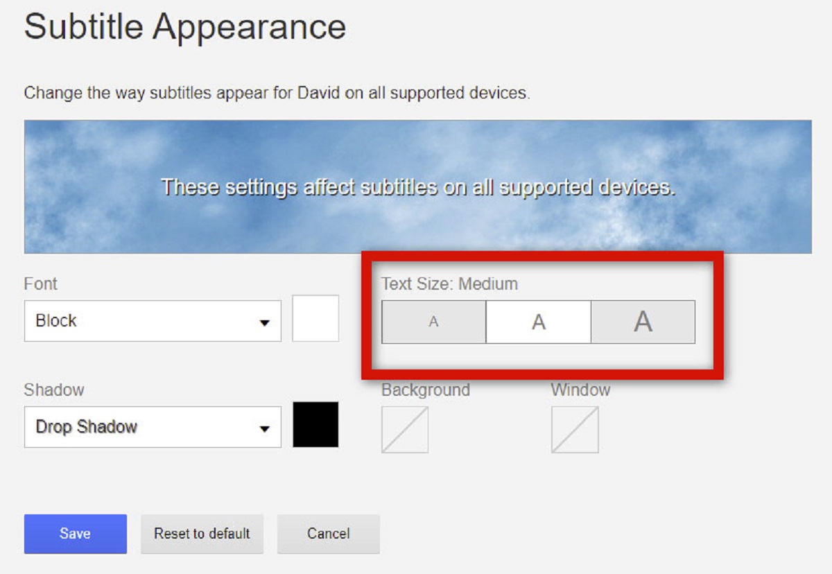
4. Customizable Subtitles: With the advent of digital media and online streaming platforms, the ability to customize subtitle colors became more prevalent. Viewers were given the option to choose their preferred subtitle colors, tailoring the visual experience to their specific needs and preferences. While yellow remains the default choice for many, this customization allows individual viewers to select colors that work best for them.
The evolution of subtitle colors not only reflects advancements in technology but also the growing understanding of the importance of accessibility and visual clarity. Filmmakers and content creators now prioritize subtitles that are not only accurate translations but also visually appealing and easy to read.
As the demand for subtitles continues to increase and new technologies emerge, it will be interesting to see how subtitle colors may evolve further in the future. The focus will likely remain on improving readability and ensuring that subtitles enhance, rather than distract from, the overall viewing experience.
The Purpose of Yellow Subtitles
The choice of yellow subtitles serves multiple purposes, all aimed at enhancing the viewing experience for a wide range of audiences. Let’s explore the primary purposes behind using yellow subtitles:
1. Readability and Visibility: The primary objective of subtitles is to convey dialogue, translations, or important information to viewers. Yellow subtitles have proven to be highly readable and visible against various backgrounds, ensuring that the text remains easily legible throughout the entire duration of the film or video. This ensures that viewers can follow the storyline without any difficulty.
2. Contrast and Eye Comfort: Yellow subtitles provide a stark contrast against both light and dark backgrounds, making them stand out effectively. This ensures that the subtitles are clearly distinguishable from the surrounding visuals, preventing them from blending in or getting lost in the scene. Additionally, yellow is considered to be less straining on the eyes than other colors, improving the overall comfort of reading subtitles for extended periods.
3. Accessibility for the Deaf and Hard of Hearing: Subtitles are crucial for individuals who are deaf or hard of hearing, enabling them to understand and enjoy content that would otherwise be inaccessible. Yellow subtitles are particularly beneficial for individuals with certain visual impairments, as the high contrast against the background makes it easier for them to read the text.
4. Cultural Factors: In some cultures, yellow is associated with positive attributes such as happiness, optimism, and enlightenment. This cultural connotation may play a role in the choice of yellow subtitles, subtly enhancing the viewer’s emotional response to the content.
5. Aesthetics and Branding: Yellow subtitles have also become a recognizable aesthetic choice, associated with numerous films, TV shows, and streaming platforms. For certain brands or production companies, the use of yellow subtitles may contribute to a distinct visual identity or branding strategy, reinforcing viewer familiarity and associations.
In summary, the purpose of using yellow subtitles is to prioritize readability, visibility, contrast, and accessibility for viewers. The color choice not only enhances the overall viewing experience but also ensures clarity and legibility of the subtitles, facilitating engagement and understanding of the content.
Accessibility and Visibility
One of the primary considerations when it comes to subtitle design is ensuring accessibility and visibility for a diverse range of viewers. Subtitles play a crucial role in enabling individuals with hearing impairments or language barriers to enjoy content, and the choice of color greatly impacts their readability. Here are some key points to consider regarding accessibility and visibility:
1. Legibility and Contrast: Subtitles need to be legible and stand out against the background to ensure optimal visibility. Yellow subtitles have proven to be highly effective in this regard, offering a stark contrast that allows for easy reading. This is particularly important when dealing with scenes that have varying lighting conditions or complex visual elements.
2. Visual Impairments: Individuals with visual impairments may have difficulty reading subtitles if they lack sufficient contrast or are displayed in colors that blend into the scene. Yellow subtitles, with their high contrast against different backgrounds, significantly improve readability for such individuals, making the content more accessible to them.
3. Variations in Display Technology: Different display technologies, such as televisions, computer screens, or mobile devices, can affect how subtitles appear. It is crucial to choose colors that are visible and clear across various display settings, and yellow subtitles generally offer good visibility on different types of screens, from traditional TVs to modern OLED displays.
4. Multilingual Subtitles: In the case of multilingual subtitles, where different languages are displayed simultaneously, ensuring visibility and readability becomes even more crucial. Yellow subtitles help in distinguishing between different languages and making it easier for viewers to follow the dialogue of each language without confusion.
5. Ambient Light Conditions: Subtitles need to be visible in various ambient light conditions, whether it’s a dark room or a brightly lit environment. Yellow subtitles, with their high contrast, remain legible and clear even in different lighting situations, ensuring that viewers can still understand the content without straining their eyes.
By prioritizing accessibility and visibility in subtitle design, content creators can ensure that their videos are inclusive and enjoyable for a wider audience. Yellow subtitles have proven to be a practical and effective choice in providing clear, readable text that enhances the overall viewing experience for individuals with different accessibility needs.
Cultural Factors
When it comes to subtitle colors, cultural factors can play an interesting role in shaping color preferences and choices. Different cultures have unique associations and connotations attached to various colors, influencing their use in subtitles. Let’s examine some of the cultural factors that may impact the choice of subtitle colors:
1. Symbolism and Meanings: Colors often carry symbolic meanings in different cultures. For example, in Western cultures, yellow is commonly associated with happiness, optimism, and enlightenment. This positive connotation may contribute to the preference for yellow subtitles, as it aligns with the desired emotional tone and enhances the viewer’s overall experience.
2. Traditional Associations: In certain cultures, there may be long-standing associations between specific colors and cultural practices or traditions. Subtitle designers may take these associations into account when choosing colors to create a sense of cultural authenticity or to resonate with the target audience. For example, in Chinese culture, red is often associated with luck, joy, and festivities, and it is not uncommon to see red subtitles used in films during celebratory scenes or holidays.
3. Visual Language: Textual elements in visuals, including subtitles, are part of the visual language of a particular culture. Subtitle colors that are commonly used and familiar to viewers within that culture can create a sense of familiarity and visual fluency. Utilizing colors that align with cultural norms and expectations contributes to a more engaging and immersive viewing experience for the target audience.
4. Psychological Impact: Colors can have a psychological impact on individuals, evoking certain emotions or responses. Cultural factors may influence the use of subtitle colors to create specific mood enhancements or to elicit desired emotional reactions from the audience. For instance, in suspenseful or intense scenes, subtitle designers may opt for colors like red or orange to heighten the tension and captivate viewers.
5. Localization Considerations: In localized versions of films or TV shows, subtitle colors may be adjusted to align with the tastes and preferences of the target audience. Localization teams often take cultural factors into account to ensure subtitles resonate with viewers and feel consistent with their cultural context.
Cultural factors significantly shape the choice of subtitle colors, reflecting the diverse interpretations and associations attached to colors across different societies. By considering these cultural factors, content creators and subtitle designers can create a more immersive viewing experience that resonates with viewers on a deeper cultural level.
Technical Considerations
When choosing subtitle colors, there are several technical factors that need to be taken into account to ensure optimal readability and compatibility with various display systems. Let’s explore some important technical considerations in subtitle design:
1. Contrast Ratio: Subtitles need to have a sufficient contrast ratio against the video content to ensure readability. The contrast ratio is the difference in luminance between the subtitle text and the background. It is crucial to select colors that provide a high enough contrast to ensure legibility, especially for viewers with visual impairments or when watching in challenging lighting conditions.
2. Color Blindness: Designers must consider the prevalence of color blindness and choose subtitle colors that are distinguishable for individuals with different types of color vision deficiency. Colors that may appear similar to color-blind viewers should be avoided to prevent confusion or misinterpretation of the text.
3. Compatibility with Display Systems: Subtitles should be compatible with various display systems, including televisions, computer screens, and mobile devices. Colors that work well across different display technologies, resolutions, and color profiles ensure that subtitles maintain their visibility and legibility regardless of the viewing platform.
4. Font and Size: In addition to choosing the right color, selecting an appropriate font and size is crucial for effective subtitle design. Fonts should be clear and easily readable, and the size should be sufficient to maintain legibility even on smaller screens or from a distance. The combination of color, font, and size ensures that subtitles are easily comprehensible without causing eye strain.
5. Transparency and Overlay: Subtitles are often displayed as an overlay on top of the video content. It is important to ensure that subtitle colors do not interfere with the visibility of the underlying visuals. A balance must be struck between the opacity and color choice to achieve a clear and unobtrusive subtitle display.
6. Localization Requirements: When designing subtitles for international audiences, it is essential to consider different language structures and character sets. The chosen color should complement the languages used in the subtitles and be compatible with any specific requirements for localized versions of the content.
Considering these technical factors in subtitle design allows for optimal legibility, compatibility, and accessibility across a range of devices and viewing scenarios. By aligning subtitle colors with technical considerations, content creators can ensure that subtitles are clear, visible, and compatible with the diverse array of display systems available to viewers.
The Future of Subtitles Colors
The world of subtitles continues to evolve alongside advancements in technology and changing viewer preferences. As we look to the future, there are several intriguing possibilities for the future of subtitle colors:
1. Customization and Personalization: With the rise of streaming platforms and personalized viewing experiences, the ability for viewers to customize subtitle colors according to their preferences may become more prevalent. This customization provides a more personalized and immersive experience, allowing individuals to choose colors that suit their visual needs and enhance their enjoyment of the content.
2. Dynamic Colors: As technology progresses, the possibility of dynamic and adaptive colors in subtitles emerges. Imagine subtitles that change color based on the scene’s lighting, background, or mood, creating a more visually engaging and immersive experience. Dynamic colors could adapt to ensure optimal readability and visibility in any situation.
3. Artificial Intelligence (AI) Integration: AI-powered subtitle systems could potentially analyze the content and automatically adjust subtitle colors based on factors such as background contrast, scene type, and viewer preferences. This technology could ensure that subtitles are always optimized for readability and visibility, without requiring manual adjustments.
4. Transparent Backgrounds: As display technologies advance, the possibility of subtitles with transparent backgrounds becomes more feasible. This would allow subtitles to seamlessly blend into the content without obstructing the visuals, while still ensuring legibility and contrast for viewers.
5. Adaptive Accessibility Features: The future of subtitles may involve advancements in accessibility features, including innovative color schemes that cater to different types of color blindness or visual impairments. Customizable subtitle options could be expanded to include different color palettes designed specifically for individuals with specific visual needs.
6. Experimental Color Palettes: As bold and unconventional color choices become more widely accepted in visual media, subtitle designers may experiment with alternative color palettes to create unique visual experiences. This could involve exploring complementary color schemes, gradients, or even artistic interpretations that add a new layer of aesthetics to the viewing experience.
The future of subtitle colors is filled with exciting possibilities, driven by advancements in technology and a growing understanding of the importance of accessibility and visual clarity. As content creators, viewers, and technology intertwine, we can expect subtitles to evolve in ways that enhance the overall viewing experience and ensure inclusion for a diverse range of audiences.
Conclusion
The choice of subtitle colors, particularly the prevalence of yellow subtitles, has a significant impact on the overall viewing experience. Throughout the history of subtitles, color choices have evolved to prioritize readability, visibility, and accessibility for viewers. By understanding the history, technical considerations, cultural factors, and the purpose of subtitles, we can appreciate the importance of the color yellow and its role in enhancing subtitles’ effectiveness.
Yellow subtitles have proven to be a practical and widely adopted choice due to their high contrast against different backgrounds, readability, and compatibility with various display systems. The use of yellow subtitles ensures that viewers can easily follow the dialogue, understand translations, and engage with the content regardless of their language proficiency or hearing abilities.
Furthermore, cultural factors and visual language play a significant role in the choice of subtitle colors. Subtitle designers carefully consider these factors to establish a sense of familiarity, cultural authenticity, and to evoke specific emotions or aesthetic associations for the viewers.
Looking to the future, advancements in technology and viewer preferences suggest exciting possibilities. Customizable and adaptive subtitle colors, AI integration, transparent backgrounds, and experimental color palettes may shape the future of subtitles, enhancing the overall accessibility and visual experience for a diverse range of audiences.
Ultimately, the choice of subtitle colors is a crucial aspect of multimedia content creation. It is not simply about aesthetics, but about ensuring that subtitles are clear, readable, and accessible to all viewers. By understanding the history and technical considerations, while taking into account cultural factors and future advancements, content creators can create an inclusive and immersive viewing experience where subtitles seamlessly enhance the understanding and enjoyment of the content.