The History of Discord
Discord, a popular voice, video, and text communication platform designed for gamers, was first developed by Jason Citron and Stanislav Vishnevskiy in 2015. The idea behind Discord was to create a platform that would revolutionize the way gamers communicated during their gameplay. Citron, a gaming enthusiast himself, felt that existing communication tools did not adequately address the needs of the gaming community.
The initial concept for Discord stemmed from Citron’s frustration with the lack of efficient voice communication tools while playing games competitively. He believed that real-time voice chat was key to enhancing team coordination and overall gaming experience. With this vision in mind, Citron set out to develop a platform that would prioritize the needs of gamers.
After several months of development and beta testing, Discord officially launched in May 2015. The platform quickly gained traction among gamers worldwide due to its user-friendly interface, superior voice quality, and robust features. Unlike its competitors, Discord offered seamless communication, with minimal latency and reliable performance.
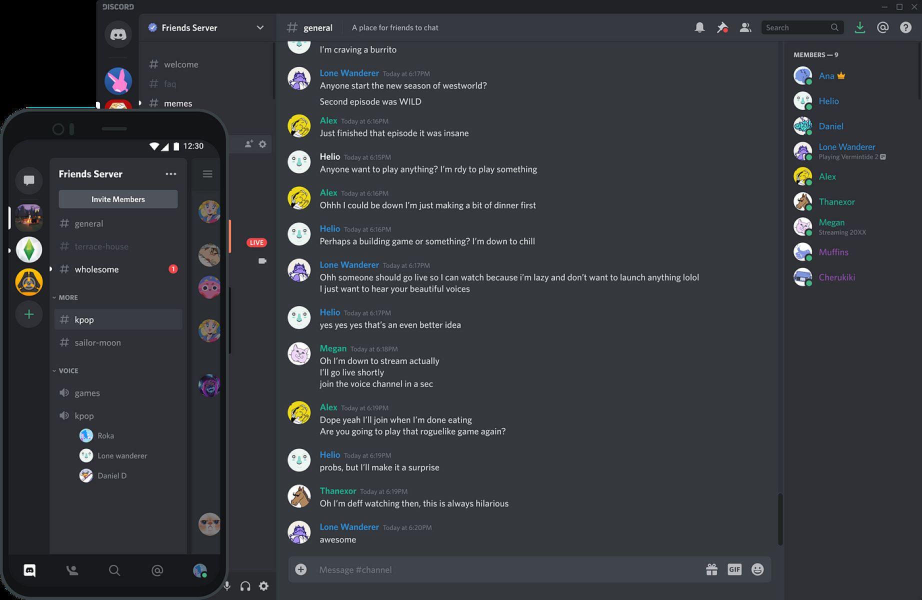
Discord’s popularity continued to grow rapidly, and it quickly evolved from a simple voice chat service to a comprehensive communication platform. In addition to voice chat, Discord introduced features such as video calls, customizable server channels, and a text chat system. These additions further solidified Discord’s position as the go-to platform for gaming communication.
As Discord gained momentum and attracted a large user base, the need for a recognizable brand identity became apparent. This led to the creation of the Discord logo, which plays a crucial role in representing the brand and its values.
The evolution of the Discord logo and its significance will be explored in the following sections.
The Concept Behind the Logo
The Discord logo was designed to capture the essence of the platform: a seamless and immersive communication experience for gamers. The logo incorporates several elements that reflect the core values and concepts of Discord.
At first glance, the Discord logo appears as a stylized chat bubble. This design choice represents the primary mode of communication on the platform – text chat. The chat bubble represents the conversations, discussions, and connections that take place within the Discord community.
However, the chat bubble alone does not fully convey the platform’s purpose. To address this, the designers added the outward-facing radio waves emanating from the chat bubble. These waves symbolize the voice and video communication that Discord facilitates. The combination of the chat bubble and the radio waves creates a perfect blend of the text and voice elements that make Discord unique.
Additionally, the square shape of the logo represents stability and balance. Discord aims to provide a reliable and secure communication platform for gamers. The square shape also signifies the organization and structure that Discord provides, allowing users to create and join communities, called servers, and engage in conversations within designated channels.
The color scheme of the logo further enhances the concept behind Discord. The vibrant shades of blue and purple evoke a sense of creativity, inspiration, and innovation. These colors were intentionally chosen to foster a welcoming and energetic atmosphere within the Discord community.
Overall, the concept behind the Discord logo combines the visual representation of chat, voice, and video communication with stability, balance, and a vibrant color palette. It embodies the core values of the platform and conveys the experience that Discord aims to provide for gamers.
The Evolution of the Discord Logo
Since its inception, the Discord logo has undergone several transformations, reflecting the growth and development of the platform. Let’s take a look at the evolution of the Discord logo:
The first version of the Discord logo featured a simple chat bubble with a pale blue color. The bubble was rounded and had a gradient effect, giving it a three-dimensional appearance. This logo aimed to convey the essence of communication and the platform’s focus on text chat.
In 2016, Discord introduced its second logo iteration. This version retained the chat bubble shape but introduced a more vibrant and saturated shade of blue. The gradient effect was replaced with a solid color, giving the logo a cleaner and more modern look. The outward-facing radio waves became more prominent, representing the core features of voice and video communication.
By 2017, Discord had further refined its logo. The third version featured a flatter design with a squared chat bubble. The edges were sharp, and the logo utilized a simplified color palette, consisting mainly of shades of blue. This iteration reflected the platform’s commitment to providing a streamlined and organized communication experience.
The most recent update to the Discord logo was introduced in 2019. This version maintained the square shape but embraced a gradient color scheme, transitioning from a vibrant purple to a deep blue shade. The chat bubble became more prominent and sleek, with slightly rounded corners. This iteration retained the outward-facing radio waves, emphasizing Discord’s commitment to voice and video communication.
The evolution of the Discord logo demonstrates the platform’s continuous efforts to modernize and align its brand image with its user base. Each iteration brings a fresh and updated look while keeping the core elements intact. The changes in color, shape, and style reflect Discord’s evolving identity and its commitment to meeting the communication needs of the gaming community.
The Meaning Behind the Colors
The color scheme of the Discord logo plays a significant role in representing the brand and evoking specific emotions and associations. Let’s explore the meaning behind the colors used in the Discord logo:
The dominant color in the Discord logo is a vibrant shade of blue. Blue is often associated with trust, reliability, and stability. It symbolizes the platform’s commitment to providing a secure and dependable communication experience for gamers. The blue color in the Discord logo aims to instill confidence in users and create a sense of trust within the community.
In addition to blue, the Discord logo also incorporates hints of purple. Purple is often associated with creativity, inspiration, and innovation. By incorporating purple into the logo, Discord aims to create an environment that fosters imagination and encourages users to explore new ideas and engage in creative conversations.
The gradient effect in the logo, transitioning from purple to blue, adds depth and visual interest. It creates a dynamic and energetic feel, capturing the excitement and enthusiasm of the gaming community. The gradient effect also symbolizes the fluidity and versatility of communication on the Discord platform, where users can seamlessly transition between text, voice, and video conversations.
Overall, the color scheme of the Discord logo conveys a powerful message. The blue and purple colors represent trust, reliability, creativity, and innovation, all essential elements in building a strong and vibrant gaming community. The gradient effect adds a touch of excitement and energy, reflecting the dynamic nature of communication on the Discord platform.
The Typography of the Discord Logo
The typography used in the Discord logo is carefully selected to reflect the brand’s identity and convey its message. Let’s delve into the details of the typography in the Discord logo:
The word “Discord” in the logo is written in a bold and modern typeface. The font used is a custom typeface called “Ginto.” This unique typeface was specifically designed for Discord, giving the logo a distinctive and recognizable look.
The Ginto typeface is known for its geometric shapes, clean lines, and balanced letterforms. The characters have a slightly condensed appearance, allowing the logo to be compact and visually appealing. The sharp corners and straight lines of the letters convey a sense of modernity and professionalism.
The letters in the Discord logo are uppercase, further adding to the bold and impactful nature of the typography. The use of uppercase letters adds a sense of authority and strength to the logo, capturing the platform’s commitment to providing a robust and reliable communication experience for gamers.
Furthermore, the spacing between the letters is consistent and well-balanced, ensuring optimal legibility and visual harmony. The even spacing between the letters contributes to the logo’s clean and streamlined appearance.
It’s worth noting that the typography in the Discord logo remains consistent across different iterations. This consistency helps to establish a strong and memorable brand identity, making the Discord logo instantly recognizable across various platforms and mediums.
In summary, the typography of the Discord logo features the custom-designed Ginto typeface, which embodies modernity and professionalism. The uppercase letters and balanced spacing contribute to the logo’s authoritative and visually appealing nature. Through its typography, the Discord logo communicates the platform’s commitment to providing a dependable and cohesive communication experience for gamers.
Discord Logo and Gaming Community
The Discord logo has become synonymous with the gaming community due to its association with the platform that revolutionized communication in gaming. The logo’s design and symbolism perfectly align with the needs and values of gamers.
One of the main reasons the Discord logo resonates with the gaming community is its emphasis on seamless communication. The chat bubble represents the conversations and connections that gamers establish while playing their favorite games. It embodies the essence of online gaming, where players come together to strategize, coordinate, and build friendships.
The incorporation of the outward-facing radio waves in the logo highlights the platform’s commitment to voice and video communication. This feature has been instrumental in enabling gamers to engage in real-time conversations during gameplay. By facilitating direct voice and video channels, Discord has played a significant role in fostering camaraderie and teamwork in the gaming community.
The square shape of the logo signifies stability and balance, essential elements in both gaming and community building. Through Discord, gamers can create and join servers, connect with like-minded individuals, and participate in vibrant communities. The logo’s square shape represents the organization and structure that Discord provides, offering gamers a place where they can share experiences, discuss strategies, and form lasting relationships.
The choice of colors in the Discord logo also appeals to the gaming community. The vibrant shades of blue and purple evoke a sense of energy, creativity, and inspiration. These colors create an inviting and dynamic atmosphere on the platform, encouraging gamers to express themselves, share ideas, and engage in lively discussions.
Furthermore, the typography in the Discord logo captures the modernity and professionalism that gamers appreciate. The bold and clean lines of the custom-designed Ginto typeface reflect the seriousness and dedication that gamers bring to their craft. The uppercase letters and balanced spacing convey authority and a sense of collaboration, characteristics that gamers value in their interactions within the Discord community.
Overall, the Discord logo serves as a visual representation of the values and aspirations of the gaming community. It embodies the power of communication, teamwork, and friendship, enabling gamers to connect, collaborate, and celebrate their shared passion for gaming. The logo’s design elements and symbolism contribute to the strong affinity between the Discord brand and the gaming community.