Introduction
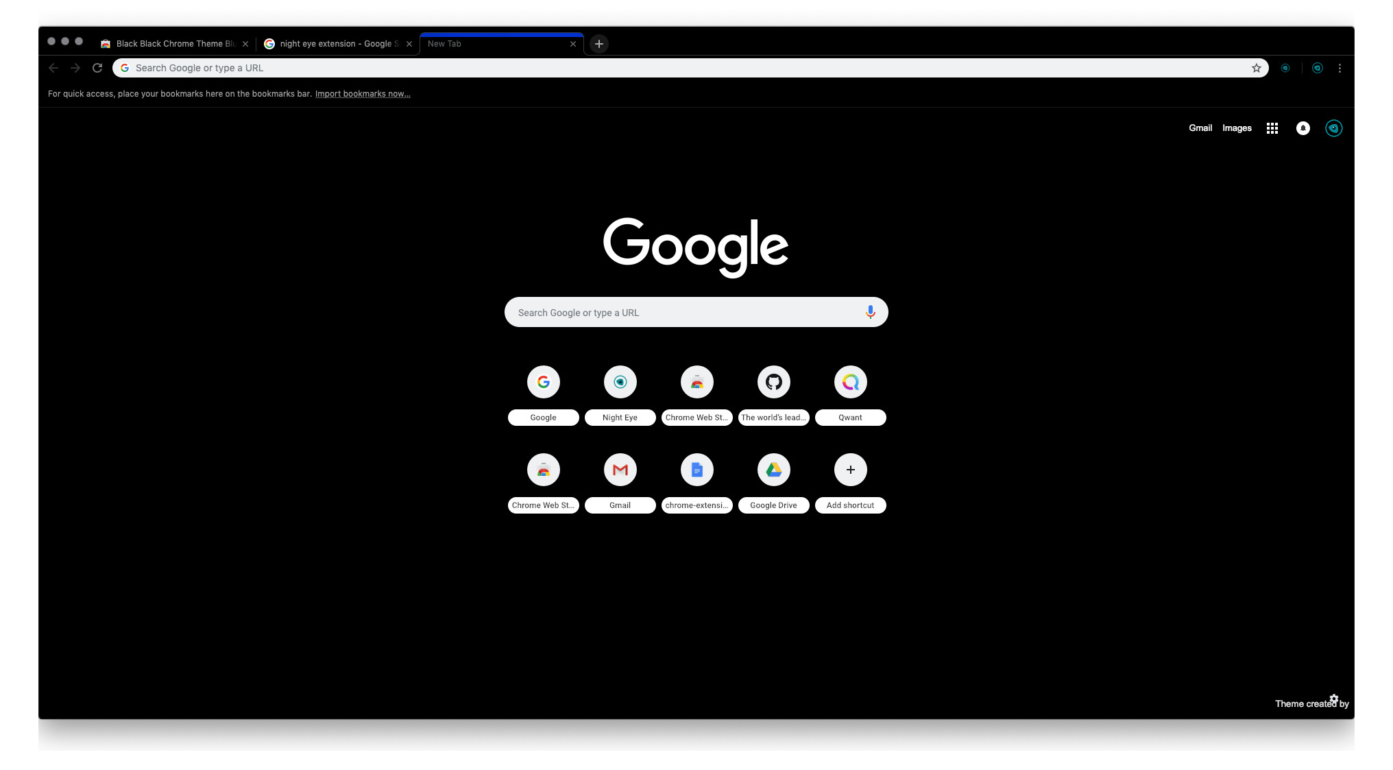
Google Chrome, the widely popular web browser developed by Google, has undergone several design changes over the years. One of the most notable alterations is the introduction of a black background for certain elements of the browser interface. This shift from the traditional white background has sparked curiosity and interest among users, prompting questions about the reasons behind this aesthetic transformation.
The evolution of Google Chrome's design has been a subject of fascination for many tech enthusiasts and casual users alike. The transition to a black background represents a departure from the conventional color scheme and has raised inquiries about its purpose and potential benefits. In this article, we will delve into the rationale behind Google Chrome's black background, exploring the factors that influenced this design choice and the implications for users.
As we embark on this exploration, it's essential to consider the impact of design elements on user experience and visual appeal. The shift to a black background signifies a departure from the familiar and invites us to examine the motivations behind this departure. By unraveling the underlying reasons for this design evolution, we can gain a deeper understanding of the thought processes and considerations that shape the user interface of Google Chrome.
The Evolution of Google Chrome's Design
Since its inception, Google Chrome has continuously evolved its design to enhance user experience and stay ahead of the curve in the competitive browser landscape. The journey of Google Chrome's design can be traced back to its launch in 2008, when it entered the market with a clean and minimalist interface. The browser's initial design prioritized simplicity and speed, reflecting Google's commitment to delivering a streamlined and efficient web browsing experience.
Over the years, Google has introduced several updates and redesigns to Chrome's interface, aiming to improve usability and visual aesthetics. One of the significant milestones in this evolution was the introduction of the Material Design language, which brought a cohesive and visually appealing look to Google's products, including Chrome.
The transition to Material Design marked a shift towards a more modern and visually engaging interface, characterized by sleek icons, smooth animations, and a focus on user-centric design principles. This design overhaul not only elevated the overall look of Google Chrome but also laid the groundwork for future design innovations.
As part of this ongoing evolution, Google Chrome introduced the option for users to enable a dark mode, which transformed the browser's interface elements into a darker color scheme. This shift towards a darker background was driven by the growing demand for alternative visual themes and the recognition of the benefits associated with dark mode interfaces.
The introduction of a black background in Google Chrome's design was a strategic response to the evolving preferences of users and the increasing emphasis on accessibility and visual comfort. The dark mode option not only catered to users who preferred a darker aesthetic but also addressed concerns related to eye strain and battery efficiency, particularly on devices with OLED displays.
Furthermore, the dark mode option aligned with the broader industry trend of offering customizable themes and interface personalization, empowering users to tailor their browsing experience to their preferences. This evolution in design reflects Google's commitment to adaptability and user-centric innovation, acknowledging the diverse needs and preferences of its global user base.
In summary, the evolution of Google Chrome's design has been characterized by a commitment to simplicity, visual appeal, and user-centric enhancements. The introduction of a black background as part of the dark mode option represents a pivotal moment in this evolution, underscoring Google's responsiveness to user preferences and its dedication to optimizing the browsing experience for all users.
The Benefits of a Black Background
The adoption of a black background in Google Chrome's design brings forth a myriad of benefits that extend beyond mere aesthetic appeal. This shift to a darker color scheme has been driven by a recognition of the tangible advantages it offers to users, encompassing aspects of visual comfort, energy efficiency, and accessibility.
Visual Comfort and Reduced Eye Strain
The implementation of a black background in Google Chrome's interface aligns with the growing emphasis on visual comfort and mitigating eye strain, particularly during extended periods of web browsing. The darker color scheme provides a stark contrast to the content displayed on web pages, enhancing readability and reducing the strain on users' eyes, especially in low-light environments. This contrast facilitates a more comfortable and less intrusive browsing experience, contributing to overall user satisfaction and well-being.
Battery Efficiency for Devices with OLED Displays
The utilization of a black background in Google Chrome's design holds significant implications for devices equipped with OLED displays. Unlike traditional LCD screens, OLED displays have the ability to individually power pixels, allowing for true black pixels to remain unlit. By leveraging this capability, the implementation of a black background in Chrome's interface contributes to improved energy efficiency on devices with OLED screens. This not only extends battery life but also aligns with sustainable practices by reducing power consumption, thereby offering a compelling advantage for users seeking to optimize the performance of their devices.
Enhanced Accessibility and Customization
The availability of a black background option in Google Chrome's design underscores the commitment to accessibility and user customization. For individuals with visual sensitivities or specific preferences regarding color schemes, the option to switch to a darker interface can significantly enhance the browsing experience. This level of customization empowers users to tailor the browser's appearance to suit their individual needs, reflecting Google's dedication to inclusivity and user empowerment.
Aesthetic Appeal and Modern Design Trends
Beyond its functional benefits, the adoption of a black background in Google Chrome's design aligns with contemporary design trends and aesthetic preferences. The sleek and sophisticated look of the dark mode interface resonates with users who appreciate a modern and visually striking browsing environment. This aesthetic appeal not only enhances the overall user experience but also positions Google Chrome as a browser that embraces design innovation and stays attuned to evolving user preferences.
In essence, the integration of a black background in Google Chrome's design brings forth a host of advantages, encompassing visual comfort, energy efficiency, accessibility, and aesthetic appeal. This strategic design choice reflects Google's commitment to enhancing the browsing experience while catering to the diverse needs and preferences of its global user base.
User Preferences and Customization Options
User preferences and customization options play a pivotal role in shaping the browsing experience within Google Chrome. The introduction of a black background as part of the dark mode option exemplifies Google's commitment to empowering users with the ability to tailor the browser's interface to align with their individual preferences and needs.
Tailoring the Browsing Experience
Google Chrome recognizes that users have diverse visual preferences and varying comfort levels when it comes to interface aesthetics. By offering customization options such as the dark mode with a black background, the browser enables users to create a personalized and visually comfortable environment for their web browsing activities. This level of customization extends beyond mere color choices, allowing users to curate an interface that resonates with their individual style and enhances their overall browsing experience.
Accessibility and Inclusivity
The availability of a black background in Google Chrome's design reflects a commitment to accessibility and inclusivity. For users with visual sensitivities or specific color preferences, the option to switch to a darker interface can significantly improve readability and reduce visual strain. This inclusivity-driven approach ensures that all users, regardless of their visual preferences, can engage with the browser in a manner that aligns with their comfort and accessibility needs.
Personalization and Self-Expression
The ability to customize the interface, including the option for a black background, empowers users to express their individuality and create a browsing environment that resonates with their personal style. This level of personalization fosters a sense of ownership and connection to the browsing experience, allowing users to engage with the browser in a manner that reflects their unique preferences and visual sensibilities.
Adapting to Evolving Preferences
As user preferences and design trends continue to evolve, Google Chrome's emphasis on customization options, including the availability of a black background, positions the browser as adaptable and responsive to the changing needs of its user base. By staying attuned to evolving preferences and offering a diverse range of customization features, Google Chrome remains a dynamic platform that caters to the individuality and evolving tastes of its global user community.
In summary, the inclusion of a black background as part of Google Chrome's customization options underscores the browser's dedication to user empowerment, inclusivity, and adaptability. By offering a diverse array of customization features, Google Chrome ensures that users can craft a browsing environment that aligns with their unique preferences and visual comfort, fostering a more engaging and personalized web browsing experience.
Conclusion
In conclusion, the introduction of a black background in Google Chrome's design represents a significant milestone in the browser's evolution, reflecting a strategic response to user preferences, visual comfort, and technological advancements. The transition to a darker color scheme, particularly through the implementation of the dark mode option, underscores Google's commitment to enhancing the browsing experience while embracing inclusivity and customization.
The benefits of a black background extend beyond its aesthetic appeal, encompassing tangible advantages such as reduced eye strain, improved battery efficiency for devices with OLED displays, enhanced accessibility, and alignment with modern design trends. By prioritizing visual comfort and energy efficiency, Google Chrome's adoption of a black background demonstrates a forward-looking approach that resonates with users seeking a more personalized and sustainable browsing experience.
Furthermore, the availability of customization options, including the black background within the dark mode, empowers users to tailor their browsing environment to align with their individual preferences and visual comfort. This emphasis on user empowerment and inclusivity positions Google Chrome as a browser that values the diverse needs and preferences of its global user base, fostering a more engaging and personalized web browsing experience.
As the digital landscape continues to evolve, Google Chrome's commitment to adaptability and responsiveness to user preferences remains evident through its ongoing design innovations. The integration of a black background serves as a testament to Google's dedication to enhancing the browsing experience while staying attuned to the evolving needs and visual preferences of its users.
In essence, the introduction of a black background in Google Chrome's design signifies a harmonious blend of visual aesthetics, user-centric innovation, and adaptability, culminating in a browsing experience that caters to the diverse needs and preferences of users worldwide. This strategic design choice not only reflects Google's commitment to user satisfaction and accessibility but also positions Google Chrome as a browser that embraces design innovation and inclusivity, setting the stage for a more personalized and visually comfortable web browsing experience for all users.


