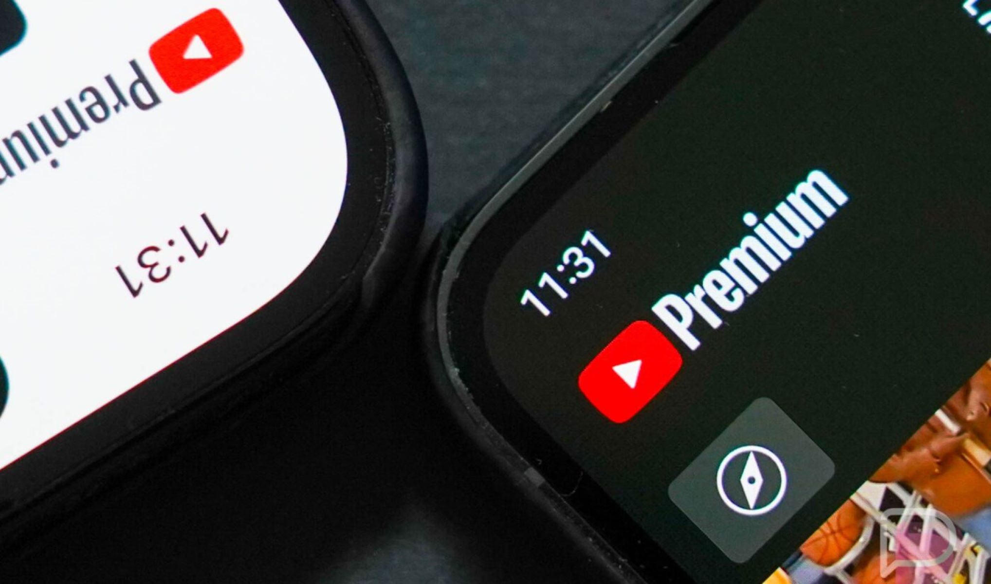
YouTube Music has recently unveiled a redesigned “Now Playing” screen, introducing several exciting updates. The most significant addition is a comments section, enabling users to read and write comments directly within the app. This latest upgrade also features prominent buttons, larger cover art, and more user-friendly elements.
The redesigned “Now Playing” screen is now available on both iOS and Android devices, according to a YouTube Music spokesperson. The revamp includes a new comments button, allowing users to view existing comments from the official music video on YouTube. Moreover, users can now share their thoughts and engage with the content, creating a more social and interactive experience.
Key Takeaway
YouTube Music has introduced a comments section to its “Now Playing” screen, fostering a more social and engaging environment for users. The new feature allows music lovers to read and contribute comments directly within the app, enhancing the overall user experience.
The comments button is conveniently located below the cover art. Once selected, a panel slides up on the screen, displaying the comments section. Alongside the comments, users will find icons for like/dislike, save, share, download, and radio. Previously hidden behind the album cover, these buttons have now been moved to a more accessible location, right below the song title.
Additionally, YouTube Music has made a subtle change for easier navigation. The song/video toggle, once matching the background color, is now in white, providing a clearer visual distinction.
This redesign follows the recent launch of “Samples,” YouTube Music’s new short-form video feed reminiscent of TikTok. “Samples” offers a personalized video feed featuring a range of content, including official music videos and live footage from YouTube’s extensive catalog.
With these updates, YouTube Music continues to evolve its platform, enhancing the user experience and creating a more social and engaging music streaming environment.


