


Introduction
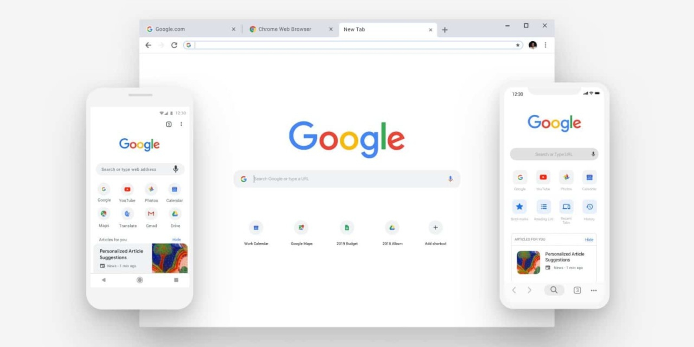
When it comes to browsing the web, the user experience is paramount. With the increasing prevalence of mobile devices, ensuring that websites are optimized for mobile viewing has become a top priority for web developers and designers. Fortunately, Google Chrome, one of the most popular web browsers, offers several built-in tools that allow users to test and optimize the mobile view of websites.
In this article, we will explore the various methods for testing the mobile view in Chrome. Whether you are a web developer, designer, or simply a curious user, understanding these tools can greatly enhance your ability to assess and improve the mobile compatibility of websites.
Testing the mobile view of a website is crucial for several reasons. Firstly, with the majority of internet traffic now originating from mobile devices, it is essential to ensure that websites are accessible and visually appealing on smaller screens. Additionally, search engines like Google prioritize mobile-friendly websites in their search results, making mobile optimization a key factor in improving a site's visibility and ranking.
By leveraging the tools provided by Chrome, users can gain valuable insights into how websites appear and function on mobile devices. This knowledge empowers web professionals to make informed decisions regarding design, layout, and functionality, ultimately leading to a more seamless and enjoyable browsing experience for mobile users.
In the following sections, we will delve into the specific methods for testing the mobile view in Chrome, including using Chrome DevTools, Responsive Design Mode, and Device Mode. Each of these approaches offers unique features and benefits, providing users with a comprehensive toolkit for evaluating and enhancing the mobile compatibility of websites. Let's embark on this journey to discover the powerful tools at our disposal for optimizing the mobile view in Chrome.
Using Chrome DevTools
Chrome DevTools is a robust set of web authoring and debugging tools built directly into the Google Chrome browser. It offers a comprehensive suite of features for inspecting, debugging, and optimizing web pages, including the ability to test and analyze the mobile view of websites.
To access Chrome DevTools, simply right-click on any element of a web page and select "Inspect" from the context menu. This opens the DevTools panel, where users can navigate to the "Toggle Device Toolbar" icon, represented by a small phone and tablet icon in the top-left corner of the panel.
Once the Device Toolbar is activated, users can simulate the mobile view of a website by selecting from a range of pre-configured device presets or by customizing the viewport dimensions. This allows for real-time visualization of how the website appears on various mobile devices, enabling developers and designers to identify potential layout issues, responsiveness challenges, or other mobile-specific concerns.
Furthermore, Chrome DevTools provides a wealth of additional functionalities for testing the mobile view of websites. The "Network" tab allows users to simulate different network conditions, such as 3G or 4G connections, to assess the website's performance and loading times on mobile devices. This feature is invaluable for optimizing the mobile experience, as it enables users to identify and address potential bottlenecks that may impact mobile users' browsing experience.
Moreover, the "Audits" panel within Chrome DevTools offers a comprehensive audit tool that evaluates a website's performance, accessibility, progressive web app capabilities, and best practices. This includes specific audits for mobile usability, providing actionable insights and recommendations for improving the mobile view of the website.
In addition to these features, Chrome DevTools allows users to inspect and modify the CSS, HTML, and JavaScript of a web page, providing a powerful toolkit for fine-tuning the mobile responsiveness and behavior of websites.
Overall, Chrome DevTools is a versatile and indispensable tool for testing the mobile view of websites. Its intuitive interface, extensive feature set, and real-time visualization capabilities make it an essential resource for web developers and designers seeking to optimize the mobile compatibility of their websites. By leveraging Chrome DevTools, users can gain valuable insights, diagnose issues, and implement enhancements to ensure a seamless and engaging mobile browsing experience for users across a diverse range of devices.
Using Responsive Design Mode
Responsive Design Mode is a powerful feature integrated into Google Chrome that empowers web developers and designers to simulate and evaluate the mobile view of websites directly within the browser. This tool is particularly valuable for assessing how websites adapt to various screen sizes and orientations, enabling users to identify and address potential layout and design challenges specific to mobile devices.
To activate Responsive Design Mode, users can simply access the Chrome DevTools by right-clicking on any element of a web page and selecting "Inspect" from the context menu. Once in the DevTools panel, users can toggle Responsive Design Mode by clicking on the icon resembling a small phone and tablet, located in the top-left corner of the panel.
Upon activating Responsive Design Mode, the web page being inspected will be displayed within a customizable viewport, allowing users to simulate the appearance and behavior of the website on different mobile devices. This includes the ability to adjust the viewport dimensions, emulate touch events, and switch between portrait and landscape orientations, providing a comprehensive simulation of the mobile browsing experience.
One of the key advantages of Responsive Design Mode is its real-time visualization capabilities, which enable users to instantly observe how the website responds to changes in viewport size and orientation. This facilitates the identification of potential issues related to content layout, text readability, image scaling, and interactive elements, allowing developers and designers to make informed adjustments to enhance the mobile user experience.
Furthermore, Responsive Design Mode offers a range of device presets, allowing users to quickly switch between popular mobile device configurations, such as various iPhone and Android models, to gain insights into how the website appears on specific devices. This feature is invaluable for tailoring the mobile view to meet the unique requirements and characteristics of different mobile platforms, ensuring a consistent and optimized experience across diverse devices.
In addition to visual simulation, Responsive Design Mode provides a network throttling feature, enabling users to emulate different network conditions, such as 3G, 4G, or offline mode. This functionality allows for the assessment of the website's performance and loading times under varying network constraints, facilitating the optimization of mobile responsiveness and speed.
Overall, Responsive Design Mode serves as a versatile and user-friendly tool for testing and refining the mobile view of websites. Its intuitive interface, customizable viewport settings, and network emulation capabilities make it an indispensable resource for web professionals seeking to create compelling and accessible mobile experiences. By leveraging Responsive Design Mode, developers and designers can gain valuable insights, address mobile-specific challenges, and ultimately deliver seamless and engaging browsing experiences for mobile users.
Using Device Mode
Device Mode is a feature within Google Chrome's DevTools that provides a comprehensive set of tools for simulating and testing the mobile view of websites. This powerful functionality enables web developers and designers to assess how websites appear and behave on a wide range of mobile devices, allowing for precise optimization of the mobile browsing experience.
To access Device Mode, users can open Chrome DevTools by right-clicking on any element of a web page and selecting "Inspect" from the context menu. Once in the DevTools panel, users can activate Device Mode by clicking on the "Toggle Device Toolbar" icon, represented by a small phone and tablet, located in the top-left corner of the panel.
Upon entering Device Mode, the web page being inspected is displayed within a customizable viewport, providing users with the ability to simulate the mobile view on various devices. Device Mode offers an extensive library of device presets, including popular smartphones, tablets, and even desktop resolutions, allowing users to accurately visualize how the website appears on different screen sizes and resolutions.
One of the standout features of Device Mode is its multi-touch emulation, which enables users to simulate touch gestures directly within the browser. This functionality is invaluable for assessing the responsiveness and interactivity of websites on touch-enabled devices, ensuring that mobile users can seamlessly navigate and interact with the content.
Furthermore, Device Mode includes a powerful network throttling feature, allowing users to emulate different network conditions such as 3G, 4G, and even offline mode. By simulating varying network speeds and connectivity, developers and designers can assess the website's performance under real-world mobile network conditions, identifying potential bottlenecks and optimizing the site's loading times for mobile users.
In addition to visual simulation and network emulation, Device Mode provides a comprehensive set of tools for analyzing and debugging the mobile view of websites. This includes the ability to inspect and modify CSS, HTML, and JavaScript, empowering users to fine-tune the mobile responsiveness and behavior of websites directly within the DevTools environment.
Overall, Device Mode stands as a versatile and indispensable tool for testing and optimizing the mobile view of websites. Its extensive device library, multi-touch emulation, network throttling capabilities, and integrated debugging tools make it an essential resource for web professionals seeking to deliver exceptional mobile experiences. By leveraging Device Mode, developers and designers can gain valuable insights, address mobile-specific challenges, and ultimately ensure that websites are fully optimized for mobile users across a diverse range of devices.
Conclusion
In conclusion, the ability to test and optimize the mobile view of websites is paramount in today's digital landscape, where mobile devices have become the primary means of accessing the internet. With Google Chrome's array of built-in tools, including Chrome DevTools, Responsive Design Mode, and Device Mode, web developers and designers are equipped with a comprehensive toolkit for evaluating and enhancing the mobile compatibility of websites.
By leveraging Chrome DevTools, users can gain valuable insights into how websites appear and function on various mobile devices. The intuitive interface and real-time visualization capabilities of Chrome DevTools enable developers and designers to identify potential layout issues, responsiveness challenges, and performance bottlenecks, empowering them to make informed decisions to optimize the mobile browsing experience.
Responsive Design Mode offers a user-friendly approach to simulating and evaluating the mobile view of websites directly within the browser. Its customizable viewport settings, device presets, and network emulation features enable users to gain precise insights into how websites adapt to different screen sizes, orientations, and network conditions, facilitating the refinement of the mobile user experience.
Device Mode, with its extensive device library, multi-touch emulation, and network throttling capabilities, provides a comprehensive set of tools for accurately simulating and testing the mobile view of websites. The integrated debugging tools further empower users to fine-tune the mobile responsiveness and behavior of websites, ensuring a seamless and engaging browsing experience for mobile users across diverse devices.
In essence, the seamless integration of these tools within Google Chrome not only streamlines the process of testing the mobile view of websites but also empowers web professionals to create compelling and accessible mobile experiences. By harnessing the capabilities of Chrome DevTools, Responsive Design Mode, and Device Mode, developers and designers can address mobile-specific challenges, gain valuable insights, and ultimately deliver websites that are fully optimized for the diverse array of mobile devices in use today.
As the digital landscape continues to evolve, the importance of mobile optimization cannot be overstated. With Google Chrome's robust set of tools, web professionals are well-equipped to meet the demands of mobile users, ensuring that websites are not only visually appealing but also highly functional and accessible across a wide range of mobile devices. By embracing these tools and prioritizing mobile optimization, web developers and designers can elevate the browsing experience for mobile users, ultimately contributing to a more inclusive and user-centric web ecosystem.


