


Introduction
When browsing the web on a desktop, have you ever come across a website that looks fantastic on a mobile device but seems clunky and awkward on your larger screen? It's a common occurrence, especially as more and more websites are optimized for mobile viewing. Fortunately, there are ways to address this issue and experience the mobile version of a website right on your desktop. This can be incredibly useful for web developers, designers, and anyone who wants to see how a website appears on various devices without actually using those devices.
In this article, we'll explore two methods for viewing the mobile version of a website on your desktop using the popular Chrome browser. The first method involves utilizing Chrome's built-in Developer Tools, which provide a powerful set of features for web development and testing. The second method entails using a Chrome extension specifically designed to emulate mobile devices, allowing you to seamlessly switch between desktop and mobile views with just a few clicks.
By the end of this article, you'll have a clear understanding of how to leverage these tools to gain valuable insights into how websites appear and function across different platforms. Whether you're a web professional seeking to optimize user experiences or simply curious about how your favorite websites look on mobile devices, these methods will empower you to explore the mobile side of the web from the comfort of your desktop. Let's dive in and discover how to unlock the mobile potential of websites right within your Chrome browser.
Method 1: Using Chrome Developer Tools
Chrome Developer Tools is a robust set of features built into the Chrome browser, designed to aid web developers in debugging, optimizing, and experimenting with web pages. One of its powerful capabilities is the ability to simulate a mobile environment, allowing users to view how a website appears and functions on various mobile devices without leaving their desktop.
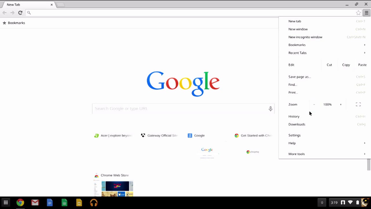
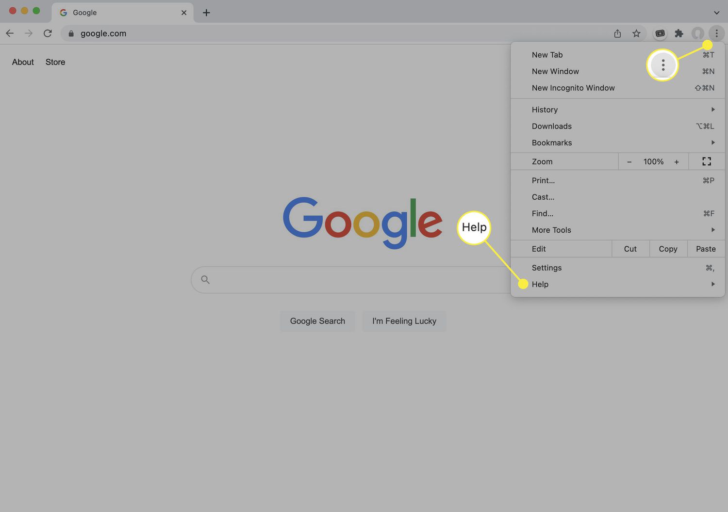
To access Chrome Developer Tools, simply right-click on any element of a web page and select "Inspect" from the context menu. Alternatively, you can press Ctrl + Shift + I on Windows or Cmd + Option + I on Mac to open the Developer Tools panel. Once the panel is open, click on the "Toggle Device Toolbar" icon (or press Ctrl + Shift + M on Windows or Cmd + Option + M on Mac) to activate the device simulation mode.
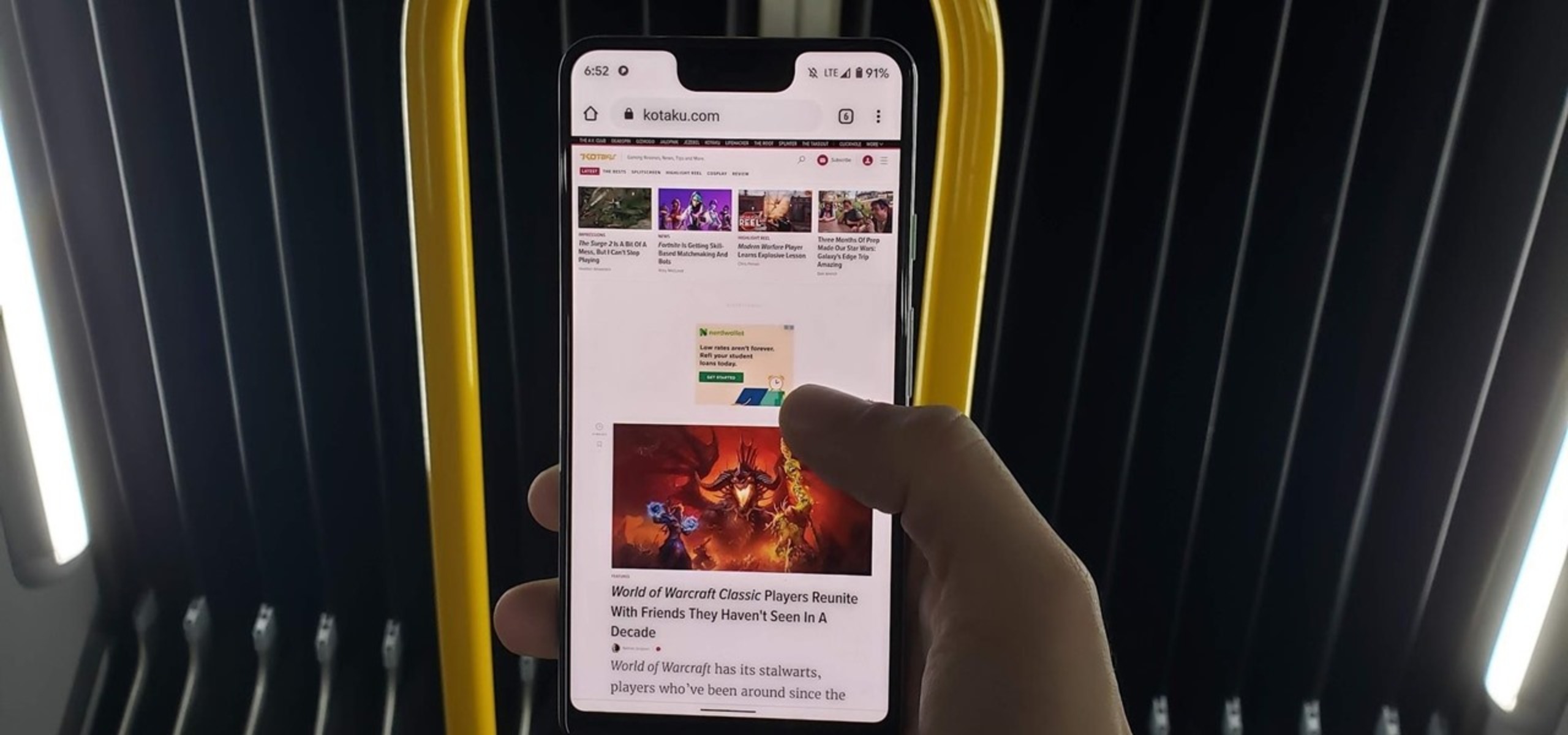
Upon enabling the device simulation mode, the web page will transform to emulate the dimensions and characteristics of a mobile device. You can choose from a wide range of pre-configured device profiles, including popular smartphones and tablets, or customize the dimensions to match a specific device. This allows you to experience the website as if you were viewing it on an actual mobile device, complete with touch interactions and responsive design adjustments.
Furthermore, Chrome Developer Tools provides additional functionalities such as network throttling, allowing you to simulate different network conditions to observe how the website performs under varying levels of connectivity. This feature is invaluable for assessing the loading times and responsiveness of a website on mobile devices with slower connections.
In addition to device simulation and network throttling, Chrome Developer Tools offers comprehensive inspection tools for analyzing and modifying the structure, layout, and behavior of web pages. This includes examining the HTML, CSS, and JavaScript components, as well as monitoring network activity and performance metrics.
By leveraging Chrome Developer Tools, users can gain deep insights into how websites adapt to mobile environments, identify potential issues, and optimize the user experience across different devices. Whether you're a web developer fine-tuning responsive designs or a curious user interested in exploring the mobile versions of your favorite websites, Chrome Developer Tools provides a powerful and accessible platform for mobile web exploration right from your desktop.
Method 2: Using Chrome Extension
Another convenient method for viewing the mobile version of a website on your desktop is by utilizing a Chrome extension specifically designed for emulating mobile devices. This approach offers a seamless and user-friendly way to switch between desktop and mobile views with just a few clicks, making it an ideal option for those who prefer a straightforward solution without delving into developer tools.
One popular Chrome extension that excels in this functionality is "Mobile View Switcher." Upon installing this extension from the Chrome Web Store, a small mobile phone icon will appear in the browser's toolbar. Clicking on this icon presents a dropdown menu featuring a variety of mobile device options, including smartphones and tablets from different manufacturers and with various screen sizes.
By selecting a specific device from the dropdown menu, the extension instantly transforms the current tab to emulate the chosen mobile device's screen dimensions and characteristics. This allows users to experience the website as it would appear on the selected mobile device, complete with responsive design adjustments and touch interactions.
The "Mobile View Switcher" extension also provides the flexibility to customize and add new device profiles, catering to specific mobile devices not included in the default options. This customization feature ensures that users can accurately emulate the exact dimensions and behaviors of the mobile devices they are interested in, providing a comprehensive testing environment for mobile web experiences.
In addition to device emulation, the extension offers a user-friendly interface for quickly toggling between mobile and desktop views, enabling effortless comparison of how a website renders and functions across different platforms. This seamless switching capability is particularly valuable for web designers, developers, and quality assurance professionals seeking to assess and optimize the mobile compatibility of websites.
Furthermore, the "Mobile View Switcher" extension integrates smoothly with other Chrome developer tools and extensions, enhancing its compatibility and usability within the broader web development ecosystem. This seamless integration ensures that users can leverage the extension alongside other web development tools to gain comprehensive insights into mobile web experiences.
By leveraging a dedicated Chrome extension such as "Mobile View Switcher," users can effortlessly explore the mobile versions of websites right from their desktop, gaining valuable perspectives on how websites adapt to various mobile devices. Whether you're a web professional striving to enhance mobile user experiences or simply curious about how your favorite websites appear on different devices, this method provides an accessible and intuitive approach to mobile web exploration within the Chrome browser.
Conclusion
In conclusion, the ability to view the mobile version of a website on a desktop using Chrome Developer Tools and dedicated Chrome extensions offers a wealth of benefits for web professionals, designers, developers, and curious users alike. By harnessing these methods, individuals can gain valuable insights into how websites adapt to mobile environments, optimize user experiences, and ensure seamless functionality across diverse devices.
The utilization of Chrome Developer Tools provides a comprehensive platform for simulating mobile environments, enabling users to experience websites as they would appear on various mobile devices. This powerful feature not only facilitates visual inspection but also allows for in-depth analysis of the website's structure, layout, and performance. With the ability to customize device dimensions and simulate different network conditions, Chrome Developer Tools empowers users to identify and address potential issues related to mobile responsiveness and user interaction.
Furthermore, the convenience and accessibility of dedicated Chrome extensions, such as "Mobile View Switcher," offer a user-friendly approach to exploring the mobile versions of websites. With seamless device emulation and effortless switching between desktop and mobile views, these extensions cater to users who prefer a straightforward solution for assessing and optimizing mobile compatibility. The integration of customization options and compatibility with other web development tools further enhances the utility of these extensions, making them valuable assets for web professionals and enthusiasts.
Whether it's ensuring a seamless user experience across devices, fine-tuning responsive designs, or simply satisfying curiosity about how websites appear on mobile platforms, the ability to view the mobile version of a website on a desktop is a valuable capability. It empowers individuals to stay ahead in the ever-evolving landscape of web design and development, fostering a deeper understanding of mobile user experiences and driving the optimization of websites for diverse audiences.
In essence, the methods outlined in this article not only enable users to explore the mobile side of the web from the comfort of their desktop but also contribute to the ongoing enhancement of mobile web experiences. By leveraging the powerful capabilities of Chrome Developer Tools and dedicated Chrome extensions, individuals can navigate the complexities of mobile web optimization with confidence and creativity, ultimately delivering exceptional user experiences across all devices.


