


Introduction
In today's digital age, the ability to access websites on various devices is crucial. With the increasing use of smartphones and tablets, many websites have developed mobile versions to cater to the needs of mobile users. However, there are instances when you may prefer to view the mobile version of a website on your desktop or laptop. This could be for testing purposes, to experience the mobile interface, or to access specific features only available on the mobile version.
Fortunately, Google Chrome, one of the most popular web browsers, offers several methods to view the mobile version of a website on your desktop. Whether you are a developer, a designer, or simply a curious user, these techniques can come in handy. In this article, we will explore two effective methods to achieve this – using Chrome Developer Tools and utilizing Chrome Extensions.
By the end of this article, you will have a clear understanding of how to seamlessly switch to the mobile version of a website on your Chrome browser, allowing you to experience the interface and functionality as if you were browsing on a mobile device. Let's dive into the details and uncover the steps to accomplish this with ease.
Using Chrome Developer Tools
Google Chrome Developer Tools is a powerful feature that allows users to inspect, debug, and modify the structure and design of a website. It provides a comprehensive set of tools for web developers and designers to analyze and optimize web pages. One of its valuable functionalities is the ability to simulate a mobile environment, enabling users to view the mobile version of a website on their desktop.
Here's a step-by-step guide on how to utilize Chrome Developer Tools to access the mobile version of a website:
-
Open the Website: Launch Google Chrome and navigate to the website for which you want to view the mobile version.
-
Access Developer Tools: Right-click anywhere on the webpage and select "Inspect" from the context menu. Alternatively, you can press
Ctrl + Shift + I(Windows/Linux) orCmd + Option + I(Mac) to open Developer Tools. -
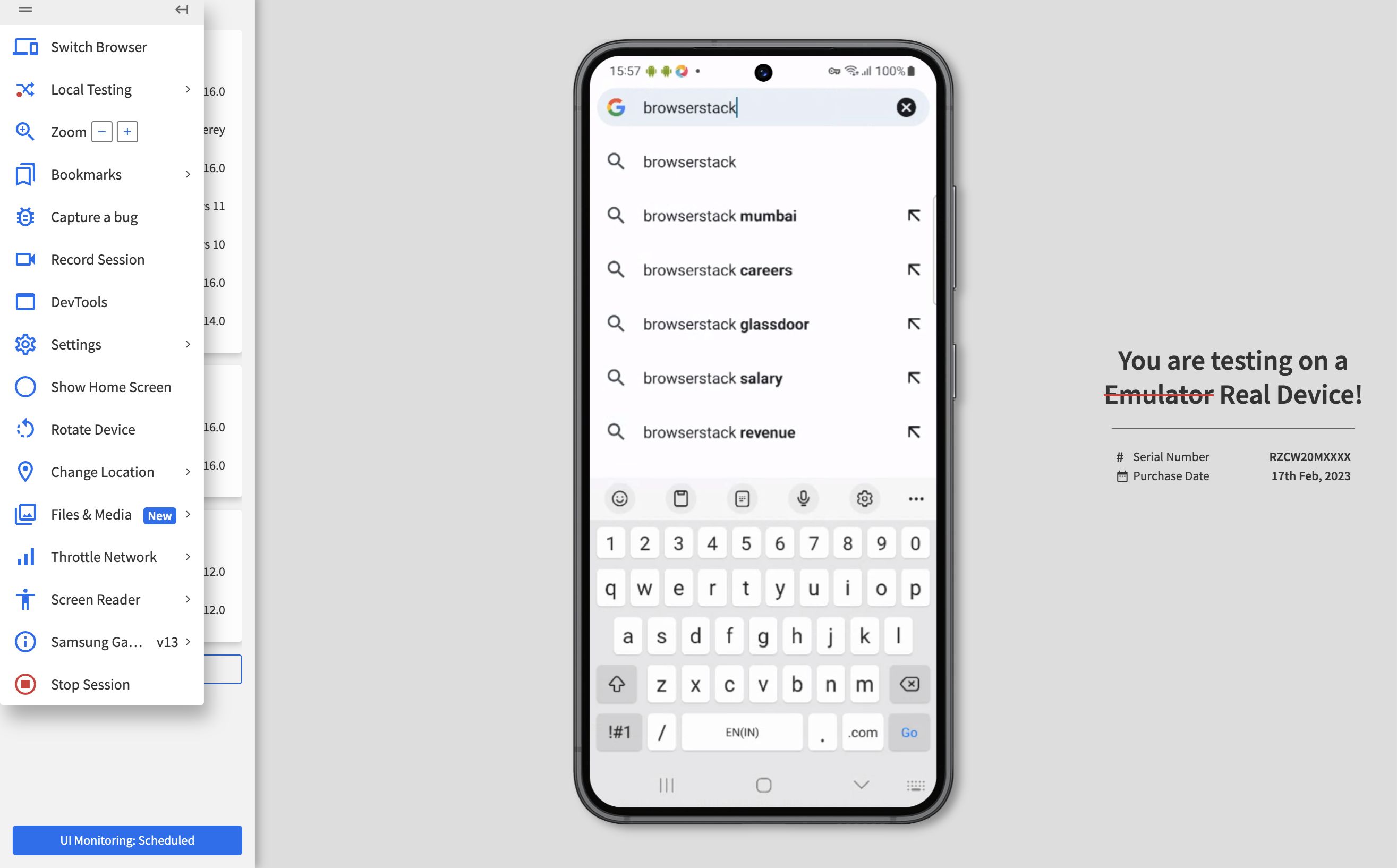
Toggle Device Toolbar: In the Developer Tools panel, click on the "Toggle Device Toolbar" icon (or press
Ctrl + Shift + Mon Windows/Linux orCmd + Option + Mon Mac) to activate the device mode. This will transform the webpage into a mobile view, allowing you to experience the website as it appears on a mobile device. -
Select Device: At the top of the screen, you can choose from a range of pre-configured devices or customize the dimensions to simulate the exact mobile device you wish to emulate. This flexibility enables you to test the website's responsiveness across various mobile platforms.
-
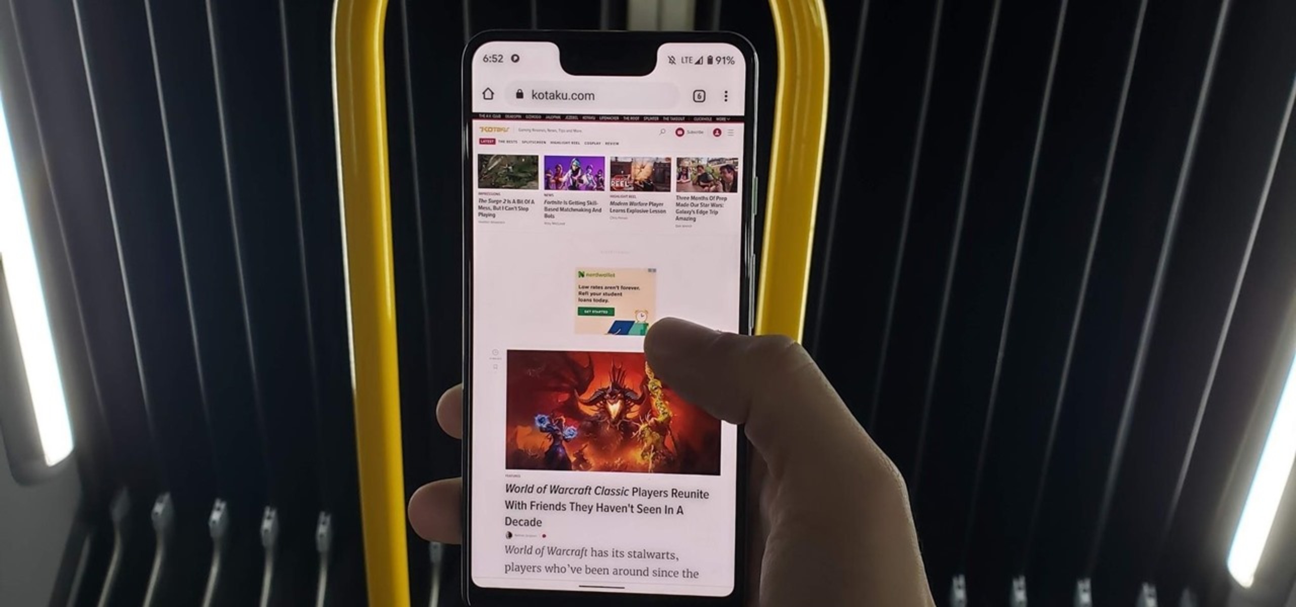
Interact with the Mobile Version: Once the mobile view is activated, you can interact with the website just as you would on a mobile device. This includes scrolling, tapping on links and buttons, and experiencing the layout and functionality tailored for mobile users.
-
Exit Device Mode: To return to the standard desktop view, simply click the "Toggle Device Toolbar" icon again or press the corresponding keyboard shortcut. This will revert the webpage to its original desktop layout.
By following these straightforward steps, you can seamlessly switch to the mobile version of a website using Chrome Developer Tools. This method provides a convenient way to explore and test the mobile interface of a website without the need for an actual mobile device. Whether you are a developer ensuring mobile responsiveness or a user curious about the mobile experience, Chrome Developer Tools offers a valuable solution for accessing the mobile version of websites on your desktop browser.
Using Chrome Extensions
In addition to leveraging Chrome Developer Tools, another effective approach to accessing the mobile version of a website on your desktop is by utilizing Chrome Extensions. These extensions are specially designed to enhance the functionality of the Chrome browser, offering a wide range of features and tools to cater to diverse user needs. When it comes to viewing the mobile version of a website, certain Chrome Extensions provide seamless solutions to achieve this objective.
Here's a detailed exploration of how to use Chrome Extensions to access the mobile version of a website:
-
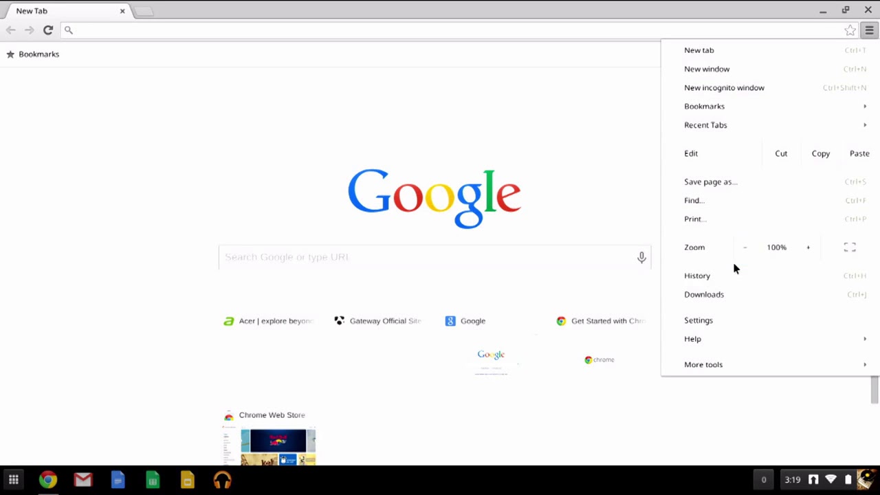
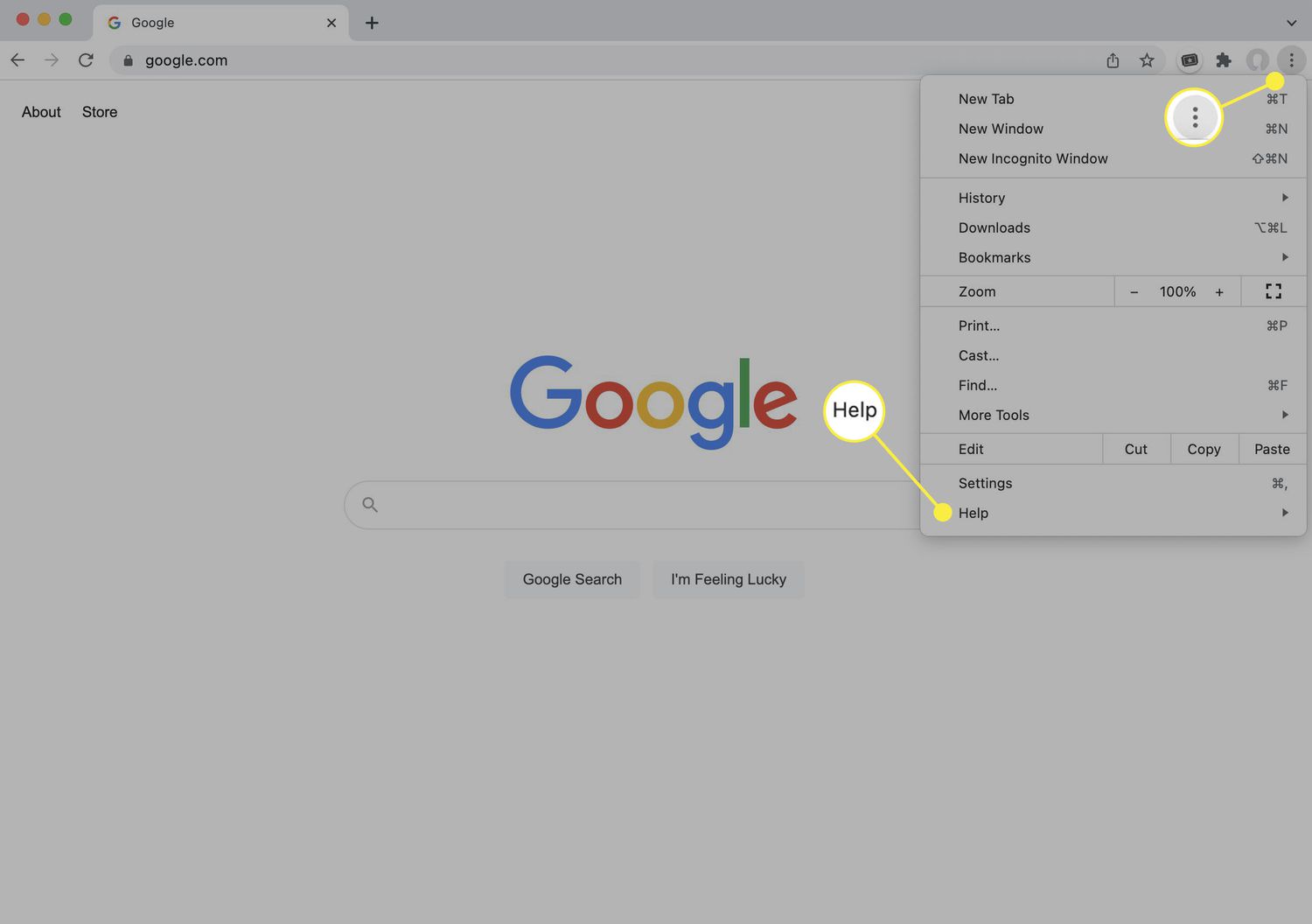
Extension Installation: The first step is to identify and install a suitable Chrome Extension that facilitates the viewing of mobile websites. You can access the Chrome Web Store by clicking on the three-dot menu in the top-right corner of the browser, selecting "More tools," and then choosing "Extensions." From there, you can browse through the available extensions or search for specific ones related to mobile website viewing.
-
Selecting the Extension: Look for extensions that offer mobile emulation or user-agent switching capabilities. These extensions typically allow you to modify the user-agent string, which is a crucial component for convincing websites that you are accessing them from a mobile device. Popular extensions such as "User-Agent Switcher for Chrome" and "Mobile View Switcher" are designed to simplify the process of switching to the mobile version of websites.
-
Activating the Extension: Once you have installed the preferred Chrome Extension, it will usually appear as an icon in the browser's toolbar. Click on the extension icon to access its features and settings. Depending on the extension, you may be able to select a specific mobile device or customize the user-agent string to emulate various mobile platforms.
-
Browsing in Mobile View: After configuring the extension to emulate a mobile device, simply navigate to the website you wish to view in its mobile version. The extension will modify the user-agent information sent to the website, prompting it to display the mobile interface instead of the standard desktop layout.
-
Interacting with the Mobile Interface: With the mobile view activated, you can interact with the website as if you were using a mobile device. This includes testing touch gestures, exploring mobile-specific features, and experiencing the responsive design tailored for smaller screens.
-
Disabling the Extension: If you wish to revert to the desktop view, you can either disable the Chrome Extension or toggle its settings to restore the default user-agent information. This will prompt the website to display its standard desktop version upon reloading the page.
By incorporating Chrome Extensions into your browsing experience, you can effortlessly switch to the mobile version of websites, gaining valuable insights into their mobile interfaces and functionalities. Whether you are a developer ensuring cross-device compatibility or a user seeking to explore the mobile experience, these extensions offer a user-friendly solution for accessing mobile versions of websites on your desktop browser.
In summary, both Chrome Developer Tools and Chrome Extensions provide accessible and efficient methods for viewing the mobile version of websites on Google Chrome. By mastering these techniques, you can seamlessly transition between desktop and mobile views, gaining a comprehensive understanding of a website's adaptability across different devices. Whether for professional development purposes or personal exploration, these methods empower users to experience the diverse dimensions of web content with ease.
Conclusion
In conclusion, the ability to view the mobile version of a website on Google Chrome opens up a world of possibilities for developers, designers, and everyday users. By employing the techniques outlined in this article, individuals can seamlessly transition between desktop and mobile views, gaining valuable insights into website responsiveness, design, and functionality across different devices.
Whether utilizing the powerful capabilities of Chrome Developer Tools or harnessing the convenience of Chrome Extensions, users can experience the mobile interface of websites without the need for physical mobile devices. This flexibility is particularly beneficial for web developers and designers who need to ensure the seamless performance of websites across diverse platforms. By simulating the mobile environment on their desktop browsers, they can identify and address any potential issues related to mobile responsiveness and user experience.
For curious users, the ability to access the mobile version of websites offers a unique opportunity to explore the tailored interfaces and features designed for mobile users. Whether testing touch gestures, experiencing responsive layouts, or accessing mobile-specific functionalities, this access provides a comprehensive understanding of a website's adaptability and user-centric design.
In essence, the methods presented in this article empower users to delve into the multi-faceted nature of web content, fostering a deeper appreciation for the intricacies of website design and development. By seamlessly switching to the mobile version of websites, users can gain a holistic perspective on the digital experiences offered to mobile audiences, ultimately contributing to enhanced user engagement and satisfaction.
As technology continues to evolve, the ability to access and experience websites across various devices becomes increasingly significant. With the insights gained from viewing mobile versions on Google Chrome, individuals are better equipped to optimize websites for diverse audiences and ensure a seamless user experience across different platforms.
In summary, the techniques explored in this article serve as valuable tools for navigating the dynamic landscape of web design and user interaction. Whether for professional development, testing purposes, or personal exploration, the ability to view the mobile version of websites on Google Chrome enhances the accessibility and understanding of digital content, ultimately contributing to a more inclusive and user-centric web environment.


