


Introduction
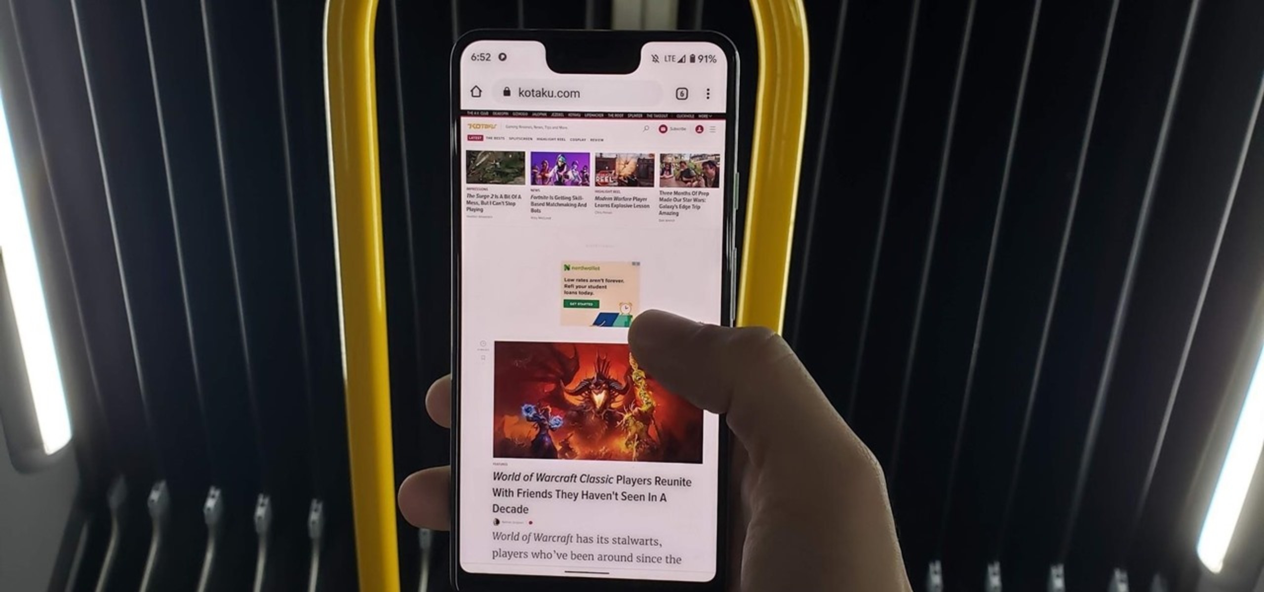
In today's digital age, the seamless transition from desktop to mobile browsing has become increasingly important. With the majority of internet users accessing websites through their mobile devices, it's crucial for web developers, designers, and even casual users to ensure that their websites are optimized for mobile viewing. However, it can be challenging to accurately gauge how a website appears and functions on a mobile device without physically accessing one. This is where the ability to view mobile versions of websites on a desktop browser, such as Chrome, becomes invaluable.
Fortunately, there are several methods available for users to simulate the mobile browsing experience directly within the Chrome browser. Whether you're a web developer looking to test the responsiveness of your website or a casual user curious about how a particular site appears on a mobile device, these methods provide a convenient way to view mobile versions of websites without the need for an actual mobile device.
By leveraging Chrome's developer tools, extensions, or emulators and simulators, users can gain insight into how websites are displayed and interacted with on various mobile devices. This not only facilitates the optimization of websites for mobile viewing but also allows for a more comprehensive understanding of the user experience across different platforms.
In the following sections, we will explore these methods in detail, providing step-by-step instructions and insights to help you seamlessly view mobile versions of websites within the Chrome browser. Whether you're a seasoned developer or a curious user, these techniques will empower you to explore the mobile web with ease and precision.
Using Chrome Developer Tools
Chrome Developer Tools is a powerful feature that enables users to inspect, debug, and modify the structure and layout of a webpage. It also provides a convenient way to simulate the mobile browsing experience directly within the Chrome browser. By leveraging this tool, users can gain valuable insights into how websites are rendered on various mobile devices, allowing for precise optimization and troubleshooting.
To access Chrome Developer Tools, simply right-click on any element of the webpage and select "Inspect" from the context menu. Alternatively, you can press Ctrl + Shift + I on Windows/Linux or Cmd + Option + I on macOS to open the Developer Tools panel. Once the panel is open, you can toggle the device toolbar by clicking the "Toggle Device Toolbar" icon (or pressing Ctrl + Shift + M on Windows/Linux or Cmd + Option + M on macOS).
The device toolbar allows you to simulate the viewport of different mobile devices, including popular models such as iPhone, iPad, Samsung Galaxy, and more. By selecting a specific device, the webpage will be rendered as it would appear on the chosen device, complete with the corresponding screen dimensions and user agent.
Furthermore, the device toolbar offers additional features such as network throttling, which simulates various network conditions to assess the website's performance on slower connections. This is particularly useful for evaluating the loading times and responsiveness of a webpage on mobile devices with limited bandwidth.
In addition to simulating specific devices, Chrome Developer Tools provides a responsive design mode that allows users to manually adjust the viewport size and orientation. This flexibility enables precise testing across a wide range of screen dimensions, ensuring that websites are optimized for various mobile devices and orientations.
Moreover, the "Elements" tab within Chrome Developer Tools offers a comprehensive view of the webpage's HTML and CSS structure, allowing users to inspect and modify the layout to better suit the mobile viewing experience. This level of granular control empowers developers and designers to fine-tune the responsiveness and visual presentation of their websites.
Overall, Chrome Developer Tools serves as a versatile and indispensable resource for viewing mobile versions of websites within the Chrome browser. Its intuitive interface, device simulation capabilities, and extensive debugging features make it an essential tool for optimizing and perfecting the mobile browsing experience. Whether you're a web developer striving for pixel-perfect responsiveness or a curious user exploring the mobile web, Chrome Developer Tools provides the means to seamlessly simulate and enhance the mobile viewing experience directly from your desktop.
Using Chrome Extensions
Chrome extensions offer a convenient and efficient way to simulate the mobile browsing experience within the Chrome browser. These extensions are designed to provide users with a seamless method for viewing mobile versions of websites, offering a range of features and customization options to suit diverse needs.
One popular Chrome extension for simulating mobile views is "Mobile View Switcher." This extension allows users to easily switch between desktop and mobile views of a webpage, providing a quick and intuitive way to experience how a website appears on different devices. By simply clicking the extension icon in the Chrome toolbar, users can toggle between desktop, tablet, and mobile views, enabling them to assess the responsiveness and layout of the webpage across various screen sizes.
Another notable extension is "User-Agent Switcher," which enables users to mimic the user agent of different devices and browsers. By altering the user agent string, this extension tricks websites into believing that the user is accessing the site from a specific device or browser, thereby presenting the corresponding mobile version of the webpage. This functionality is particularly useful for testing how websites respond to different user agents and ensuring that the mobile versions are accurately displayed.
Furthermore, the "Window Resizer" extension offers a comprehensive set of predefined screen resolutions for popular mobile devices, allowing users to instantly resize the browser window to match the dimensions of specific smartphones and tablets. This feature provides a practical way to visualize how websites adapt to different screen sizes, facilitating the identification of potential layout and responsiveness issues.
Additionally, the "Ripple Emulator" extension provides a robust environment for testing mobile web applications within the Chrome browser. This extension simulates various mobile devices and operating systems, allowing developers to interact with web applications as if they were running on real devices. With its emulation capabilities and extensive device library, the Ripple Emulator extension offers a comprehensive solution for evaluating the performance and functionality of mobile web applications.
Overall, Chrome extensions offer a diverse array of tools and functionalities for simulating mobile views within the Chrome browser. Whether you're a web developer seeking to optimize website responsiveness or a casual user interested in exploring the mobile web, these extensions provide a user-friendly and accessible means to experience and evaluate the mobile versions of websites directly from your desktop browser.
Using Emulators or Simulators
In addition to Chrome's built-in developer tools and extensions, another effective method for viewing mobile versions of websites within the Chrome browser is by utilizing emulators or simulators. Emulators and simulators are powerful tools that replicate the behavior of mobile devices, allowing users to experience and interact with websites as if they were accessing them from an actual smartphone or tablet.
One notable option for leveraging emulators and simulators is the Android Virtual Device (AVD) Manager, which is part of the Android Studio development environment. This tool enables users to create virtual Android devices with specific configurations, including screen size, resolution, and Android version. By launching these virtual devices within the Chrome browser, users can accurately simulate the mobile browsing experience and assess how websites are rendered on different Android devices.
Similarly, iOS developers can utilize the iOS Simulator, which is included as part of Xcode, Apple's integrated development environment. The iOS Simulator allows users to emulate various iPhone and iPad models, providing a realistic representation of how websites appear and function on iOS devices. By selecting different device configurations and orientations, users can gain valuable insights into the responsiveness and visual presentation of websites on iOS platforms.
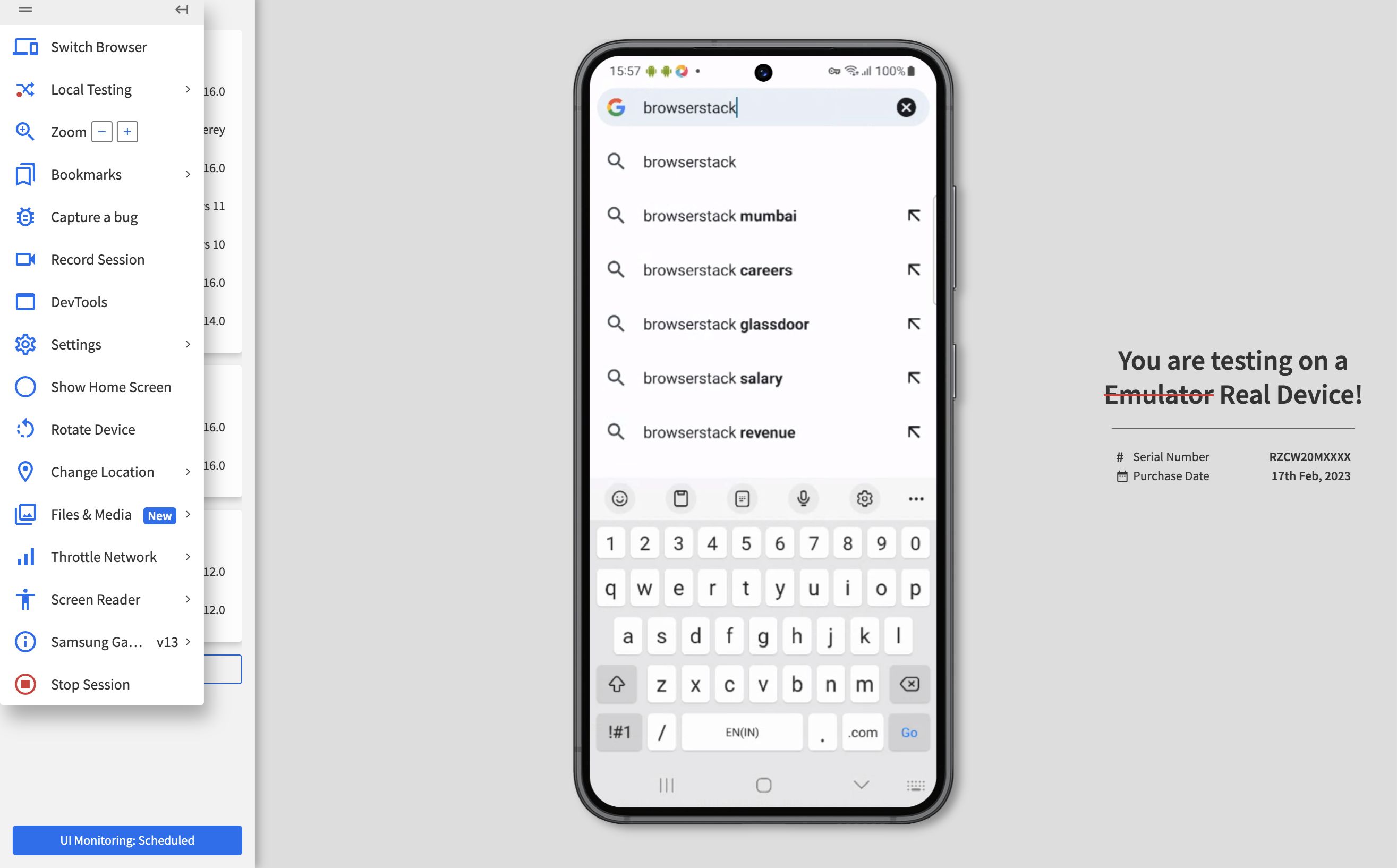
Moreover, web-based emulators such as BrowserStack and Sauce Labs offer comprehensive solutions for testing websites across a wide range of devices and browsers. These platforms provide virtual environments that accurately replicate the behavior of numerous mobile devices, allowing users to interact with websites in a manner that closely mirrors the experience on actual devices. With support for diverse operating systems, screen sizes, and device capabilities, web-based emulators offer a versatile and thorough approach to evaluating the mobile versions of websites.
Additionally, the Chrome DevTools Device Mode includes an option to connect to remote devices, enabling users to view and interact with websites on physical smartphones and tablets directly from the Chrome browser. By establishing a connection between the desktop browser and a mobile device, users can assess the real-time performance and responsiveness of websites on actual hardware, gaining a comprehensive understanding of the mobile browsing experience.
In summary, emulators and simulators provide a robust and comprehensive means to view mobile versions of websites within the Chrome browser. Whether utilizing platform-specific tools such as AVD Manager and iOS Simulator, or leveraging web-based emulators and remote device connections, these methods offer a detailed and accurate representation of the mobile browsing experience. By simulating the behavior of various mobile devices, users can effectively optimize websites for mobile viewing and ensure a seamless user experience across different platforms and devices.


