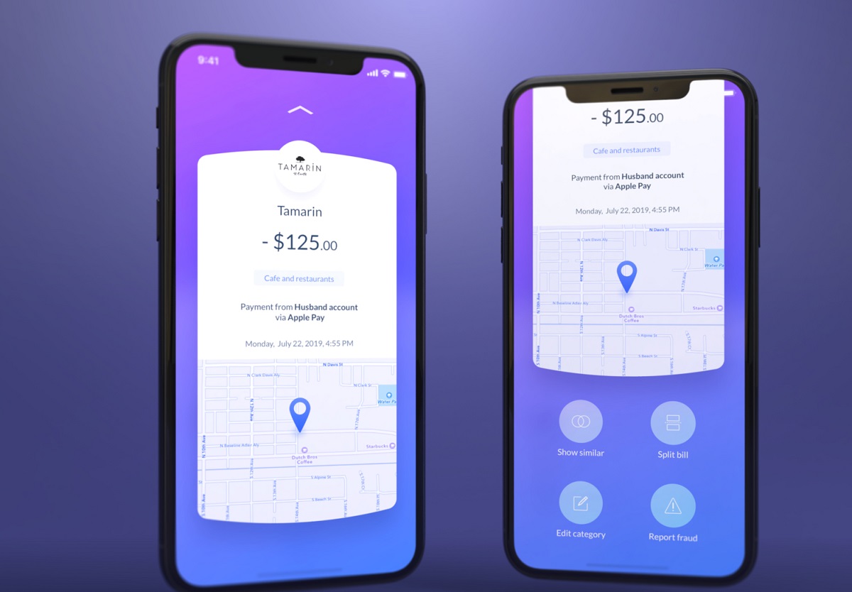
Hey there, fellow designers and enthusiasts! Ever found yourself absorbed in the tiny, colorful symbols adorning the screen of your mobile or computer? Ever wondered how these seemingly insignificant symbols, better known as icons, play an integral part in your interaction with the digital world? Icons, the unsung heroes of mobile and web User Interface (UI) and User Experience (UX), are fundamental elements that guide our interaction with a device and help create an intuitive, user-friendly environment.
The Importance of Icons in UI/UX
Icons are not just decorative elements in your UI design; they are crucial navigational cues that guide users through an interface, making it more accessible and user-friendly. They have the power to instantly communicate functions, features, and directions to the user without the need for text, thus saving space and reducing cognitive load. Recognizable and consistent icons help users understand your platform quicker, making the interaction smooth and efficient. So, when you’re designing a UI/UX, remember, the journey begins with the icons.
Understanding Icon Design
Icon design might seem simple at first glance – creating appealing symbols. However, it is a complex process that requires a deep understanding of user behavior, cultural nuances, and visual balance. Designing icons is about ensuring that your symbols are easily recognized, simple, yet meaningful. It’s a balancing act between maintaining aesthetic appeal and delivering clarity. It’s about creating an identity, ensuring consistency, and scaling for various devices and resolutions.
Different Types of Icons
In the world of UI/UX design, we primarily deal with three types of icons – Material Icons, Glyph Icons, and Flat Icons. Material Icons, with their subtle depth effects and realistic light and shadow, offer a three-dimensional feel. Glyph Icons, on the other hand, are minimalistic and straightforward, often used in mobile apps for their simplicity and scalability. Flat Icons, void of any depth or realistic attributes, rely on simple shapes and bright colors to communicate their function. Understanding these types and their appropriate use is crucial in creating an effective icon set.
How to Create Icon Sets
Embarking on the journey of creating an icon set can be intimidating. But, fret not! We’re here to guide you. To create an effective apps icon set, there are certain factors you need to consider:
Define Your Style
Establishing a consistent style for your icons is the first step. Whether you’re going for a minimalistic look or a detailed, complex style, make sure it aligns with your overall UI design. A consistent style helps in creating a coherent visual language across your interface.
Keep It Simple
Remember the timeless KISS principle (Keep It Simple, Silly)? It holds paramount importance in icon design. Your icons should be simple and clear, not overwhelmed with unnecessary details. Over-complicating an icon could lead to confusion, defeating its very purpose.
Use Consistent Geometry
Geometry plays a crucial role in your icon design. Whether you’re using rounded corners or angular shapes, make sure you maintain consistency across all your icons. Consistent shapes help create a unified look and contribute to visual harmony.
Be Mindful of Size and Scalability
Your icons should retain their clarity and recognizability, regardless of their size. Scalability is key. Whether a user is interacting with your interface on a large desktop monitor or a compact mobile screen, your icons should deliver the same level of clarity and functionality.
Color and Contrast
Color is more than just a design choice. It plays a vital role in distinguishing icons and drawing user attention. Make sure the color of your icons contrasts well with the background and is consistent with your overall color scheme.
Design Tools for Icon Creation
Icon design is a meticulous process, and the right tools can make all the difference. Let’s delve into some widely used tools:
Adobe Illustrator
A frontrunner in the design realm, Adobe Illustrator offers a powerful platform for icon design. With its extensive set of vector editing tools, Illustrator allows you to create detailed, scalable icons with ease.
Sketch
Renowned for its user-friendly interface and feature-rich environment, Sketch is a favorite among designers. It’s an excellent tool for creating vector-based icons and allows for easy editing and flexibility.
Figma
Figma stands out with its web-based interface and robust collaboration features. Its vector editing tools are ideal for designing icons, and its cloud-based nature allows multiple designers to collaborate in real-time.
Online Icon Libraries
In the vast, fast-paced digital realm, efficiency often holds the key to success. As designers, there may be scenarios where you need to expedite your design process without compromising on the quality. This is where online icon libraries can be a godsend. These treasure troves of ready-to-use icons not only save you precious time but also provide a wealth of inspiration for your projects.
The online space is brimming with several major players when it comes to icon libraries. Here are a few big names you might want to explore:
- Icons8: Icons8 offers a vast array of icons in various styles, sizes, and formats. Their impressive collection is created by a community of passionate designers.
- Flaticon: Flaticon boasts one of the largest databases of free icons available in PNG, SVG, EPS, PSD, and BASE 64 formats. Their diverse range caters to different design aesthetics and needs.
- Iconfinder: Offering both free and premium icons, Iconfinder provides high-quality graphics perfect for web, apps, and design projects.
- FontAwesome: Particularly popular among web designers, FontAwesome offers a library of vector icons and logos, which can be easily integrated into your designs.
- Noun Project: With its focus on creating a global visual language, Noun Project provides a diverse collection of icons and symbols contributed by creators around the world.
While online icon libraries are a boon for designers, remember that they should supplement, not replace, your original designs. Using these resources in conjunction with your own creative process will ensure your designs are not only efficient but also unique and personalized.
Testing Your Icon Designs
Testing is a critical part of the design process. It helps gauge the effectiveness of your icons and make necessary adjustments. Here’s how you can do it:
A/B Testing
A/B testing involves creating two versions of your icon set and testing them with a group of users. The version that achieves better user interaction and understanding is the one you should proceed with.
User Feedback
Lastly, direct user feedback is invaluable. Observe how your users interact with your icons, gather their feedback, and use it to refine your designs. Real-world testing provides insights that theoretical analysis often misses.
Conclusion
Designing icons is a fusion of art and science, intertwining aesthetics with functionality. It’s not just about making a pleasing image; it’s about delivering clarity, maintaining consistency, and, most importantly, enhancing the user experience. Icons are the visual voice of your interface. So, jump in, create your unique icon sets, and let your UI/UX design speak volumes!


