Introduction
Welcome to the world of self-publishing! As an aspiring author, you have the incredible opportunity to share your stories and knowledge with readers around the globe. But before your words can captivate their minds, you need an eye-catching eBook cover that grabs their attention and entices them to click that “Buy” button. In this article, we’ll explore the art of creating stunning eBook covers using Photoshop.
Photoshop is a powerful tool that allows you to unleash your creativity and design professional-looking covers that stand out in the crowded digital marketplace. Whether you’re a seasoned designer or a beginner, this guide will provide you with the essential knowledge and techniques to create visually appealing eBook covers that represent the essence of your work.
But why is a well-designed eBook cover so important? Well, just like a book’s cover can make or break its success in a traditional bookstore, an eBook cover plays a vital role in attracting potential readers online. In the vast sea of eBooks available, a visually striking cover can serve as a magnet, drawing readers in and promising them a captivating reading experience.
Not only does a great cover visually communicate the genre and tone of your book, but it also establishes credibility and professionalism. A professionally designed cover gives the impression that the content within is of high quality, convincing readers that they’re making a worthwhile investment.
In this article, we’ll dive into the exciting world of Photoshop and cover design. We’ll explore topics such as choosing the right dimensions for your eBook cover, selecting typography that enhances your book’s message, using high-quality images, creating eye-catching backgrounds, adding text and titles, designing an appealing color scheme, enhancing your cover with effects and filters, and finally, exporting the file.
So, without further ado, let’s embark on this creative journey to craft unforgettable eBook covers that will truly make your work stand out in the crowded digital marketplace.
Getting Started with Photoshop
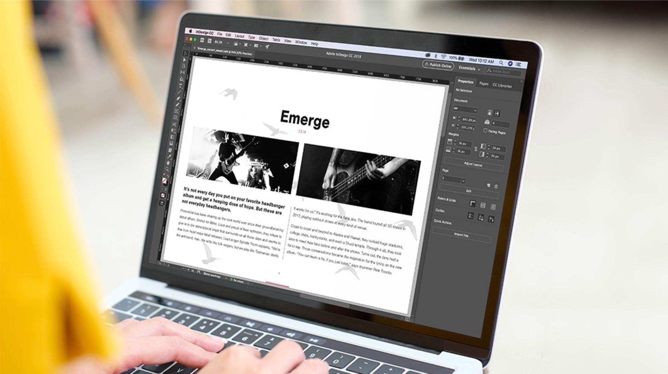
Before we begin designing our eBook cover, let’s familiarize ourselves with Photoshop and its basic features. If you’re new to Photoshop, don’t worry – it may seem intimidating at first, but with a little practice, you’ll be able to navigate the software like a pro.
First things first, make sure you have Photoshop installed on your computer. If you don’t already have it, you can easily download the software from Adobe’s website and follow the installation instructions.
Once you have Photoshop up and running, let’s take a quick tour of the interface. The main window is comprised of several panels and toolbars, each serving a specific purpose. The Tools panel, located on the left-hand side, contains various tools that allow you to select, paint, retouch, and manipulate elements on your canvas. The Options bar, located at the top of the screen, displays settings and options for the currently selected tool, allowing you to customize your editing preferences.
At the top right corner of the Photoshop window, you’ll find the Document toolbar, which displays information about your current document, such as its size, resolution, and color mode. Adjacent to the Document toolbar is the Layers panel, a powerful feature that allows you to work with different layers of content, enabling you to easily manage and organize your design elements.
Now that we’re familiar with the basic layout of Photoshop, let’s create a new document for our eBook cover. Go to File > New and enter the dimensions for your cover. It’s recommended to use the standard eBook cover size of 1563 pixels wide by 2500 pixels tall. Set the resolution to 300 pixels per inch (PPI) to ensure a high-quality print output.
Once your document is set up, you’re ready to embark on your creative journey. In the next sections, we’ll explore various design elements and techniques that will elevate your eBook cover to new heights. From typography and images to colors and effects, we’ll cover it all.
Remember, practice is key when it comes to mastering Photoshop. Don’t be afraid to experiment, try new tools and techniques, and most importantly, have fun along the way. Happy designing!
Choosing the Right Dimensions for Your eBook Cover
One of the first steps in creating an outstanding eBook cover is choosing the right dimensions for your design. The dimensions of your cover are crucial as they determine how your image will appear on different devices and platforms. Ensuring that your cover looks visually appealing and professional across various platforms is essential for catching the attention of potential readers.
Most eBook platforms and online retailers have specific guidelines and requirements for cover dimensions. It’s important to familiarize yourself with these guidelines to ensure your cover meets the necessary standards.
The standard eBook cover size varies slightly depending on the retailer, but a widely accepted dimension is 1563 pixels wide by 2500 pixels tall. This size ensures that your cover retains its quality and proportions, regardless of the device used to view it.
When designing your cover, it’s crucial to consider its aspect ratio. The aspect ratio refers to the relationship between the width and height of the cover. A common aspect ratio for eBook covers is 1:1.6, which falls in line with the 1563 pixels wide by 2500 pixels tall dimension. This aspect ratio ensures that your cover doesn’t appear distorted or stretched when displayed on different devices.
In addition to the aspect ratio, it’s essential to consider the resolution of your cover. The standard resolution for eBook covers is 300 pixels per inch (PPI). This high resolution ensures that your cover looks crisp and sharp, even when zoomed in or viewed on high-resolution screens.
While the standard dimensions and aspect ratio mentioned above are widely used, it’s always a good idea to double-check the specific requirements of the platform you’re publishing on. Some platforms may have additional guidelines or recommendations for cover size and aspect ratio.
Furthermore, it’s worth noting that eBook covers may also require alternative dimensions for promotional purposes. For example, some retailers may require smaller versions of your cover for thumbnail images or featured sections. It’s important to create these alternative versions while ensuring that your design remains visually appealing and recognizable.
By choosing the right dimensions for your eBook cover, you ensure that your design looks professional, maintains its proportions, and stands out in the crowded digital marketplace. Take the time to research the specific guidelines of the platform you’re using, and don’t forget to optimize your cover for different promotional uses. With the right dimensions in place, you’re ready to move onto the next step: understanding the importance of typography in your eBook cover design.
Understanding the Importance of Typography
When it comes to designing a captivating eBook cover, typography plays a significant role in grabbing the attention of potential readers and conveying the essence of your book. Typography refers to the style, arrangement, and appearance of the text on your cover, including fonts, sizes, and spacing. A well-thought-out typography selection can elevate your cover design, making it visually appealing, readable, and enticing.
One of the key considerations in choosing typography for your eBook cover is selecting the right font. Start by considering the genre and tone of your book. Different fonts convey different emotions and portray distinct styles. For instance, serif fonts like Times New Roman and Garamond evoke a classic and traditional feel, while sans-serif fonts like Arial and Helvetica give a modern and clean look. Script fonts can add elegance and sophistication, and display fonts can inject a sense of uniqueness and creativity. Take the time to explore various font options and select one that aligns with the content and genre of your book.
While it’s tempting to choose multiple fonts to add variety, it’s best to keep it simple and limit your selection to two or three fonts. Too many fonts can make your cover appear cluttered and distract from the main message. Ensure that the fonts you choose complement each other and create a cohesive visual experience.
Once you’ve chosen the fonts, it’s essential to consider their sizes and proportions. The title of your book should be the most prominent element on the cover and easily readable even in thumbnail size. Experiment with different sizes to find the perfect balance between visibility and aesthetic appeal. Subtitles, author names, and other text elements should be smaller but still legible.
In addition to font style and size, pay attention to the spacing and alignment of your text. Proper spacing between letters, words, and lines can enhance readability and make your cover look more polished. Align your text to create visual coherence, whether it’s centered, left-aligned, or right-aligned. Consistency in text alignment throughout your cover design provides a professional and cohesive look.
Remember that readability is key. Avoid using overly elaborate or decorative fonts that may be difficult to read, especially in thumbnail or smaller sizes. Your cover needs to grab attention quickly, and legible typography is crucial for immediate comprehension.
Overall, typography is a powerful tool for sending a clear message to potential readers. Each font choice, size, and spacing decision should align with the tone, genre, and overall theme of your book. By mastering the art of typography, you can create an eBook cover that not only captivates the eye but also communicates the essence of your story and entices readers to delve into your work.
Using High-Quality Images for Your eBook Cover
Images are powerful visual elements that can evoke emotions, set the mood, and capture the essence of your eBook. Choosing high-quality images for your cover is essential for creating an eye-catching and professional design that grabs the attention of potential readers.
First and foremost, it’s important to select images that are relevant to the content of your book and convey its genre and theme. Whether it’s a captivating photograph, an intriguing illustration, or a unique artwork, the image should resonate with your target audience and give a glimpse into the world of your story.
When searching for images, consider using reputable stock photo websites that provide a wide range of high-quality visuals. These platforms offer a vast selection of images to choose from, ensuring that you find the perfect fit for your eBook cover. Pay attention to the resolution and image quality, aiming for images that are sharp, clear, and visually appealing.
Another crucial aspect to consider when using images for your cover is copyright and licensing. Ensure that the images you choose are properly licensed for commercial use, specifically for eBook covers. This ensures that you have the legal rights to use the image for your intended purpose without infringing on any copyrights.
Once you have selected the perfect image, it’s important to tailor it to fit your cover design. Consider cropping, resizing, or adjusting the image to fit the dimensions of your eBook cover template. The goal is to create a visually balanced and compelling composition where the image seamlessly integrates with the typography and other design elements.
Remember, simplicity can often be more impactful than cluttered designs. Consider using a focal point within the image that draws attention and enhances the message or theme of your eBook. Experiment with different image placements, orientations, and effects to achieve the desired look and feel for your cover.
Lastly, don’t be afraid to add your own artistic touch and personalize the image further. You can modify colors, apply filters, or overlay text or graphics to make the image unique to your eBook. However, exercise caution to maintain the overall clarity and visual appeal of the image.
Incorporating high-quality images into your eBook cover design can significantly enhance its appeal and captivate potential readers. The right image can speak volumes about your book, making it an essential element in creating a striking and memorable cover. With careful selection and thoughtful integration, your eBook cover will be a visual masterpiece that entices readers to discover the wonders within.
Designing Eye-Catching Backgrounds
When it comes to creating an eBook cover that grabs attention, one element that can make a significant impact is the background design. The background sets the stage for your cover, creating a visual backdrop that enhances the overall composition and draws the viewer’s eye. Designing an eye-catching background can make your cover stand out, convey the mood of your book, and pique the interest of potential readers.
One approach to designing a captivating background is to use colors strategically. Colors evoke emotions and can evoke specific associations. Consider the genre and theme of your book – do you want a bold and vibrant background to grab attention, or a softer, more muted palette to create a sense of tranquility or mystery? Experiment with different color combinations to find the perfect balance that complements your book’s content and grabs attention.
Another technique for a visually appealing background is to use gradients. Gradients create a smooth transition between two or more colors and add depth and dimension to your cover. They can be used subtly as a background texture or as a more prominent element to create a visually striking effect. The key is to choose colors that harmonize with your overall design and don’t overwhelm the other elements of the cover.
Texture is another important aspect to consider when designing backgrounds. Textures can add visual interest and evoke a specific atmosphere or theme. From subtle patterns to grunge textures or intricate designs, there are endless possibilities to explore. You can find textures online or create your own using Photoshop’s built-in tools or external resources. Experiment with different textures and their opacities to create a visually appealing and cohesive background.
Using images as a background can also be a captivating approach for your eBook cover. Choose images that are relevant to your book’s content and enhance its overall message. Consider blending the image with other design elements or overlaying it with textures, gradients, or colors to create a unique and cohesive background. Ensure that the image doesn’t overpower the other elements on your cover but rather enhances the overall composition.
Remember to consider the readability of your cover when designing the background. The background should not overwhelm or clash with the text elements. Ensure sufficient contrast between the background and the text to make it easy to read, especially in thumbnail or smaller versions.
Designing an eye-catching background requires creativity and attention to detail. Consider the genre, mood, and theme of your book when selecting colors, gradients, textures, or images for the background. Experiment with different elements and combinations until you achieve a background design that captivates the reader’s gaze and sets the stage for the compelling story within your eBook.
Adding Text and Titles to Your eBook Cover
Once you have created a visually appealing background for your eBook cover, it’s time to add text and titles that enhance the overall composition and communicate the essence of your book. The text elements on your cover play a crucial role in grabbing the attention of potential readers and enticing them to explore further.
One of the most important text elements on your cover is the title of your book. The title should be the focal point and stand out prominently. Experiment with different fonts, sizes, and styles to find a combination that captures the tone and genre of your book while ensuring readability. Consider using a font that complements the theme of your book, whether it’s a sleek and modern font for a contemporary novel or an elegant script font for a romance story.
In addition to the title, you may want to include a subtitle or tagline that further conveys the theme or hook of your book. The subtitle should be smaller in size compared to the title, but still easily readable. It can provide additional context or intrigue readers by hinting at the story or the benefit your book offers.
Another important text element is the author name. Include your name on the cover to establish credibility and make it clear who the writer of the book is. The author name should be legible but doesn’t need to compete for attention with the title. Experiment with font styles and sizes to find a balance that complements the overall design.
When placing the text elements on your cover, consider the hierarchy and visual flow. The title should be the most prominent and visually striking element, followed by the subtitle and author name. Experiment with different placements and alignments to find an arrangement that creates a visually pleasing and cohesive composition.
Color is also an important consideration when adding text elements. Ensure that the color of the text contrasts with the background to increase legibility. Aim for readability and visibility, especially when the cover is viewed in a smaller size or as a thumbnail image. Keep in mind that different color combinations can evoke different emotions – choose colors that enhance the overall tone and genre of your book.
Lastly, be mindful of spacing and alignment when adding text to your cover. Proper spacing between letters, words, and lines enhances readability and gives your cover a polished look. Align your text elements to create visual coherence, whether it’s centered, left-aligned, or right-aligned. Consistency in alignment throughout the cover design provides a professional and cohesive appearance.
By carefully considering the design and placement of the text elements on your eBook cover, you can create a visually captivating composition that engages potential readers and communicates the essence of your book. Experiment with different fonts, colors, sizes, and arrangements until you achieve a combination that represents your book in a compelling and eye-catching way.
Creating an Appealing Color Scheme
An appealing color scheme can greatly enhance the visual impact of your eBook cover and evoke emotions that resonate with potential readers. The right combination of colors can set the mood, convey the genre of your book, and create a visually harmonious design that grabs attention.
When choosing a color scheme, consider the genre and theme of your book. Different colors have different psychological associations and can evoke specific emotions. For example, warm colors like red and orange can create a sense of excitement or passion, while cool colors like blue and green can evoke calmness or mystery. Consider the tone and atmosphere of your story and choose colors that align with it.
One approach to creating a visually appealing color scheme is to use complementary colors. Complementary colors are opposite each other on the color wheel, such as blue and orange or purple and yellow. When used together, they create a vibrant and eye-catching contrast that can make your cover stand out. Experiment with different combinations and find a balance that enhances the overall composition.
Analogous colors, on the other hand, are colors that are adjacent to each other on the color wheel. These colors create a harmonious and cohesive look. For example, using different shades of blue and green can create a serene and soothing effect. Analogous color schemes work well when you want to create a unified and calming visual experience.
Monochromatic color schemes involve using different shades, tints, and tones of a single color. This approach can create a sleek and sophisticated look. It’s especially useful if you want to emphasize a particular mood or theme in your book. Experimenting with different variations of a single color can give your cover a unique and visually interesting appeal.
When designing your color scheme, don’t forget about contrast. Contrast ensures that elements on your cover stand out and are easily distinguishable from one another. A high contrast between the background and the text, for example, ensures that the text is legible. Keep in mind that contrast can be achieved through both color and value (lightness and darkness of colors).
Aim for a visually balanced color scheme that doesn’t overwhelm or distract from the main elements of your cover. Select two or three primary colors and use additional colors sparingly as accents or highlights. Too many colors can create a chaotic and cluttered appearance.
Lastly, consider how your color scheme translates across different devices and platforms. Keep in mind that colors may appear slightly different on various screens or when printed. Test your cover design on different devices and in different formats to ensure that your color scheme remains appealing and consistent.
By carefully selecting and creating a color scheme that aligns with your book’s genre and theme, you can create an eBook cover that immediately attracts the attention of potential readers. Experiment with different color combinations and contrast, and aim for a visually balanced and harmonious design that speaks to the essence of your story.
Enhancing Your eBook Cover with Effects and Filters
Once you have the foundation of your eBook cover design in place, it’s time to take it to the next level by incorporating effects and filters. These creative enhancements can add depth, dimension, and visual interest to your cover, making it even more captivating to potential readers.
One way to enhance your eBook cover is by using various filters and adjustments available in Photoshop. Filters can dramatically transform the look and feel of your cover by applying different effects such as blurring, sharpening, or adding texture. Experiment with different filters to find the one that best enhances the mood and atmosphere of your book. However, be cautious not to overpower the other design elements or compromise the readability of the text.
Another technique to consider is adding shadows and highlights to certain elements of your cover. Shadows can create depth and make your design appear more three-dimensional, while highlights can add dimension and make certain areas pop. Use these effects selectively to enhance specific elements, such as the title or images, and create a more dynamic and visually engaging cover.
Textures and overlays can also elevate your eBook cover design. From subtle grunge textures to intricate patterns, overlays can add visual interest and create a unique and textured look. Experiment with different blending modes and opacities to achieve the desired effect. However, be mindful of maintaining balance and readability, ensuring that the overlays don’t overpower the other elements of your cover.
Adding gradients or color overlays can also enhance the overall aesthetic of your cover. Gradients can create a smooth transition between colors, adding depth and dimension. Color overlays can give your cover a cohesive and unified look, tying together different elements. Experiment with different gradients and color overlays to find the combination that enhances the overall composition and complements your chosen color scheme.
Special effects, like glow or light rays, can add a touch of magic or intrigue to your eBook cover. These effects can enhance certain elements or create a focal point that draws attention. Be mindful of using these effects sparingly and purposefully to maintain a professional and aesthetically pleasing composition.
Remember, the goal of incorporating effects and filters is to enhance your eBook cover and make it more visually captivating. However, it’s important to strike a balance and not overdo it. The effects should supplement and elevate the overall design, rather than distract or overpower it. Always consider the readability of the text elements and ensure that they remain clear and legible.
By experimenting with different effects and filters, you can transform your eBook cover into a visually stunning creation that grabs the attention of potential readers. Consider the mood and theme of your book, and choose enhancements that align with its essence. With careful consideration and a creative touch, you can enhance the impact of your eBook cover and make it truly stand out.
Finalizing Your eBook Cover and Exporting the File
After putting in the effort to design and enhance your eBook cover, it’s time to finalize it and prepare it for publishing. Taking the necessary steps to ensure your cover is optimized and properly exported will ensure that it looks professional and appealing to potential readers.
Once you are satisfied with the overall design of your eBook cover, it’s essential to review it for any potential issues or errors. Check for spelling mistakes, misplaced elements, or any other inconsistencies that may affect the overall quality of the cover. Make any necessary adjustments or revisions to ensure that your cover is polished and represents your book accurately.
When exporting your eBook cover, it’s crucial to choose the appropriate file format. For digital publishing, such as eBooks, the most common file format used is JPEG (.jpg) or PNG (.png). These formats offer a good balance between image quality and file size. Remember to select a high resolution (preferably 300 pixels per inch) to ensure that the cover appears crisp and sharp, even when viewed on high-resolution screens.
Consider exporting the cover in different sizes to cater to different platforms and promotional needs. For the main eBook cover, follow the specific guidelines and requirements of the platform you’re publishing on. Additionally, create smaller versions of the cover for use as thumbnails or promotional images on websites, social media, or other marketing materials. These smaller versions should still maintain the key elements and legibility of the main cover design.
When exporting, double-check that all the necessary layers and elements are flattened and merged to ensure compatibility across different devices and platforms. Including fonts and text as outlined shapes can also prevent any font-related display issues on devices that may not have the specific font installed.
After exporting the final version of your eBook cover, take the time to view it on different devices and in various formats to ensure that it appears as intended. Check how it looks as a thumbnail, on different eReaders, and even in print if you plan on offering a physical version of your book. Make any necessary adjustments to optimize the cover for different display scenarios.
Before publishing, always review the specific guidelines and requirements of the platform you’ll be using. Certain platforms may have file size limitations or specific instructions on how to upload and display your eBook cover. By adhering to these guidelines, you ensure that your cover meets the necessary standards and creates a cohesive and professional representation of your book.
Finalizing your eBook cover and properly exporting the file is a crucial step in the self-publishing process. Taking the time to review, optimize, and adhere to the platform’s guidelines will ensure that your cover looks professional and visually appealing to potential readers. With a visually striking and well-executed cover, you are one step closer to capturing the attention and interest of readers around the world.