What is a Trendline?
A trendline is a visual representation of the relationship between two sets of data in a chart. It helps to identify and analyze trends and patterns in the data, making it easier to interpret the information and make informed decisions.
Typically, trendlines are used to plot the trend of data points over time, such as stock prices, sales figures, or website traffic. By drawing a line through the data points, a trendline shows the general direction and slope of the data, allowing us to understand if the data is increasing, decreasing, or following a specific pattern.
For example, if you have a sales chart showing the performance of a product over several months, adding a trendline can help you identify if sales are consistently increasing, decreasing, or if there is a seasonal pattern. This information can be valuable for forecasting future sales, identifying potential areas for improvement, or analyzing the impact of marketing campaigns.
Trendlines can be added to different types of charts, including line charts, scatter plots, bar charts, or column charts. By displaying the trendline alongside the data points, it provides a visual representation of the overall trend, making it easier to interpret the data and draw meaningful insights.
Adding a trendline in Google Sheets is a simple yet powerful tool for data analysis. It allows you to enhance the visual representation of your data, making it easier to understand trends, patterns, and correlations. Whether you are working on personal projects, business analytics, or academic research, using trendlines can help you gain deeper insights into your data and make more informed decisions.
Benefits of Adding a Trendline in Google Sheets
Adding a trendline to your data in Google Sheets can provide several benefits and insights that can aid in data analysis and decision-making. Here are some key advantages of using trendlines:
- Identify trends and patterns: By adding a trendline to your data, you can easily recognize any underlying trends or patterns that may not be immediately apparent when examining individual data points. This allows for a better understanding of the data and helps identify potential correlations.
- Forecast future outcomes: Trendlines can be used to predict future outcomes based on historical data. By extending the trendline into the future, you can estimate the potential values and trends of your data. This is particularly useful in financial forecasting, sales projections, and demand planning.
- Validate data assumptions: Trendlines enable you to validate assumptions about the relationship between different variables in your dataset. For example, by plotting a scatter plot with a trendline, you can verify if there is a clear relationship between two variables or if the data points are randomly dispersed.
- Monitor performance and progress: Adding a trendline to your data allows you to track the progress and performance of a specific metric over time. This is particularly useful in business scenarios, where you can analyze sales growth, website traffic trends, or customer satisfaction levels over a specific period.
- Communicate insights effectively: Trendlines help to visualize and present data more effectively. Adding a trendline to a chart or graph makes it easier to communicate insights and findings to stakeholders or colleagues, enhancing the clarity and impact of your data analysis.
Overall, adding a trendline in Google Sheets empowers users to uncover valuable insights hidden within their data. It facilitates data interpretation, helps in making data-driven decisions, and improves the overall understanding and communication of trends and patterns. Whether you are analyzing financial data, tracking project progress, or evaluating marketing campaigns, trendlines provide a powerful tool for data analysis in Google Sheets.
Step-by-step Guide: How to Add a Trendline in Google Sheets
Adding a trendline to your data in Google Sheets is a straightforward process. Follow these simple steps to add a trendline to your chart:
- Select your data: Open your Google Sheets document and highlight the data range that you want to include in your chart. This could be a single column or multiple columns depending on the data you want to analyze.
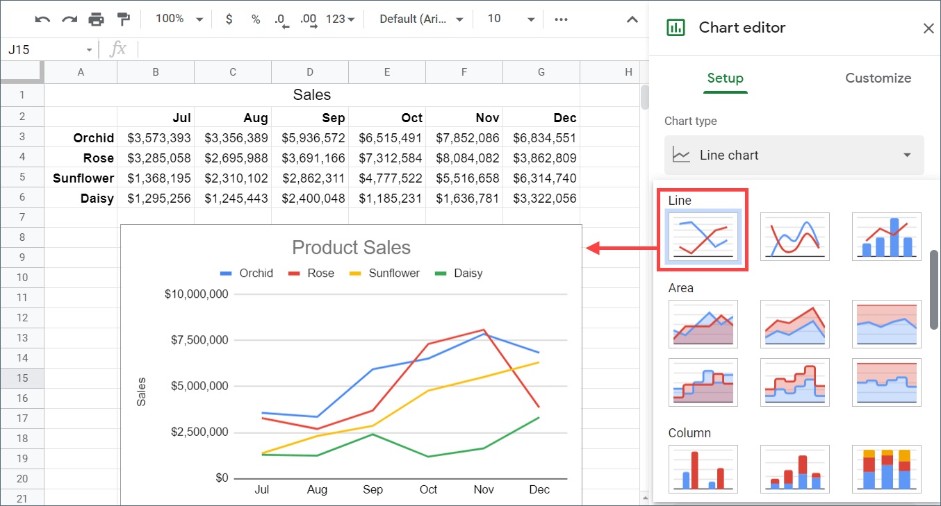
- Create a chart: With your data selected, navigate to the menu and click on “Insert” > “Chart.” This will open the “Chart editor” on the right-hand side of the screen.
- Choose the chart type: In the “Chart editor,” select the chart type that best represents your data. Common options include line charts, scatter plots, and bar charts. Choose the one that suits your data and visualization needs.
- Customize your chart: Once you have selected the chart type, you can customize various elements of your chart, such as the title, axis labels, and data range. Make the necessary adjustments to ensure your chart accurately reflects your data.
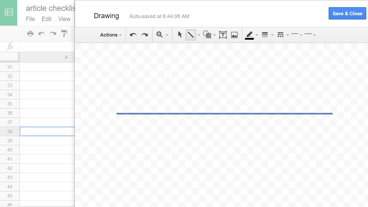
- Add a trendline: In the “Chart editor,” navigate to the “Customize” tab. Here, you will find a variety of customization options. Scroll down and locate the “Trendlines” section. Select the type of trendline you want to add, such as linear, exponential, or polynomial.
- Adjust trendline options: After selecting the trendline type, you can modify additional settings, such as the line color, style, or thickness. Experiment with these options to customize your trendline to your preference.
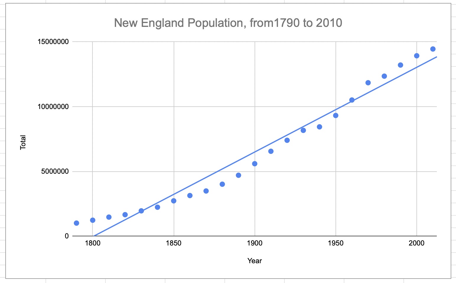
- View and analyze your trendline: Once you have added and customized the trendline, click “Apply” to see it displayed on your chart. Take a moment to interpret the trendline, analyzing the direction, slope, and any patterns or insights it reveals.
Following these steps will allow you to easily add a trendline to your data in Google Sheets. Remember to adjust the trendline type and customization options according to your specific data and analytical requirements. Adding a trendline enhances your data visualization and helps uncover trends, correlations, and predictions, making your data more meaningful and actionable.
Option 1: Adding a Trendline to a Chart
If you already have a chart in Google Sheets and want to add a trendline to it, follow these steps:
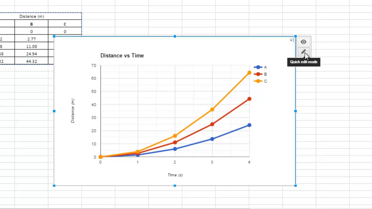
- Select your chart: Open your Google Sheets document and locate the chart to which you want to add a trendline. Click on the chart to select it.
- Edit the chart: In the top right corner of the chart, you will see a small icon resembling a pencil. Click on this icon to enter the chart editing mode.
- Add a trendline: Once in the chart editing mode, you will see a small “+” button in the top right corner of the chart. Click on this button to open the chart editor sidebar.
- Navigate to trendline options: In the chart editor sidebar, click on the “Customize” tab. Scroll down until you find the “Trendlines” section.
- Select trendline type: Within the “Trendlines” section, choose the type of trendline you want to add. Options include linear, exponential, polynomial, or moving average.
- Customize the trendline: Adjust the settings and options for your trendline, such as line color, style, and thickness. Experiment with these options to customize the trendline to your liking.
- Apply the changes: Once you have finished customizing the trendline, click the “Apply” button to add the trendline to your chart.
- Review and analyze: Take a moment to interpret the trendline in the context of your chart. Analyze the direction, slope, and any patterns or insights that the trendline reveals.
By following these steps, you can easily add a trendline to an existing chart in Google Sheets. Remember to choose the appropriate trendline type and customize it based on your data and analysis requirements. Adding a trendline to your chart enhances the visualization, making it easier to identify trends, correlations, and predictions within your data.
Option 2: Adding a Trendline to a Scatter Plot
If you have a scatter plot in Google Sheets and want to add a trendline to it, follow these steps:
- Select your scatter plot: Open your Google Sheets document and locate the scatter plot to which you want to add a trendline. Click on the scatter plot to select it.
- Edit the scatter plot: In the top right corner of the scatter plot, you will see a small icon resembling a pencil. Click on this icon to enter the scatter plot editing mode.
- Add a trendline: Once in the scatter plot editing mode, you will see a small “+” button in the top right corner of the scatter plot. Click on this button to open the chart editor sidebar.
- Navigate to trendline options: In the chart editor sidebar, click on the “Customize” tab. Scroll down until you find the “Trendlines” section.
- Select trendline type: Within the “Trendlines” section, choose the type of trendline you want to add to your scatter plot. Options include linear, exponential, polynomial, or moving average.
- Customize the trendline: Adjust the settings and options for your trendline, such as line color, style, and thickness. Experiment with these options to customize the trendline to your liking.
- Apply the changes: Once you have finished customizing the trendline, click the “Apply” button to add the trendline to your scatter plot.
- Review and analyze: Take a moment to interpret the trendline within the scatter plot. Analyze the direction, slope, and any patterns or insights that the trendline reveals in the relationship between the variables plotted.
By following these steps, you can easily add a trendline to a scatter plot in Google Sheets. The trendline helps you visually understand the relationship between the plotted variables, allowing you to identify trends, correlations, and predictions within your data. Customize the trendline options to suit your analysis requirements and interpret the insights it provides to make informed decisions.
Customizing Your Trendline
When adding a trendline to your chart or scatter plot in Google Sheets, you have the option to customize various aspects of the trendline. This allows you to personalize the appearance and style of the trendline to suit your preferences and analysis needs. Here are some customization options available:
- Trendline type: Google Sheets offers different types of trendlines, including linear, exponential, polynomial, and moving average. Choose the type that best represents the relationship between your data points or aligns with your analysis goals.
- Trendline options: Depending on the trendline type you choose, you may have additional options to customize. For example, with a polynomial trendline, you can specify the degree of the polynomial equation. Experiment with different options to find the best fit for your data.
- Trendline appearance: You can customize the appearance of your trendline by adjusting its color, line style, and thickness. This can help differentiate the trendline from other elements in the chart and make it more visually appealing.
- Trendline label: You can add a label to your trendline to provide additional context. This label can be customized with text, font style, size, and color. Use the trendline label to highlight key insights or explain the trendline’s significance.
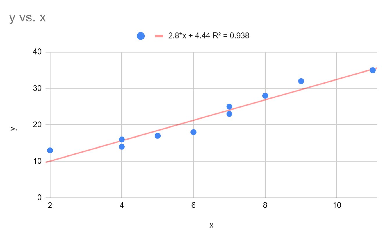
- Regression equation: Google Sheets allows you to display the regression equation for your trendline. This equation calculates the relationship between the x and y variables in your data. Enabling the regression equation can provide additional insights into the nature of the trendline.
- Show R-squared value: R-squared is a statistical measure that represents the goodness-of-fit of the trendline to the data points. Enabling the display of the R-squared value can help evaluate the accuracy and strength of the trendline.
By customizing your trendline in Google Sheets, you can create a chart or scatter plot that better suits your analysis goals and enhances data interpretation. Experiment with various customization options to find the combination that provides the most meaningful insights from your data. Remember that the customization choices should align with the purpose of your analysis and the audience you are presenting the information to.
Different Types of Trendlines
Google Sheets offers several types of trendlines that can be added to your charts and scatter plots. Each type represents a different mathematical relationship between the variables in your data and provides insights into patterns and trends. Here are the different types of trendlines you can choose from:
- Linear Trendline: A linear trendline is the most basic type and represents a straight line that best fits the data points. It is used when the relationship between the variables is best represented by a linear equation, where the y-variable changes proportionally with the x-variable.
- Exponential Trendline: An exponential trendline is used when the data increases or decreases at an accelerating rate. It is often used in scenarios where the growth or decline of a variable follows an exponential pattern.
- Polynomial Trendline: A polynomial trendline represents a curved line that best fits the data points. It is used when the relationship between the variables can be better represented by a polynomial equation of a specific degree.
- Moving Average Trendline: A moving average trendline is used to smooth out fluctuations in the data and identify underlying trends. It calculates the average value over a specific number of periods and plots the trendline based on these averages.
- Power Trendline: A power trendline is used when the data points form a curved pattern that resembles a power function, where the y-variable changes exponentially with the x-variable.
- Logarithmic Trendline: A logarithmic trendline is used when the data points increase or decrease rapidly initially and then level off over time. It is commonly used with data that exhibits exponential growth or decay.
By selecting the appropriate type of trendline, you can effectively visualize and analyze the relationship between the variables in your data. Experiment with different trendline types to identify the most suitable representation for your data and gain meaningful insights into trends, patterns, and predictive tendencies.
Best Practices for Using Trendlines
When using trendlines in your data analysis, it’s important to follow some best practices to ensure accurate interpretation and meaningful insights. Here are some guidelines to consider:
- Choose the right trendline: Select the type of trendline that best represents the relationship between your variables. Consider the nature of your data and the patterns you expect to see to make an informed decision.
- Use appropriate data: Ensure that your data is relevant, reliable, and representative of the phenomenon you are studying. Including outliers or inconsistent data points can distort the trendline and lead to inaccurate analysis.
- Interpret the direction and slope: Pay attention to the direction and slope of the trendline. A positive slope indicates an increasing trend, while a negative slope indicates a decreasing trend. The steepness of the slope reflects the rate of change.
- Consider other factors: Trendlines provide a visual representation of the relationship between variables, but they may not account for other influential factors. Consider other factors that may impact the trendline, such as external events, market conditions, or interventions.
- Validate with additional analysis: Use trendlines as a starting point for analysis but complement them with additional statistical methods or techniques. Conduct hypothesis testing, calculate correlations, or perform regression analysis to support or validate the insights gained from the trendline.
- Communicate findings effectively: When presenting trendline analysis, clearly communicate the key insights and findings to your audience. Use visual cues, annotations, or supporting data to enhance the understanding of the trendline and its implications.
- Update and review: Regularly update your trendline analysis as new data becomes available. Review and refine your trendline to ensure it remains accurate and meaningful over time, considering any changes in patterns or relationships.
By following these best practices, you can effectively utilize trendlines in your data analysis. They provide valuable insights into trends, patterns, and predictive tendencies, but always remember to consider context, validate with additional analysis, and communicate findings clearly to ensure accurate and meaningful interpretation.
Conclusion
Adding trendlines to your charts and scatter plots in Google Sheets is a powerful technique for visualizing and analyzing data. Trendlines help identify trends, patterns, and correlations, enabling you to make informed decisions and predictions based on historical data.
Throughout this guide, we explored the various aspects of using trendlines in Google Sheets. We learned about the benefits of adding trendlines, including their ability to identify trends, forecast future outcomes, and validate data assumptions. We also delved into the step-by-step process of adding trendlines to charts and scatter plots, as well as customizing their appearance and options to suit your analysis goals.
Furthermore, we discussed the different types of trendlines available in Google Sheets, such as linear, exponential, polynomial, moving average, power, and logarithmic trendlines. These different types offer flexibility in capturing and representing complex relationships within your data.
Finally, we explored best practices for using trendlines, emphasizing the importance of selecting the right trendline type, using appropriate data, interpreting the direction and slope, considering other factors, validating findings, and effectively communicating the insights gathered from trendline analysis.
By following these guidelines, you can effectively leverage trendlines to uncover hidden trends, make data-driven decisions, and communicate your findings more effectively. So, get started with adding trendlines to your charts and scatter plots in Google Sheets, and unlock the power of data visualization and analysis.