Gnome 40 has just been released, and it comes with a spectrum of improvements for the desktop environment. Gnome is the open-source desktop environment for various operating systems, including Linux’s Ubuntu and Fedora. This latest iteration promises to deliver a more aesthetically pleasing design and optimal performance.
Let’s take a look at the design changes and improvements made to the desktop environment.

What Is Gnome?
Gnome is an open-source desktop interface that goes along with a variety of Unix-based operating systems. A desktop environment normally runs beside an operating system to give it form. It determines the look and feel of a desktop and the appearance of the programs installed.
Gnome started as an open-source project by the Free Software Foundation. Members of the foundation believe that source codes should be made available to the public so that they can improve them as part of a collective effort. Since then, members of the organization and contributors have worked together to improve the software over time.
What’s the Need for Gnome?


At this point, some people might wonder why there is a need to install a desktop environment on top of an operating system. Normally, installing operating systems like Windows and Mac doesn’t require an external desktop environment. The answer is these operating systems have their desktop environment, while others like Fedora and Ubuntu Linux require an external desktop environment. Gnome was built as a stand-alone desktop environment meant to be installed on top of an operating system. It’s often seen with Linux and UNIX-based operating systems like Fedora and Ubuntu.
If you are using a Windows or Mac computer, it’s still possible to try out Gnome. But you’ll need to use virtualization software to run the program alongside an operating system.
Gnome 40: New Versioning Scheme


Previous iterations of Gnome had decimals for labels. For example, the latest version of the program was Gnome 3.38. The developers released this version along with Ubuntu 20.10 and Fedora 33 operating systems. After the release of Gnome 3.38, the creators decided they needed to change the naming convention. This time, they wanted to reflect the position of the program within the sequence of revisions that they’ve done over the years. As such, this latest version was called Gnome 40.
The developers also switched to a new development cycle starting with Gnome 40. Beginning with Gnome 40, each upcoming version will have three phases. There will be an alpha, beta, and final version of the program. The versioning scheme will also include native applications such as Files, Web, Image Viewer, Document Viewer, and so on.
The alpha and beta versions will help the developers test for performance and identity issues within the program and native apps. It’s meant to seal off the weaknesses of the program before the release of the final version. So that by the time the final version is released, the program is already clean and without need for system updates.
Gnome 40: Installation Requirements

Three Linux distributions currently support Gnome 40. These include Gnome OS, Fedora OS version 33, and OpenSUSE. Eventually, other Linux-based operating systems should follow suit.
However, since the current version is not yet the final version, we highly recommend using virtual software to run it. This can help insulate your operating system from any errors that come with the beta version. When the final version comes out, you can freely install it on your computer to replace your old OS.
Gnome 40: New Features
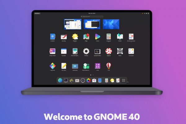

The previous iteration of Chrome received a variety of improvements as well as a performance boost. But the Gnome 40 surprised everyone when it offered even more improvements in terms of design and features. Here are some of the improvements that you need to know:
Dock Placement
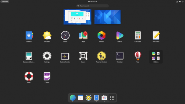

Gnome used to have a vertical dock located at the left-hand portion of the screen. But now, the dock lies in a horizontal position at the bottom of the screen. Before, you could move the dock to another location. It would also move automatically whenever a window requires desktop space. But with this new version, the dock is permanently assigned to the bottom of the screen with no way to move it around.
Activities Overview
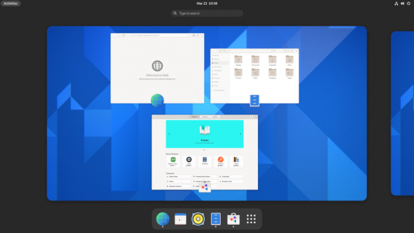

The Activities Overview functions a lot like the Home Screen on Windows and Mac devices. It shows you all of your active applications, and it’s the first thing you’ll see when you log in. It has a search bar at the top and a dock at the bottom at all times.
If you are using Fedora or Ubuntu, you might find a shortcut on the top panel labeled “Activities.” This shortcut will lead you straight to your Activities Overview. On the other hand, if you are on the Activities Overview page, you can click on Esc to return to your original desktop.
Another change they’ve implemented is that the tabs remain in place even as you switch between your desktop and the Activities Overview page. Each application remains open and active. It also contains an icon of the workspace where it came from, and the icon is located at the bottom.
Weather App


The weather app on Gnome 40 has been redesigned to show the weather forecast and temperatures on an hourly or daily basis. The original weather tool only offered a single view showing the weather forecast for two weeks. The new weather app features two views for your weather forecasts. Both views allow you to see the hourly temperature, humidity, and wind speed forecasts, but the difference lies in the period. The first view has a period of 48 hours, while the second view has a period of 10 days.
Application Launcher


Clicking on the Application Launcher from the dock opens up a list of all the applications installed on the program. It’s much like the app store on an Android mobile device. You can use your mouse or up and down key sot navigate through the list of apps. Now that the program has a horizontal theme, the apps will slide in from the sides instead of from the top. In addition, you can change the position of any app on the interface using the drag-and-drop method.
Gestures


Gnome 40 is also now able to recognize swipe gestures for navigating between workspaces. For example, you can use a three-finger swipe to either the left or right to switch between workspaces. On the other hand, a three-finger swipe upwards opens up the applications tab. If you want to customize the gestures on your device, you can do so through a dedicated Gestures app. Naturally, this feature only works for computers with touchscreens and tablets.
Files Manager


The developers tweaked the Files Manager app to mimic the functionality of the Windows File Manager. If you enter an entry or an app name on the location bar, it will provide suggestions for you to click on. A new “Created” column has been added to the location bar, and it lets you check for your files based on when they were created. You can even right-click on the column headings and select which columns you want to see.
Gnome 40 makes it easier to move files as well. If you try to move a file to another location, it will better estimate the total file size and time remaining for transfer. If you try to save a file using a file name that already exists in the documents list, the system will ask you to rename the file. This is very similar to the way the file manager on Windows works.
Also Read: Windows 11 Is Here! Everything You Need to Know
The system is also able to handle the extraction of password-protected ZIP files. The maps app was also upgraded to incorporate information from Wikipedia. If you click on a location, it can show you details culled from the popular wiki.
Design
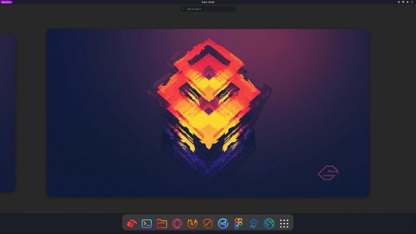

Developers have incorporated changes to the design as well. For starters, most of the tabs now have rounded edges instead of the typical square-shaped edges. This change affects most of the applications, including the Activities icon, extensions, and systems menu. The buttons and dialog design have become modernized as well. That’s all thanks to the newly implemented GTK 4 toolkit.
Another key change is that it no longer underlines the entry when you move your mouse over an entry. It highlights the entry instead. In addition, the activities overview has a dedicated spot at the top left corner of the home page. If you launch an app, it will appear on the dock temporarily.
Extensions


Gnome has always had to offer many extensions, and that hasn’t changed with Gnome 40. Before, you could access the extensions from the Gnome Tweak tool. While that tool remains accessible in Gnome 40, they’ve removed the extensions part. In other words, you have to install a separate utility tool called “Extensions” from the Applications software.
Most of the extensions have a singular function and are very easy to install. A great example would be the floating dock extension which lets you move the dock anywhere on the screen. Another example would be Blur My Screen. This feature will blur your background wallpaper while in view of your applications and workspaces to help you focus. Another example would be the Arc menu. This gives you access to extra tools for customizing the appearance and function of your workspace.
Final Thoughts on Gnome 40

The changes made to Gnome 40 aggregate as a substantial improvement over the previous workflow for this desktop environment. This particular version of Gnome is more than just an iterative upgrade, as it fixed the long-held issues and rough edges of previous versions. This version is the closest we can get to a Windows or Mac user interface, but without the brand.
The developers paid special attention to native apps like Files, Web, Maps, and Settings and modified them faster and better. These changes certainly pose a great advantage to operating systems that run alongside Gnome. It will offer a faster and more reliable user experience for any operating system that it pairs with. Not to mention, it should work well on both computer systems and virtual machines.


