Introduction
When it comes to evaluating the performance of machine learning models, performance metrics play a critical role. These metrics provide quantitative measures of a model’s accuracy, precision, recall, and other important aspects. Understanding and utilizing these metrics is essential for data scientists, researchers, and analysts to assess the effectiveness of their machine learning algorithms.
In this article, we will explore and examine various performance metrics used in machine learning. These metrics help assess the quality of predictions made by models and enable us to make informed decisions about the algorithm’s performance.
Performance metrics serve as a benchmark for comparing different models or fine-tuning algorithms to achieve optimal results. They provide insights into the strengths and weaknesses of a model, aiding in model selection, parameter tuning, and overall model improvement.
It is important to note that no single metric can fully capture the performance of a machine learning model in all scenarios. The choice of metrics depends on the nature of the problem being solved, the available data, and the desired outcome. Different metrics serve different purposes, and understanding their nuances will empower practitioners to make more informed decisions.
In the following sections, we will dive into some of the most commonly used performance metrics in machine learning. From accuracy and precision to error metrics and evaluation curves, we will explore the significance of each metric and its applications. By the end of this article, readers will have gained a comprehensive understanding of these performance metrics and how to interpret and apply them effectively in their machine learning projects.
Accuracy
Accuracy is one of the fundamental performance metrics used in machine learning. It measures the proportion of correct predictions made by a model out of the total number of predictions. In mathematical terms, accuracy is expressed as:
Accuracy = (Number of Correct Predictions) / (Total Number of Predictions)
Accuracy provides a general overview of how well a model performs on a given dataset. It is particularly useful when the classes in the dataset are well-balanced. For example, if we have a binary classification problem with an equal number of positive and negative instances, accuracy can be a reliable measure.
However, accuracy alone may not be sufficient in scenarios where class imbalances exist. In cases where the dataset is skewed and one class dominates the other, accuracy can be misleading. For instance, if we have 95% of instances belonging to the negative class and only 5% belonging to the positive class, a model that predicts all instances as negative will achieve an accuracy of 95%, which seems impressive but is not indicative of the model’s performance.
Therefore, it is crucial to consider accuracy alongside other metrics, such as precision and recall, to get a more comprehensive evaluation of a model’s performance. These metrics focus on the model’s ability to correctly classify positive instances and avoid false positives and false negatives.
While accuracy is easy to understand and interpret, it has its limitations. It does not provide any insights into the type of errors made by the model or the severity of those errors. It treats all misclassifications equally, regardless of their impact.
Despite its limitations, accuracy remains a valuable metric in machine learning, especially when dealing with balanced datasets or when the costs of false positives and false negatives are not significantly different. It serves as a starting point for evaluating a model’s performance and can be followed by a deeper analysis using other metrics to gain a more nuanced understanding of the model’s predictive capabilities.
Precision
Precision is a performance metric that quantifies the ability of a model to correctly identify positive instances from the total predicted positive instances. In other words, it measures the proportion of true positive predictions out of all positive predictions. Precision is calculated as:
Precision = (True Positives) / (True Positives + False Positives)
Precision focuses on the quality of positive predictions, aiming to minimize the number of false positives. It indicates how precise and accurate the model is when it predicts a positive instance.
A high precision score suggests that the model has a low rate of falsely identifying negative instances as positive, while a low precision score indicates a higher rate of false positives. Precision is particularly important in scenarios where the cost or consequences of false positives are high, such as medical diagnoses or fraud detection.
However, it’s important to note that while maximizing precision is desirable, it is often achieved at the expense of recall (discussed in a later section). In some cases, a higher precision may lead to missing some true positive instances, resulting in false negatives. Thus, finding the right balance between precision and recall is crucial, depending on the specific requirements of the problem at hand.
It’s worth mentioning that precision is a useful metric when there is an imbalance in the classes, specifically when the negative class is significantly larger than the positive class. In such cases, accuracy might not provide an accurate assessment of the model’s performance since it can be skewed by a high number of true negatives. Precision allows us to assess the model’s ability to correctly identify positive instances, regardless of the class imbalance.
By considering precision alongside other performance metrics, such as recall, we can gain a more comprehensive understanding of a model’s effectiveness and make more informed decisions about its deployment and optimization.
Recall
Recall, also known as sensitivity or true positive rate, is a performance metric that measures the ability of a model to correctly identify positive instances from the total number of actual positive instances. It quantifies the proportion of true positive predictions out of all actual positive instances. Recall is calculated as:
Recall = (True Positives) / (True Positives + False Negatives)
Recall focuses on the model’s ability to capture all positive instances and minimize false negatives. It is particularly important in scenarios where the consequences of false negatives are high, such as disease diagnosis or identifying potentially harmful substances.
A high recall score indicates that the model is effective at identifying positive instances, while a low recall score suggests a higher rate of false negatives. Maximizing recall ensures that fewer positive instances are missed by the model, reducing the chances of false negatives.
Similar to precision, optimizing recall may come at the expense of precision. In some cases, a higher recall may increase the number of false positive predictions, as the model becomes more permissive in classifying instances as positive. Balancing precision and recall is crucial to strike an appropriate trade-off based on the specific problem requirements.
Recall is particularly useful when the dataset is imbalanced, with a significantly larger number of negative instances compared to positive instances. It provides insights into the model’s ability to correctly identify positive instances, regardless of the class imbalance.
By considering recall alongside other performance metrics, such as precision and accuracy, we can gain a more comprehensive understanding of the model’s performance and make more informed decisions regarding its effectiveness and suitability for the intended application.
F1 Score
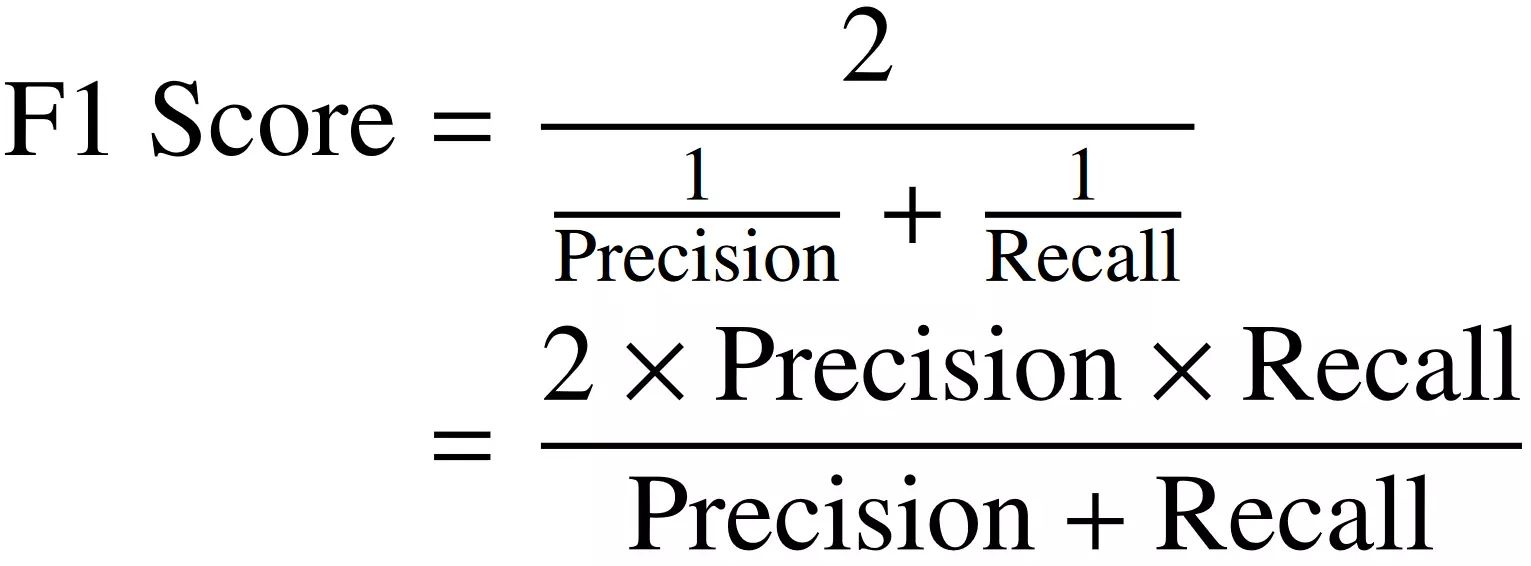
The F1 score is a performance metric that combines precision and recall into a single metric. It provides a balanced measure of a model’s accuracy by considering both false positives and false negatives. The F1 score is calculated as the harmonic mean of precision and recall and is expressed as:
F1 Score = 2 * ((Precision * Recall) / (Precision + Recall))
The F1 score ranges from 0 to 1, where a value of 1 denotes perfect precision and recall, and a value of 0 represents the worst possible score.
The F1 score is particularly useful when dealing with imbalanced datasets or when both precision and recall are equally important for evaluating model performance. It is a suitable metric when there is a trade-off between minimizing false positives and false negatives.
By combining precision and recall into a single metric, the F1 score provides a balanced view of a model’s performance. It helps to assess the precision and recall simultaneously and allows for better model comparison and selection. If we solely optimize for precision or recall, we might overlook the importance of the other metric. The F1 score helps strike a balance between the two.
It’s important to note that the F1 score assumes equal importance for precision and recall. However, in some scenarios, precision or recall might be more crucial than the other. In such cases, alternative metrics or customized evaluation methods should be considered.
The F1 score is widely used in the evaluation of machine learning models, especially in situations where achieving both high precision and high recall is desirable. By using the F1 score, practitioners can make more informed decisions about the model’s performance, select the optimal threshold for classification, and fine-tune the algorithm to achieve the desired balance between precision and recall.
ROC Curve
The Receiver Operating Characteristic (ROC) curve is a graphical representation of the performance of a machine learning classifier. It illustrates the trade-off between the true positive rate (sensitivity) and the false positive rate (1 – specificity) at various classification thresholds.
The ROC curve is created by plotting the true positive rate on the y-axis against the false positive rate on the x-axis for different threshold values. Each point on the curve represents a different threshold, and the curve itself provides insights into the classifier’s performance across various discrimination thresholds.
By evaluating the ROC curve, we can visually determine the classifier’s ability to distinguish between classes. The closer the curve is to the top-left corner, the better the classifier’s performance.
The Area Under the ROC Curve (AUC) is a commonly used metric to summarize the overall performance of the classifier. A perfect classifier would have an AUC of 1, indicating that it has a near-perfect ability to separate positive and negative instances. An AUC of 0.5 suggests that the classifier performs no better than random chance, while an AUC below 0.5 indicates that the classifier is performing worse than random.
The ROC curve is especially useful when dealing with imbalanced datasets and when both false positives and false negatives are important. By examining the shape of the curve and the AUC score, we can determine the classifier’s trade-off between sensitivity and specificity and choose an appropriate threshold based on the requirements of the problem at hand.
It’s important to note that the ROC curve and AUC are applicable to binary classifiers. For multi-class classification, variations such as the One-vs-All approach can be employed to create multiple ROC curves, one for each class, and calculate the micro or macro-average AUC.
The ROC curve provides valuable insights into the performance of a classifier at different thresholds and helps in decision-making regarding model deployment and optimization. It offers a comprehensive view of the classifier’s ability to discriminate between classes, considering both true positive and false positive rates.
AUC (Area Under the Curve)
The Area Under the Curve (AUC) is a performance metric commonly used in machine learning to evaluate the overall quality of a classifier’s predictions when plotted on a Receiver Operating Characteristic (ROC) curve.
The AUC quantifies the classifier’s ability to separate positive and negative instances across all possible classification thresholds. It represents the probability that a randomly chosen positive instance will rank higher than a randomly chosen negative instance.
The AUC ranges from 0 to 1, with 1 indicating a perfectly accurate classifier and 0.5 implying that the classifier performs no better than random chance.
A high AUC value suggests that the classifier has a strong discriminatory ability and can effectively distinguish between positive and negative instances. As the AUC approaches 1, the classifier’s performance improves, indicating a higher true positive rate and a lower false positive rate across various threshold values.
The AUC is particularly useful when evaluating classifiers on imbalanced datasets or when the costs of false positives and false negatives are significantly different. It provides a robust measure of overall classifier performance that is not biased by the choice of a specific threshold.
Furthermore, the AUC allows for comparisons between different classifiers. If two classifiers have overlapping ROC curves, their AUC values can help determine which one performs better overall. A higher AUC suggests better performance in terms of correctly classifying positive and negative instances.
It’s important to note that the AUC is not affected by the classifier’s calibration or the specific threshold selected for classification. This makes it a valuable metric for evaluating and comparing classifiers, especially in situations where selecting an appropriate threshold poses challenges.
Overall, the AUC is a widely used performance metric that provides a comprehensive summary of a classifier’s discrimination ability. It allows practitioners to assess and compare different classifiers objectively, making it a valuable tool in machine learning model evaluation and selection.
Confusion Matrix
The confusion matrix is a table that provides a detailed breakdown of the performance of a classification model. It summarizes the predictions made by the model on a test dataset, comparing them with the actual ground truth labels.
The confusion matrix consists of four main components:
- True Positives (TP): These are the instances where the model correctly predicts the positive class.
- False Positives (FP): These are the instances where the model incorrectly predicts the positive class.
- False Negatives (FN): These are the instances where the model incorrectly predicts the negative class.
- True Negatives (TN): These are the instances where the model correctly predicts the negative class.
By arranging these elements into a matrix, the confusion matrix provides a more comprehensive view of a model’s predictions. It helps assess the performance across different classes and evaluate the trade-off between false positives and false negatives.
The confusion matrix allows us to calculate several performance metrics, such as accuracy, precision, recall, and F1 score. These metrics provide insights into the model’s effectiveness in correctly classifying instances and avoiding misclassifications.
For example, accuracy can be calculated as (TP + TN) / (TP + FP + TN + FN), representing the proportion of correctly classified instances out of the total.
Precision, on the other hand, is calculated as TP / (TP + FP), measuring the model’s ability to correctly identify positive instances, while recall is calculated as TP / (TP + FN), indicating the proportion of actual positives that the model correctly identifies.
The confusion matrix is especially useful when evaluating the performance of a classifier on imbalanced datasets, where one class may dominate the other. It provides insights into how well the model performs for each class, allowing for targeted analysis and improvement.
By analyzing the confusion matrix, practitioners can identify specific areas of improvement. For example, if the model has high false positive rates, it may be necessary to adjust the classification threshold or consider alternative algorithms or features.
In summary, the confusion matrix is a valuable tool for evaluating and interpreting the performance of classification models. It provides a detailed breakdown of predictions and serves as the foundation for calculating various performance metrics, enabling practitioners to make informed decisions and improvements in their models.
Mean Absolute Error (MAE)
Mean Absolute Error (MAE) is a common performance metric used to measure the average magnitude of errors in a regression model. It provides an absolute measure of how far the predicted values deviate from the actual values.
The MAE is calculated by taking the average of the absolute differences between the predicted values and the corresponding actual values. It is expressed as:
MAE = (1/n) * Σ|predicted – actual|
The MAE represents the average absolute deviation of the predicted values from the actual values. It provides a measure of the model’s overall accuracy and provides a straightforward interpretation.
Unlike other error metrics that involve squaring the differences (e.g., Mean Squared Error), the MAE is less sensitive to outliers. It gives equal weight to all errors, irrespective of their direction. This property makes MAE a robust metric when dealing with data points that have high variability.
MAE is particularly useful when the magnitude of errors is critical and needs to be directly interpreted. For example, in predicting house prices, a MAE of $100,000 indicates that, on average, the model’s predictions deviate from the actual values by $100,000.
However, it’s important to note that MAE does not provide information about the direction and distribution of errors. It treats both overestimation and underestimation equally and does not account for the relative importance of different errors.
While the MAE is a simple and interpretable metric, it may not always capture the full picture of a model’s performance. In certain scenarios, other error metrics, like Mean Squared Error (MSE) or Root Mean Squared Error (RMSE), might be more appropriate.
Overall, the MAE is a widely used metric in regression tasks, providing a measure of the average absolute error. It allows for easy interpretation of the model’s accuracy and can be used for model comparison and evaluation, offering insights into the overall performance of regression models.
Root Mean Squared Error (RMSE)
Root Mean Squared Error (RMSE) is a common performance metric used in regression tasks to quantify the average magnitude of errors in a model’s predictions. It provides a measure of how well the model fits the observed data.
The RMSE is calculated by taking the square root of the Mean Squared Error (MSE), which is the average of the squared differences between the predicted values and the corresponding actual values. It is expressed as:
RMSE = √(MSE) = √((1/n) * Σ(predicted – actual)^2)
The RMSE represents the standard deviation of the residuals (the differences between predicted and actual values) and is measured in the same units as the predicted variable. It provides a measure of the typical or average prediction error.
Compared to the Mean Absolute Error (MAE), the RMSE puts more emphasis on larger errors due to the squaring of the differences. This property makes the RMSE more sensitive to outliers and extreme values.
The RMSE is particularly useful in scenarios where large errors have a significant impact or where the distribution of errors is not normally distributed. It penalizes larger errors more severely, reflecting the potential consequences of inaccuracies in predictions.
The RMSE is also widely used in model comparison. Lower RMSE values indicate better model performance, as they reflect smaller prediction errors. However, it’s important to compare RMSE values in the context of the problem domain to determine their practical significance.
While the RMSE is a widely-used metric, it should be interpreted carefully as it is influenced by the scale of the predicted variable. Therefore, it is not suitable for comparing models or evaluating performance across different target variables.
It’s worth noting that the RMSE is an indirectly interpretable metric. Unlike MAE, which can be interpreted in the same unit as the predicted variable, the RMSE provides a measure of the average prediction error in the original units but not the specific meaning of the error.
In summary, the RMSE is a commonly used metric for evaluating regression models. It provides a measure of the average prediction error, taking into account both the magnitude and distribution of errors. By considering the RMSE, practitioners can assess the overall fit of their models and compare different models to select the one with the best performance.
R-Squared (R²)
R-Squared (R²) is a statistical measure commonly used in regression analysis to assess the goodness of fit of a model to the observed data. It provides an indication of how well the model explains the variability in the dependent variable.
R-Squared represents the proportion of the variance in the dependent variable that can be explained by the independent variables in the model. It ranges from 0 to 1, where 0 indicates that the model explains none of the variability and 1 indicates a perfect fit.
R-Squared is calculated as:
R² = 1 – (SSE / SST)
where SSE (Sum of Squared Errors) represents the sum of the squared differences between the observed and predicted values, and SST (Total Sum of Squares) represents the sum of the squared differences between the observed values and the mean of the dependent variable.
An R-Squared value of 0 implies that the model does not explain any of the variance in the dependent variable, indicating that the model is not useful or that it fails to capture any meaningful information. On the other hand, an R-Squared of 1 suggests that the model perfectly predicts the observed data without any errors.
R-Squared is often used as a relative metric to compare different models and evaluate their performance. Higher R-Squared values indicate a better fit, although it’s important to interpret the value in the context of the specific problem domain.
It’s essential to note that R-Squared has limitations. It does not determine the correctness of the model or the significance of the independent variables. It only provides insights into the proportion of the variability explained by the model.
R-Squared can be misleading in certain situations, such as when dealing with overfitting. An overfitted model may have a high R-Squared on the training data but may perform poorly on unseen data. Therefore, it’s crucial to evaluate the model’s performance using additional metrics and cross-validation techniques.
In summary, R-Squared is a widely used metric in regression analysis that measures the proportion of variance explained by the model. It offers a quantitative measure of how well the model fits the observed data, aiding in model comparison and selection. However, it should be used in conjunction with other metrics and interpreted carefully to avoid misinterpretation or reliance on a single measure of model performance.
Area Under the Precision-Recall Curve (AUPRC)
The Precision-Recall curve is a graphical representation of the trade-off between precision and recall for different classification thresholds in a binary classifier. The Area Under the Precision-Recall Curve (AUPRC) is a performance metric that quantifies the overall performance of the model across all possible thresholds.
The Precision-Recall curve is created by plotting the precision (true positives divided by the sum of true positives and false positives) on the y-axis against the recall (true positives divided by the sum of true positives and false negatives) on the x-axis at various classification thresholds. The AUPRC represents the integral of this curve.
The AUPRC ranges between 0 and 1, where a value of 1 indicates perfect precision and recall, while a value close to 0.5 suggests poor performance, similar to random chance.
The AUPRC is particularly useful in scenarios where the positive class is rare or imbalanced compared to the negative class. It provides a robust evaluation of the model’s ability to correctly identify positive instances (precision) while capturing a high proportion of all positive instances (recall).
The AUPRC is especially valuable when the consequences of false positives and false negatives are significantly different. By considering precision-recall trade-offs at different thresholds, the AUPRC provides a comprehensive assessment of the model’s performance and allows for flexible threshold selection.
Unlike other performance metrics, such as accuracy or F1 score, which are affected by the choice of a single threshold, the AUPRC captures the performance across all thresholds. This makes it more informative and suitable for decision-making, especially when the optimal threshold depends on the specific problem context.
It’s important to note that the AUPRC may not be the most appropriate metric in all scenarios. For example, in cases where precision and recall carry different weights, or when the ROC curve is more relevant due to variations in class distributions, alternative evaluation methods should be considered.
In summary, the AUPRC is a performance metric that summarizes the overall performance of a binary classification model across all possible thresholds. It effectively captures the trade-off between precision and recall, making it particularly useful in imbalanced datasets and scenarios where the choice of threshold is critical. By evaluating the AUPRC, practitioners can gain insights into the model’s performance and make informed decisions regarding threshold selection and model optimization.
Log Loss
Log Loss, also known as logarithmic loss or cross-entropy loss, is a performance metric commonly used in binary and multi-class classification tasks. It measures the accuracy of a classification model’s predicted probabilities by comparing them to the true labels.
Log Loss is calculated as the average logarithm of the predicted probabilities for each instance, weighted by the true class labels. It is expressed as:
Log Loss = -(1/n) * Σ(y * log(p) + (1 – y) * log(1 – p))
where y represents the true class labels (0 or 1) and p represents the predicted probability for the positive class.
The lower the Log Loss value, the better the model’s performance. Log Loss penalizes confident incorrect predictions more severely, making it sensitive to both false positives and false negatives. By minimizing Log Loss, the model is incentivized to generate calibrated and accurate probabilities for each class.
Log Loss is particularly useful in scenarios where the distribution of classes is imbalanced or when different misclassification errors carry different costs. It provides a comprehensive evaluation of the model’s performance, taking into account the entire predicted probability distribution.
It’s important to note that Log Loss is more interpretable when comparing models rather than as an absolute measure of performance. The Log Loss value depends on the problem and specific dataset, making it difficult to interpret without context or comparison with other models.
Furthermore, Log Loss is well-suited for probabilistic models that generate predicted probabilities. It encourages models to output probabilities that reflect the true likelihood of each class, making it a popular choice for evaluating models in competitions and real-world scenarios.
However, it’s worth mentioning that Log Loss estimates the uncertainty of a model and does not provide insights into the specific types of errors made by the classifier. It quantifies the average deviation and measures the fit between predicted probabilities and the actual labels.
In summary, Log Loss is a widely used performance metric in classification tasks, providing insight into the accuracy of predicted probabilities. By minimizing Log Loss, models can generate well-calibrated probability estimates and make more informed decisions. However, it should be interpreted alongside other metrics and in the context of the specific problem domain.
Mean Squared Logarithmic Error (MSLE)
Mean Squared Logarithmic Error (MSLE) is a performance metric commonly used in regression tasks, particularly when the predicted values cover a wide range of magnitudes. It measures the average of the logarithmic differences between the predicted and actual values, providing a measure of the relative error rather than the absolute error.
MSLE is calculated by taking the mean of the squared logarithmic differences between the natural logarithm of the predicted values and the natural logarithm of the actual values. It is expressed as:
MSLE = (1/n) * Σ(log(predicted + 1) – log(actual + 1))^2
MSLE is particularly useful when the magnitude of errors matters more than the exact differences. By taking the logarithm of the values, it normalizes the differences and reduces the impact of large outliers.
MSLE penalizes underestimations and overestimations proportionally, making it more applicable to datasets with exponential or multiplicative trends. It is commonly used in domains such as time series forecasting, population growth modeling, and financial predictions.
Unlike mean absolute error (MAE) or mean squared error (MSE), MSLE focuses on the relative differences between the predicted and actual values. It ensures that errors for smaller values are considered as important as errors for larger values, regardless of the specific magnitude of the differences.
It’s important to note that MSLE can be more challenging to interpret compared to other error metrics. Since it measures the mean of the squared differences on a logarithmic scale, the MSLE value itself does not have a direct intuitive interpretation, making it more suitable for model comparison rather than standalone evaluation.
Additionally, MSLE may not be the most appropriate metric for all types of regression problems. It should be used alongside other metrics, such as mean absolute error (MAE) or root mean squared error (RMSE), to gain a comprehensive understanding of the model’s performance.
In summary, MSLE is a performance metric commonly used in regression tasks where the relative differences between predicted and actual values are important. By focusing on the logarithmic differences, it provides a measure of the relative error and is well-suited for datasets with exponential or multiplicative trends. However, it should be interpreted alongside other error metrics and in the context of the specific problem at hand.
Mean Absolute Percentage Error (MAPE)
Mean Absolute Percentage Error (MAPE) is a performance metric commonly used in regression tasks to quantify the average percentage difference between the predicted and actual values. It measures the relative error of the model’s predictions, taking into account the scale of the underlying data.
MAPE is calculated by taking the average of the absolute percentage differences between the predicted and actual values, expressed as a percentage. It is represented by the formula:
MAPE = (1/n) * Σ(|(predicted – actual) / actual|) * 100%
MAPE provides a measure of the average magnitude of the error as a percentage of the actual values. It offers insights into how accurate the model’s predictions are relative to the true values and is particularly useful in scenarios where relative errors carry more significance than absolute errors.
A lower MAPE value indicates better model performance, indicating that the model’s predictions are closer to the actual values in terms of percentage difference. A MAPE of 0% indicates a perfect fit, with no error in the predictions.
MAPE is often used when the data contains different scales or variable ranges, as it normalizes the error across the entire range of values. It allows for a direct comparison of prediction accuracy across different data points.
However, it’s essential to note that MAPE can be sensitive to instances where the actual value is close to or equal to zero, as it may lead to undefined or very large percentage differences. In such cases, it is advised to handle those instances separately or consider alternative metrics.
MAPE is commonly utilized in forecasting, demand planning, and other fields where relative accuracy is significant. It provides a straightforward interpretation of the model’s average percentage deviation from the true values, enabling stakeholders to gauge the level of accuracy achieved.
Although MAPE is a widely-used metric, it has limitations. Interpretation can be challenging when dealing with large errors or highly varying target variable ranges. Additionally, the choice of MAPE as a performance measure should be evaluated based on the specific problem domain and requirements.
In summary, MAPE is a performance metric that quantifies the average percentage difference between the predicted and actual values. It is useful for assessing the relative accuracy of a model’s predictions, especially when dealing with data of different scales. MAPE provides a measure of prediction error that facilitates easy interpretation and comparison across different data points.
Conclusion
Performance metrics play a vital role in assessing the effectiveness of machine learning models. From accuracy and precision to area under curves and error metrics, each metric serves a specific purpose in evaluating model performance and guiding optimization efforts.
Accuracy, as a fundamental metric, measures the proportion of correct predictions made by a model and provides an overview of its overall performance. Precision focuses on the quality of positive predictions, while recall emphasizes the model’s ability to capture positive instances. The F1 score combines precision and recall into a single metric, striking a balance between the two.
ROC curves and the associated AUC provide insights into a classifier’s performance across various thresholds, particularly important in imbalanced datasets. The confusion matrix helps in evaluating the model’s performance per class and provides a detailed breakdown of its predictions.
Regression metrics such as Mean Absolute Error (MAE), Root Mean Squared Error (RMSE), and R-squared (R²) enable the assessment of prediction accuracy and model fit. MSLE focuses on relative differences, while MAPE provides a percentage-based measure of prediction accuracy.
Each metric has its strengths and limitations, depending on the nature of the problem, the available data, and the desired outcomes. It is crucial to choose the most appropriate metrics for the specific task at hand and consider multiple metrics in combination to gain a comprehensive understanding of the model’s performance.
By utilizing these performance metrics, machine learning practitioners can evaluate, compare, and optimize their models effectively. It is essential to interpret and utilize these metrics judiciously, considering the specific requirements of the problem domain and the limitations of the metrics themselves.
In summary, performance metrics provide valuable insights into the quality and effectiveness of machine learning models. Understanding these metrics and their applications empowers data scientists, researchers, and analysts to assess model performance accurately and make informed decisions in their machine learning projects.