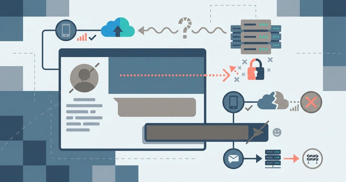





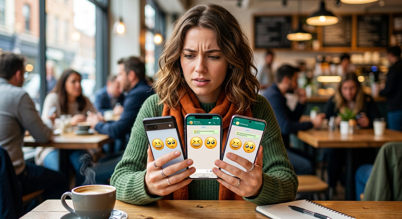
You type a grinning face and hit send. On your end it looks warm and friendly. On the other person's screen it might look sinister, blank, or like a small gray square. This is not a minor cosmetic glitch. It is a communication problem baked into how emoji actually work, and it affects millions of messages every day across workplaces, friend groups, and customer interactions.
The Rendering Gap Is Real: Emoji are not universal images, they are Unicode code points rendered differently by each operating system and platform.
- The same character can look friendly on iOS and unsettling on Android or Windows, changing the meaning of your message completely.
- People and body emoji carry the highest risk of misreading across platforms because of variations in skin tone, gesture, and expression.
- Text-based alternatives like kaomoji sidestep the problem entirely by rendering identically on every device, no font or OS required.
Why the Same Emoji Looks Different Everywhere
Emoji are not image files. They are text characters defined by the Unicode Consortium, a nonprofit organization that maintains the global standard for text encoding. When you type an emoji, you are inserting a code point, and it is up to your operating system, app, or font to decide how to draw it.
Apple draws it one way. Google draws it another. Microsoft has its own interpretation. Samsung used to ship phones with a completely separate emoji font that diverged significantly from every other platform. Each company designs its own set, and the same code point can produce very different visuals depending on who rendered it.
The result is what researchers and designers call rendering inconsistency. A study cited in emoji encoding standards research has documented cases where the same emoji was rated as having a positive sentiment on one platform and a negative sentiment on another. That is not a minor annoyance. That is a real risk in any context where tone matters.
The Platforms That Differ the Most
The gap between platforms is widest when you compare:
- Apple iOS versus older Android builds
- Twitter's Twemoji set versus system-native rendering
- Windows emoji fonts versus macOS equivalents
- Web apps that strip or substitute emoji entirely
Web-based platforms often layer in their own emoji fonts on top of whatever the operating system provides. This means the emoji you see in Slack may differ from what the same Slack message looks like on your phone. Even within a single platform, an OS update can change how an emoji renders for users who have not updated yet.
People and Body Emoji Are the Riskiest Category
If you use emoji professionally, the category that deserves the most caution is people and body emojis. This group covers gestures, facial expressions, hand signs, and figures, and it is where rendering differences are most dramatic.
A hand gesture that signals "okay" in one rendering might look like a pinching motion or a different symbol in another. A face that appears to be winking might display as a grimacing expression on a different font set. Skin tone modifiers add another layer of complexity, since not all platforms apply them consistently or display them in the same visual style.
Before using any of these in a professional message, it is worth checking how the character actually renders across different systems. What you see on your screen is only one version of what gets delivered.
The Software Angle: It Is a Font and Rendering Problem
From a technical standpoint, emoji inconsistency is a front-end rendering issue. Unicode assigns a code point. The operating system's emoji font maps that code point to a glyph. The app then displays that glyph in its interface.
Because each vendor controls its own font, there is no enforcement of visual consistency. The Unicode Consortium defines the character and its general meaning, but it does not mandate how the glyph must look. This is by design, the same way that the letter "A" can look wildly different across typefaces while still being the letter A. The difference is that most typeface variations for Latin letters do not change the emotional meaning of the character. With emoji, a subtle design choice can reverse sentiment entirely.
Software teams building cross-platform products have tried various workarounds. Some apps ship their own emoji font to guarantee consistency. Others convert emoji to images at the rendering layer. Both approaches add complexity and maintenance overhead, and neither is foolproof for general internet communication.
Kaomoji: The Text-Based Solution That Always Renders Correctly
The most practical workaround for everyday users is not a technical fix. It is a return to text.
Kaomoji are emoticons built entirely from standard keyboard characters, punctuation, and letters. Expressions like (^^) or (TT) or ¯\(ツ)/¯ are not image-based characters. They are plain text. Every device, every app, every operating system that can display basic text will display them exactly the same way.
This is a significant advantage in any context where visual consistency matters. A kaomoji cannot be misread because of a font update. It cannot be blank because a recipient's phone has not loaded an emoji pack. It cannot look aggressive on one screen and friendly on another, because it is simply characters arranged in a sequence.
Kaomoji originated in Japan in the 1980s, and the history of emoticons traces them as a creative response to the limitations of ASCII art in early text communication. They were a workaround then. They are still a workaround now, but they solve a genuinely modern problem.
When to Use Emoji, When to Use Kaomoji
Neither format is wrong. The question is what you are trying to achieve and who you are communicating with.
Emoji work well when you are confident both parties are on the same platform, when the character you are using is simple and low-ambiguity, and when the rendering gap between devices is unlikely to matter. A red heart or a thumbs up carries a consistent enough visual across major platforms that the risk is low.
Kaomoji are the better choice when you are sending messages across different operating systems, when you need to guarantee identical rendering for everyone on a team or mailing list, when your audience includes people on older devices or less common software, or when you are in a professional context where a misread gesture could create confusion.
The choice is not about aesthetics. It is about controlling what actually lands on the other end.
What This Means for Cross-Platform Communication
The broader lesson here is that digital communication is not as uniform as it looks. The infrastructure underneath the surface, fonts, Unicode tables, OS rendering engines, app-level overrides, is fragmented. Emoji are a visible symptom of that fragmentation.
For software users and internet-savvy communicators, understanding this is useful. It changes how you think about what you send and what you assume the recipient sees. It also changes how you evaluate tools that claim to be cross-platform. A message app that renders everything consistently for all users has solved a genuinely hard problem.
Until that problem is universally solved, the safest rule is to know your audience's platform, check unfamiliar emoji before using them professionally, and keep a few well-chosen text-based expressions in your back pocket for moments when you need to be sure.
The Character You Send Is Not Always the Character They See
Emoji are a powerful communication tool, and they are also a reminder that the software layer between you and another person is never completely invisible. The same four characters can produce a laugh, a frown, or a blank box depending on what is running on the other side.
That is not a reason to avoid emoji entirely. It is a reason to use them with a bit more awareness, to know which categories carry the most rendering risk, to have a text-based fallback ready, and to send with the recipient's screen in mind, not just your own.