Introduction
Welcome to our comprehensive guide on how to create a pivot table in Google Sheets. If you’re unfamiliar with pivot tables or are looking to expand your knowledge on their usage, you’ve come to the right place. Pivot tables are a powerful tool that can help you analyze and summarize large amounts of data easily and efficiently.
Whether you’re working on financial data, sales reports, or any other type of data that requires in-depth analysis, pivot tables can be a game-changer. Google Sheets, the free cloud-based spreadsheet software, provides a user-friendly interface to create pivot tables without the need for complex formulas or coding.
In this guide, we’ll walk you through the step-by-step process of creating a pivot table in Google Sheets. We’ll cover everything from organizing your data to formatting and customizing your pivot table. By the end of this guide, you’ll have the necessary skills to create and manipulate pivot tables to gain valuable insights from your data.
Whether you’re a business professional, analyst, student, or simply someone interested in improving their data analysis skills, this guide is for you. No prior experience is required, as we’ll start from the basics and gradually progress to more advanced techniques.
So, let’s dive in and unlock the power of pivot tables in Google Sheets. By the end of this guide, you’ll be equipped with a valuable data analysis tool that can streamline your work and help you make informed decisions.
What is a Pivot Table?
A pivot table is a data summarization tool that allows you to analyze and extract meaningful insights from large datasets quickly and easily. It takes raw data and organizes it into a more understandable and structured format, making it easier to identify patterns, trends, and correlations.
With a pivot table, you can transform a long list of data into a concise, summarized report without the need for complex formulas or manual calculations. It helps you aggregate, group, and summarize data based on various criteria, such as categories, dates, or custom fields.
One of the key advantages of pivot tables is their flexibility. You can manipulate and rearrange the data within the pivot table to get different perspectives and explore different dimensions of your data. You can add or remove rows, columns, and filters on the fly, allowing you to perform ad-hoc analysis without altering the original dataset.
Pivot tables also provide powerful aggregation functions that allow you to calculate and summarize data in various ways. You can use functions like sum, average, count, min, max, and more to analyze numerical data. Moreover, you can create calculated fields and custom formulas to perform complex calculations within the pivot table.
Another great feature of pivot tables is their ability to easily slice and dice the data. You can apply filters to include or exclude specific data points, which allows you to zoom in on specific subsets of your data for more focused analysis. This enables you to uncover trends and patterns that might have otherwise gone unnoticed.
Overall, pivot tables are a valuable tool for data analysis, providing you with a flexible and intuitive way to explore, summarize, and make sense of your data. They can save you a significant amount of time and effort by automating the data transformation and analysis process.
In the next section, we’ll explore the benefits of using pivot tables in more detail, highlighting how they can enhance your data analysis capabilities.
Benefits of Using Pivot Tables
Using pivot tables in your data analysis workflow offers several advantages that can greatly enhance your productivity and decision-making. Let’s explore some of the key benefits of using pivot tables:
- Easy Data Summarization: Pivot tables simplify the process of summarizing and aggregating large datasets. You can quickly create summary reports with just a few clicks, saving you time and effort compared to manually sorting and calculating the data.
- Flexible Data Exploration: Pivot tables allow you to effortlessly change the layout and structure of your data analysis. You can easily pivot rows and columns, switch data fields, and apply filters to explore different perspectives and uncover hidden insights.
- Rapid Analysis: With pivot tables, you can conduct quick ad-hoc analysis by dynamically adjusting the data layout. You don’t need to create complex formulas or write lengthy scripts. Everything can be done interactively, providing instantaneous results.
- Powerful Aggregation Functions: Pivot tables offer a wide range of built-in aggregation functions that enable you to perform calculations on your data. You can easily calculate sums, averages, counts, percentages, and more. This allows you to obtain meaningful insights and make data-driven decisions.
- Data Slicing and Dicing: Pivot tables provide the ability to slice and dice your data, allowing you to focus on specific subsets or dimensions. By applying filters and drilling down into your data, you can uncover patterns, outliers, and trends that may not be apparent at first glance.
- Visualize Data: Pivot tables can generate visualizations such as charts and graphs to help you visualize your data. This makes it easier to identify trends and patterns, communicate insights to stakeholders, and create visually appealing reports.
- Data Accuracy: With pivot tables, you reduce the risk of human error in data analysis. Since the calculations and aggregation are automated, you eliminate the chances of making mistakes during manual calculations.
- Customization and Formatting: Pivot tables offer various customization options, allowing you to format and present your data in a visually appealing manner. You can customize column widths, font styles, cell formatting, and more to make your reports professional and easy to read.
By harnessing these benefits, pivot tables empower you to extract maximum value from your data and make informed decisions based on accurate and insightful analysis.
Now that we understand the advantages of using pivot tables, let’s move on to the next section, where we’ll learn how to get started with Google Sheets and create a pivot table.
Getting Started with Google Sheets
If you’re new to Google Sheets or haven’t used it in a while, let’s begin by getting you acquainted with the basics. Google Sheets is a free, web-based spreadsheet software that provides a wide range of features for data analysis and manipulation.
To start using Google Sheets, you’ll need a Google account. If you don’t have one, you can create it for free and access Google Sheets through your web browser. Once you’re signed in, you can create a new spreadsheet or open an existing one.
When opening Google Sheets, you’ll be presented with a blank spreadsheet consisting of rows and columns. Similar to other spreadsheet software, you can enter data into cells, perform calculations using formulas, and format the data as needed.
Google Sheets also offers a variety of pre-built templates for different purposes, such as budgets, schedules, and project trackers. These templates can save you time and provide a starting point for your data analysis tasks.
Once you have your data ready, you can proceed to creating a pivot table. Under the “Data” menu in Google Sheets, you’ll find the “Pivot table” option. Click on it to begin creating your pivot table.
Google Sheets will analyze your data and open a new tab where you can configure and customize your pivot table. You’ll have the flexibility to choose the rows, columns, and values to include in your pivot table. You can also apply filters and sorting to further refine your analysis.
Remember that Google Sheets offers a user-friendly interface that simplifies the process of creating pivot tables. You don’t need any coding or advanced technical skills to take advantage of this powerful feature.
In the next sections, we’ll explore how to organize your data for a pivot table, how to create and customize a pivot table, and various advanced techniques to make the most out of your data analysis in Google Sheets.
Now that you’re familiar with the basics of Google Sheets, let’s move on to the next section and learn how to organize your data for a pivot table.
Organizing Data for a Pivot Table
Before creating a pivot table in Google Sheets, it’s important to ensure your data is organized in a way that facilitates accurate and meaningful analysis. Properly organizing your data will make it easier to identify trends, group data, and summarize information effectively.
Here are some key considerations when organizing data for a pivot table:
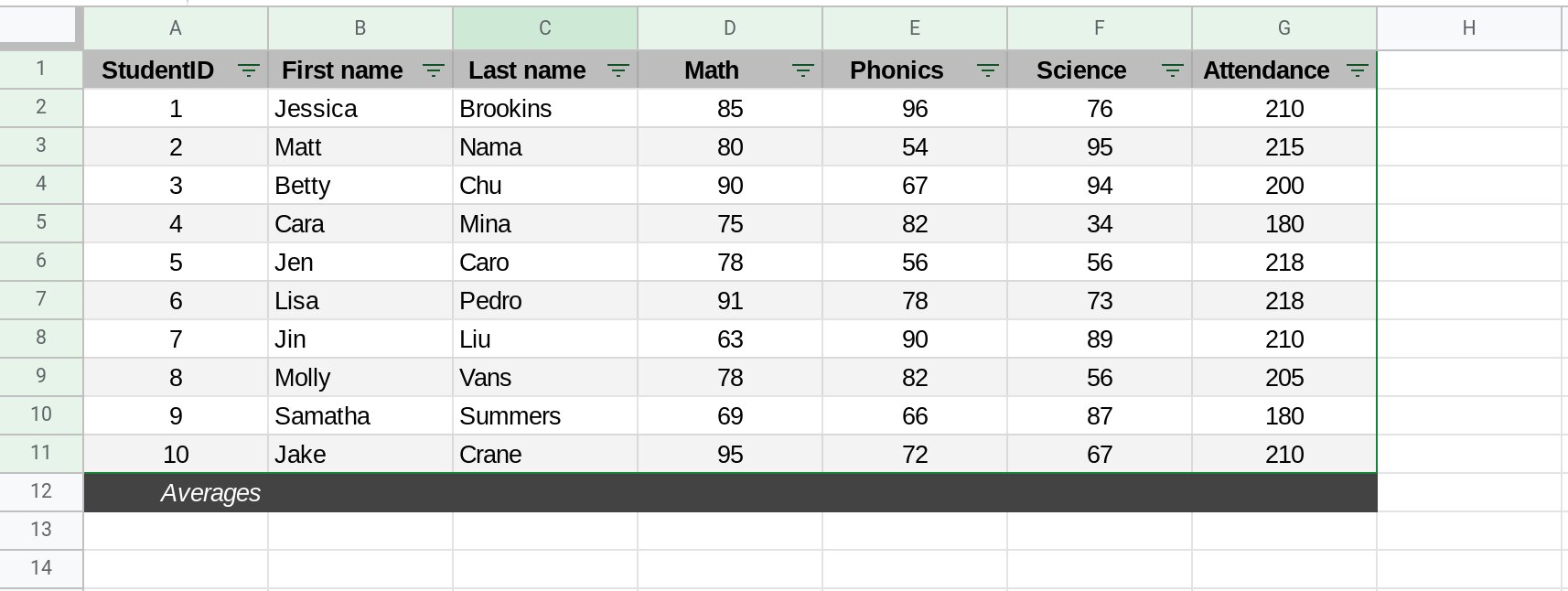
- Data Structure: Ensure that your data is structured in a tabular format, with rows representing individual records and columns representing different attributes or variables. Each column should have a unique header that describes the data it contains.
- Consistent Data Types: Make sure that each column contains data of the same type. For example, keep numeric data separate from text data, and use consistent date formats throughout the dataset.
- Column Labels: Use clear and descriptive column labels that accurately represent the data contained in each column. Avoid using abbreviations or cryptic labels that may cause confusion during data analysis.
- No Empty Rows or Columns: Remove any empty rows or columns from your dataset. Empty rows or columns can disrupt the calculation of totals and aggregates in the pivot table.
- Data Formatting: Ensure that your data is properly formatted. Use consistent number formats, such as decimal places and currency symbols, to maintain consistency across your dataset.
- Normalized Data: If your data is spread across multiple sheets or tables, consider consolidating it into a single table or using the “Import Range” function in Google Sheets to bring the data together. This will make it easier to create a pivot table that analyzes the complete dataset.
- Data Cleansing: Scan your dataset for any errors, duplicates, or inconsistencies. Remove or correct any inaccurate data points to ensure the accuracy of your analysis.
- Data Range: Define the range of your data to be analyzed. This can be done by selecting the entire range or using named ranges in Google Sheets. Specifying the correct data range ensures that your pivot table includes all the relevant data for analysis.
By following these guidelines, you’ll have a well-organized dataset that is ready to be used in a pivot table. Remember, the quality and organization of your data will directly impact the accuracy and effectiveness of your pivot table analysis.
In the next section, we’ll walk you through the process of creating a pivot table in Google Sheets, starting from selecting your data range to customizing the pivot table layout.
Creating a Pivot Table in Google Sheets
Creating a pivot table in Google Sheets is a straightforward process that allows you to analyze and summarize your data easily. Follow these step-by-step instructions to create a pivot table:
- Select Your Data: Begin by selecting the range of cells that contains your data. Make sure to include all the relevant columns and rows that you want to analyze in your pivot table.
- Open the Pivot Table Builder: Go to the “Data” menu in Google Sheets and select “Pivot table” from the dropdown menu. This will open the Pivot Table Builder in a new tab.
- Configure the Pivot Table: In the Pivot Table Builder, you’ll see various options to customize your pivot table. Start by choosing the range of data you selected in Step 1 as the “Data range” for your pivot table.
- Choose Rows and Columns: Determine which columns from your data you want to use as rows and columns in your pivot table. Drag and drop the column headers into the “Rows” and “Columns” sections of the Pivot Table Builder. This will define the structure of your pivot table.
- Add Values: Decide which columns contain the numerical values you want to summarize in your pivot table. Drag and drop those column headers into the “Values” section of the Pivot Table Builder. You can choose from a variety of aggregation functions, such as sum, count, average, etc.
- Apply Filters: If you want to filter your data based on specific criteria, you can add filters to your pivot table. Drag and drop the column header you want to filter by into the “Filters” section of the Pivot Table Builder. This will allow you to focus on specific subsets of your data.
- Customize the Pivot Table: Google Sheets provides various options to customize the appearance and layout of your pivot table. You can adjust the formatting, apply conditional formatting, modify column widths, add subtotals, and more.
- Explore and Refresh: Once you’ve created your pivot table, you can start exploring the data by expanding and collapsing rows and columns. If you make any changes to your original data, you can refresh the pivot table to update the analysis.
That’s it! By following these steps, you can create a pivot table in Google Sheets to analyze and summarize your data. Experiment with different configurations, functions, and layouts to uncover valuable insights from your dataset.
Now that you know how to create a pivot table, let’s move on to the next section where we’ll learn how to add rows, columns, and apply various aggregation methods to customize your pivot table analysis.
Adding Rows and Columns to the Pivot Table
One of the key features of a pivot table is the ability to dynamically add, remove, and arrange rows and columns to analyze your data from different perspectives. In this section, we’ll explore how to add rows and columns to your pivot table in Google Sheets.
Once you have created your pivot table, follow these steps to add rows and columns:
- Rows: To add a new row to your pivot table, simply drag and drop a column header from the “Available fields” section of the Pivot Table Builder into the “Rows” area. This will group your data by the values in that particular column. You can add multiple rows to further break down your data.
- Columns: Similarly, to add a new column to your pivot table, drag and drop a column header into the “Columns” area of the Pivot Table Builder. This will create additional columns in your pivot table, allowing you to analyze your data across different dimensions.
- Sorting: You can apply sorting to the rows and columns in your pivot table to arrange the data in ascending or descending order. Simply click on the arrow next to the row or column header and choose the desired sorting option.
- Subtotals and Grand Totals: Google Sheets allows you to add subtotals and grand totals to your pivot table. Subtotals are automatically calculated for each grouping level, providing a breakdown of the aggregated values. Grand totals represent the sum or other aggregation of the entire dataset.
- Expanding and Collapsing: You can expand or collapse individual rows or columns in your pivot table to show or hide detailed data. This can be useful when dealing with large datasets or when you want to focus on specific segments of your analysis.
By adding rows and columns, you can slice and dice your data in various ways, enabling you to gain deeper insights and understand the relationships between different attributes.
Experiment with different combinations of rows and columns, and explore how they impact the analysis of your data. This will allow you to tailor your pivot table to meet specific reporting and analysis needs.
Next, we’ll learn about changing the values and aggregation methods in a pivot table, providing further customization options for your data analysis.
Changing the Values and Aggregation Methods
When creating a pivot table in Google Sheets, you have the flexibility to choose the values to include in your analysis and apply different aggregation methods to summarize your data. In this section, we’ll explore how to change the values and aggregation methods in your pivot table.
Follow these steps to customize the values and aggregation methods in your pivot table:
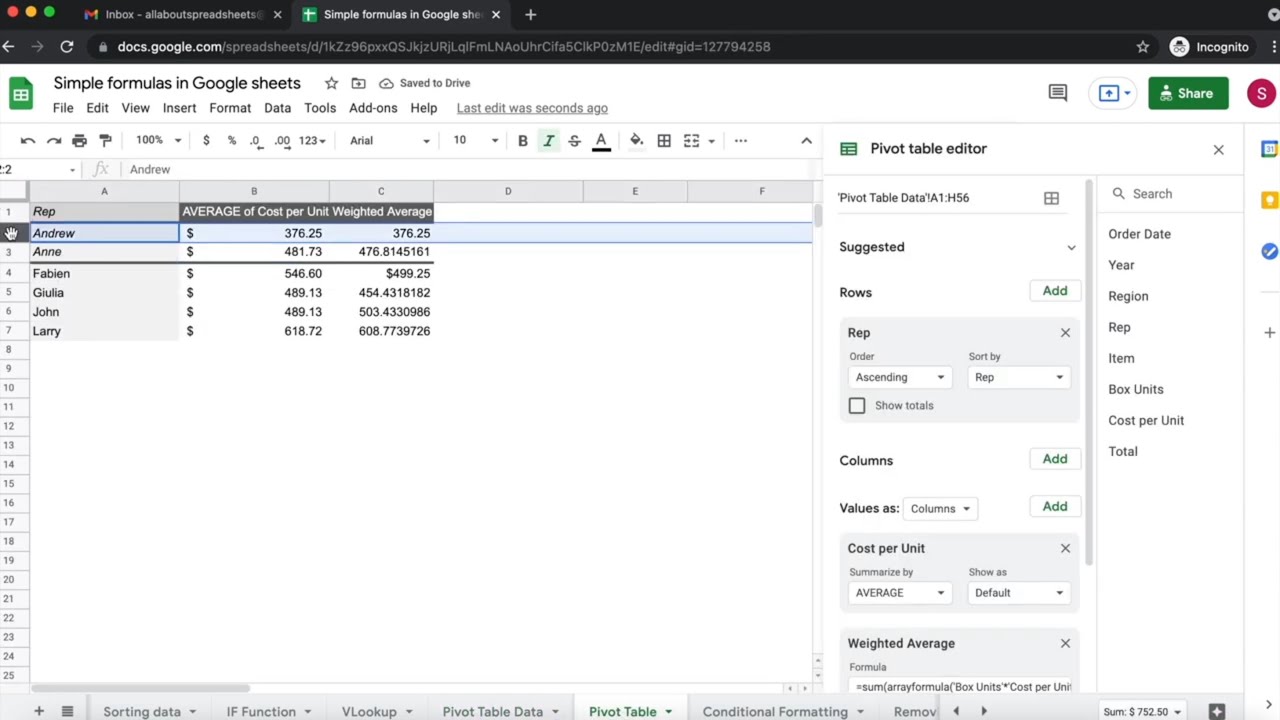
- Values: In the Pivot Table Builder, locate the “Values” section. This is where you can define the numerical data you want to analyze in your pivot table. By default, Google Sheets will display the sum of the selected values, but you can change this by clicking the arrow next to the value and selecting a different aggregation function. You can choose from functions like sum, count, average, min, max, and more.
- Custom Formulas: If the built-in aggregation functions don’t meet your needs, you can create custom formulas in Google Sheets to perform complex calculations. To do this, click the arrow next to the value, select “Value Field Settings,” and choose the “Custom” option. Here, you can enter your formula using Google Sheets’ formula language.
- Multiple Values: You can include multiple values in your pivot table by dragging and dropping additional columns into the “Values” section of the Pivot Table Builder. Each value will be displayed as a separate column in your pivot table, allowing you to compare different metrics or perform multiple calculations simultaneously.
- Changing Aggregation Methods: If you want to change the aggregation method for a specific value, click the arrow next to the value and select “Value Field Settings.” From there, you can choose a different aggregation function for that specific value. This allows you to analyze different aspects of your data using different calculations.
- Number Formatting: You can adjust the number formatting of the values in your pivot table. Right-click on a value, select “Number Format,” and choose the desired formatting option. This allows you to display values with decimal places, percentage symbols, currency symbols, and more.
By changing the values and aggregation methods in your pivot table, you can derive more specific insights and perform detailed analysis on your data. This flexibility enables you to customize your analysis based on the specific goals and requirements of your project.
Take advantage of these features to gain valuable insights from your data and present your findings in a clear and meaningful manner.
Next, we’ll explore how to filter data in a pivot table to focus on specific subsets of your dataset.
Filtering Pivot Table Data
Filtering is an important feature in pivot tables that allows you to focus on specific subsets of your data, providing a more refined analysis. By applying filters, you can examine data based on specific criteria, such as date ranges, categories, or custom fields. In this section, we’ll explore how to filter data in a pivot table in Google Sheets.
Follow these steps to apply filters to your pivot table:
- Filtering Rows: To filter rows in your pivot table, locate the “Rows” section in the Pivot Table Builder. Hover over a row label, click on the downward arrow that appears, and select the desired filter option. This will display a dropdown menu where you can choose specific values to include or exclude from your analysis.
- Filtering Columns: Similarly, to filter columns, locate the “Columns” section in the Pivot Table Builder. Hover over a column label, click on the downward arrow, and select the desired filter option. This will allow you to include or exclude specific columns from your pivot table.
- Value Filtering: If you want to filter the values themselves, click on the downward arrow next to a value in the “Values” section. From the dropdown menu, select “Filter by Condition” to apply conditions such as greater than, less than, equal to, etc.
- Multiple Filters: You can apply multiple filters to your pivot table by repeating the above steps. Each filter you apply further narrows down the data displayed in your pivot table, allowing you to zoom in on specific subsets based on multiple criteria.
- Clearing Filters: To clear a filter and display all the data again, click on the filter icon next to the row or column label and select “Clear filter.” This will remove the filter and restore the full dataset to your pivot table.
- Using Slicers: Slicers are visual controls that allow you to quickly filter your pivot table data. To add a slicer, select a cell inside your pivot table, go to the “Data” menu, and choose “Slicer.” You can then select the fields you want to use as slicers, and they will appear as separate interactive elements that you can use to filter your pivot table.
By applying filters to your pivot table, you can focus on specific subsets of your data for detailed analysis. This helps in identifying patterns, trends, and outliers that may be hidden in the larger dataset.
Experiment with different filter combinations to narrow down your analysis and gain more granular insights into your data. Filters allow you to ask specific questions and get precise answers from your pivot table, making your analysis more targeted and meaningful.
Next, let’s explore how to group and summarize your data in a pivot table to further enhance your analysis.
Grouping Data in a Pivot Table
Grouping data in a pivot table allows you to organize and summarize your data into meaningful categories or time periods. This feature is especially useful when dealing with large datasets or when you want to analyze data in a more structured and manageable way. In this section, we’ll explore how to group data in a pivot table using Google Sheets.
Follow these steps to group data in your pivot table:
- Grouping Dates: If your data includes dates and you want to analyze it by specific time periods, such as months or years, you can group the dates in your pivot table. Right-click on a date value in your pivot table, select “Create pivot date group,” and choose the desired grouping level. This will automatically group your dates into the selected time periods.
- Grouping Numeric Data: If your data includes numeric values and you want to group them into specific ranges or intervals, you can create custom groups. Right-click on a numeric value in your pivot table, select “Create pivot number group,” and define the group ranges and intervals accordingly.
- Grouping Text Data: Text data can also be grouped in a pivot table. Right-click on a text value, select “Create pivot text group,” and specify the desired criteria for grouping. This can be useful when you have categorical data and want to group similar values together.
- Ungrouping Data: If you want to remove the grouping from your pivot table, right-click on a grouped value and select “Ungroup” from the dropdown menu. This will return your data to its original form without any grouping applied.
- Expanding and Collapsing Groups: Once you have grouped your data, you can expand or collapse the groups to show or hide the underlying details. This is particularly helpful when analyzing large datasets and you want to focus on specific sections of your data.
Grouping data in your pivot table helps to provide a more organized and concise view of your data, making it easier to identify patterns and trends within specific categories or time periods. It allows for a more granular analysis and provides a clearer understanding of the data.
Experiment with different grouping options in your pivot table to customize and refine your analysis. Grouping can be applied to rows, columns, or values, depending on the structure of your data and the insights you are seeking.
Next, let’s explore how to format and customize your pivot table in Google Sheets to make it more visually appealing and informative.
Formatting and Customizing a Pivot Table
Formatting and customizing your pivot table in Google Sheets can greatly enhance its visual appeal and make it easier to interpret and analyze the data. In this section, we’ll explore various ways to format and customize your pivot table.
Consider the following formatting and customization options:
- Column Width: Adjust the width of the columns in your pivot table to ensure that the data is clearly visible. You can manually drag the column boundaries or use the “Resize Columns” option under the “Format” menu to automatically adjust the width based on the content.
- Cell Formatting: Format the cells in your pivot table to enhance readability and highlight important information. You can change font styles, font sizes, and apply different text and cell background colors. Use the “Format” menu to access various formatting options.
- Conditional Formatting: Apply conditional formatting rules to your pivot table to visually represent data patterns or highlight specific values. For example, you can use color scales, data bars, or icon sets to indicate high and low values or variations across the dataset.
- Pivot Table Styles: Google Sheets offers a variety of built-in pivot table styles that can instantly change the appearance of your pivot table. Under the “Format” menu, select “Pivot table styles” to choose from different predefined styles. This can help you create a more professional and visually appealing pivot table.
- Value Field Settings: Explore the “Value Field Settings” option in your pivot table to customize how the values are displayed and calculated. Here, you can change the number formatting, summarize values by a specific calculation, and perform other advanced customization options.
- Borders and Gridlines: Add borders and gridlines to your pivot table to make it visually organized and easier to navigate. You can use the “Borders” option in the “Format” menu to apply different border styles and thickness to cells, rows, and columns.
- Chart Creation: One of the advantages of pivot tables in Google Sheets is the ability to quickly create charts directly from the pivot table. Select a cell inside the pivot table, go to the “Insert” menu, and choose the desired chart type. This will generate a visual representation of your pivot table data, allowing for easier data interpretation.
By formatting and customizing your pivot table, you can present data in a more visually compelling and informative way. This can significantly improve the readability and usability of your pivot table, making it easier for stakeholders to understand the insights and findings.
Experiment with different formatting options, styles, and chart types to find the best way to present your data based on your specific audience and requirements.
In the final section, we’ll learn how to refresh and update your pivot table to keep it up-to-date with the latest data.
Refreshing and Updating a Pivot Table
As you work with your pivot table in Google Sheets, it’s important to keep it up-to-date with the latest data. Changes made to the underlying dataset will not automatically reflect in the pivot table. In this section, we’ll explore how to refresh and update your pivot table.
Follow these steps to ensure your pivot table reflects the most recent data:
- Manual Refresh: To manually refresh your pivot table, right-click anywhere inside the pivot table and select “Refresh” from the dropdown menu. This will update the pivot table with the latest data from the underlying dataset.
- Auto Refresh: You can set your pivot table to automatically refresh whenever changes are made to the source data. To do this, go to the “Data” menu, select “Data validation,” and set the “On change” dropdown option to “Refresh automatically.” Now, whenever changes are made to the data, the pivot table will update automatically.
- Data Source Expansion: If your dataset grows or new data is added, you may need to expand the data source of your pivot table. To do this, right-click on any cell within the pivot table, select “Edit source,” and adjust the data range to include the new or expanded data.
- Updates in Calculated Fields: If you have created calculated fields in your pivot table, any changes made to the source data that affect the calculated fields will not automatically update. You will need to manually update the calculations by modifying the formula in the calculated field settings.
By regularly refreshing and updating your pivot table, you can maintain the accuracy and relevance of your data analysis. This is especially crucial if you are working with dynamic datasets or if your underlying data frequently changes.
Remember to refresh your pivot table whenever you need to reflect the latest changes in the underlying data. This will ensure that your analysis remains accurate and up-to-date.
Now that you know how to refresh and update your pivot table, you’re equipped with the knowledge to conduct efficient and accurate data analysis using pivot tables in Google Sheets.
Conclusion
Congratulations! You have learned the ins and outs of creating and working with pivot tables in Google Sheets. Pivot tables are a powerful tool that allows you to analyze and summarize large amounts of data with ease. By organizing your data, creating pivot tables, and applying various customization options, you can gain valuable insights, identify trends, and make data-driven decisions.
We covered the basics of pivot tables, including what they are and their benefits in data analysis. We discussed how to get started with Google Sheets and organize your data for a pivot table. We walked you through the step-by-step process of creating a pivot table and adding rows, columns, and values. We explored how to change aggregation methods, filter data, group data, format and customize the pivot table, and refresh and update it to reflect the latest changes in the underlying dataset.
With the knowledge you’ve gained, you can now confidently handle and analyze data using pivot tables in Google Sheets. As you continue to work with pivot tables, remember to experiment with different configurations, try out advanced features like calculated fields and custom formulas, and explore additional options for visualizing your data.
Remember, practice makes perfect, so continue refining your skills by working on real-world data analysis projects. The more you use pivot tables, the more proficient you’ll become at extracting insights and making informed decisions based on your data.
Thank you for joining us on this pivot table journey. Harness the power of pivot tables in Google Sheets to unlock the potential of your data and elevate your data analysis abilities.