Introduction
Fonts play a crucial role in brand identity and overall branding strategy. They have the power to evoke emotions, create a visual connection, and leave a lasting impression on consumers. When it comes to establishing a distinct brand image, every element, including the choice of font, matters. One brand that has successfully leveraged the power of fonts to create a unique identity is Spotify.
Spotify, a renowned music streaming platform, has become a household name in the industry. Apart from its vast music library and personalized recommendations, Spotify’s visual branding has played a significant role in its success. From its logo to its user interface, every design element has been carefully chosen to resonate with its target audience.
In this article, we will explore the importance of fonts in branding and delve into the specific font that Spotify has chosen to represent its brand. We will also discuss its characteristics, how it can be used, and provide insights into alternative fonts that can be used to achieve a similar aesthetic.
The Importance of Fonts in Branding
Fonts are a critical element in establishing a brand’s identity and creating a cohesive visual experience. They have the power to communicate a brand’s personality, evoke specific emotions, and differentiate it from competitors. Just like colors, typography can elicit certain feelings and associations in the minds of consumers.
Selecting the right font for a brand requires careful consideration of various factors. The chosen font should align with the brand’s overall message, values, and target audience. It should create a consistent and memorable visual identity across different mediums, such as logos, websites, marketing materials, and packaging.
Additionally, fonts play a significant role in readability and user experience. A well-chosen font enhances the legibility and comprehension of the brand’s message, making it easier for users to engage with the content. On the other hand, a poorly chosen font can lead to confusion, frustration, and even detachment from the brand.
Typography also contributes to brand recognition. Consistently using the same font across different touchpoints helps users associate it with the brand, even without the presence of a logo or other visual cues. Think of iconic brands like Coca-Cola or Nike – their fonts have become instantly recognizable, conveying their brand image even without their logos.
Moreover, fonts can evoke specific emotions and set the tone for the brand experience. For instance, a bold and modern font can communicate innovation and forward-thinking, while a script font can evoke elegance and sophistication. By carefully selecting the right font, brands can reinforce their desired brand personality and connect with their target audience on a deeper level.
The Evolution of Spotify’s Branding
When Spotify first launched in 2008, its branding was relatively simple and minimalistic. The company used a lowercase, black logo with the word “Spotify” written in a custom font. This font, known as Spotify Font, was created exclusively for the brand and was not widely available for public use.
However, as Spotify grew in popularity and expanded its services, it recognized the need to rebrand and create a more cohesive visual identity. In 2013, Spotify unveiled a new branding strategy, which included a refreshed logo and a more extensive visual system. The design team at Spotify collaborated with the agency Collins to develop the new brand language.
The updated logo retained the lowercase lettering but introduced a new element – a vibrant green circle with three arcs inside, commonly known as the “Play” button. The new logo aimed to capture the spirit of music and the energy of the Spotify experience.
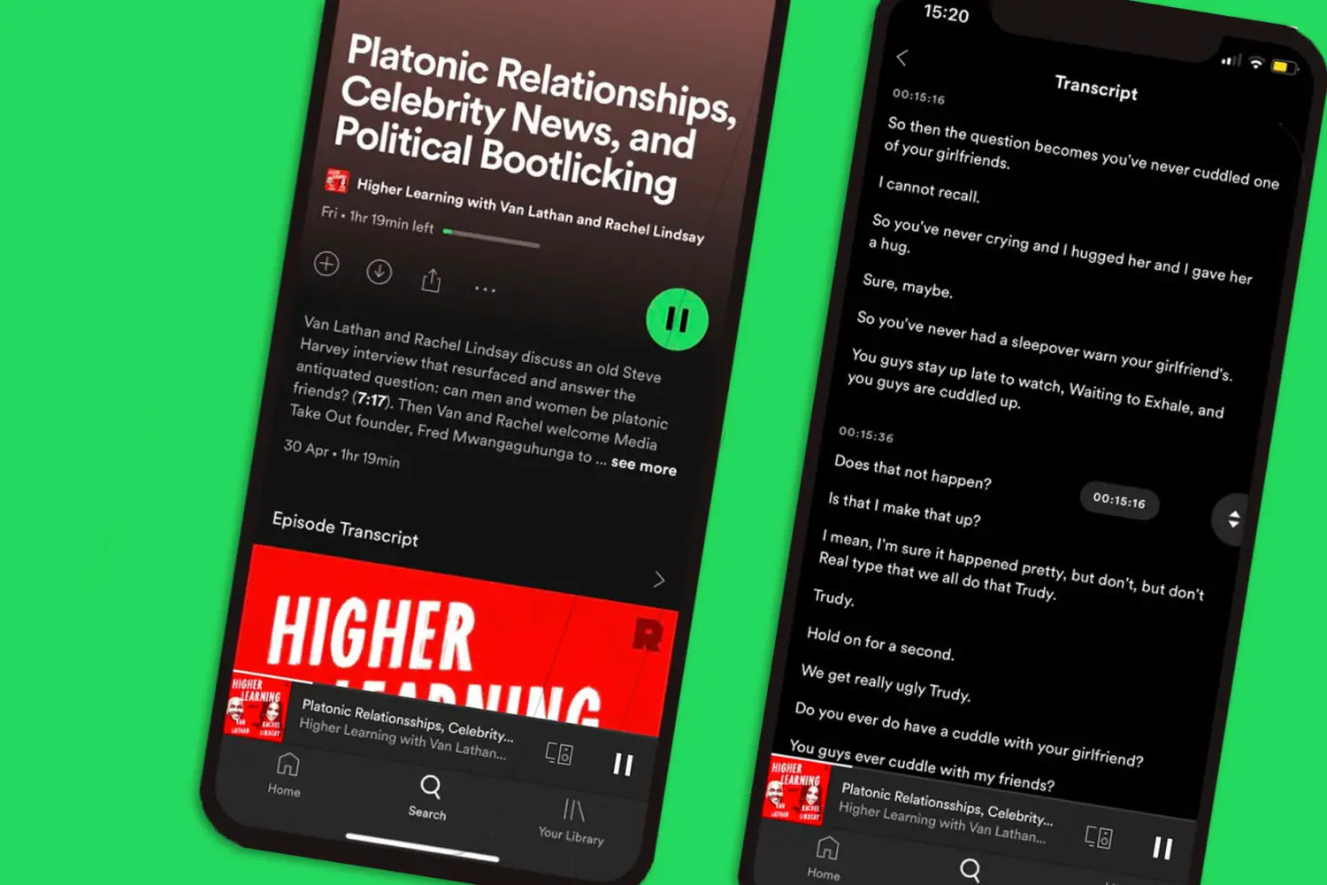
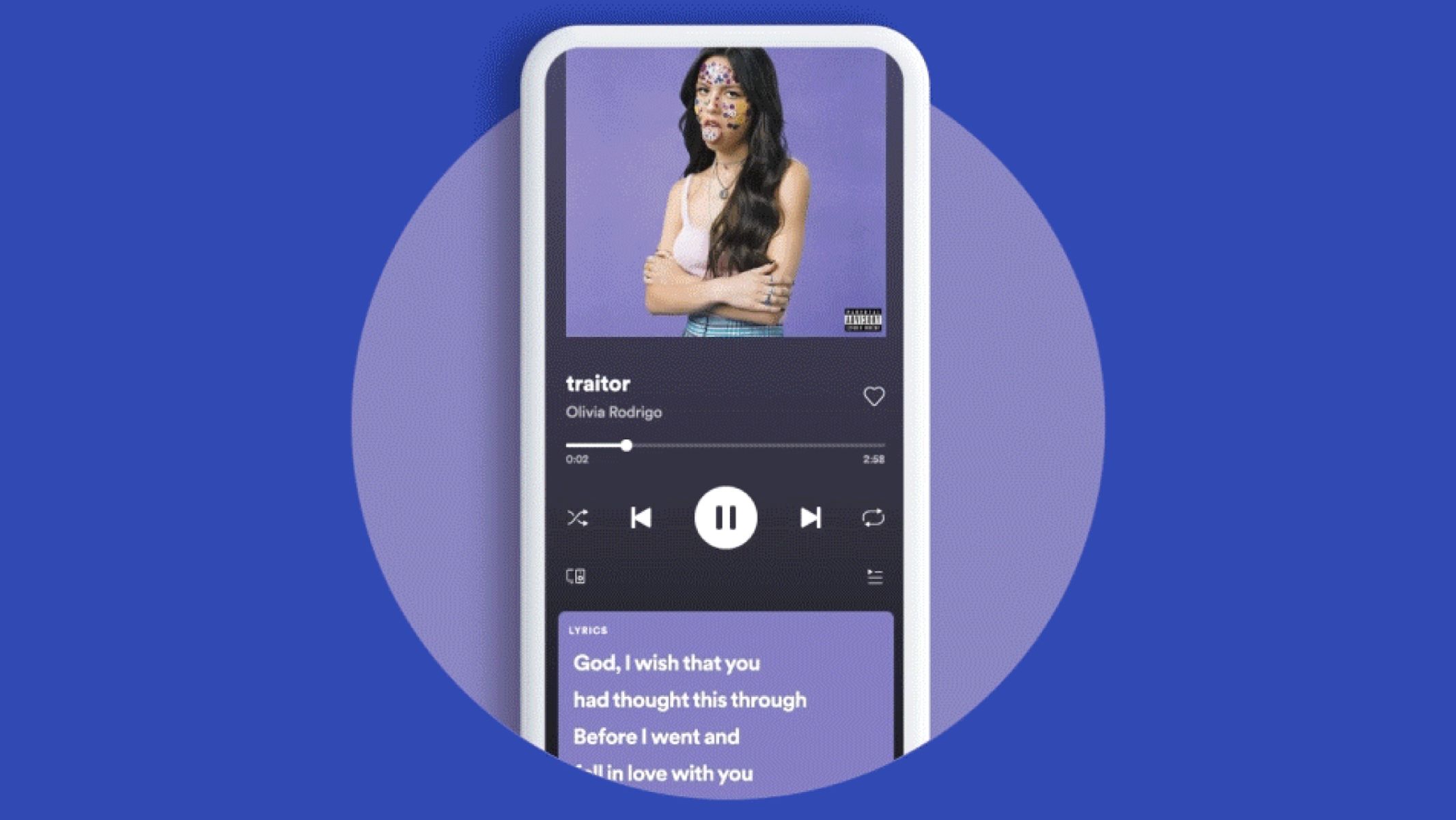
In addition to the logo, Spotify introduced a new font system to complement its updated visual identity. The primary font used by Spotify is now called “Circular.” Circular is a contemporary sans-serif typeface that was specifically designed for legibility and versatility across various digital platforms.
The Circular font embodies Spotify’s brand attributes – it is clean, modern, and approachable. It works seamlessly across different devices and screen sizes, ensuring a consistent visual experience for users. The font’s rounded corners and balanced letterforms give it a friendly and welcoming appearance, reflecting the brand’s focus on creating a user-friendly music streaming service.
Over the years, Spotify’s branding has continued to evolve, incorporating various design elements and experimentation. The brand has strategically used color, imagery, and typography to establish a strong visual presence in the competitive music streaming market.
As Spotify expands its services and reaches a global audience, one thing remains consistent – its commitment to creating a visually appealing and engaging brand experience. The evolution of Spotify’s branding reflects its adaptability and desire to stay relevant in an ever-changing digital landscape.
The Current Font Used by Spotify
The current font used by Spotify is known as “Circular.” Created in collaboration with the Swiss Typefaces foundry, Circular is a contemporary and versatile sans-serif typeface that perfectly aligns with Spotify’s brand identity and values.
Circular was specifically designed to be highly legible and adaptable across various digital platforms, making it suitable for Spotify’s web and mobile applications. Its clean and balanced letterforms, along with rounded corners, give it a friendly and approachable aesthetic, reflecting Spotify’s commitment to providing a user-friendly music streaming experience.
One of the reasons Spotify adopted Circular as its primary font is its versatility. It can effortlessly adapt to different screen sizes, ensuring a consistent visual experience for users across desktops, tablets, and mobile devices. This flexibility is a critical aspect of Spotify’s brand, as it caters to a diverse and global user base.
The rounded corners of Circular provide a softer, more inviting appearance compared to traditional straight-edged fonts. This design choice aligns with Spotify’s emphasis on creating a friendly and personalized music streaming service. The font’s simplicity and elegance contribute to a visually appealing and engaging user interface, enhancing the overall user experience.
Another advantage of Circular is its scalability. Whether it’s used for headings, body text, or buttons, Circular remains consistent and easy to read at various sizes. This consistency allows for clear and coherent communication of information throughout Spotify’s platforms, ensuring that users can navigate and interact with the interface without any visual obstacles.
By adopting the Circular font, Spotify has successfully established a distinctive visual identity that sets it apart from its competitors. Consistency in typography helps users recognize and associate the font with the Spotify brand, creating a sense of familiarity and trust.
However, it’s important to note that while Circular is the primary font used by Spotify, the brand may also utilize other fonts for specific purposes, such as display or promotional materials. These additional fonts are carefully chosen to complement the overall brand aesthetic and evoke a specific mood or message.
Characteristics of the Spotify Font
The Spotify font, known as “Circular,” possesses distinct characteristics that contribute to its overall appeal and alignment with the Spotify brand. Here are some notable features of the Circular font:
1. Clean and Modern: Circular embraces a clean and modern design aesthetic, with its well-defined letterforms and balanced proportions. The absence of unnecessary embellishments or serifs gives it a contemporary and timeless look, aligning with Spotify’s commitment to innovation and staying ahead of trends.
2. Rounded Corners: Circular features rounded corners, softening the overall appearance of the font. This design choice adds a touch of friendliness and approachability, reflecting Spotify’s desire to create a welcoming and enjoyable music streaming experience for its users.
3. Legibility: One of the primary considerations in choosing a font is its legibility, especially in the digital realm. Circular excels in this area, with its carefully crafted letterforms that ensure clarity even at smaller sizes and on various screen resolutions. The font’s legibility aids in enhancing user experience by enabling easy reading of song titles, artist names, and other textual elements within the Spotify interface.
4. Versatility: The versatility of Circular is a crucial factor in its selection as the primary font for Spotify. It can be utilized across different mediums and screen sizes without sacrificing its readability or visual impact. This adaptability is essential for maintaining a consistent and cohesive brand identity across Spotify’s web and mobile platforms.
5. Multilingual Support: As a global music streaming platform, Spotify caters to users worldwide. Circular supports a wide range of languages, ensuring that Spotify can effectively communicate with its diverse user base. The font’s ability to display characters and symbols from various languages and writing systems further strengthens Spotify’s commitment to inclusivity and accessibility.
Overall, the characteristics of the Circular font contribute to a visually appealing and user-friendly experience within the Spotify ecosystem. Its clean lines, rounded corners, and high legibility make it an excellent choice for representing Spotify’s modern and approachable brand image.
How to Use the Spotify Font
Using the Spotify font, Circular, can help create a cohesive and recognizable brand identity for your own projects. While the font itself is not freely available, there are alternatives that can achieve a similar look and feel. Here are a few guidelines on how to use the Spotify font:
1. Alternative Fonts: Since the Spotify font is not publicly available, you can use alternative fonts that have a similar style and aesthetic. Some popular options include Gotham, Proxima Nova, and Montserrat. These fonts share characteristics like clean lines, modern design, and versatility, allowing you to achieve a similar look to the Spotify branding.
2. Typeface Pairing: To create visual interest and hierarchy in your designs, consider pairing the Spotify font alternative with a complementary font for headings, subheadings, or body text. Experiment with different font combinations to achieve a balanced and harmonious visual experience. For example, pairing Circular with a serif font like Playfair Display can create an elegant and sophisticated look, while pairing it with a sans-serif font like Open Sans can enhance its modern and clean aesthetic.
3. Consistency: To establish a strong brand identity, consistency is key. Whether you are creating a website, marketing materials, or social media graphics, ensure that you consistently use the selected font throughout your design. Consistent typography reinforces brand recognition and helps create a cohesive visual experience for your audience.
4. Legibility: When using any font, including alternatives to the Spotify font, prioritize legibility. Make sure the chosen font is easy to read, both at larger and smaller sizes. Consider factors such as spacing, line height, and contrast to ensure that your text remains legible across different devices and screen resolutions.
5. Licensing and Copyright: If you plan to use the actual Spotify font, be aware that it is proprietary and cannot be used without proper licensing. It’s important to respect copyright laws and obtain the necessary permissions if you intend to use the official Spotify font for your projects.
By following these guidelines, you can effectively use alternative fonts and typography strategies to achieve a visual style reminiscent of the Spotify branding. Remember to maintain consistency and prioritize legibility in your designs to create a memorable and impactful visual experience for your audience.
Alternatives to the Spotify Font
While the official Spotify font, Circular, is not publicly available, there are several alternative fonts with similar characteristics that can be used to achieve a similar look and feel. These fonts can help you create a cohesive and visually appealing design that aligns with Spotify’s branding. Here are a few popular alternatives:
1. Gotham: Gotham is a widely-used geometric sans-serif font known for its clean and modern design. It features a balanced letterform with a wide range of weights and styles, making it versatile for various design needs. Gotham’s simplicity and readability make it an excellent choice for applications such as headings, subheadings, and body text in Spotify-inspired designs.
2. Proxima Nova: Proxima Nova is a highly legible and versatile font that shares similarities with Circular. It combines geometric shapes with humanist letterforms, resulting in a contemporary and approachable aesthetic. Proxima Nova’s extensive range of weights and widths make it suitable for various design applications, offering flexibility and consistency.
3. Montserrat: Montserrat is a popular font created by Julieta Ulanovsky. It is inspired by the urban typography of the Montserrat neighborhood in Buenos Aires. Montserrat’s clean lines and distinctive uppercase letterforms resemble the geometric structure found in Circular. With its versatility and availability in multiple weights and styles, Montserrat is a great choice for creating Spotify-inspired designs.
4. Avenir: Avenir is a classic geometric sans-serif font known for its clean and elegant appearance. Its balanced letterforms and wide range of weights provide flexibility and coherence across various design projects. Avenir’s friendly and legible nature aligns well with Spotify’s branding, making it a suitable alternative to the Circular font.
5. Open Sans: Open Sans is a widely-used and highly-readable font that offers a modern and professional look. With its open letterforms and balanced proportions, Open Sans is suitable for both display and body text applications. Its versatility and availability in multiple weights and styles make it a practical choice for Spotify-inspired designs.
When using these alternative fonts, remember to consider factors such as spacing, line height, and contrast to ensure optimal legibility and visual harmony. Pairing these fonts with other typefaces, such as serif or script fonts, can help create interesting and engaging designs while maintaining a consistent brand aesthetic.
It’s important to note that while these fonts may resemble the Spotify font, they are not exact replicas. Utilizing alternative fonts allows you to create designs inspired by the Spotify brand while maintaining the necessary legal and ethical considerations.
Conclusion
Fonts play a crucial role in branding, and Spotify has successfully leveraged the power of typography to establish its unique brand identity. Through careful consideration and evolution, Spotify has created a visual language that resonates with its target audience and enhances the user experience.
The Spotify font, Circular, embodies the brand’s attributes of being modern, clean, and user-friendly. Its rounded corners and balanced letterforms contribute to a friendly and approachable aesthetic, while its versatility ensures a consistent visual experience across different platforms and devices.
However, it’s important to note that while the official Spotify font may not be accessible to the public, there are alternative fonts available that can achieve a similar look and feel. Using these alternative fonts, such as Gotham, Proxima Nova, Montserrat, Avenir, or Open Sans, can help create designs inspired by Spotify’s branding while maintaining legal and ethical considerations.
Consistency is key when using fonts in branding. By consistently applying the chosen font and considering factors like legibility and readability, you can enhance brand recognition and create a cohesive visual identity across various design touchpoints.
In conclusion, fonts are powerful branding tools, and Spotify’s careful consideration of typography has contributed to its success as a global music streaming platform. By understanding the importance of fonts in branding and utilizing suitable alternatives, you can create designs that evoke emotions, convey brand messages, and leave a lasting impression on your target audience.