Introduction
Data is the lifeblood of businesses and organizations in today’s digital age, and the volume of data being generated is growing exponentially. This overwhelming amount of data, known as Big Data, holds immense potential for insights and decision-making. However, without an effective way to analyze and understand this data, it becomes meaningless and unmanageable. This is where data visualization plays a crucial role.
Data visualization is the process of representing complex data sets and patterns in a visual format, making it easier for users to comprehend and derive insights. By transforming raw data into visual graphics, such as charts, graphs, and infographics, data visualization allows for a more intuitive and interactive understanding of information. It enables organizations to uncover hidden patterns, trends, and correlations that may not be apparent in raw data alone.
With the rise of Big Data, the need for data visualization has become even more critical. Big Data encompasses massive volumes of information from various sources and in different formats, including structured, semi-structured, and unstructured data. This complexity makes it challenging for businesses to extract meaningful insights and make informed decisions.
Data visualization simplifies this complexity by translating vast amounts of data into visually engaging representations. It helps businesses and organizations make sense of their data, identify patterns, and gain actionable insights. Whether it’s analyzing customer behavior, tracking sales performance, monitoring operational efficiency, or predicting market trends, data visualization unlocks the power of Big Data and facilitates data-driven decision-making.
What is Big Data?
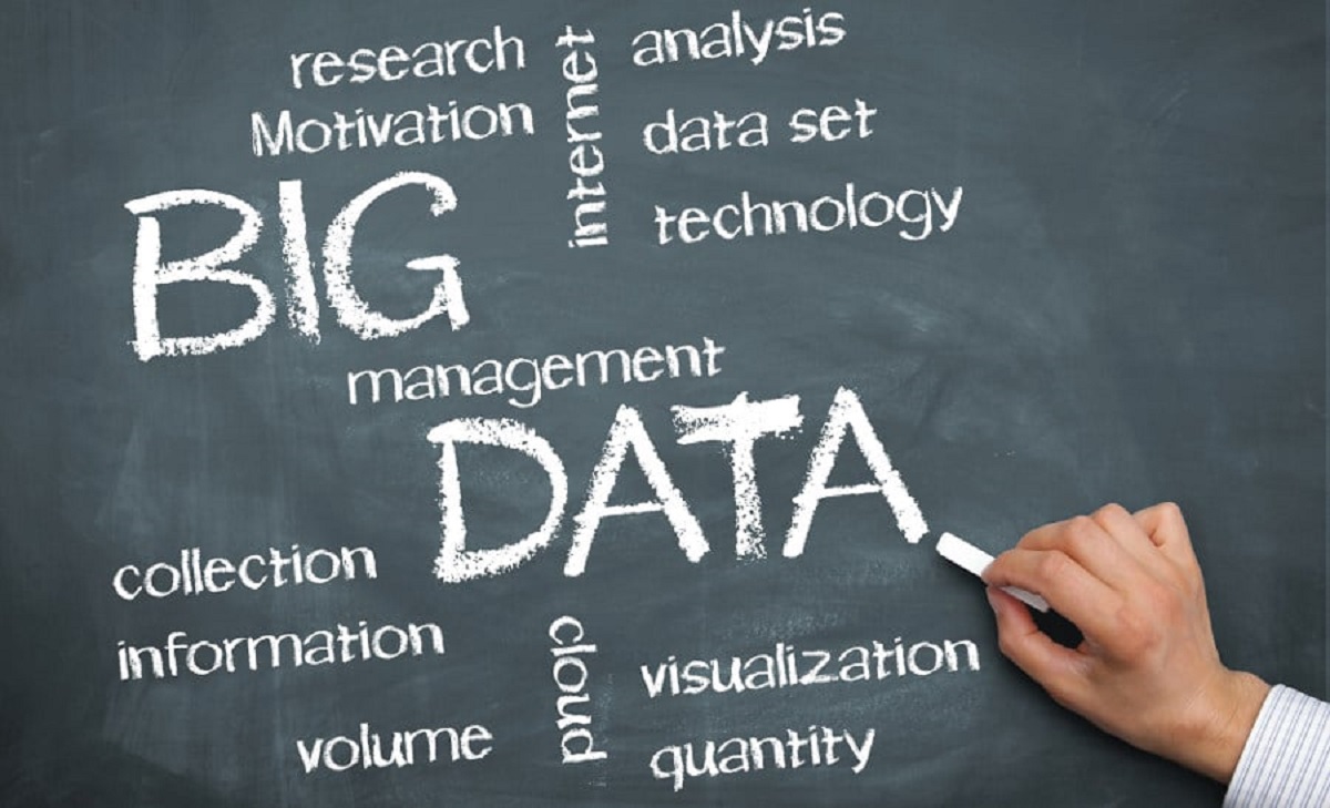
Big Data refers to extremely large and complex data sets that cannot be effectively managed, processed, or analyzed using traditional data processing methods. The vast amount of data generated from various sources, such as social media, sensors, online platforms, and transactions, has resulted in an explosion of data that traditional databases and tools are unable to handle.
Big Data is characterized by the 3Vs – volume, velocity, and variety. Firstly, it involves massive volumes of data, often reaching terabytes, petabytes, or even exabytes in size. Secondly, the velocity at which data is generated is incredibly fast, with real-time or near real-time data streams from sources like web and mobile devices. Lastly, Big Data encompasses a wide variety of data types, including structured data from databases, unstructured data from social media or emails, and semi-structured data like XML or JSON files.
Traditional data processing tools and techniques are ill-equipped to handle the vastness and complexity of Big Data. This has led to the emergence of new technologies and approaches, such as distributed computing, parallel processing, and cloud infrastructure, to efficiently store, process, and analyze Big Data.
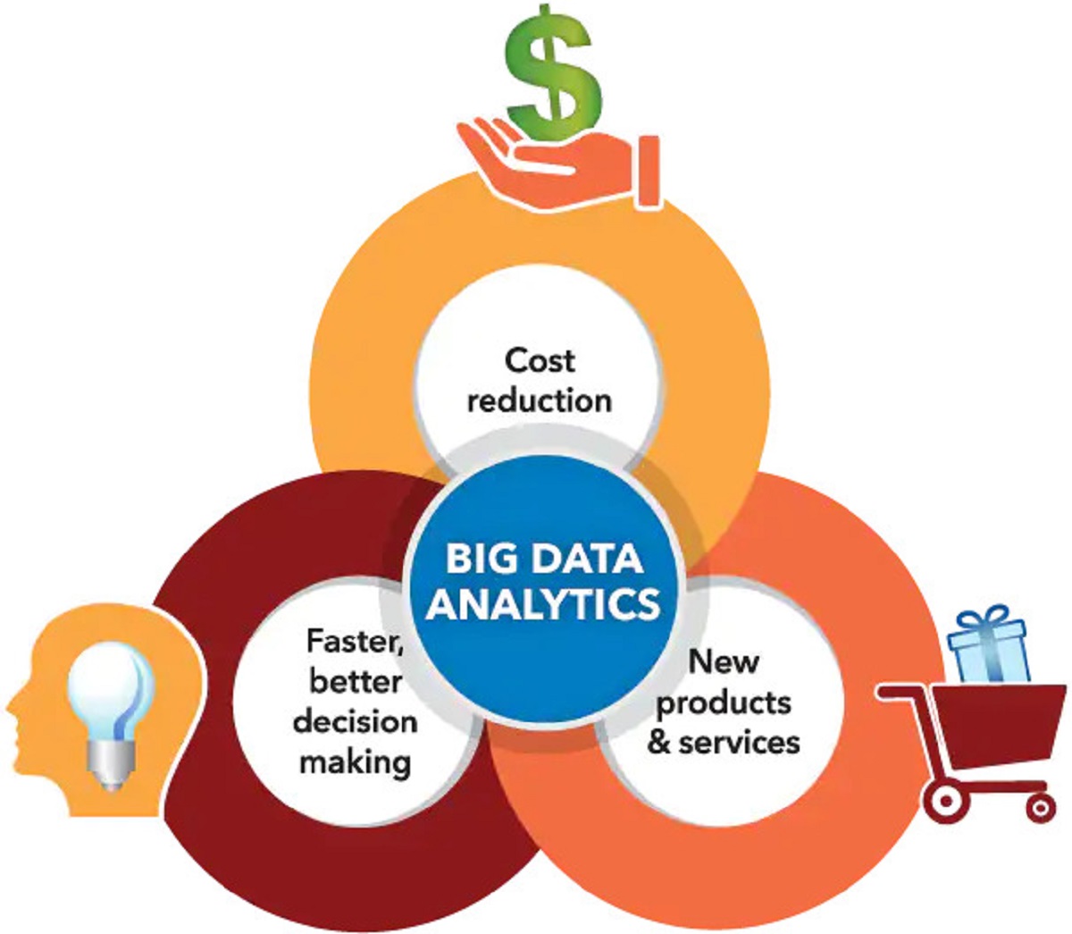
The importance of Big Data lies in its potential to uncover valuable insights and enable data-driven decision-making. By analyzing large and diverse data sets, businesses can gain a comprehensive understanding of their customers, identify trends and patterns, predict future outcomes, and optimize their operations. Big Data has applications across various industries, including healthcare, finance, retail, manufacturing, transportation, and more.
Overall, Big Data represents a paradigm shift in how organizations deal with data. It presents both challenges and opportunities. To leverage the power of Big Data, businesses must adopt advanced analytics techniques, invest in scalable and flexible infrastructure, and utilize data visualization tools to make sense of the vast amounts of information and transform it into actionable insights.
What is Data Visualization?
Data visualization is the representation of data in a visual format, such as charts, graphs, maps, and diagrams, to effectively communicate information and insights. It simplifies complex data sets and patterns, making it easier for users to grasp and interpret the data at a glance.
At its core, data visualization aims to transform raw data into visual elements that can be easily understood and analyzed by both technical and non-technical users. It utilizes visual cues like colors, shapes, sizes, and patterns to illustrate relationships, trends, and patterns in the data.
Data visualization serves several purposes. Firstly, it enables data exploration by providing an interactive and intuitive way to analyze and navigate through large data sets. Users can interact with the visualizations, drill down into specific data points, and gain a deeper understanding of the underlying information.
Secondly, data visualization allows for pattern recognition and spotting trends that may not be apparent in the raw data. By presenting the data in a visual format, trends and patterns can be easily identified, providing valuable insights for decision-making.
Furthermore, data visualization facilitates data storytelling and communication. By presenting data visually, complex information can be conveyed in a simple and compelling manner. Visualizations can be used to present findings, share insights, and persuade stakeholders, making data more accessible and engaging for non-technical audiences.
Data visualization plays a crucial role in data-driven decision-making. It empowers organizations to derive actionable insights from their data, helping them make informed decisions and gain a competitive edge. Visualizations can reveal correlations, outliers, and patterns, enabling businesses to identify opportunities, optimize processes, and mitigate risks.
Moreover, data visualization enhances data comprehension and retention. Humans are visual learners, and visualizing data helps us process and remember information more effectively. By presenting data in a visually appealing and interactive format, users are more likely to understand and retain the insights gained from the data.
In summary, data visualization is a powerful tool that transforms data into visual representations, enabling users to explore, understand, and communicate insights. It is an essential component of data analysis and plays a vital role in harnessing the potential of data to drive informed decision-making and business success.
The Role of Data Visualization in Big Data
In the realm of Big Data, the role of data visualization is paramount. The sheer volume, velocity, and variety of data in Big Data make it challenging to comprehend and extract meaningful insights. Data visualization acts as a powerful tool to tackle these challenges and unlock the true potential of Big Data.
One of the primary roles of data visualization in Big Data is to provide a better understanding of complex data sets. Big Data is often too vast and complex to be comprehended through traditional methods. By visually representing the data, data visualization makes it easier for users to grasp the patterns, correlations, and trends embedded within the data.
Moreover, data visualization enables the spotting of trends and patterns that might otherwise go unnoticed in the massive volumes of data. Through graphical representations, trends and patterns become visually apparent, allowing organizations to make data-driven decisions based on real insights.
Data visualization also plays a crucial role in identifying outliers and anomalies in Big Data. Anomalies can indicate potential issues, opportunities, or irregularities within the data. By visualizing the data, organizations can quickly spot outliers and take appropriate actions to address them.
Another important role of data visualization in Big Data is making the data more accessible to non-technical users. Big Data is often complex and technical in nature, making it difficult for non-technical users to understand and harness its value. Data visualization simplifies the data, enabling users from various backgrounds to interact with and gain insights from the data without needing extensive technical knowledge.
Furthermore, data visualization enhances decision-making in the context of Big Data. With the help of visual representations, decision-makers can gain a comprehensive understanding of the data and make more informed choices. By visualizing data, complex insights can be communicated more effectively, enabling decision-makers to act on valuable information quickly and confidently.
Data visualization also plays a crucial role in communicating data insights within organizations. Instead of presenting raw data or complex reports, visualizations make it easier for stakeholders to grasp the key messages and understand the implications of the data. This facilitates collaboration, alignment, and informed decision-making across teams and departments.
Lastly, data visualization contributes to increasing efficiency and productivity in dealing with Big Data. With large volumes of information to process, analyze, and interpret, visualizing the data streamlines the workflow and enables users to identify important patterns and insights faster. This leads to more efficient decision-making processes and resource allocation.
In summary, data visualization plays a pivotal role in extracting value from Big Data. It helps users understand complex data sets, spot trends and outliers, make data accessible to non-technical users, enhance decision-making, communicate insights, and increase efficiency. By leveraging the power of data visualization, organizations can unlock the true potential of Big Data and drive meaningful outcomes.
Better Understanding of Complex Data
In the world of Big Data, data sets are often vast, complex, and difficult to comprehend using traditional data analysis methods. This is where data visualization steps in to provide a better understanding of complex data.
Data visualization simplifies complex data sets by transforming them into visually appealing and intuitive representations such as charts, graphs, and diagrams. These visualizations make it easier for users to grasp the patterns, relationships, and trends within the data.
By representing complex data visually, data visualization allows users to explore and navigate through the information with ease. It helps in breaking down the complexity of the data into digestible chunks, enabling users to interactively analyze and interpret the data. Through interactive features like zooming, filtering, and drill-down capabilities, users can delve deeper into the data, uncovering insights that may not be apparent from a surface-level analysis.
Moreover, visualizing complex data aids in identifying patterns and correlations that might be missed in the raw data. Humans excel at pattern recognition, and data visualization leverages this inherent ability. By spotting visual patterns and trends, users are better equipped to derive meaningful insights and make data-driven decisions.
Visualizations also facilitate the identification of outliers and anomalies within complex data sets. Outliers can indicate important changes or anomalies that require further investigation. By visually representing the data, anomalies become more prominent, allowing users to quickly detect and address them.
Furthermore, data visualization helps in understanding the context and story behind complex data by providing a narrative structure. It allows users to tell a story with the data, making it easier to communicate and share insights with stakeholders. By translating the data into a visual narrative, users can present the data in a more engaging and memorable way, ensuring that the key messages and insights are effectively conveyed.
Data visualization also enables the comparison and analysis of multiple variables and dimensions within complex data sets. By displaying data in different chart types, users can examine relationships and correlations between various data points. This multidimensional view of the data provides a deeper understanding of the complexity and interdependencies within the data.
In summary, data visualization plays a vital role in facilitating a better understanding of complex data. By simplifying data through visual representations, it enables users to explore, analyze, and interpret the data with ease. Moreover, data visualization helps in identifying patterns, outliers, and correlations, as well as telling a compelling story with the data. By leveraging the power of data visualization, users can confidently navigate complex data sets and extract valuable insights.
Spotting Trends and Patterns
One of the key benefits of data visualization in Big Data is its ability to spot trends and patterns that may not be immediately evident in raw data. By visually representing the data, patterns and trends become more apparent, helping users derive valuable insights and make informed decisions.
Data visualization allows users to identify trends over time by displaying data in chronological order. Line charts, for example, can plot data points over a specific time period, enabling users to observe trends, fluctuations, and seasonality patterns. This helps in understanding how variables change over time and identifying long-term trends or short-term anomalies.
Furthermore, visualizations provide a means to analyze data across different dimensions or variables. By plotting data on scatter plots or bubble charts, users can explore the relationships and correlations between multiple variables. This allows for the identification of patterns and trends that may exist between different data points. For example, in market analysis, visualizations can reveal correlations between customer demographics and purchasing behaviors, helping businesses tailor their marketing strategies accordingly.
Data visualization also aids in identifying patterns within complex datasets. By using techniques like heatmaps or treemaps, users can detect clusters or groupings within the data. This can be particularly useful in fraud detection, where visualizations can assist in spotting irregular patterns or abnormal behaviors.
Additionally, data visualization plays a crucial role in identifying anomalies or outliers within the data. Outliers can be indicators of significant events, anomalies, or errors. By visually representing the data, outliers are more easily noticeable, allowing users to investigate and understand the reasons behind these unusual data points.
Data visualization tools often come equipped with advanced algorithms and machine learning techniques that automatically identify trends and patterns within the data. This enables users to gain insights without necessarily requiring a deep understanding of statistical analysis or data manipulation. Visualizations take the hard work out of data analysis and present the trends and patterns in a visually appealing and intuitive format.
In summary, data visualization is an invaluable tool for spotting trends and patterns within Big Data. By visually representing the data, trends become more evident, outliers are easily noticed, and relationships between variables are identified. This allows users to derive insights and make data-driven decisions, transforming raw data into actionable information.
Identifying Outliers and Anomalies
In the realm of Big Data, identifying outliers and anomalies is crucial for ensuring data quality, detecting potential issues, and uncovering hidden insights. Data visualization plays a vital role in this process by visually highlighting outliers and anomalies, making them easier to identify and investigate.
Outliers are data points that deviate significantly from the majority of the dataset. They can indicate important events, exceptional cases, or potential errors within the data. By visually representing the data, data visualization enables users to quickly spot outliers that may not be apparent in raw data.
Visualizations such as scatter plots, box plots, or histograms can effectively display the distribution of the data and identify any data points that lie significantly outside the expected range. For example, in finance, visualizations can detect unusual trading patterns that may indicate insider trading or fraudulent activities.
Anomalies, on the other hand, refer to any unexpected or irregular data points that deviate from the normal patterns within the dataset. Anomalies may arise due to data measurement errors, system malfunctions, or genuine anomalies that require further investigation.
Data visualization techniques like heatmaps or geographic maps can help identify spatial or temporal anomalies. These visualizations allow users to detect unusual clusters or patterns that may indicate unusual events or anomalies. For example, in cybersecurity, visualizations can reveal abnormal network traffic or unauthorized access attempts.
By leveraging data visualization, users can investigate and understand the reasons behind outliers and anomalies more effectively. They can zoom in on specific data points, analyze related variables, or drill down into the underlying data to identify the causes of these anomalies. This helps in uncovering valuable insights, improving data quality, and addressing potential issues.
In addition to visually identifying outliers and anomalies, data visualization tools often provide built-in anomaly detection algorithms. These algorithms automatically analyze the data and generate alerts or visual cues for unusual data points. These automated techniques complement visual inspections and assist in detecting anomalies efficiently.
Overall, data visualization plays a critical role in identifying outliers and anomalies in Big Data. By visually representing the data and highlighting unusual data points, it enables users to quickly identify potential issues, investigate the causes, and take appropriate actions. By utilizing data visualization techniques, organizations can enhance data quality, improve decision-making, and mitigate risks associated with anomalies in their data.
Making Data More Accessible to Non-Technical Users
One of the challenges of working with Big Data is that it can be complex and technical, making it difficult for non-technical users to understand and utilize effectively. Data visualization plays a pivotal role in bridging this gap by making data more accessible to non-technical users.
Data visualization tools transform raw data into visually appealing and intuitive representations, such as charts, graphs, and infographics. These visualizations provide a user-friendly interface that enables non-technical users to interact with and understand the data without requiring specialized knowledge or technical skills.
By presenting data in a visual format, data visualization simplifies complex information and makes it easier to comprehend. Visualizations eliminate the need for users to manually analyze large datasets, allowing them to quickly grasp trends, patterns, and key insights at a glance.
Moreover, data visualization allows non-technical users to explore and interact with the data in a self-guided manner. Interactive features like filtering, zooming, and drill-down capabilities enable users to customize their exploration and focus on specific areas of interest. This empowers users to extract relevant insights and answer their own questions, without relying on technical experts.
Data visualization also enhances the storytelling aspect of data by presenting information in a compelling and engaging way. Visualizations enable non-technical users to present their findings and communicate insights effectively to stakeholders. By combining visuals with narratives, users can tell a data-driven story that captivates and informs a broader audience.
Furthermore, data visualization tools often provide pre-built templates and customizable dashboards that cater to the specific needs of non-technical users. These templates simplify the process of data exploration and analysis, allowing users to easily access and interpret data without the need for complex data transformations or coding.
Additionally, data visualization tools offer the ability to create dynamic and real-time visualizations. This enables non-technical users to stay up-to-date with the latest data and monitor key performance indicators without the need for manual data updates or programming skills.
By making data more accessible to non-technical users, data visualization fosters a data-driven culture within organizations. It empowers employees across departments to make informed decisions, enhances collaboration, and promotes a deeper understanding of the organization’s operations and goals.
In summary, data visualization plays a vital role in making Big Data accessible to non-technical users. By transforming complex data into visually engaging and interactive representations, data visualization enables users without technical expertise to explore, analyze, and communicate insights effectively. By democratizing access to data, organizations can foster a data-driven culture and leverage the collective intelligence of their team members.
Enhancing Decision Making
Data visualization plays a significant role in enhancing decision-making processes within organizations. By presenting data in a visual format, it enables decision-makers to derive insights, understand complex information, and make informed decisions effectively and efficiently.
One of the primary benefits of data visualization in decision-making is the ability to gain a comprehensive understanding of the data. Visualizations provide a holistic view of the data, enabling decision-makers to analyze multiple dimensions, variables, and relationships simultaneously. This helps in uncovering patterns, trends, and correlations that may not be evident in raw data or traditional reports.
Data visualization also facilitates the exploration and analysis of different scenarios and what-if scenarios. By manipulating visualizations, decision-makers can assess the impact of various factors, test hypotheses, and understand the implications of their decisions. This empowers decision-makers to make more informed choices and mitigate potential risks before implementing strategies or making significant changes.
Moreover, data visualization simplifies complex information and makes it more accessible for decision-makers. Visual representations allow decision-makers to quickly grasp the key messages, identify outliers or anomalies, and detect trends. By having a clear and concise visualization of the data, decision-makers can process information faster and make data-driven decisions in a timely manner.
Data visualization also supports collaborative decision-making within teams and departments. Visualizations provide a shared understanding of the data, enabling stakeholders to work together, align their perspectives, and contribute to the decision-making process. By visualizing data, decision-makers can communicate insights more effectively, leading to more efficient and consensus-driven decision-making.
Furthermore, data visualization aids in the communication of insights and recommendations to stakeholders. Instead of presenting raw data or complex reports, visualizations provide a visually engaging and accessible medium for sharing information. Decision-makers can use visualizations to present findings, explain their thought processes, and persuade stakeholders, making it easier for all parties to understand and support the decision-making process.
Additionally, data visualization helps in monitoring key performance indicators (KPIs) and tracking progress towards goals. Dashboards with visualizations allow decision-makers to have real-time access to relevant metrics and indicators, enabling them to make data-driven decisions on an ongoing basis. This helps in identifying potential issues, uncovering opportunities, and ensuring that actions align with organizational objectives.
In summary, data visualization enhances decision-making processes by enabling decision-makers to gain a comprehensive understanding of the data, explore scenarios, simplify complex information, foster collaboration, and communicate insights effectively. By leveraging the power of data visualization, decision-makers can make more informed choices, mitigate risks, and drive organizational success.
Communicating Data Insights
Data insights are only valuable when effectively communicated to stakeholders and decision-makers. Data visualization plays a vital role in this process by providing a clear and concise way to communicate complex information and insights derived from the data.
Data visualization enables the translation of data into visual representations, such as charts, graphs, infographics, and dashboards. These visualizations serve as a powerful communication tool, allowing stakeholders to grasp the key messages and implications of the data at a glance.
By presenting data visually, data insights become more accessible and understandable to a wider audience, even those without a technical background. Visualizations simplify complex information and help stakeholders quickly comprehend the main findings and trends within the data. This facilitates better comprehension and engagement with the insights being shared.
Visualizations also offer a more engaging and memorable way to communicate data insights. Humans are visual creatures, and visual information is processed faster and retained more effectively than textual or numerical data. By using visuals, data insights become more compelling and impactful, ensuring that the key messages are delivered and retained by stakeholders.
Data visualization also allows for the storytelling aspect of data communication. Visualizations can be utilized to present a narrative around the data, providing context, and guiding stakeholders through the insights. By combining visuals with narratives, data storytelling becomes more persuasive and informative, making it easier for stakeholders to connect with the insights and understand their significance.
Moreover, data visualization tools often provide interactive features that allow stakeholders to explore the data and dive deeper into specific areas of interest. By interacting with visualizations, stakeholders can discover additional insights and answer their own questions, fostering a more participatory and engaging experience.
Data visualizations are also effective in facilitating knowledge sharing and collaboration within teams. By providing a visual representation of data insights, visualizations act as a common language that enables stakeholders to discuss and align their understanding of the data. This enhances collaboration, promotes data-driven decision-making, and ensures that insights are effectively communicated across the organization.
Furthermore, visualizations allow for the customization and personalization of data insights for different stakeholders. Each stakeholder may have unique information needs and preferences. By tailoring visualizations to specific requirements, stakeholders can focus on the aspects of the data that are most relevant to them, allowing for more effective communication and decision-making.
In summary, data visualization plays a crucial role in communicating data insights effectively. By transforming complex data into visually appealing and accessible representations, data visualization simplifies information, engages stakeholders, enables storytelling, fosters collaboration, and customizes insights for specific audiences. By leveraging data visualization, organizations can effectively communicate the value and impact of data insights, leading to informed decision-making and positive outcomes.
Increasing Efficiency and Productivity
Data visualization not only improves data comprehension and decision-making but also plays a significant role in increasing efficiency and productivity within organizations. By providing a streamlined and visual approach to data analysis, data visualization helps users work more efficiently and effectively with data.
One way data visualization increases efficiency is by simplifying the process of data exploration and analysis. Visualizations allow users to quickly navigate and interact with the data, enabling them to identify patterns, correlations, and outliers more efficiently than traditional methods. With a clear visual representation of the data, users can save time and effort in manually scanning and analyzing large datasets.
Furthermore, data visualization tools often provide features like filtering, sorting, and drill-down capabilities that allow users to focus on specific areas of interest. These interactive features enable users to dynamically adjust the visualizations based on their analytical needs, enabling them to extract insights more efficiently.
Data visualization also supports faster decision-making by providing real-time or near real-time access to data. Dashboards or live visualizations allow users to monitor key metrics and indicators on an ongoing basis, reducing the time it takes to gather and analyze relevant data. This timely access to information empowers users to make decisions in a more agile and responsive manner, resulting in increased productivity.
Moreover, data visualization facilitates the communication of insights and findings to stakeholders. By using visualizations to present complex information, users can convey key messages more efficiently and effectively, leading to clearer and faster understanding by stakeholders. This enhances collaboration and speeds up the decision-making process.
Data visualization also improves productivity by reducing the reliance on technical expertise or data analysis skills. With user-friendly visualization tools, individuals across various roles and departments can independently explore and interpret data without the need for extensive training or coding knowledge. This empowers more people within the organization to work with data, driving productivity and enabling a data-driven culture.
Additionally, data visualization enables users to identify areas of improvement or optimization within business processes. By visualizing data related to operations, production, or customer behavior, users can identify bottlenecks, inefficiencies, and areas of potential improvement more efficiently. This leads to informed decision-making and targeted efforts to increase productivity and streamline operations.
In summary, data visualization contributes to increasing efficiency and productivity by streamlining data exploration and analysis, facilitating real-time access to data, enhancing decision-making processes, reducing reliance on technical expertise, and identifying areas of improvement. By leveraging the power of data visualization, organizations can leverage their data assets to drive productivity, optimize processes, and achieve better outcomes.
Conclusion
In the era of Big Data, data visualization plays a vital role in unlocking the true potential of data. It enables organizations to make sense of complex and voluminous data sets by transforming them into visually engaging and intuitive representations. Through data visualization, businesses can better understand their data, spot trends and patterns, identify outliers and anomalies, and make data more accessible to non-technical users.
Data visualization enhances decision-making by providing a comprehensive understanding of the data and the ability to explore various scenarios. It simplifies complex information, promotes collaboration, and empowers stakeholders to communicate data insights effectively. Moreover, data visualization boosts efficiency and productivity by streamlining data analysis, facilitating real-time access to data, and driving targeted improvements within business processes.
By leveraging data visualization, organizations can unlock the power of their data and gain transformative insights. With the ability to make data more accessible, understandable, and actionable, data visualization empowers decision-makers, facilitates data-driven decision-making, and drives organizational success.
In conclusion, data visualization is the bridge that connects Big Data to actionable insights and informed decision-making. It transforms data into visually appealing and meaningful representations, allowing organizations to unlock patterns, identify anomalies, and communicate insights effectively. Through data visualization, businesses can navigate the complexities of Big Data and gain a competitive advantage in today’s data-driven landscape.