Introduction
Welcome to the world of stock trading! If you’re new to the game, understanding how to read stock charts is an essential skill that can help you make better trading decisions. Stock charts provide valuable information about price movements and patterns that can give you insights into the market’s behavior.
By analyzing stock charts, you can identify trends, support and resistance levels, and potential entry and exit points. This information can be crucial for day traders who aim to capitalize on short-term price fluctuations. However, deciphering these charts may seem daunting at first, with lines, bars, and candlesticks often appearing complex and confusing.
In this article, we’ll break down the basics of stock chart analysis and guide you through the process of reading stock charts for day trading. We’ll explore different chart types, patterns, and technical indicators that can assist in making informed trading decisions. So, whether you’re a beginner or looking to enhance your existing skills, this guide will provide you with valuable insights to read stock charts like a pro.
Before we dive into the intricacies of stock chart analysis, it’s essential to understand that successful trading requires a combination of technical analysis, fundamental analysis, and risk management. Reading stock charts is just one piece of the puzzle, albeit an important one.
Technical analysis involves studying historical price and volume data to predict future price movements. It’s based on the belief that past price patterns tend to repeat over time. On the other hand, fundamental analysis focuses on evaluating a company’s financial health, industry trends, and market conditions to determine its intrinsic value. Both approaches have their merits, and incorporating them together can provide a comprehensive view of a stock’s potential.
Additionally, it’s crucial to have a clear trading strategy before you start analyzing stock charts. A trading strategy outlines your entry and exit points, risk tolerance, and money management principles. It helps you stay disciplined and avoid impulsive decisions driven by emotions. With a well-defined strategy in place, your analysis of stock charts will become more purposeful and effective.
Now that we have laid the groundwork, let’s move on to understanding the basics of stock charts and how they can help you make better trading decisions.
Understanding the Basics of Stock Charts
Stock charts are graphical representations of a stock’s price and trading volume over a specific period. They provide valuable information about the supply and demand dynamics of a particular stock and help traders analyze and predict future price movements. Understanding the basics of stock charts is essential for effective technical analysis and trading decisions.
There are three primary types of stock charts: line charts, bar charts, and candlestick charts. Each chart type has its advantages and can provide different insights into a stock’s performance.
The line chart is the simplest form of stock chart, displaying only the closing prices of a stock over time. It helps to identify trends and track the overall direction of the stock’s price movement.
Bar charts are slightly more advanced, displaying four crucial data points for each time period: the opening price, closing price, high price, and low price. The vertical line represents the high and low prices, while the horizontal line indicates the opening and closing prices. Bar charts allow traders to assess price volatility and identify key support and resistance levels.
Candlestick charts, originating from Japan, have gained popularity due to their ability to provide comprehensive information in an easily readable format. Each candlestick represents a specific time period and displays the opening, closing, high, and low prices, similar to a bar chart. The body of the candlestick is colored differently based on whether the price has increased or decreased during that period. This visual representation enables traders to quickly gauge market sentiment and identify patterns.
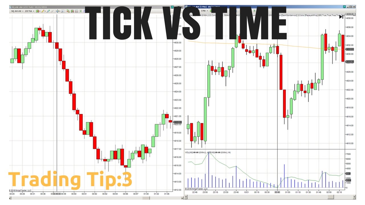
When reading stock charts, it’s crucial to pay attention to the timeframe selected. Different traders may have different preferences, ranging from intraday charts (such as 1-minute or 5-minute charts) to daily, weekly, or monthly charts. Each timeframe provides a different level of detail and can reveal unique patterns and trends.
In addition to the chart type and timeframe, volume is another essential element to consider. Volume represents the number of shares traded during a specific time period. It provides insights into the level of interest and participation in a stock, confirming price movements and indicating potential trend reversals. High volume during price increases suggests buying pressure, while high volume during price decreases signals selling pressure.
By understanding the basics of stock charts, including the different chart types, timeframes, and volume, you will be equipped with the fundamental tools to analyze and interpret stock price movements. In the next section, we will delve deeper into identifying key chart patterns and how they can help you make informed trading decisions.
Different Types of Stock Charts
When it comes to analyzing stock price movements, there are several types of charts available, each providing its own unique insights. By understanding the different types of stock charts, you can effectively interpret and identify key patterns and trends in the market. Let’s explore the main types of stock charts:
1. Line Charts: Line charts are the most basic and commonly used type of stock chart. They plot the closing prices of a stock over a specific time period and connect the data points with a line. Line charts are useful for determining the overall trend of a stock and identifying support and resistance levels.
2. Bar Charts: Bar charts provide more detailed information compared to line charts. They display the high, low, open, and close prices for a given time period using vertical bars. The top of the bar represents the high price, while the bottom represents the low price. A horizontal tick to the left of the bar indicates the opening price, and a tick to the right indicates the closing price. Bar charts are valuable for analyzing price ranges, volatility, and identifying potential reversal patterns.
3. Candlestick Charts: Candlestick charts are widely used by traders due to their ability to convey comprehensive information in a visually appealing way. Each candlestick represents a specific time period and displays the opening, closing, high, and low prices. The body of the candlestick is filled or hollow, depending on whether the closing price is lower or higher than the opening price. Candlestick charts provide valuable insights into market sentiment and can indicate potential trend reversals and continuation patterns.
4. Point and Figure Charts: Point and figure charts focus solely on price movements and filter out time-related information. These charts use Xs and Os to represent price increases and decreases, respectively, and plot them on a grid. Point and figure charts are particularly useful for identifying long-term trends, support and resistance levels, and breakout patterns.
5. Renko Charts: Renko charts are constructed using fixed price movements and disregard time. These charts consist of bricks that are either filled or hollow, depending on whether the price has surpassed a predefined threshold. Renko charts filter out noise and highlight significant price movements, aiding traders in identifying trends and reversals.
When choosing the type of stock chart to use, consider your trading style, time frame, and the information you want to analyze. It’s also important to experiment with different chart types to find the one that resonates with you and suits your trading objectives.
In the next section, we will explore how to identify key chart patterns that can help you make informed trading decisions.
Identifying Key Chart Patterns
Chart patterns are formations that appear on stock charts and can provide valuable insights into future price movements. By learning to identify these key chart patterns, traders can make more informed trading decisions and potentially profit from price fluctuations. Let’s explore some of the most common chart patterns:
1. Head and Shoulders: The head and shoulders pattern is a reversal pattern that signals a potential trend reversal from bullish to bearish. It consists of three peaks, with the middle peak (the “head”) being higher than the other two (the “shoulders”). The pattern is complete when the price breaks below the “neckline,” a support level drawn through the lows of the two shoulders. Traders often use this pattern to anticipate a bearish price movement.
2. Double Top and Double Bottom: The double top pattern occurs when the price reaches a peak, pulls back, and then rallies to a similar level before declining again. It indicates a potential trend reversal from bullish to bearish. Conversely, the double bottom pattern occurs when the price reaches a bottom, bounces back, and then returns to a similar level before rising again. It suggests a potential trend reversal from bearish to bullish.
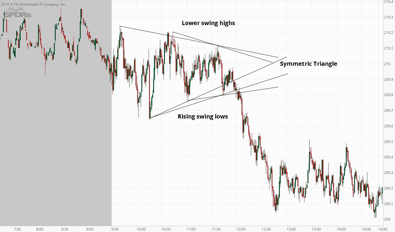
3. Ascending and Descending Triangles: Ascending and descending triangles are continuation patterns that indicate a potential pause in the current trend before a continuation. An ascending triangle is formed by a horizontal resistance line and an upward-sloping trendline. The pattern suggests that buyers are becoming more aggressive, and a breakout above the resistance level may lead to further upside movement. On the other hand, a descending triangle is formed by a horizontal support line and a downward-sloping trendline. The pattern indicates that sellers are becoming more aggressive, and a breakdown below the support level may lead to further downside movement.
4. Bullish and Bearish Flags: Bullish and bearish flags are consolidation patterns that typically occur after a strong price movement. A bullish flag is characterized by a sharp upward price movement, followed by a brief period of consolidation with a downward-sloping flagpole and a horizontal upper resistance line. This pattern suggests that the price may continue its upward movement after the consolidation phase. Conversely, a bearish flag is characterized by a strong downward price movement, followed by a period of consolidation with an upward-sloping flagpole and a horizontal lower support line. It suggests that the price may continue its downward movement after the consolidation phase.
5. Cup and Handle: The cup and handle pattern is a bullish continuation pattern that resembles a cup followed by a handle. The cup is formed by a rounded bottom, while the handle is a small consolidation or pullback before another upward movement. Traders often look for a breakout above the handle’s resistance level as a signal to enter a long position.
It’s important to note that chart patterns are not foolproof signals and should be used in conjunction with other technical indicators and analysis techniques. Additionally, patterns can sometimes fail and result in false signals, so it’s essential to manage risks and use proper stop-loss orders.
In the next section, we’ll discuss the use of technical indicators to enhance your trading decisions and confirm your analysis of chart patterns.
Using Technical Indicators to Enhance Trading Decisions
Technical indicators are mathematical calculations that utilize historical price and volume data to provide additional insights into market trends and trading opportunities. By incorporating technical indicators into your analysis, you can enhance your trading decisions and confirm the signals generated from chart patterns. Let’s explore some commonly used technical indicators:
1. Moving Averages: Moving averages (MAs) are trend-following indicators that smooth out price fluctuations and provide a visual representation of the average price over a specific period. The most commonly used types of moving averages are the simple moving average (SMA) and the exponential moving average (EMA). MAs can help traders identify the direction of the trend, support and resistance levels, and potential reversal points.
2. Relative Strength Index (RSI): The Relative Strength Index is a momentum oscillator that measures the speed and change of price movements. The RSI oscillates between 0 and 100 and is used to identify overbought and oversold conditions in a stock. Traders often look for divergences between the RSI and price to anticipate potential trend reversals.
3. Moving Average Convergence Divergence (MACD): The MACD is a trend-following momentum indicator that compares two moving averages of a stock’s price. It consists of a MACD line (the difference between the two moving averages) and a signal line (a moving average of the MACD line). The MACD generates buy and sell signals when the MACD line crosses above or below the signal line. Traders also pay attention to divergences between the MACD and price for potential trend reversals.
4. Bollinger Bands: Bollinger Bands are volatility indicators that consist of three lines: a middle band (usually a 20-day moving average) and an upper and lower band that are typically two standard deviations away from the middle band. Bollinger Bands expand and contract based on market volatility. Traders often look for price to move outside the bands, indicating potential overbought or oversold conditions.
5. Stochastic Oscillator: The Stochastic Oscillator is a momentum indicator that compares a stock’s closing price to its price range over a specified period. It oscillates between 0 and 100 and helps identify overbought and oversold conditions. Traders look for crosses between the %K and %D lines or divergences between the indicator and price to anticipate potential trend reversals.
These are just a few examples of the many technical indicators available to traders. It’s important to note that no single indicator can guarantee accurate predictions. Therefore, it’s often beneficial to use multiple indicators in conjunction with other analysis techniques to confirm trading decisions and reduce false signals.
When using technical indicators, it’s essential to understand their strengths and limitations and to adapt them to match your trading strategy and objectives. Additionally, be mindful of not overloading your charts with too many indicators, as it can lead to analysis paralysis and confusion.
In the next section, we’ll dive deeper into reading candlestick charts, which can provide valuable insights into price movements and market sentiment.
Reading Candlestick Charts for Day Trading
Candlestick charts are widely used by day traders due to their ability to provide detailed information about price movements and market sentiment. By learning to read and interpret candlestick patterns, traders can gain valuable insights into potential trading opportunities. Let’s explore the key elements of candlestick charts and some common candlestick patterns:
1. Candlestick Anatomy: A single candlestick consists of four main components: the open, close, high, and low. The body of the candlestick represents the opening and closing prices, while the wicks or shadows represent the high and low prices during the trading period. The color of the body can be filled or hollow. A filled (red or black) candlestick indicates that the close is lower than the open, while a hollow (green or white) candlestick indicates that the close is higher than the open.
2. Bullish and Bearish Engulfing Patterns: The bullish engulfing pattern occurs when a green candlestick completely engulfs the previous red candlestick. It suggests a potential trend reversal from bearish to bullish. Conversely, the bearish engulfing pattern occurs when a red candlestick completely engulfs the previous green candlestick, indicating a potential trend reversal from bullish to bearish.
3. Doji: A doji candlestick has a small body, indicating that the open and close prices are very close or equal. It represents indecision in the market and can signal a potential trend reversal. The length of the wicks on a doji can provide additional insights into market sentiment. For example, a long lower wick indicates buying pressure, while a long upper wick suggests selling pressure.
4. Hammer and Shooting Star: The hammer and shooting star candlesticks have a small body and a long lower or upper wick, respectively. A hammer pattern typically appears at the bottom of a downtrend and suggests a potential trend reversal from bearish to bullish. Conversely, a shooting star pattern typically appears at the top of an uptrend and indicates a potential trend reversal from bullish to bearish.
5. Morning Star and Evening Star: The morning star pattern consists of three candlesticks: a large red candlestick, followed by a small-bodied candlestick (can be filled or hollow) that gaps lower, and finally a large green candlestick that gaps higher. It suggests a potential trend reversal from bearish to bullish. The evening star pattern is the inverse of the morning star and indicates a potential trend reversal from bullish to bearish.
These are just a few examples of the many candlestick patterns that traders use to make better trading decisions. It’s important to remember that individual candlestick patterns should not be interpreted in isolation but rather in the context of the overall price action and other technical indicators.
In addition to individual candlestick patterns, traders often look for patterns formed by multiple candlesticks, such as the three white soldiers, three black crows, and bullish or bearish engulfing patterns. These patterns provide insights into market sentiment and potential trend reversals.
By studying candlestick charts and understanding the various candlestick patterns, you can gain a deeper understanding of price movements and make more informed trading decisions in your day trading endeavors.
In the next section, we will explore the significance of volume in stock charts and its role in confirming price movements and patterns.
Volume and its Significance in Stock Charts
Volume is a crucial component of stock charts that provides valuable insights into the level of interest and participation in a particular stock. By analyzing volume data, traders can confirm price movements, identify potential trend reversals, and gauge the strength of a trend. Let’s explore the significance of volume in stock charts:
1. Confirming Price Movements: Volume can help confirm the validity of price movements. Generally, higher volume during price increases suggests buying pressure and reinforces the upward movement. Conversely, higher volume during price decreases indicates selling pressure and confirms the downward movement. When volume aligns with price movements, it provides traders with more confidence in the direction of the trend.
2. Identifying Breakouts and Breakdowns: Volume can be particularly significant when a stock breaks out of a key resistance level or breaks down through a critical support level. In these instances, a surge in volume often accompanies the breakout or breakdown, indicating strong buying or selling interest. Higher volume during these crucial price movements gives traders more confidence in the sustainability of the breakout or breakdown.
3. Gauging Trend Strength: Analyzing volume can help assess the strength of a trend. In an uptrend, increasing or sustained high volume suggests robust buying interest, indicating a healthy and strong upward movement. Conversely, in a downtrend, increasing or sustained high volume indicates strong selling pressure, reinforcing the bearish trend. However, if a trend is accompanied by declining volume, it may suggest a lack of conviction from market participants and signal a potential weakening or reversal of the trend.
4. Spotting Accumulation and Distribution: Volume can provide insights into accumulation and distribution of a stock. Accumulation occurs when large institutional investors and smart money are buying shares, which is often accompanied by increased volume. On the other hand, distribution happens when these institutional investors and smart money are selling shares, usually resulting in higher volume as well. Monitoring volume alongside price movements can help traders identify when significant players are actively accumulating or distributing a stock.
5. Confirming Reversal Patterns: In addition to price patterns, volume can confirm potential trend reversals. For example, if a stock forms a bullish reversal pattern, such as a double bottom, an increase in volume when the stock breaks above the pattern’s neckline adds credibility to the anticipated trend reversal. Conversely, if a bearish reversal pattern, like a double top, forms, an increase in volume during the breakdown below the pattern’s neckline confirms the potential trend reversal.
It’s important to compare volume levels to average volume as well. Unusually high or low volume, compared to the stock’s average volume, can indicate significant market interest or lack thereof. It’s essential to consider volume in conjunction with other technical indicators and price patterns to make well-informed trading decisions.
By paying attention to volume on stock charts, traders can obtain valuable insights into market dynamics and confirm price movements and patterns. In the next section, we will explore how to apply support and resistance levels to further enhance trading decisions.
Applying Support and Resistance Levels
Support and resistance levels are vital tools for traders to identify potential price levels at which a stock is likely to experience buying or selling pressure. These levels can provide valuable insights into entry and exit points, trend reversals, and price targets. Applying support and resistance levels in your analysis can enhance your trading decisions. Let’s delve into the significance of support and resistance levels:
1. Support Levels: Support levels are price levels at which buying pressure is anticipated to outweigh selling pressure, causing the stock’s price to stabilize or bounce back. They act as a floor to provide support and prevent prices from dropping further. Support levels are often identified by previous price lows, where buyers have shown a willingness to step in and push the price higher. Traders pay close attention to support levels to determine potential entry points for buy positions or as areas to set stop-loss orders.
2. Resistance Levels: Resistance levels are price levels at which selling pressure is expected to outweigh buying pressure, preventing the stock’s price from rising further. They act as a ceiling, capping the price and causing it to reverse or consolidate. Resistance levels are typically identified by previous price highs, where sellers have historically entered the market, resulting in a price reversal. Resistance levels are valuable for traders to determine potential exit points for sell positions or areas to set profit targets.
3. Role Reversal: Once a support level is breached, it can potentially become a resistance level, and vice versa. This role reversal occurs when the buying or selling pressure shifts, changing the dynamics of the stock’s price movement. Traders closely monitor these role-reversal levels as they can offer significant trading opportunities. For example, if a stock breaks above a previous resistance level, that level may now act as a new support level, providing a potential entry point for long positions.
4. Breakouts and Breakdowns: Breakouts and breakdowns occur when the stock’s price moves beyond a significant support or resistance level. A breakout above a resistance level suggests that buying pressure is gaining strength, potentially leading to further price increases. Traders often use breakouts as a signal to initiate long positions. Conversely, a breakdown below a support level suggests that selling pressure is intensifying, potentially leading to further price declines. Traders may use breakdowns as a signal to enter short positions.
5. Consolidation and Breakout Patterns: Support and resistance levels are particularly relevant in consolidation patterns, where the stock’s price remains within a defined range. These patterns, like triangles or rectangles, typically have clear support and resistance lines. Traders closely monitor these patterns and wait for a breakout or breakdown to occur before taking action. A breakout above the resistance line signals a potential bullish move, while a breakdown below the support line suggests a potential bearish move.
When applying support and resistance levels, it’s important to consider multiple time frames to identify stronger levels that are relevant across different periods. Additionally, combining support and resistance levels with other technical indicators, such as moving averages or trendlines, can provide additional confirmation for trading decisions.
In the next section, we will discuss the importance of setting stop-loss and take-profit levels to manage risk and protect trading positions.
Setting Stop Loss and Take Profit Levels
Setting appropriate stop loss and take profit levels is crucial for managing risk and protecting trading positions. Stop loss and take profit levels are predetermined price points that help limit losses and secure profits. By incorporating these levels into your trading strategy, you can effectively manage risk and maximize potential returns. Let’s explore the importance of setting stop loss and take profit levels:
1. Stop Loss Levels: A stop loss level is a predetermined price at which you will exit a trade to limit potential losses. It acts as a safety net, protecting your trading capital from significant drawdowns. Stop loss levels are set based on factors such as overall risk tolerance, the stock’s volatility, and the analysis of support and resistance levels. By setting a stop loss level, you establish a point at which you acknowledge that your trade idea was incorrect and that it’s time to exit before incurring further losses.
2. Take Profit Levels: A take profit level is a predetermined price at which you will exit a trade to secure your profits. It allows you to lock in gains and ensure that you don’t miss out on potential profits. Take profit levels are determined by various factors including performance targets, technical analysis patterns, or fundamental analysis indicators. Setting a take profit level helps you avoid second-guessing your trade and allows you to exit the market with a predetermined profit objective in mind.
3. Risk Management: Setting stop loss and take profit levels is an integral part of risk management. It ensures that you are aware of your potential risk-reward ratio before entering a trade. By determining your stop loss level based on how much you are willing to risk, you can calculate your position size accordingly. Risk management helps preserve your trading capital and ensures that one losing trade doesn’t significantly impact your overall portfolio. It also promotes discipline and helps eliminate emotional decision-making during times of market volatility.
4. Flexibility and Adjustments: While it’s essential to have predefined stop loss and take profit levels, it’s equally important to be flexible and open to adjusting them if market conditions change. As the trade progresses, monitor the price action and reassess your levels if necessary. You may choose to tighten or loosen your stop loss and take profit levels based on new information or changing market dynamics. Adapting to market conditions allows you to optimize your risk-reward ratio and potentially capture more significant profits or minimize losses.
5. Trailing Stop Loss and Partial Profit Taking: Traders also have the option to use trailing stop loss orders and partial profit taking to enhance their risk management strategies. A trailing stop loss is a dynamic stop loss level that moves with the price as it moves in your favor. It allows you to capture more significant profits while still protecting against potential reversals. Partial profit taking involves scaling out of a position gradually, taking profits at predetermined levels and allowing the remaining portion to run, aiming for a larger gain. Both of these techniques can help optimize risk-reward ratios and adapt to changing market conditions.
By setting appropriate stop loss and take profit levels, you can effectively manage risk and protect your trading positions. Remember, a well-defined risk management strategy is essential for long-term success in trading. In the next section, we will explore how to analyze trends and price movements to make better trading decisions.
Analyzing Trends and Price Movements
Analyzing trends and price movements is a fundamental aspect of technical analysis that can help traders make better informed trading decisions. By studying historical price data and identifying trends, traders can gain insights into potential future price movements and market behavior. Let’s explore the importance of analyzing trends and price movements:
1. Trend Identification: Identifying trends is a crucial first step in analyzing price movements. Trends can be categorized as uptrends (higher highs and higher lows), downtrends (lower highs and lower lows), or sideways trends (consolidation with no clear direction). Analyzing trends allows traders to align their trading strategies with the prevailing market direction. Trend analysis can be done using different timeframes, from short-term intraday trends to long-term trends spanning several months or years.
2. Trendlines: Trendlines are an essential tool for analyzing trends and price movements. They are drawn by connecting consecutive high points or low points on a price chart. Trendlines act as dynamic support or resistance levels, providing insights into the strength and direction of a trend. Traders look for breaks or bounces off trendlines to confirm or anticipate trend reversals or continuations.
3. Price Patterns: Price patterns are repetitive formations on a chart that provide insights into market psychology and potential future price movements. Common price patterns include triangles, rectangles, wedges, and head and shoulders patterns. Traders look for these patterns to forecast potential breakouts or breakdowns and take advantage of ensuing price movements.
4. Price Oscillators: Price oscillators, such as the Relative Strength Index (RSI) or the Stochastic Oscillator, are technical indicators that help assess overbought or oversold conditions in a market. These oscillators measure the speed and magnitude of price movements and provide insights into potential trend reversals. Traders consider divergence between price and oscillators as a potential signal of an upcoming trend change.
5. Moving Averages: Moving averages (MAs) are widely used in trend analysis to smooth out price fluctuations and identify trend direction. MAs can act as dynamic support or resistance levels and help traders confirm trends. The crossover of different MAs, such as the 50-day and 200-day moving averages, can also provide insights into potential trend reversals.
6. Volatility Analysis: Analyzing volatility is essential for understanding price movements and market dynamics. Volatility measures the magnitude of price fluctuations, and high volatility can indicate increased market uncertainty or potential trading opportunities. Traders use indicators like Bollinger Bands or Average True Range (ATR) to gauge volatility and adjust their trading strategies accordingly.
It’s important to note that price movements are influenced by various factors, including economic events, market sentiment, and news releases. Therefore, it’s crucial to combine technical analysis with a broader understanding of fundamental analysis and market drivers.
By analyzing trends and price movements, traders can gain insights into potential future price movements and make better-informed trading decisions. Remember, it’s essential to use multiple analysis techniques and indicators to confirm each other’s signals and increase the accuracy of your trading strategy. In the next section, we will explore how moving averages can be used to evaluate stock trends.
Evaluating Stock Trends with Moving Averages
Moving averages (MAs) are widely used by traders to evaluate stock trends and identify potential buy or sell signals. By analyzing the interaction between different MAs and the stock’s price, traders can gain insights into the strength and direction of a trend. Let’s explore how moving averages can be used to evaluate stock trends:
1. Simple Moving Averages (SMA): The simple moving average is the most basic form of moving average. It calculates the average closing price over a specific period. For example, a 50-day SMA calculates the average closing price over the last 50 trading days. Traders use SMAs to identify the overall direction of a trend. When the stock’s price is above the SMA, it indicates an uptrend, and when the price is below the SMA, it suggests a downtrend. Traders monitor the crossover of different SMAs, such as the 50-day and 200-day moving averages, as potential buy or sell signals.
2. Exponential Moving Averages (EMA): The exponential moving average gives more weight to recent price data, making it more responsive to current price movements compared to the simple moving average. It adjusts its calculation based on a specified smoothing factor. EMAs are particularly useful for short-term trend analysis and identifying potential entry or exit points. Traders often look for crossovers between different EMAs, such as the 9-day and 21-day moving averages, as potential trading signals.
3. Golden Cross and Death Cross: The golden cross occurs when a shorter-term moving average (e.g., 50-day) crosses above a longer-term moving average (e.g., 200-day). It suggests a potential bullish signal, indicating a shift towards an uptrend. Conversely, the death cross occurs when a shorter-term moving average crosses below a longer-term moving average, signaling a potential bearish signal and a shift towards a downtrend. These crosses are considered significant events and can attract the attention of traders and investors.
4. Moving Average Convergence Divergence (MACD): MACD is a popular trend-following momentum indicator that incorporates two moving averages and a signal line. It helps traders identify potential trend reversals and capture the strength and direction of a trend. The MACD line represents the difference between two EMAs (e.g., 12-day EMA and 26-day EMA), while the signal line is typically a 9-day EMA of the MACD line. Traders often look for crossovers between the MACD line and the signal line as potential buy or sell signals.
5. Trend Reversals and Support/Resistance: Moving averages can also act as dynamic support or resistance levels. For example, when the stock’s price pulls back towards a rising moving average, it may find support and bounce back, confirming the strength of the uptrend. Conversely, when the price approaches a declining moving average from below, it may act as resistance, confirming the strength of the downtrend. These interactions between price and moving averages can provide insights into trend reversals.
It’s important to note that moving averages work best in trending markets and may generate false signals in choppy or sideways markets. Traders often use moving averages alongside other technical indicators and analysis techniques to confirm signals and enhance their trading strategy.
By evaluating stock trends with moving averages, traders can gain insights into the direction, strength, and potential reversal points of a trend. Remember, no single indicator can guarantee accurate predictions, so it’s essential to combine moving averages with other analysis tools to make well-informed trading decisions. In the next section, we will explore how combining chart patterns with indicators can generate better trading signals.
Combining Chart Patterns with Indicators for Better Trading Signals
Combining chart patterns with indicators can enhance trading signals and provide valuable insights into potential market moves. Chart patterns offer visual representations of price movements, while indicators use mathematical calculations to analyze market data. By combining the two, traders can generate more robust trading signals and improve their chances of making successful trades. Let’s explore how combining chart patterns with indicators can lead to better trading signals:
1. Confirming Chart Patterns: Chart patterns, such as triangles, double tops, or head and shoulders, can provide indications of potential trend reversals or continuations. However, it’s essential to confirm these patterns using technical indicators to improve the accuracy of the signals. For example, if a chart pattern suggests a bullish reversal, confirming it with oversold conditions on the Relative Strength Index (RSI) can provide more confidence in the potential upward move.
2. Divergence: Divergence occurs when the price of a security and an indicator move in opposite directions. It suggests a potential trend reversal. By combining chart patterns with divergence on indicators like the Moving Average Convergence Divergence (MACD) or the Stochastic Oscillator, traders can identify potential entry or exit points with higher accuracy. For instance, if a double bottom pattern forms, and the indicator shows bullish divergence, it strengthens the signal for a potential trend reversal to the upside.
3. Support and Resistance Levels: Combining chart patterns with indicators can help validate support and resistance levels. If a stock approaches a significant resistance level and a momentum indicator like the RSI shows overbought conditions, it can confirm the resistance and potentially signal a reversal. Similarly, if a stock finds support at a key level, and an indicator like the MACD shows bullish divergence, it can confirm the support and signal a potential rally.
4. Trend Confirmation: Technical indicators can help confirm the strength and direction of a trend suggested by a chart pattern. For example, if a rising wedge pattern forms, and the indicator lines up with the direction of the wedge (e.g., the Moving Average points upward), it adds weight to the validity of the pattern and confirms the potential downward move. Combining the chart pattern with trend-confirming indicators reduces the risk of false signals and enhances the likelihood of successful trades.
5. Enhancing Entry and Exit Points: Combining chart patterns with indicators helps in determining precise entry and exit points. For instance, if a breakout from a chart pattern occurs, traders can use indicators like the Average True Range (ATR) to determine the optimal stop-loss and take-profit levels. Additionally, confirming the breakout with indicators like the Volume Weighted Average Price (VWAP) can provide insights into the strength of the breakout and potential follow-through.
Remember, no trading strategy or combination of chart patterns and indicators is foolproof. It’s crucial to thoroughly understand each pattern and indicator, their strengths, and limitations. Additionally, traders should practice due diligence by combining multiple sources of analysis and using proper risk management techniques.
By combining chart patterns with indicators, traders can generate better trading signals and improve their overall trading performance. Experimentation, backtesting, and continuous learning are keys to finding the right combination of indicators and chart patterns that best suit your trading style and objectives. In the next section, we will put our knowledge into practice and analyze a sample stock chart.
Putting it all Together: Analyzing a Sample Stock Chart
Now, let’s put our knowledge of chart patterns, indicators, and trend analysis into practice by analyzing a sample stock chart. For this example, let’s consider a daily chart of ABC Company’s stock. Here’s a step-by-step analysis:
1. Identify the Overall Trend: Begin by analyzing the overall trend of the stock. Are we in an uptrend, downtrend, or sideways trend? Look for higher highs and higher lows for an uptrend, lower highs and lower lows for a downtrend, and a range-bound price for a sideways trend. In this case, it appears that ABC Company’s stock is in an uptrend, as it has been consistently making higher highs and higher lows over the past few months.
2. Look for Chart Patterns: Identify any chart patterns that may be present on the chart. Common patterns include triangles, rectangles, head and shoulders, and double tops/bottoms. In our analysis, we notice a potential ascending triangle pattern forming, with a horizontal resistance line and an upward-sloping trendline connecting higher lows.
3. Confirm with Indicators: Use technical indicators to confirm the validity of the chart pattern and the overall trend. Check whether the indicators align with the identified pattern and trend. For example, if utilizing the Relative Strength Index (RSI), ensure it is showing bullish conditions or potential divergences that support the uptrend and the potential breakout from the ascending triangle pattern.
4. Evaluate Support and Resistance Levels: Identify key support and resistance levels that coincide with the chart pattern and trend. These levels help determine potential entry and exit points. Look for areas where the stock has historically found support or resistance and analyze how they align with the pattern and indicators. Adjust stop-loss and take-profit levels based on these support and resistance levels.
5. Consider Volume: Analyze the volume accompanying the price movements and pattern formations. A significant increase in volume during a breakout or breakdown can reinforce the potential validity of the chart pattern and trend. Conversely, low volume during a pattern formation suggests caution and potential weakness in the pattern’s reliability.
6. Execute and Manage the Trade: Based on the analysis of the stock chart, chart pattern, trend, indicators, and other factors, make an informed decision about entering the trade. Set precise entry and exit points, along with appropriate stop-loss and take-profit levels, based on the identified support and resistance levels. Monitor the trade’s progression, adjusting stop-loss levels and taking profits as needed.
Remember, while the analysis provides insights and improves the probability of successful trades, no method guarantees 100% accuracy. It’s essential to assess risk-reward ratios, practice proper risk management, and continually monitor the trade based on market conditions and new information.
By utilizing a comprehensive analysis incorporating chart patterns, indicators, trend analysis, and other key elements, traders can make more informed decisions in navigating the complexities of the stock market. Successful trading requires practice, experience, and continuous learning to refine these skills over time.
In this guide, we have covered the fundamentals of reading stock charts, understanding different chart types, identifying chart patterns, using technical indicators, analyzing trends, and combining all these aspects for better trading signals. With diligence and practice, you can improve your ability to make confident trading decisions and increase your chances of success in the dynamic world of stock trading. Happy trading!
Conclusion
In conclusion,
Understanding how to read stock charts is a vital skill for traders. By analyzing different chart types, identifying chart patterns, using technical indicators, and evaluating trends and price movements, traders can gain valuable insights into market behavior and make better-informed trading decisions.
Start by familiarizing yourself with the basics of stock charts and the different types available, such as line charts, bar charts, and candlestick charts. Learn how to interpret these charts and identify key chart patterns like head and shoulders, double tops/bottoms, triangles, and more.
Technical indicators play a significant role in enhancing trading decisions. By utilizing indicators like moving averages, RSI, MACD, and Bollinger Bands, traders can confirm signals, identify trend reversals, and gauge market sentiment.
It’s important to consider volume and its significance in stock charts. Volume provides insights into buying and selling pressure, confirming price movements and reinforcing patterns. Additionally, setting stop-loss and take-profit levels is crucial for managing risk and protecting trading positions.
Combining chart patterns with indicators leads to better trading signals. Look for confirmation between the chart pattern, trend analysis, and indicators to increase the accuracy of your trades. Additionally, understanding support and resistance levels can help determine entry and exit points and validate trading decisions.
By evaluating stock trends with moving averages, traders can gain insights into direction and potential reversal points. Moving averages act as dynamic support or resistance levels, confirming the strength of trends and providing entry or exit signals.
To make the most of your analysis, combine all these elements when analyzing a sample stock chart. Ensure you align the chart pattern, trend analysis, indicators, support and resistance levels, and volume to generate well-informed trading decisions.
Lastly, remember that no trading strategy guarantees 100% accuracy. Risk management, continuous learning, and adaptability are key to success. Practice, experimentation, and the willingness to adjust your approach as per changing market conditions will lead to improved trading outcomes.
With the knowledge gained from this guide and a commitment to ongoing learning, you can enhance your skills in reading stock charts and make more confident and informed trading decisions in the dynamic world of finance.