


Introduction
Welcome to the digital age, where browsing the internet has become an essential part of our daily lives. As we navigate various websites and explore their content, we often come across websites that look different depending on the device we are using. Have you ever wondered why this happens? It all comes down to the size of your browser.
When we talk about the size of a browser, we are referring to the dimensions of the window in which the website is displayed. This window can vary in size depending on several factors, such as the device being used, the screen resolution, and even the user’s preferences. Understanding the size of your browser is essential for both website developers and users, as it can impact the overall user experience and the way a website is displayed.
In this article, we will explore different methods for finding your browser size and explain why it matters. By the end, you will have a better understanding of how browser size affects the way websites are displayed, and you may even uncover some useful tips for optimizing website layout to improve the user experience.
How to Find Your Browser Size
Finding your browser size is relatively simple, and there are a few methods you can use to determine the dimensions of the window you are currently using to browse the internet. Let’s take a look at a few of these methods:
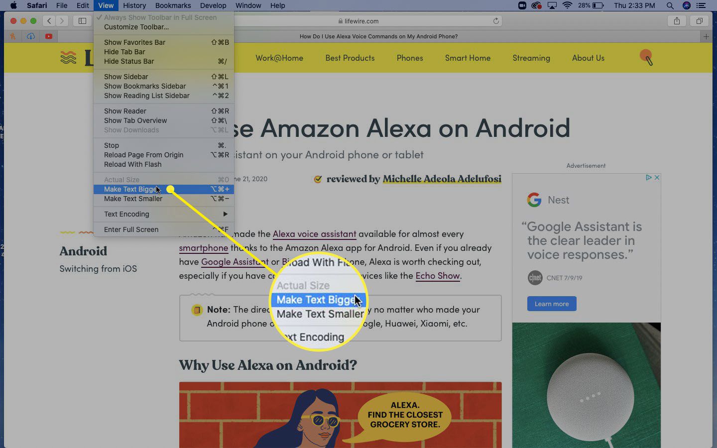
- Using Built-in Developer Tools: Most modern browsers come equipped with built-in developer tools that allow you to inspect and analyze various aspects of a webpage. To find your browser size using these tools, simply right-click anywhere on the webpage, select “Inspect” or “Inspect Element,” and a panel will appear showing the HTML and CSS code of the page. Within this panel, you will find a section labeled “Elements” or “Styles” that displays the dimensions of the browser window.
- Using Browser Extensions: Another convenient way to find your browser size is by using browser extensions. These extensions provide additional functionality and can often include features that display the dimensions of your browser window. Install a reliable browser extension specifically designed for this purpose, and you will have easy access to your browser size whenever you need it.
- Using Online Tools: If you prefer a more straightforward approach, there are various online tools available that can provide your browser size with just a few clicks. Simply search for “browser size checker” in your preferred search engine, and you will find a list of reliable websites that can determine your browser size instantly.
- Manually Resizing the Window: Lastly, you can determine your browser size by manually resizing the window. To do this, simply click and drag any edge or corner of the browser window until it reaches the desired size. This method allows you to see the dimensions of the window as you make adjustments.
Regardless of the method you choose, it’s important to note that your browser size may vary based on the device being used and the current screen resolution. It’s always best to check your browser size on the specific device and screen resolution that you intend your website or web application to be viewed on, to ensure optimal user experience.
Determining the Viewport Size
When it comes to web design and development, understanding the viewport size is crucial. The viewport refers to the visible area of a webpage within the browser window, excluding any browser UI elements such as the address bar or scrollbar. Determining the viewport size allows developers to create responsive designs that adapt to different screen sizes and optimize the user experience. Here are a few ways to determine the viewport size:
- Using JavaScript: JavaScript provides a straightforward method for determining the viewport size. By utilizing the “window.innerWidth” and “window.innerHeight” properties, you can extract the width and height of the viewport, respectively. These values are dynamic and change when the browser window is resized.
- Using CSS: Cascading Style Sheets (CSS) also offers a way to determine the viewport size. By using the “vw” and “vh” units, which represent a percentage of the viewport width and height, you can create flexible layouts that adjust to different viewport sizes. Additionally, the “@media” rule allows you to define specific CSS rules based on different viewport sizes.
- Using Online Tools: Similar to finding your browser size, there are online tools available that can help determine the viewport size. These tools usually display the viewport dimensions and provide additional information such as the user agent and device type. Simply search for “viewport size checker” in your preferred search engine, and you’ll find several reliable options.
- Using Browser Developer Tools: Much like finding your browser size, browser developer tools can also be used to determine the viewport size. By inspecting the webpage and navigating to the “Elements” or “Styles” section of the developer tools panel, you can usually find information about the current viewport dimensions.
By understanding the viewport size, web developers can implement responsive design techniques that adapt the layout, font sizes, and images based on the user’s device. This ensures that websites are visually appealing and easy to navigate, regardless of the screen size or orientation. It’s essential to test your website on different devices and viewport sizes to ensure a seamless experience for all users.
Checking the Window Size
In addition to knowing the browser and viewport sizes, it’s also helpful to check the window size, which refers to the dimensions of the entire browser window, including any browser UI elements. Checking the window size can provide further insights into how much space is available for content and can help optimize the layout of your website. Here are a few methods to check the window size:
- Using JavaScript: JavaScript provides a simple way to check the window size. You can use the “window.innerWidth” and “window.innerHeight” properties to get the width and height of the entire browser window. These values represent the dimensions in pixels and update dynamically when the window is resized.
- Using Browser Developer Tools: Most browsers come with built-in developer tools that allow you to inspect various aspects of a webpage. By opening the developer tools panel and navigating to the “Elements” or “Styles” section, you can often find information about the window size. Look for properties like “clientWidth” and “clientHeight” to determine the size of the window.
- Using Online Tools: If you prefer a more straightforward approach, you can use online tools to check the window size. These tools typically display the dimensions of the window and provide additional information such as the screen resolution and device type. Search for “window size checker” in your preferred search engine, and you’ll find various websites that offer this functionality.
Checking the window size is particularly useful when designing websites that require precise positioning and alignment of elements. By understanding the available space, you can ensure that your content is displayed optimally and that users are not required to scroll excessively or encounter overlapping elements.
Keep in mind that the window size may differ from the viewport size due to the presence of browser UI elements. Therefore, it’s important to consider both aspects when designing and developing websites to create an exceptional user experience across different devices and screen sizes.
Understanding Screen Size
In the world of browsing the internet, screen size plays a vital role in determining how websites are displayed. The screen size refers to the physical dimensions of the device’s display and greatly influences the overall user experience. Here’s what you need to know about understanding screen size:
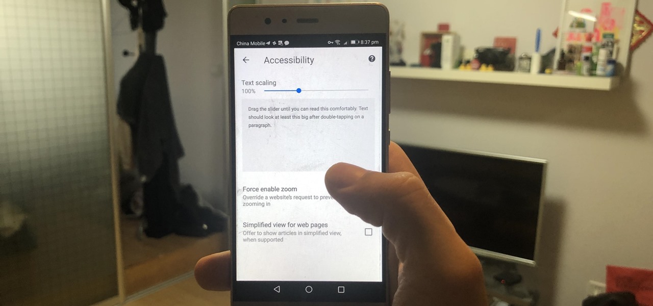
Measuring Screen Size: Screen size is typically measured diagonally, from one corner of the display to the opposite corner. Common units for expressing screen size include inches and centimeters. It’s important to note that screen size does not consider the resolution or pixel density of the display, which can vary even among devices with the same screen size.
Screen Resolution: Screen resolution refers to the number of pixels displayed on the screen, both horizontally and vertically. Higher screen resolutions provide more detail and sharper images. Common resolutions include 1080p (1920×1080), 1440p (2560×1440), and 4K (3840×2160). It’s crucial for web developers to take into account different screen resolutions when designing responsive websites to ensure content is properly displayed across various devices.
PPI and Retina Displays: Pixels per inch (PPI) is a measurement that indicates the pixel density of a display. Higher PPI values result in crisper and more detailed images. Retina displays, a term coined by Apple, refer to high-resolution displays with a pixel density that is difficult for the human eye to distinguish individual pixels. Web developers must consider PPI and Retina displays when optimizing images to ensure they appear sharp on these screens.
Aspect Ratio: The aspect ratio defines the proportional relationship between the width and height of a screen. Common aspect ratios include 16:9, which is widely used for televisions and computer monitors, and 4:3, which was popular among older displays. Aspect ratio affects how content is displayed, and web developers should consider various aspect ratios to create responsive designs that adapt to different screens.
Understanding screen size is essential for web designers and developers to create websites that deliver a consistent and visually appealing experience across different devices. By considering the screen size, resolution, PPI, and aspect ratio, developers can optimize layouts and content to accommodate a wide range of screens, ultimately enhancing the user experience.
Why Browser Size Matters
The size of the browser window plays a significant role in how websites are displayed and experienced by users. Understanding why browser size matters is crucial for web developers and designers. Here are a few reasons why browser size is important:
Responsive Web Design: In today’s digital landscape, responsive web design has become a fundamental aspect of creating user-friendly websites. With the wide variety of devices and screen sizes available, ensuring that a website looks and functions well across different browsers and devices is essential. By considering browser size, developers can implement responsive design techniques that adapt the layout, font sizes, and images to provide an optimal viewing experience for users.
User Experience: The browser size directly impacts the user experience of a website. If a website is not optimized for the specific browser size, users may struggle to navigate, read content, or interact with elements. A seamless and visually appealing user experience can be achieved by dynamically adjusting the website layout based on the browser size, ensuring that content is displayed intuitively and conveniently for users.
Content Visibility: Browser size affects the visibility of content on a website. If the browser window is too small, important elements may be hidden or require excessive scrolling to access. On the other hand, if the browser window is too large, content may appear too spread out, negatively impacting readability and engagement. Optimizing the layout and design based on the available browser size allows for better content visibility and engagement.
Cross-Browser Compatibility: Different web browsers, such as Chrome, Firefox, or Safari, may render websites differently based on their built-in features and default settings. By considering browser size, developers can ensure that a website appears consistent and functions properly across multiple browsers, providing a seamless experience for users regardless of their preferred browsing application.
Search Engine Optimization (SEO): Browser size indirectly impacts search engine optimization. Search engines consider user experience as one of the ranking factors. If a website is not optimized for different browser sizes, it can result in higher bounce rates and lower user engagement, negatively affecting its search engine rankings. By prioritizing responsive design and accommodating various browser sizes, websites can improve their SEO performance.
Considering the impact of browser size is crucial for delivering exceptional user experiences and ensuring websites are accessible and functional across different devices and browsers. By taking into account responsive design principles, developers can create websites that not only look great, but also provide a seamless and enjoyable browsing experience for users.
Tips for Optimizing Website Layout
Optimizing the layout of your website is essential for creating a visually appealing and user-friendly browsing experience. Here are some valuable tips to help you optimize your website layout:
- Responsive Design: Implementing a responsive design is crucial in today’s mobile-driven world. Ensure that your website adapts seamlessly to different browser sizes and devices, providing an optimal viewing experience for all users.
- Use a Grid System: Employing a grid system can help you create a well-structured and visually cohesive layout. Grid systems ensure alignment and consistency throughout your website design, making it easier for users to navigate and find information.
- Consider Typography: Font size, line spacing, and readability are important considerations for your website’s typography. Choose fonts and font sizes that are legible on various screen sizes to enhance the user experience.
- Optimize Images: Large, unoptimized images can significantly slow down your website’s loading time. Compress and optimize images without compromising their quality to ensure fast and efficient website performance.
- Whitespace and Visual Hierarchy: Utilize whitespace strategically to create a clean and uncluttered layout. It helps to guide users’ attention to important elements and makes your website appear more organized and visually appealing.
- Consistent Navigation: Create a consistent and intuitive navigation system that is easy for users to understand and navigate. Clear and concise menu labels and well-organized navigation menus make it simple for visitors to find what they are looking for.
- Content Prioritization: Prioritize your content based on its importance and relevance. Place crucial information and key call-to-action elements prominently to ensure they capture users’ attention and drive desired actions.
- Cross-Browser Compatibility: Test your website on multiple browsers and devices to ensure it renders correctly across different platforms. Address any layout inconsistencies or functional issues that may arise during testing.
- User Testing and Feedback: Regularly conduct user testing and gather feedback to identify areas for improvement. By understanding how users interact with your website, you can make informed decisions to enhance the layout and usability.
- Continuously Monitor and Update: Website optimization is an ongoing process. Regularly monitor user behavior, analyze website metrics, and keep up-to-date with design trends to make necessary adjustments and improvements to your website layout.
By implementing these tips, you can optimize your website layout, enhance user experience, and ensure that your website provides a visually appealing and user-friendly environment for visitors.
Conclusion
Understanding the size of your browser and optimizing your website layout accordingly are essential steps in creating a seamless and user-friendly browsing experience. By considering browser size, viewport size, screen size, and the overall user experience, web developers can ensure that their websites are visually appealing, responsive, and accessible across various devices and browsers.
Knowing how to find your browser size using developer tools, online tools, or browser extensions allows you to tailor your website to the specific dimensions of the browser window. Additionally, understanding the viewport size helps you create responsive designs that adapt to different screen sizes and orientations.
Checking the window size provides insights into the available space for content, enabling you to optimize the layout and ensure content visibility and readability. Furthermore, considering the screen size, screen resolution, PPI, and aspect ratio helps you create websites that look great and deliver a consistent experience across different devices.
Optimizing your website layout involves implementing responsive design, using a grid system, considering typography, optimizing images, utilizing whitespace and visual hierarchy, providing consistent navigation, prioritizing content, ensuring cross-browser compatibility, conducting user testing, and regularly updating your website based on user feedback and emerging design trends.
By following these tips and best practices, you will create websites that provide an exceptional user experience, regardless of the device or browser being used. Remember to continuously monitor and update your website to adapt to evolving technologies and user needs.
So, the next time you develop a website or optimize an existing one, be mindful of browser size and take these insights into account, ultimately enhancing the browsing experience for your users.


