Introduction
In today's digital age, web browsing has become an integral part of our daily lives. Whether it's for work, entertainment, or staying connected with the world, the ability to access websites seamlessly is crucial. With the widespread use of mobile devices, many websites have optimized their layouts for mobile viewing. However, there are instances when you may prefer to view a website in its desktop version, especially when certain features or functionalities are not available in the mobile layout.
Google Chrome, one of the most popular web browsers globally, offers a convenient solution for users who wish to switch to the desktop version of a website. By enabling the "Desktop Site" option, users can experience the full functionality and layout of a website as it appears on a desktop or laptop computer. This feature is particularly useful for tasks that require a larger screen, such as editing documents, filling out forms, or accessing complex web applications.
In this guide, we will walk you through the simple steps to switch to desktop mode on Chrome, allowing you to seamlessly transition from the mobile view to the desktop view of any website. Whether you're using Chrome on your smartphone, tablet, or any other mobile device, this tutorial will empower you to make the most of your browsing experience by accessing the desktop version of websites with ease.
So, if you've ever found yourself frustrated by the limitations of a mobile-optimized website and wished for a way to access its full desktop functionality, you're in the right place. Let's dive into the step-by-step process of switching to desktop mode on Chrome and unlock the full potential of your web browsing experience.
Step 1: Open Chrome Browser
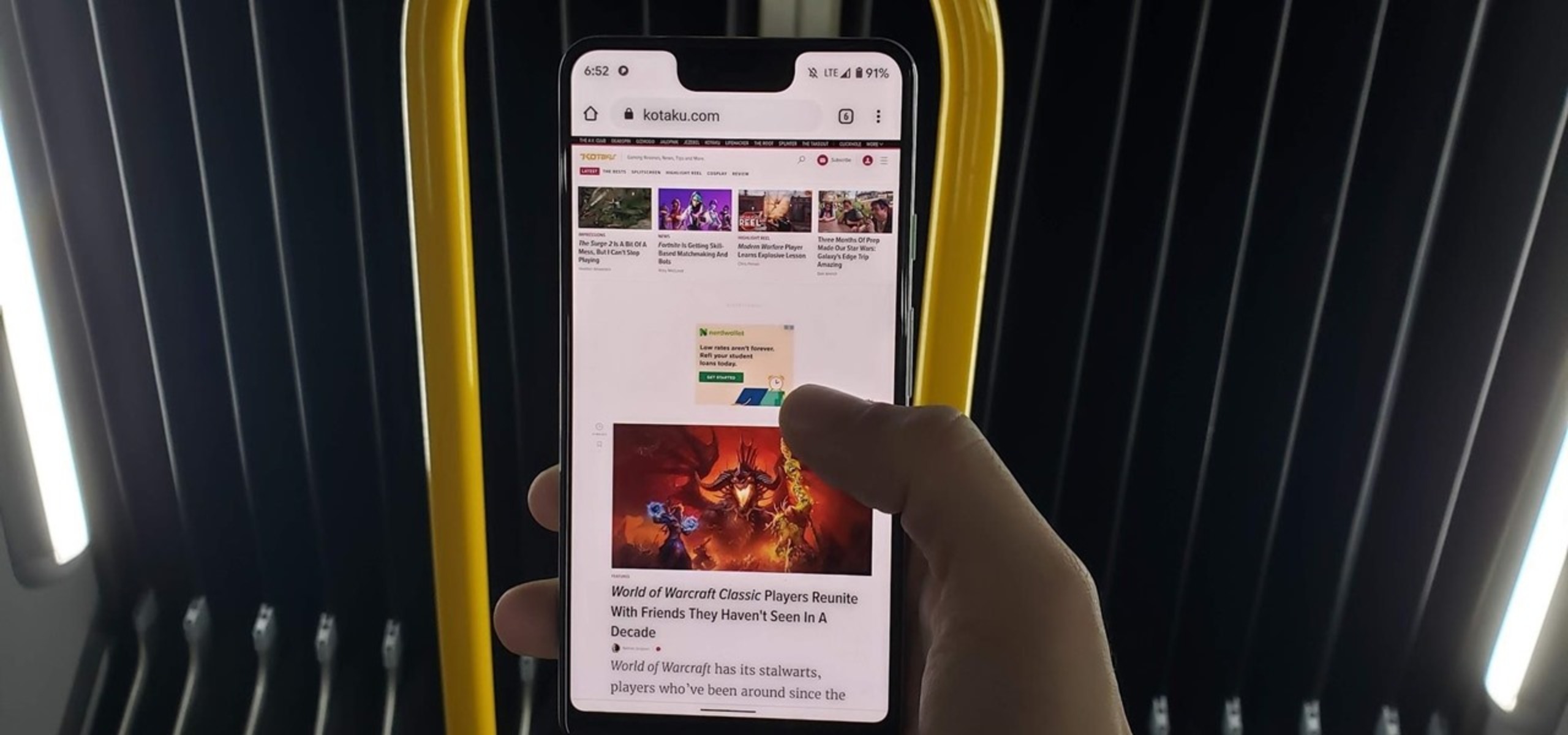
To begin the process of switching to desktop mode on Chrome, the first step is to open the Chrome browser on your mobile device. Whether you're using an Android smartphone, an iPhone, or a tablet, locating the Chrome app icon and tapping on it will launch the browser.
Upon opening Chrome, you will be greeted by the familiar interface, featuring the address bar at the top and the navigation controls at the bottom of the screen. The browser's clean and intuitive layout makes it easy to navigate and access the various settings and options available.
Once the Chrome browser is open, you are ready to proceed to the next step in the process of switching to desktop mode. This initial step sets the stage for seamlessly transitioning from the mobile view to the desktop view of the website you wish to explore in its full functionality.
With Chrome's user-friendly interface and smooth navigation, accessing the browser is a straightforward and familiar experience for millions of users worldwide. Whether you're a seasoned Chrome user or new to the platform, the process of opening the browser sets the foundation for optimizing your web browsing experience by enabling the desktop mode feature.
Now that you have successfully opened the Chrome browser on your mobile device, you are one step closer to unlocking the full potential of websites by switching to their desktop versions. The next steps will guide you through the simple process of accessing the "Desktop Site" option, allowing you to seamlessly transition to the desktop view of any website with just a few taps.
With Chrome's versatility and user-centric design, the transition to desktop mode is designed to be intuitive and accessible, empowering users to tailor their browsing experience to their preferences and needs. As you move forward to the subsequent steps, you will discover how effortless it is to harness the power of Chrome's desktop mode feature, enhancing your ability to interact with websites in a more comprehensive and efficient manner.
Step 2: Click on the Three Dots
Upon opening the Chrome browser on your mobile device, the next step in switching to desktop mode involves accessing the menu options by clicking on the three dots located at the top-right corner of the browser window. These three dots, also known as the "More" or "Menu" icon, serve as the gateway to a plethora of settings and features that empower users to customize their browsing experience.
By tapping on the three dots, you will unveil a dropdown menu that presents a range of options, including settings, history, bookmarks, and more. This intuitive design ensures that essential functions and tools are easily accessible, allowing users to navigate through the browser's features effortlessly.
The three-dot menu symbolizes Chrome's commitment to user convenience and accessibility, providing a centralized hub for managing various aspects of the browsing experience. Whether you're seeking to adjust settings, access specific features, or customize your browsing environment, the three-dot menu serves as a versatile gateway to a wealth of options.
As you click on the three dots, the dropdown menu gracefully unfolds, inviting you to explore the array of possibilities at your fingertips. This seamless interaction exemplifies Chrome's dedication to user-centric design, ensuring that essential functions are just a tap away, enhancing the overall usability of the browser.
The act of clicking on the three dots marks a pivotal moment in the process of switching to desktop mode, as it signifies the transition to the next phase of accessing the "Desktop Site" option. With the menu options elegantly revealed before you, the stage is set for seamlessly progressing to the subsequent step, where you will uncover the pathway to enabling the desktop view of the website you wish to explore.
In the following step, you will delve into the process of selecting the "Desktop Site" option from the menu, a decisive move that will unlock the full desktop functionality of the website, empowering you to engage with its content and features in a comprehensive and immersive manner. The journey to desktop mode continues to unfold, guided by Chrome's intuitive interface and user-friendly design, ensuring that every tap brings you closer to a richer and more expansive browsing experience.
Step 3: Select "Desktop Site" Option
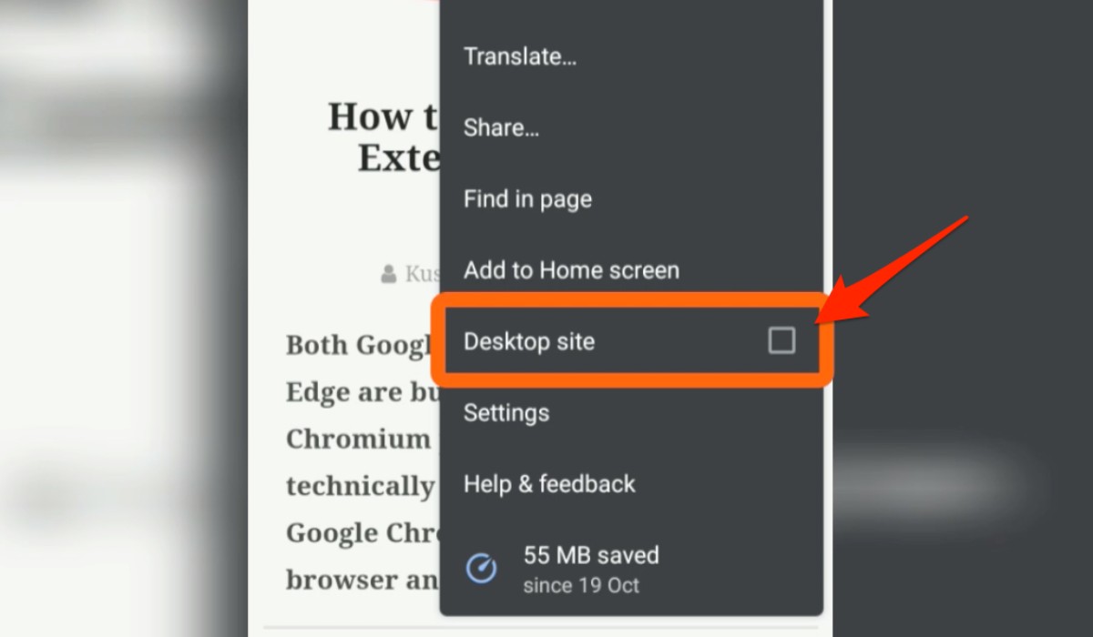
Upon clicking on the three dots and unveiling the dropdown menu, the pivotal moment arrives as you navigate towards the "Desktop Site" option. This essential feature, nestled within the menu, serves as the gateway to accessing the full desktop version of the website you are currently viewing in its mobile layout.
As your eyes scan through the menu options, the "Desktop Site" feature stands out, beckoning you to tap on it and unlock the expansive potential of the website. With a simple yet decisive touch, you select the "Desktop Site" option, initiating the seamless transition from the mobile view to the desktop view of the website.
The moment you activate the "Desktop Site" option, the website undergoes a remarkable transformation, unfolding before you in its full desktop glory. The layout expands, revealing a wealth of content, features, and functionalities that were previously concealed in the mobile view. Text becomes more readable, images appear in greater detail, and the overall browsing experience transcends the confines of the mobile interface.
Chrome's "Desktop Site" option empowers you to engage with the website as if you were accessing it from a desktop or laptop computer, offering a comprehensive and immersive experience that aligns with the website's original design and functionality. Whether you're exploring complex web applications, conducting research, or simply enjoying a more expansive view of your favorite websites, the "Desktop Site" option enriches your browsing journey in profound ways.
The seamless transition to desktop mode, facilitated by Chrome's intuitive interface and feature-rich capabilities, underscores the browser's commitment to empowering users with the flexibility to tailor their browsing experience to their preferences and needs. By selecting the "Desktop Site" option, you have unlocked a world of possibilities, enabling you to interact with websites in a manner that transcends the limitations of the mobile view.
As the website embraces its desktop form, you are greeted by a landscape of possibilities, ready to be explored and experienced in all its richness and depth. The "Desktop Site" option, a testament to Chrome's dedication to user-centric design, ensures that you can seamlessly transition between mobile and desktop views, allowing you to harness the full potential of websites with unparalleled ease and convenience.
With the "Desktop Site" option activated, you are now poised to immerse yourself in the expansive world of the website's desktop version, where every feature, detail, and functionality awaits your exploration. The journey to desktop mode has reached its culmination, unveiling a realm of possibilities that invite you to engage, discover, and experience the web in its most comprehensive and captivating form.
Step 4: Switching Back to Mobile Mode
After immersing yourself in the expansive world of the desktop version of a website, you may find the need to switch back to the familiar confines of the mobile view. Whether you're seeking the streamlined layout of the mobile interface or simply prefer the convenience of the mobile-optimized design, Chrome offers a seamless pathway to transition back to mobile mode.
To switch back to mobile mode on Chrome, follow these simple steps:
-
Click on the three dots: Just as you did when accessing the "Desktop Site" option, tap on the three dots located at the top-right corner of the browser window. This action will reveal the dropdown menu, presenting a range of options to customize your browsing experience.
-
Unselect "Desktop Site" option: Within the dropdown menu, you will notice the "Desktop Site" option, which is currently activated. To revert to the mobile view, simply tap on the "Desktop Site" option again. This action will deactivate the desktop mode, seamlessly transitioning the website back to its mobile-optimized layout.
-
Embrace the mobile view: As you unselect the "Desktop Site" option, the website gracefully transforms back to its mobile form, offering the familiar layout and functionality optimized for smaller screens. Text becomes more concise, images adjust to fit the mobile interface, and the overall browsing experience aligns with the convenience of mobile viewing.
By following these straightforward steps, you can effortlessly switch back to mobile mode on Chrome, ensuring that your browsing experience remains flexible and tailored to your preferences. Whether you're transitioning between mobile and desktop views for specific tasks or simply adapting to different browsing contexts, Chrome's intuitive interface and feature-rich capabilities empower you to navigate seamlessly between the two modes, ensuring a versatile and dynamic browsing experience.
As you transition back to the mobile view, you are greeted by the familiar landscape of the website, ready to be explored and experienced in its mobile-optimized form. The seamless switch from desktop to mobile mode underscores Chrome's commitment to user-centric design, ensuring that you can effortlessly tailor your browsing experience to your preferences and needs, whether you're engaging with websites on a smartphone, tablet, or any other mobile device.
With the ability to seamlessly transition between mobile and desktop modes, Chrome empowers you to unlock the full potential of websites, ensuring that every browsing session is tailored to your unique preferences and requirements. Whether you're delving into the expansive features of the desktop view or embracing the streamlined layout of the mobile interface, Chrome's versatility and user-friendly design ensure that your browsing journey is enriched with flexibility, convenience, and seamless transitions between modes.


