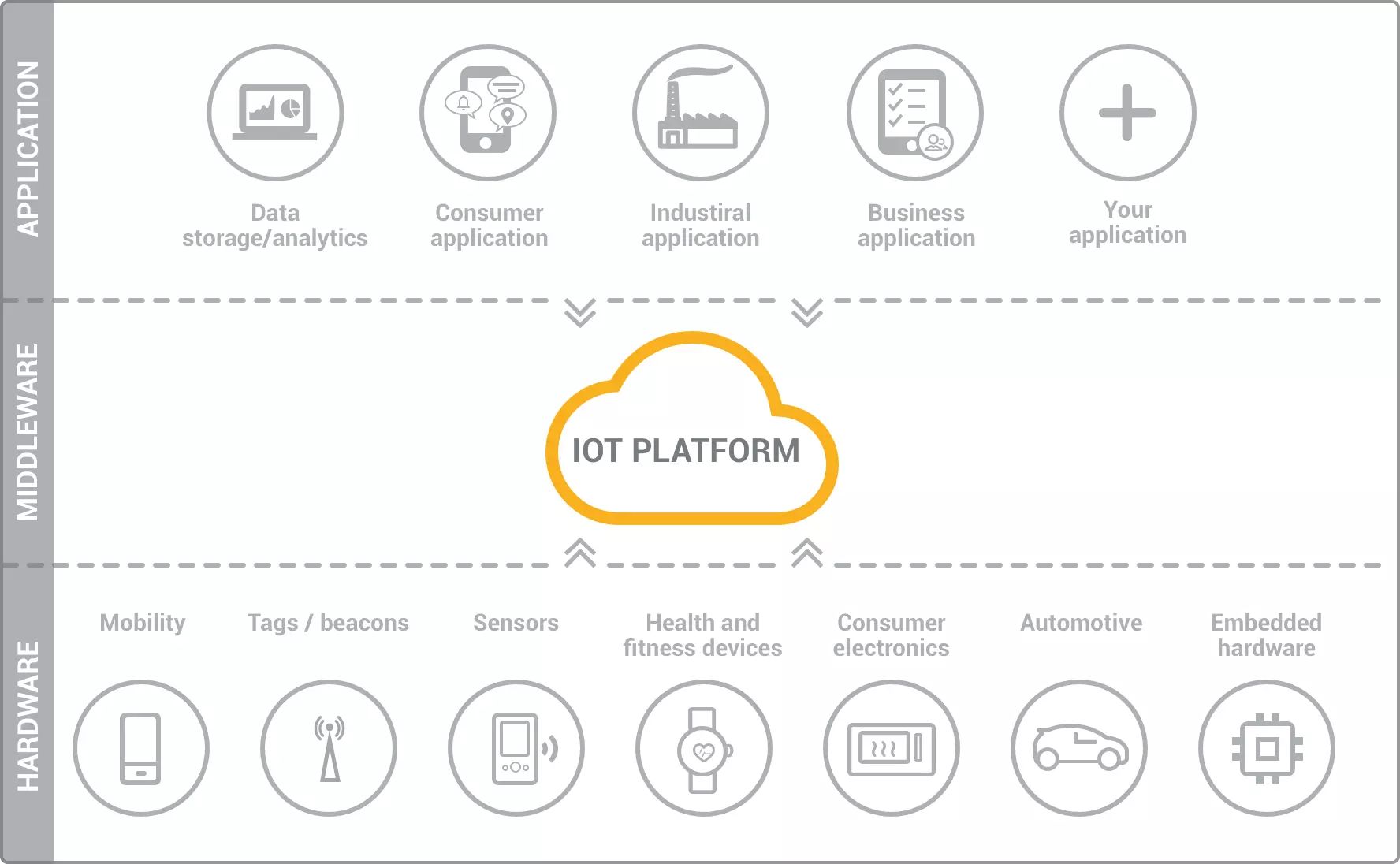
Introduction
Welcome to the fascinating world of the Internet of Things (IoT). As our world becomes increasingly interconnected, IoT has emerged as a powerful technology that enables devices to communicate and share information with each other. Through a network of sensors, actuators, and connectivity, IoT has revolutionized various industries, ranging from healthcare and manufacturing to transportation and agriculture.
While IoT has opened up immense possibilities for data collection and analysis, the sheer volume and complexity of this data can often be overwhelming. This is where visualization comes into play. Visualization is the process of representing complex data in a visual format, such as charts, graphs, and maps, to facilitate easy understanding and analysis.
With the rapidly growing IoT ecosystem, visualization has become an indispensable tool for making sense of the massive amounts of data generated by IoT devices. It allows stakeholders to gain meaningful insights, make informed decisions, and optimize processes. In this article, we will explore the importance of visualization in IoT, its benefits, various visualization techniques, and examples of how visualization is used in IoT applications. We will also discuss the challenges associated with visualization in IoT and how they can be addressed.
What is Visualization?
Visualization is the process of representing data in a visual format, making it easier to interpret and understand. It involves the use of charts, graphs, maps, and other visual elements to present complex information in a concise and intuitive manner. In the context of IoT, visualization plays a crucial role in transforming raw data into actionable insights.
By visualizing IoT data, stakeholders can identify patterns, trends, and anomalies that may not be apparent in raw data alone. This allows them to gain a comprehensive understanding of the state of their IoT systems, enabling them to make data-driven decisions and take appropriate actions.
Effective visualization in IoT goes beyond simply presenting data in a visually appealing way. It involves selecting the right visual elements and techniques to convey the intended message clearly and efficiently. The choice of visualization techniques depends on the nature of the data and the specific needs of the users.
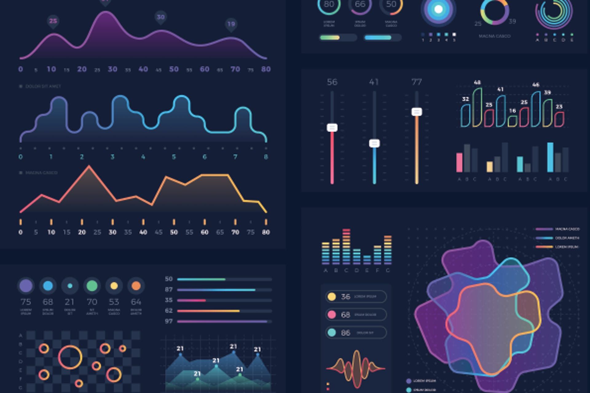
Common types of visualizations used in IoT include line charts, bar graphs, scatter plots, heatmaps, and geospatial maps. Each type of visualization excels at representing different types of data, such as time-series data, comparisons, distributions, and spatial relationships.
Furthermore, interactive visualizations allow users to explore and interact with data in real-time. This capability enables them to drill down into specific data points, filter information based on different criteria, and gain deeper insights into their IoT systems.
Importance of Visualization in IoT
Visualization plays a crucial role in the success and effectiveness of IoT implementations. Here are some key reasons why visualization is important in the context of IoT:
1. Data Understanding: IoT systems generate massive amounts of data, and visualizing this data helps stakeholders understand and make sense of the information. By presenting data in a visual format, complex patterns and relationships can be easily identified, leading to better insights and decision-making.
2. Real-Time Monitoring: Visualization allows stakeholders to monitor the status of IoT devices and systems in real-time. With interactive dashboards and visual indicators, it becomes easier to identify and address issues as they arise, improving overall system performance and reliability.
3. Trend Analysis: By visualizing historical IoT data, trends and patterns can be identified over time. This helps stakeholders to analyze past performance, identify areas for improvement, and make informed predictions for future planning and optimization.
4. Remote Management: Visualization enables remote monitoring and management of IoT devices and systems. Through intuitive dashboards and visual representations, stakeholders can remotely control and oversee their IoT deployments, reducing the need for physical intervention and streamlining operations.
5. Data Sharing and Collaboration: Visualization facilitates the sharing of IoT data and insights with different stakeholders. By presenting information in a visual format, it becomes easier to communicate complex data to non-technical users, promoting collaboration, and fostering a broader understanding of IoT systems.
6. Quick Decision-Making: With visualization, stakeholders can quickly assimilate information and make data-driven decisions. The ability to grasp key insights at a glance allows for faster response times, leading to more efficient operations and better outcomes.
In summary, visualization is essential in the IoT landscape as it helps stakeholders understand data, monitor IoT systems in real-time, analyze trends, manage devices remotely, share insights with collaborators, and make quick decisions. By harnessing the power of visual representation, IoT data becomes more accessible and actionable, leading to improved efficiency, productivity, and innovation.
Benefits of Visualization in IoT
Visualization brings numerous benefits to IoT implementations, enhancing the understanding and utilization of data. Here are some key benefits of visualization in the context of IoT:
1. Improved Decision-Making: Visualization enables stakeholders to quickly and accurately interpret data, leading to better decision-making. By presenting data in a visual format, complex patterns, trends, and correlations become more apparent, empowering stakeholders to make informed choices and take strategic actions.
2. Enhanced Data Analysis: Visualization facilitates the analysis of IoT data by providing visual representations that are easy to comprehend and explore. It allows analysts to identify outliers, spot anomalies, and detect patterns that may not be evident in raw data. This leads to a deeper understanding of the data and unlocks valuable insights.
3. Increased Efficiency: Through intuitive visual representations, stakeholders can quickly grasp the operational status of IoT devices and systems. By monitoring remote devices, identifying bottlenecks, and detecting performance issues in real-time, organizations can improve overall efficiency, optimize resource allocation, and streamline operations.
4. Enhanced Communication: Visualization simplifies the communication of complex IoT data to different stakeholders. Visual representations make it easier to convey insights, trends, and findings to non-technical audiences, fostering collaboration and enabling effective communication across teams and departments.
5. Improved Predictive Analysis: Visualization allows for the identification of trends and patterns in historical IoT data. By analyzing past data with visual tools, organizations can uncover valuable insights that aid in predictive analysis. This helps to forecast future trends, anticipate potential issues, and make proactive decisions.
6. Better Customer Experience: Visualization plays a crucial role in delivering a superior customer experience in IoT applications. By presenting real-time data in an easy-to-understand visual format, customers can track and monitor their own IoT devices, visualize usage patterns, and make informed decisions based on the data provided.
7. Increased Innovation: Visualization encourages creativity and innovation by stimulating exploration and discovery of IoT data. By enabling users to interact with visualizations, organizations can gain fresh perspectives, uncover hidden insights, and make breakthrough discoveries that drive innovation and competitive advantage.
In summary, the benefits of visualization in IoT are numerous. It empowers stakeholders with improved decision-making capabilities, enhances data analysis, increases efficiency, improves communication, enables predictive analysis, enriches the customer experience, and fuels innovation. By leveraging the power of visualization, organizations can unlock the full potential of their IoT data and drive meaningful outcomes.
Types of Visualization Techniques in IoT
Visualization techniques in IoT play a vital role in transforming complex data into meaningful insights. Here are some common types of visualization techniques used in IoT:
1. Line Charts: Line charts are used to visualize trends and changes over time in IoT data. They are effective in representing continuous data streams, such as temperature fluctuations or energy consumption patterns. Line charts provide a clear visual representation of how a specific variable changes over a given time period.
2. Bar Graphs: Bar graphs are suitable for comparing different categories or discrete data points. In IoT, bar graphs can be used to compare sensor readings from different devices, visualize the distribution of data, or analyze performance metrics across different locations or time periods.
3. Scatter Plots: Scatter plots are used to visualize the relationships between two variables. In IoT applications, scatter plots can be used to identify correlations or patterns between different sensor readings. They help in understanding how changes in one variable affect another and can provide valuable insights into the interconnectedness of IoT data.
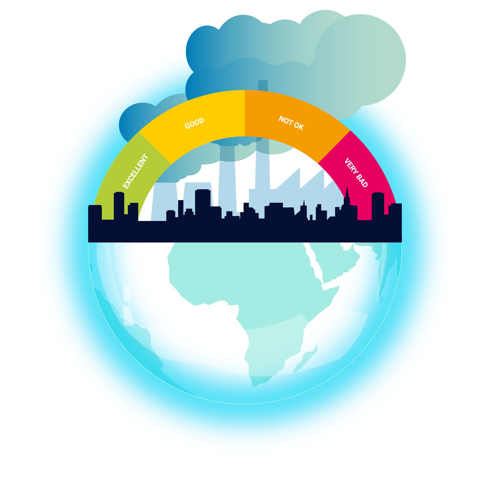
4. Heatmaps: Heatmaps use colors and gradients to represent data density or intensity. In IoT, heatmaps can be used to visualize areas of high or low activity, such as network congestion or sensor readings across a geographical area. Heatmaps provide a visual representation of spatial patterns and can help identify areas of interest or anomalies.
5. Geospatial Maps: Geospatial maps are used to visualize IoT data in the context of geographical locations. By plotting sensor readings or device statuses on a map, stakeholders can gain insights into regional or localized patterns, track the movement of assets, or analyze data based on specific locations. Geospatial maps can be interactive, allowing users to zoom in, filter data, and explore details.
6. Pie Charts: Pie charts are effective in visualizing proportions or percentages. In IoT, pie charts can be used to represent the distribution of different data categories or the relative contribution of specific data sources. They provide a quick overview of how a whole is divided into parts.
7. Dashboard Visualizations: Dashboards are comprehensive visual representations that integrate multiple visualization techniques into a single interface. IoT dashboards often include a combination of charts, graphs, gauges, and real-time data visualizations. They provide a holistic view of IoT systems, enabling stakeholders to monitor key performance indicators, spot trends, and take immediate actions.
It is worth noting that the choice of visualization technique depends on the nature of the data, the insights sought, and the intended audience. Effective visualization techniques enhance data understanding, facilitate analysis, and drive actionable insights for better decision-making in IoT applications.
Examples of Visualization in IoT
Visualization plays a critical role in making sense of IoT data, enabling stakeholders to gain insights and make informed decisions. Here are some examples of how visualization is used in IoT applications:
1. Smart Home Energy Monitoring: In smart home applications, energy consumption data from IoT devices such as smart meters and appliances can be visualized using line charts or bar graphs. Homeowners can track their energy usage over time, identify peak periods, and make adjustments to optimize energy efficiency.
2. Industrial IoT Asset Tracking: In manufacturing and logistics, IoT sensors can track the location and status of assets such as vehicles, cargo, or equipment. Geospatial maps can be used to visualize the real-time movement of assets, monitor delivery routes, and optimize supply chain operations.
3. Environmental Monitoring: Environmental sensors deployed in IoT networks collect data on air quality, temperature, humidity, and other environmental factors. Heatmaps can be used to visualize pollution levels across cities, helping urban planners identify areas of concern and implement targeted solutions.
4. Healthcare IoT Monitoring: IoT devices in healthcare settings collect vital signs, patient activity, and medical device data. By visualizing this data using line charts or scatter plots, healthcare professionals can monitor patient health trends, detect potential issues, and provide timely interventions.
5. Smart Agriculture: IoT sensors in agricultural systems capture data on soil moisture, temperature, and weather conditions. Visualization techniques such as heatmaps and line charts can help farmers monitor crop growth, optimize irrigation, and predict yield for better decision-making.
6. Smart City Traffic Management: IoT sensors embedded in urban infrastructure monitor traffic flow, congestion, and parking availability. Geospatial maps and real-time dashboards help city authorities visualize traffic patterns, identify bottlenecks, and optimize traffic management strategies for improved mobility.
7. Industrial IoT Machine Monitoring: IoT sensors placed on machinery collect data on operating parameters, performance, and maintenance needs. Visualizations such as real-time gauges, line charts, and scatter plots enable operators to monitor equipment health, detect anomalies, and schedule maintenance proactively.
These are just a few examples of how visualization is used in IoT applications across various industries. Visualization techniques provide stakeholders with actionable insights, real-time monitoring, and a comprehensive understanding of IoT systems, leading to improved efficiency, performance, and decision-making.
Challenges in Visualization in IoT
While visualization plays a crucial role in unlocking the value of IoT data, there are several challenges that need to be addressed for effective visualization in IoT applications:
1. Big Data Management: IoT generates massive amounts of data, often referred to as big data. Managing and processing this data in real-time can be challenging, especially when visualizing it. Visualization tools need to be capable of handling large volumes of data efficiently, ensuring smooth and responsive visualizations.
2. Data Quality and Accuracy: The accuracy and quality of data collected from IoT devices can vary, affecting the reliability of visualizations. Data may be incomplete, contain outliers or errors, or suffer from sensor malfunctions. Visualization techniques must account for and handle data inconsistencies to provide accurate insights.
3. Data Integration: IoT systems often involve multiple devices, sensors, and platforms, each generating their own data streams. Integrating and correlating data from different sources can be complex, requiring effective data integration strategies and robust visualization tools capable of handling diverse data formats and protocols.
4. Real-Time Processing: IoT data is often time-sensitive, requiring real-time processing and visualization to enable timely decision-making. Extracting meaningful insights and visualizing data in real-time presents challenges in terms of latency, computational resources, and visualization responsiveness.
5. Data Security and Privacy: IoT data often includes sensitive and personal information. Ensuring data security and privacy when visualizing IoT data is crucial. Visualization tools need to implement strong security measures, including encryption, access control, and data anonymization, to protect sensitive information.
6. User Experience Design: Designing intuitive and user-friendly visualizations for different user groups with varying technical backgrounds is a challenge. Effective visualization in IoT requires considering user needs, designing interactive and responsive interfaces, and providing clear and actionable insights without overwhelming users with unnecessary complexity.
7. Visualizing Complex Networks: IoT systems often involve complex networks of interconnected devices, making it challenging to visualize system-wide interactions and relationships. Graph-based visualizations and network analysis techniques can help in understanding the structure and dynamics of IoT networks.
Overcoming these challenges requires a combination of technical advancements in data processing, visualization techniques, and user experience design. As IoT continues to grow, addressing these challenges will be key to harnessing the full potential of IoT data through effective visualization.
Conclusion
Visualization plays a vital role in the world of IoT by enabling stakeholders to make sense of complex data, gain insights, and make informed decisions. By representing data in visual formats such as charts, graphs, maps, and dashboards, visualization turns raw data into actionable information.
The importance of visualization in IoT cannot be overstated. It allows stakeholders to understand data, monitor real-time information, analyze trends, manage IoT systems remotely, share insights, and make quick decisions. Through intuitive visual representations, stakeholders can grasp key insights, identify patterns, and detect anomalies that may not be apparent in raw data alone.
There are various visualization techniques used in IoT, including line charts, bar graphs, scatter plots, heatmaps, geospatial maps, and pie charts. Each technique excels at representing different types of data and serving specific purposes. Interactive dashboards and visualizations enable users to explore data, filter information, and gain deeper insights into IoT systems.
While visualization has numerous benefits, there are challenges that need to be addressed. These challenges include managing big data, ensuring data quality and accuracy, integrating diverse data sources, processing data in real-time, ensuring data security and privacy, designing user-friendly visualizations, and visualizing complex networks in IoT.
Despite these challenges, visualization continues to play a crucial role in transforming IoT data into actionable insights. By addressing these challenges through technological advancements and user-centered design, stakeholders can unlock the full potential of IoT data and drive efficiencies, innovation, and better decision-making in various industries.
In conclusion, visualization is an essential tool in the IoT landscape, enabling stakeholders to understand, analyze, and leverage data effectively. Through the power of visualization, IoT data becomes accessible, understandable, and actionable, paving the way for a smarter and more connected future.