Introduction
Data visualization is a powerful tool that allows us to make sense of complex data by representing it visually. In the context of the Internet of Things (IoT), data visualization plays a crucial role in transforming vast amounts of raw data into meaningful insights. IoT refers to the network of connected devices and sensors that gather and transmit data. With the exponential growth of IoT devices, there is an overwhelming amount of data being generated, which can be overwhelming to comprehend without proper visualization.
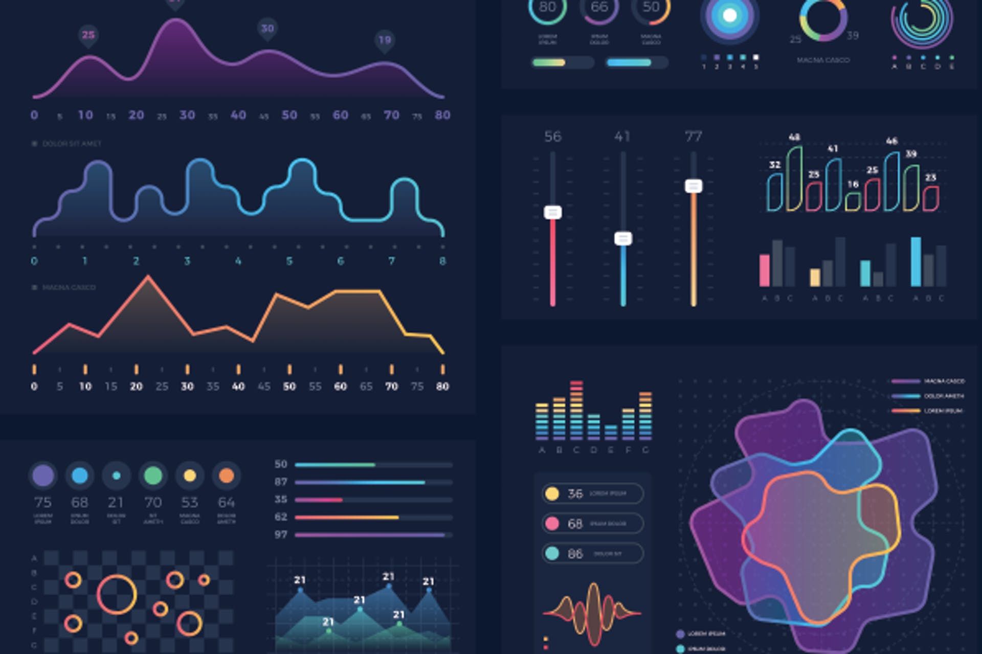
Data visualization in IoT involves using graphical representations, such as charts, graphs, heat maps, and interactive dashboards, to depict the data collected from IoT devices. By visualizing the data, decision-makers can easily identify patterns, trends, and anomalies, enabling them to make data-driven decisions, optimize processes, and improve efficiency.
The importance of data visualization in IoT cannot be overstated. With the increasing adoption of IoT devices across industries, organizations have access to valuable data that can drive innovation and improve operational efficiency. However, the true value of this data lies in the ability to interpret and act upon it effectively. This is where data visualization comes into play, as it provides a visual representation of the data, making it easier to analyze and gain insights from it.
In the following sections, we will explore the importance of data visualization in IoT, the benefits it offers, the tools and techniques commonly used, best practices, and real-world examples of data visualization in the IoT landscape. By understanding the power of data visualization and how it can be leveraged in IoT, organizations can unlock the full potential of their data and stay competitive in today’s data-driven world.
What is Data Visualization?
Data visualization is the graphical representation of data to uncover patterns, relationships, and insights that might not be easily discernible in raw data. It involves transforming complex datasets into visual visuals, such as charts, graphs, maps, and infographics, to make data more understandable and accessible to a wide audience.
In the context of IoT, data visualization plays a crucial role in translating the massive amounts of data generated by IoT devices into meaningful and actionable insights. It helps in uncovering hidden patterns, trends, and anomalies within the data, leading to informed decision-making and improved business outcomes.
Data visualization allows users to quickly grasp complex concepts and understand the significance of the data. Instead of poring over spreadsheets or rows of numbers, data visualizations present information in a visually appealing and intuitive manner, enabling easier interpretation and analysis.
By representing data visually, various relationships and patterns can be identified. For example, line charts can show trends over time, scatter plots can reveal correlations between variables, and maps can display geographic distribution.
Data visualization also offers the opportunity to explore data interactively. Users can utilize interactive elements, such as filters, drill-downs, and zoom features, to delve deeper into the data and uncover more detailed insights. This interactivity enhances the user experience and allows for dynamic exploration of the data.
Furthermore, data visualization promotes data storytelling by presenting information in a compelling narrative format. It helps to communicate complex ideas and data-driven insights effectively to a broad audience, including non-technical stakeholders. By presenting data in a visually engaging way, data visualizations facilitate better understanding, engagement, and decision-making.
In summary, data visualization is the process of presenting complex data in a visual format to enable better understanding, analysis, and decision-making. In the IoT context, it helps organizations make sense of the vast amounts of data generated by connected devices, leading to improved operational efficiency, informed decisions, and enhanced business outcomes.
Importance of Data Visualization in IoT
Data visualization plays a critical role in the realm of IoT, where vast amounts of data are being generated from interconnected devices. Let’s explore the key reasons why data visualization is essential in the IoT landscape:
1. Understanding complex data: IoT devices generate massive volumes of data that can be challenging to comprehend in its raw form. Through data visualization, complex data sets can be simplified and presented visually, allowing users to quickly grasp patterns, trends, and outliers. This understanding is vital for making data-driven decisions and identifying opportunities for improvement.
2. Identifying actionable insights: Data visualizations enable the identification of actionable insights from IoT data. By representing data visually, patterns and relationships become more apparent, enabling organizations to extract valuable insights. These insights can drive operational efficiency, optimize processes, and uncover potential areas for innovation.
3. Real-time monitoring: IoT devices generate data in real-time, which requires near-instantaneous analysis. Data visualizations provide real-time monitoring dashboards, enabling organizations to track key performance indicators (KPIs), identify anomalies, and respond promptly to critical events. Real-time data visualization empowers organizations to make informed decisions and take timely actions.
4. Improved collaboration: Data visualizations are easily understood by diverse audiences, including non-technical stakeholders. By presenting data visually, organizations can foster collaboration between technical and non-technical teams. This interdisciplinary collaboration facilitates a shared understanding of IoT data, leading to more effective communication, problem-solving, and decision-making.
5. Enhanced data exploration: Data visualization tools offer interactive features that empower users to explore and analyze IoT data in depth. These features include filters, drill-down capabilities, and dynamic visual representations. With interactive data visualizations, users can uncover hidden insights, perform root cause analysis, and gain a deeper understanding of IoT data.
6. Improved decision-making: Data visualization simplifies complex information, empowering decision-makers to quickly comprehend the implications of IoT data. Visual representations enable stakeholders to grasp the big picture, evaluate multiple data points simultaneously, and make informed decisions. This leads to more effective problem-solving, reduced response time, and better outcomes.
7. Data-driven storytelling: Data visualization enables organizations to tell compelling stories with their IoT data. By presenting data in a visually engaging manner, organizations can captivate audiences and communicate data-driven insights effectively. With data-driven storytelling, organizations can gain buy-in from stakeholders, inspire action, and drive positive business outcomes.
In summary, data visualization is of paramount importance in the IoT landscape. It helps organizations make sense of complex IoT data, identify actionable insights, improve collaboration, enhance data exploration, facilitate informed decision-making, and drive data-driven storytelling. By leveraging the power of data visualization in IoT, organizations can unlock the full potential of their data and drive innovation and competitive advantage.
Benefits of Data Visualization in IoT
Data visualization in the context of IoT offers numerous benefits that help organizations harness the power of their data. Let’s explore some of the key advantages of using data visualization in the IoT landscape:
1. Improved data comprehension: Data visualization simplifies complex data by presenting it in a visual format that is easy to understand. By representing data using charts, graphs, and other visual elements, users can quickly grasp patterns, trends, and relationships within IoT data. This improved comprehension enhances decision-making and drives actionable insights.
2. Enhanced decision-making: Data visualization empowers decision-makers to make informed and data-driven decisions. By visualizing IoT data, decision-makers can quickly identify trends, outliers, and insights that are difficult to discern in tabular or textual formats. Visual representations facilitate quicker decision-making, leading to better business outcomes.
3. Identification of anomalies and issues: Data visualization enables the identification of anomalies and issues within IoT data. By spotting unusual patterns or outliers, organizations can proactively address problems or take necessary actions. Detecting anomalies in real-time helps prevent system failures, optimize processes, and improve overall operational efficiency.
4. Optimization of IoT systems: Data visualization provides valuable insights into the performance and efficiency of IoT systems. By visualizing key metrics and performance indicators, organizations can identify bottlenecks, inefficiencies, and areas for improvement. This helps optimize IoT systems, enhance device performance, and ensure reliable and efficient operations.
5. Enhanced data exploration: Data visualization tools offer interactive features that facilitate in-depth exploration of IoT data. Users can easily filter, drill down, and manipulate visualizations to gain deeper insights. This interactive data exploration helps uncover hidden patterns, correlations, and dependencies within IoT data, enabling predictive analysis and data-driven decision-making.
6. Improved communication and collaboration: Data visualizations simplify the communication of complex IoT data to diverse audiences, including non-technical stakeholders. Visual representations make it easier to convey insights, trends, and key findings, fostering collaboration and shared understanding. By communicating data visually, organizations can align teams, secure buy-in from stakeholders, and drive effective decision-making.
7. Real-time monitoring and alerts: Data visualization allows for real-time monitoring of IoT data. Interactive dashboards provide up-to-date insights and alerts on key performance indicators and metrics. Real-time monitoring enables organizations to respond promptly to critical events, mitigate risks, and ensure optimal operational performance.
8. Storytelling with data: Data visualization enables impactful storytelling with IoT data. By presenting data visually, organizations can create compelling narratives that engage and inspire audiences. Visual storytelling helps convey the significance and implications of IoT data, driving action and enabling stakeholders to understand the value of data-driven insights.
In summary, data visualization in IoT offers a range of benefits, including improved data comprehension, enhanced decision-making, anomaly detection, system optimization, interactive data exploration, improved communication and collaboration, real-time monitoring, and the ability to tell powerful stories with data. By leveraging these benefits, organizations can unlock the full potential of IoT data and drive innovation, efficiency, and competitive advantage.
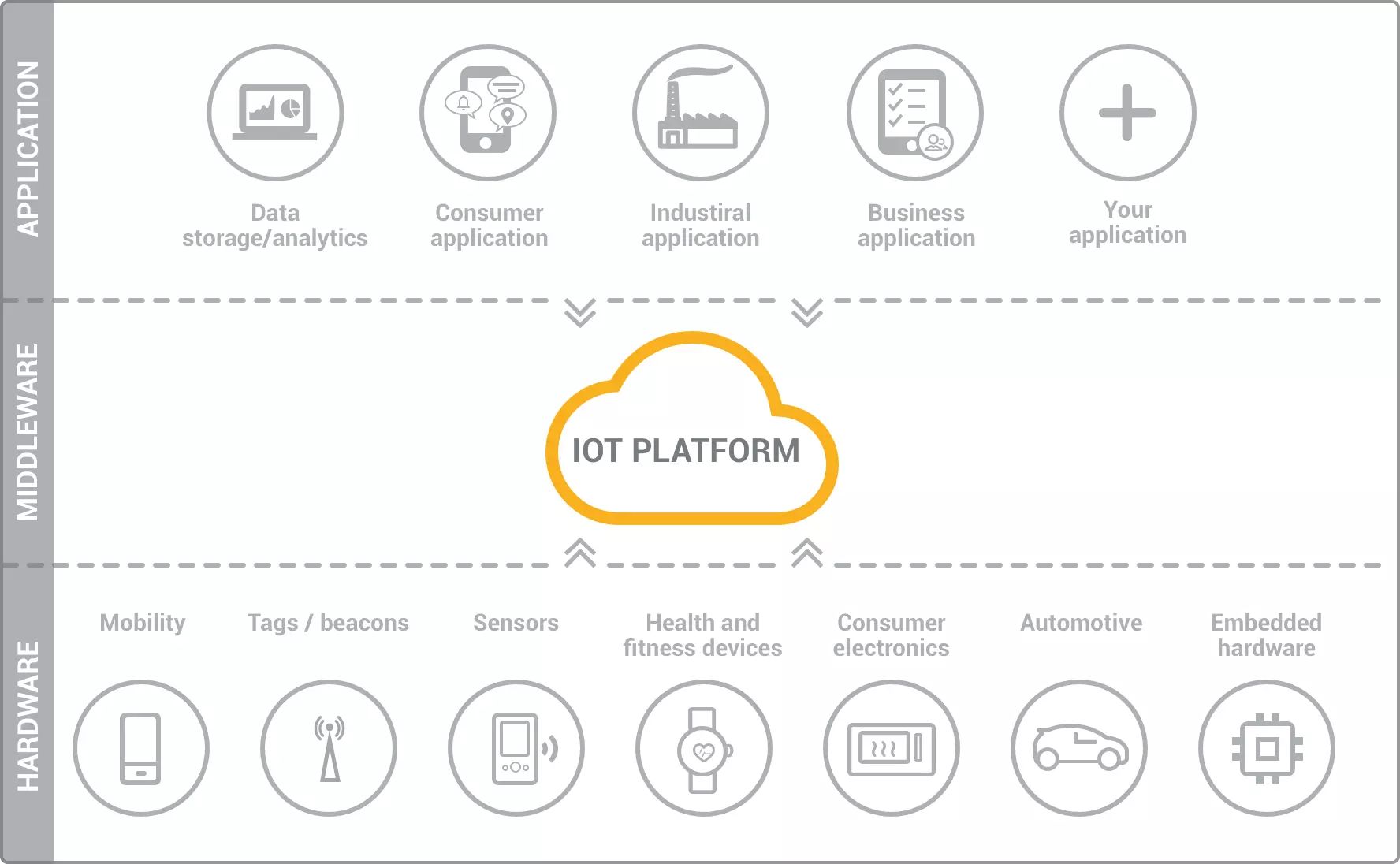
Common Tools and Techniques for Data Visualization in IoT
Data visualization in the IoT landscape is facilitated by a variety of tools and techniques specifically designed to handle the complexities of IoT data. Let’s explore some of the commonly used tools and techniques for data visualization in IoT:
1. Business Intelligence (BI) Platforms: BI platforms such as Tableau, Power BI, and QlikView provide powerful data visualization capabilities. These platforms enable users to connect and visualize IoT data from various sources, create interactive dashboards, and generate insightful reports. They offer a range of chart types, advanced data manipulation options, and real-time monitoring features.
2. Custom-built Visualizations: Organizations often develop custom-built visualizations tailored to their specific IoT data and use cases. These visualizations can be created using programming languages such as D3.js, Python’s Matplotlib, or JavaScript frameworks like Highcharts. Custom visualizations provide flexibility and allow for unique representations of IoT data.
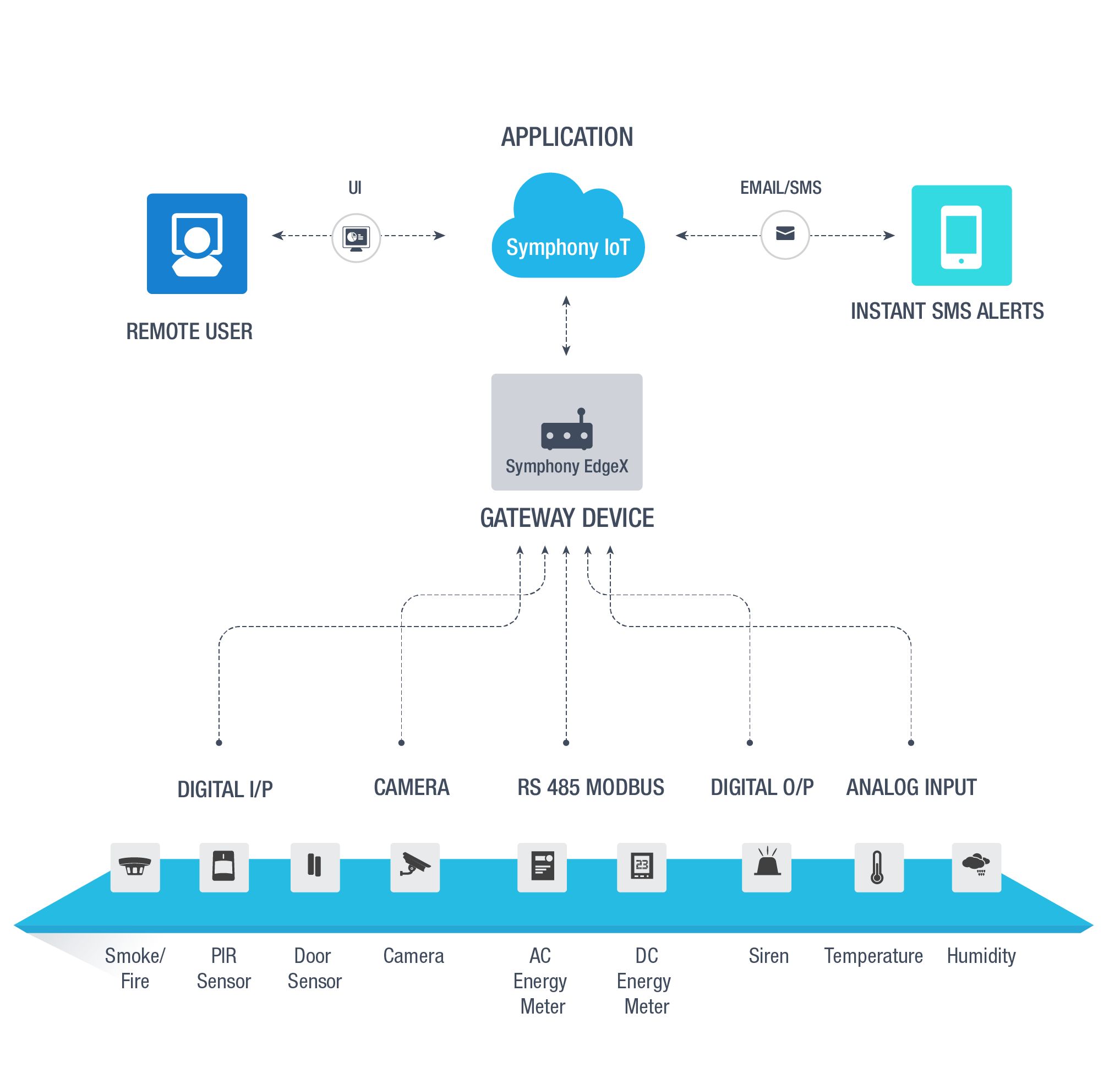
3. Real-time Monitoring and Dashboarding: Real-time monitoring is crucial in IoT data visualization. Tools such as Grafana, Kibana, and Splunk enable users to create real-time dashboards that display key metrics, alerts, and IoT data streams. These tools offer interactive visualizations, anomaly detection, and the ability to drill down into real-time data for in-depth analysis.
4. Geospatial Visualization: Geospatial visualization is often used in IoT applications that involve geographic data. Platforms like ArcGIS, Google Maps API, and Mapbox provide mapping capabilities to visualize IoT data in a spatial context. Geospatial visualizations help analyze location-based data, identify spatial patterns, and make location-specific decisions.
5. Time-Series Analysis and Visualization: Time-series analysis is crucial in IoT, where data is collected over time. Tools like Grafana, Python’s Matplotlib, and Excel offer specialized features for time-series analysis and visualizations. These tools enable users to uncover trends, seasonality, and anomalies in time-series IoT data and present them in intuitive visual formats.
6. Interactive Data Exploration: Tools like Plotly, d3.js, and ggplot2 allow for interactive data exploration and manipulation. These tools provide users with the ability to filter, sort, and drill down into IoT data to gain deeper insights. Interactive visualizations enhance the exploration process and support data-driven decision-making.
7. Data Streaming Visualization: For real-time data streaming from IoT devices, tools like Apache Kafka and Apache Flink are often used. These tools allow for the data ingestion, processing, and visualization of high-velocity IoT data streams. They provide real-time visualizations and analytics for streaming data, enabling organizations to monitor and analyze IoT data as it flows.
8. Machine Learning and AI Visualization: Machine learning and AI techniques are employed in IoT data analysis. Tools like TensorFlow, RapidMiner, and KNIME provide visualization capabilities specifically designed for machine learning models and algorithms. These tools enable users to visualize model outputs, analyze predictions, and evaluate the performance of AI-based IoT applications.
In summary, a range of tools and techniques are available for data visualization in the IoT landscape. These tools facilitate the creation of interactive dashboards, custom visualizations, real-time monitoring, geospatial visualizations, time-series analysis, interactive data exploration, data streaming visualization, and machine learning/AI visualization. By utilizing these tools appropriately, organizations can effectively visualize and gain valuable insights from their IoT data.
Best Practices for Data Visualization in IoT
Effective data visualization in the IoT landscape requires adherence to certain best practices to ensure clarity, accuracy, and actionable insights. Let’s explore some of the key best practices for data visualization in IoT:
1. Understand the Audience: Start by understanding the target audience and their specific needs and goals. Consider the level of technical expertise, domain knowledge, and the key insights they are seeking from the IoT data. Customize the visualizations accordingly to ensure they resonate with the audience and effectively convey the intended message.
2. Keep it Simple and Clear: Simplify complex data by using a minimalist approach. Avoid cluttered and overloaded visuals that can confuse or overwhelm the viewers. Choose clean and straightforward visual elements, removing any unnecessary embellishments. Focus on clarity and ensure that the key message is communicated clearly.
3. Choose the Right Visualization Techniques: Select appropriate visualization techniques that best represent the IoT data and insights you want to convey. Consider the data type, relationships, and objectives. Whether it’s line charts, bar graphs, maps, or scatter plots, choose visuals that effectively communicate the message and facilitate easy interpretation.
4. Provide Context: Contextualize the IoT data by providing relevant background information, explanations, and labels. Include axes labels, titles, and legends to help viewers understand and interpret the visualizations accurately. Adding context ensures that the viewers can grasp the significance of the data and make informed decisions based on it.
5. Use Color and Contrast Thoughtfully: Color is a powerful tool in data visualization, but it should be used thoughtfully. Choose a color palette that enhances the visual appeal without compromising clarity. Use color to highlight key data points or patterns, and ensure sufficient contrast to distinguish between different elements in the visualization.
6. Ensure Data Accuracy and Integrity: Validate the accuracy and integrity of the IoT data before visualizing it. Check for outliers, missing data, and any data inconsistencies that could affect the reliability and validity of the visualizations. Incorrect or misleading visualizations can lead to poor decision-making, so ensure the data is trustworthy.
7. Make it Interactive: Incorporate interactive elements in the visualizations to enable viewers to explore the IoT data further. Interactive features like filters, brushable charts, and tooltips allow users to analyze specific areas of interest, drill down into details, and extract more insights. Interactivity enhances engagement and facilitates deeper exploration of IoT data.
8. Consider Device Limitations: Keep in mind the limitations of the devices through which the visualizations will be accessed. Ensure that the visualizations are responsive and optimized for different screen sizes and resolutions. Consider the bandwidth and processing power of the devices to ensure a smooth and seamless user experience.
9. Iterative Design and Testing: Take an iterative approach to design and testing of the visualizations. Seek feedback from end users and stakeholders to fine-tune the visualizations and ensure they effectively meet their needs. Test the visualizations on various devices and platforms to identify and resolve any usability or compatibility issues.
10. Document and Maintain Consistency: Document the design decisions, guidelines, and standards for data visualization in IoT. Maintain consistency in style, colors, fonts, and layouts across different visualizations to reinforce the brand identity and create a cohesive experience. Consistency improves user familiarity and allows for easier understanding and interpretation of the visualizations.
By following these best practices, organizations can create effective data visualizations in the IoT landscape that deliver actionable insights and facilitate informed decision-making.
Real-world Examples of Data Visualization in IoT
Data visualization plays a crucial role in various real-world applications of IoT, enabling organizations to gain valuable insights from complex data and make data-driven decisions. Let’s explore some noteworthy examples of data visualization in IoT:
1. Smart Cities: In smart cities, IoT devices gather data on traffic patterns, air quality, energy consumption, and more. Data visualization tools help city officials analyze and visualize this data to make informed decisions. For example, interactive maps can display real-time traffic congestion, enabling officials to optimize traffic flow and reduce congestion.
2. Manufacturing and Industrial IoT: In manufacturing, IoT devices collect data on the production line, equipment performance, and product quality. Data visualizations provide real-time monitoring of manufacturing processes, highlighting areas for improvement and identifying bottlenecks. Interactive dashboards allow operators to adjust parameters to optimize production efficiency.
3. Agriculture and Precision Farming: In precision farming, IoT sensors collect data on soil moisture, temperature, and crop health. Data visualization tools help farmers understand this data visually, enabling them to make informed decisions on irrigation, fertilization, and disease control. Visualizations can display crop health maps, showing areas that require attention.
4. Healthcare and Telemedicine: In healthcare, IoT devices and wearables monitor patient vitals and collect health data. Data visualization tools enable healthcare professionals to monitor patients remotely, visualize trends in health parameters, and detect anomalies. This visual information assists in making timely decisions and providing personalized care.
5. Energy Management: IoT devices monitor energy usage in smart buildings, homes, and grids. Data visualizations help users understand energy consumption patterns, identify areas of high energy usage, and optimize energy efficiency. Interactive dashboards can display real-time energy consumption and provide recommendations for reducing energy waste.
6. Retail Analytics: In the retail industry, IoT devices track customer movement, footfall, and buying behavior. Data visualizations enable retailers to understand customer behavior, optimize store layouts, and personalize shopping experiences. Heat maps and flow diagrams visualize foot traffic patterns, informing strategic decisions on product placement and store design.
7. Transportation and Logistics: In the transportation sector, IoT sensors gather data on vehicle performance, fuel consumption, and route optimization. Data visualization tools help fleet managers monitor vehicle conditions, track routes, and identify areas for improvement. Real-time visualizations can display live tracking of vehicles, enabling efficient routing and minimizing delays.
8. Environmental Monitoring: IoT sensors collect data on air quality, water quality, and weather conditions. Data visualization tools transform this data into interactive maps, graphs, and heat maps, providing a comprehensive view of environmental factors. Visualizations enable researchers and policymakers to monitor and respond to environmental changes effectively.
In summary, data visualization in IoT has found its applications in various industries, including smart cities, manufacturing, agriculture, healthcare, energy management, retail, transportation, logistics, and environmental monitoring. Through data visualization, organizations can gain valuable insights, optimize processes, improve decision-making, and drive innovation in their respective fields. The visual representation of IoT data enhances understanding, facilitates communication, and enables stakeholders to take prompt actions based on the insights derived from the data.
Conclusion
Data visualization plays a vital role in the realm of IoT by transforming complex data into meaningful visual representations. The power of data visualization lies in its ability to uncover patterns, relationships, and insights that might otherwise go unnoticed in raw data. By visually representing data through charts, graphs, and interactive dashboards, organizations can easily interpret and analyze IoT data, leading to informed decision-making and improved business outcomes.
The importance of data visualization in IoT cannot be overstated. It enables organizations to understand complex data, identify actionable insights, optimize processes, and drive innovation. By visualizing IoT data in real-time, decision-makers can monitor key performance indicators, identify anomalies, and take prompt actions to ensure optimal operational efficiency.
When implementing data visualization in IoT, it is essential to follow best practices. Understanding the audience, keeping visualizations clear and simple, choosing appropriate visualization techniques, and providing contextual information are crucial elements of effective data visualization. Additionally, using color and contrast thoughtfully, ensuring data accuracy and integrity, and incorporating interactivity are key considerations for creating impactful visualizations.
Real-world examples showcase the diverse applications of data visualization in IoT. From smart cities and manufacturing to healthcare and retail, organizations leverage data visualization to gain valuable insights, optimize processes, and enhance decision-making. Visualizing IoT data allows stakeholders to monitor trends, identify areas for improvement, and make data-driven decisions that lead to positive business outcomes.
In conclusion, data visualization is a powerful tool that enables organizations to make sense of the vast amounts of data generated by IoT devices. By leveraging effective data visualization techniques and tools, organizations can unlock the full potential of their IoT data, drive innovation, improve operational efficiency, and gain a competitive edge in today’s data-driven world.