




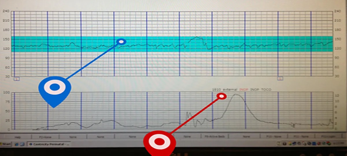
When you're in labor and watching the monitor, contractions on a monitor look like a series of bell-shaped curves or waves that rise and fall in a steady rhythm. The screen displays a graph where the horizontal axis (X-axis) tracks time in seconds or minutes, and the vertical axis (Y-axis) measures the intensity of uterine activity in units from 0 to 100. Each contraction appears as a distinct peak that climbs from a low resting line, reaches a high point, and then descends back down, creating the visual pattern that healthcare providers use to assess your labor's progress.
What contractions on a monitor look like: A direct, immediate answer
Contractions on a monitor are visually represented as a continuous line that forms peaks and valleys, with each peak representing one uterine contraction. The bottom of the graph shows the resting state of the uterus, and the upward curve of each peak indicates the beginning of a contraction, with the highest point showing the peak intensity before the line falls back to the baseline. This visual pattern is the primary way healthcare providers track the frequency, duration, and strength of your contractions in real time, allowing them to make informed decisions about your care.
How to read the contraction tracing step by step
Reading a contraction tracing involves identifying four key components on the graph: the baseline, the start of a contraction, the peak, and the return to baseline. The baseline is the lower, relatively flat line that represents the uterus at rest between contractions, and it appears as the portion of the tracing below the peaks. When a contraction begins, the line rises gradually or steeply, indicating the onset of uterine muscle tightening, and this is the point where you'll see the curve start to climb.
Identifying the resting tone (baseline)
The resting tone is the level of the tracing between contractions, shown as the lower sections of the graph. This baseline provides crucial information about how well the uterus is relaxing and recovering between contractions, and it appears as the flat or slightly wavy line that connects the bottom of each peak. Healthcare providers look at the resting tone to ensure the uterus is returning to a relaxed state, as an elevated baseline could indicate inadequate rest or uterine hyperstimulation.
Recognizing the start and peak of a contraction
The start of a contraction is marked by the point where the tracing begins to rise above the baseline, and this is the beginning of the upward curve. The peak intensity is the highest point of the curve, representing the maximum strength of the contraction, and it's the most visually prominent part of the wave. After reaching the peak, the tracing descends back to the baseline, marking the end of the contraction, and this entire cycle from start to finish represents one complete contraction.
Counting frequency and duration
To count frequency, measure the time from the start of one contraction to the start of the next, which gives you the interval in minutes. Duration is measured from the beginning of the upward curve to the point where the tracing returns to the baseline, showing how long the contraction lasts. These measurements help you and your healthcare team determine if contractions are regular, how far apart they are, and whether they're lasting long enough to be effective in progressing labor.
Understanding the numbers: what the units mean
The numbers on the Y-axis of an external monitor represent "units" (typically 0-100), which measure the relative tension of the uterine muscle, not absolute pressure. Instead, what matters most is the trend in the numbers, whether the peaks are getting higher over time, indicating stronger contractions, and the overall shape of the curve, which shows how the contraction builds, peaks, and releases.
The key takeaway is that the absolute number on the screen is less important than the pattern and trend of the tracing. Healthcare providers are trained to look at whether the peaks are becoming more frequent, lasting longer, and increasing in height as labor progresses, which indicates effective contractions. A single high peak isn't necessarily a cause for concern, and a lower peak doesn't mean a contraction is ineffective; rather, it's the consistency and progression of the pattern that matters most for assessing labor progress.
External vs. internal monitoring visuals
When you're being monitored externally with a tocodynamometer (TOCO), the contraction tracing appears as a series of smooth, rounded waves on the lower graph, with the Y-axis showing relative units from 0 to 100. In contrast, an internal intrauterine pressure catheter (IUPC) measures the actual pressure inside the uterus in millimeters of mercury (mmHg), providing a more precise measurement of contraction strength. Despite this difference in measurement units, the visual pattern on the monitor remains similar, both methods produce a bell-curve shape for each contraction, with a rising phase, a peak, and a falling phase, making it easy to interpret the tracing regardless of which monitoring method is used.
However, for the purposes of reading the monitor, the same principles apply: you're looking for the frequency, duration, and intensity of the peaks, and the shape of the curve will always resemble a wave or bell curve, whether it's generated by an external or internal device.
Common contraction patterns and what they indicate
A normal contraction pattern shows regular peaks that become progressively taller, longer, and closer together as labor advances, indicating that the uterus is working effectively to dilate the cervix. Healthcare providers look for this pattern of increasing intensity and frequency, which signals that labor is progressing normally and that the baby is descending through the birth canal. On the monitor, this appears as a series of evenly spaced peaks with similar or gradually increasing heights, with adequate rest periods (baseline) between each contraction.
In contrast, a pattern called tachysystole, which appears as very frequent peaks with short intervals between them, can be a sign of uterine hyperstimulation, which may reduce oxygen supply to the baby. Recognizing this pattern is crucial because it allows healthcare providers to intervene promptly, whether by repositioning the mother, adjusting medications, or taking other steps to ensure the safety of both mother and baby. The monitor helps identify these patterns early, enabling timely decisions that can prevent complications and ensure the best possible outcome for labor and delivery.
By understanding what contractions on a monitor look like and how to interpret the tracing, you can feel more informed and engaged during labor. The visual representation of uterine activity provides real-time feedback that helps you and your healthcare team work together to monitor progress, manage pain, and make decisions that support a safe and positive birth experience.
\nRelated reading: Why Does My TV Picture Look Stretched Or Distorted, What Is An Fhd Monitor, and Why Does My LG Smart TV Look Blue.