




To read cryptocurrency charts, start by understanding that each candlestick displays a specific period's open, high, low, and close price, with the body showing the open/close and wicks showing the high/low. The key to learning how to read cryptocurrency charts is to first orient yourself with the price axis (vertical), time axis (horizontal), and volume bars at the bottom, then practice identifying trends and support/resistance on a daily or weekly chart.
How to read cryptocurrency charts at a glance
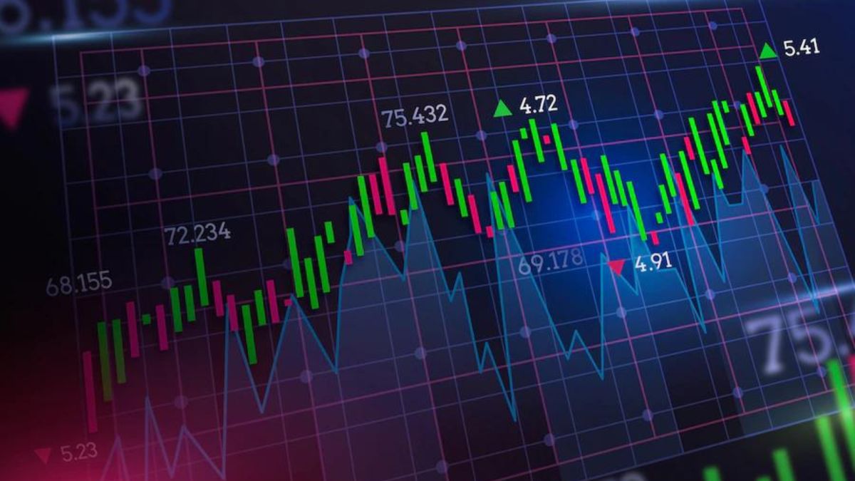
Look at any candlestick chart and you'll see a vertical scale on the right (price), a horizontal scale at the bottom (time), and a series of candles. Each candle has a thick "body" and thin "wicks" (or shadows) extending above and below it. The top of the upper wick marks the period's highest price, the bottom of the lower wick marks the lowest price, and the body's top and bottom edges show the opening and closing prices. Below the price chart, you'll see a histogram of vertical bars, this is trading volume, showing how much of the asset changed hands during each period. In seconds, you can identify whether buyers or sellers controlled the period by checking if the body is green (close higher than open) or red (close lower than open).
Choosing the right chart type for your analysis
For quick trend spotting, use a line chart that connects closing prices, but for detailed price action, candlestick charts are superior because they reveal the open, high, low, and close for each period. These are the only two chart types a beginner needs, line charts for a clean overview and candlesticks for the full story of buyer-seller dynamics. Avoid bar, Renko, or point-and-figure charts until you've mastered these two, as they add complexity without additional insight for basic analysis.
Decoding a candlestick’s body and wicks
Start with the body: if the close is higher than the open, the body is typically green or white, indicating buying pressure; if the close is lower, it's red or black, indicating selling pressure. The thin lines extending from the candle body, called wicks or shadows, show the highest and lowest prices reached during that specific period. A long upper wick means sellers pushed the price down from the high, while a long lower wick means buyers pushed it up from the low. The body's length relative to the wicks tells you who controlled the session, a tall body with short wicks shows strong conviction, while a small body with long wicks signals indecision.
Picking a timeframe that reduces noise
Timeframes range from 1-minute to monthly charts, and the timeframe you choose determines the significance of each signal. Beginners should generally avoid very short timeframes (e.g., 1-minute) as they contain significant "noise" and can lead to misinterpreting minor movements as significant signals. Start with daily or weekly charts, where each candlestick represents a full day or week of trading, smoothing out random price fluctuations and revealing the true trend. As you gain experience, you can drop to 4-hour or 1-hour charts for more entry points, but always check the daily chart first to stay aligned with the larger trend.
Confirming moves with trading volume
Look at the volume histogram beneath the price chart, each bar corresponds to the trading activity for that period. A price move accompanied by high volume confirms strong conviction, while a move on low volume signals weakness and a higher chance of reversal. For example, if the price breaks above a resistance level on double the average volume, that breakout is more likely to hold. Conversely, if you see a rally on shrinking volume, it's a warning that buyers are losing interest, and the trend may soon stall.
Spotting support and resistance zones
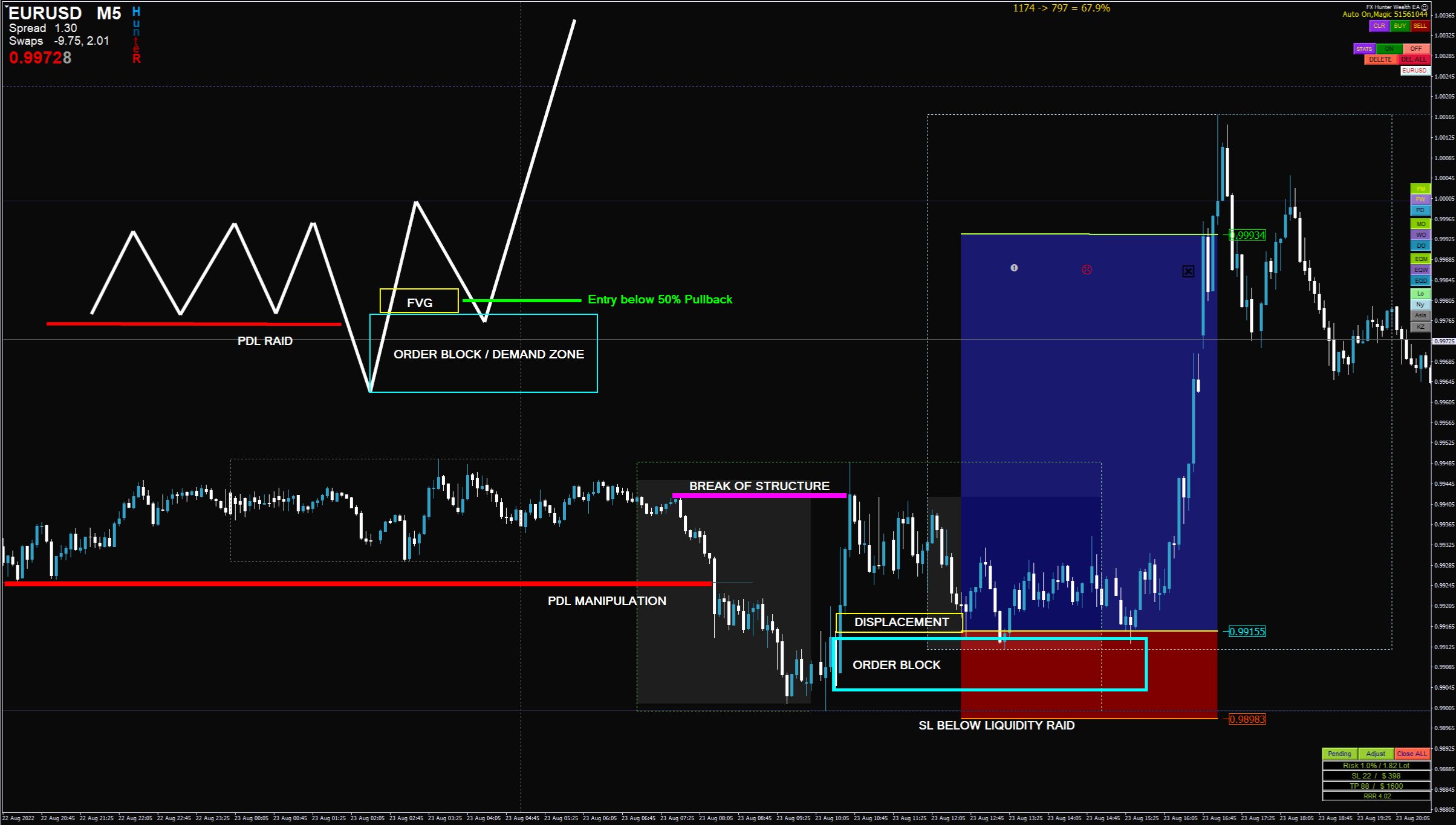
Find horizontal levels where the price has reversed multiple times in the past, these are your support (floor) and resistance (ceiling) zones. Draw a line across the lowest lows and another across the highest highs; the more times the price touches these levels, the stronger they become. When the price approaches support, expect buyers to step in; when it nears resistance, expect sellers to emerge. A break above resistance or below support on high volume signals a potential trend continuation, while a false break (price pierces the level then closes back) often traps traders and leads to a sharp reversal.
Recognizing key candlestick patterns for reversals
Focus on three high-probability patterns: the Doji (open and close nearly equal, showing indecision), the Hammer (small body at the top, long lower wick, appearing after a downtrend), and the Engulfing candle (a larger candle completely engulfs the previous candle's body). A bullish Engulfing pattern forms during a downtrend and suggests a potential reversal to the upside, while a bearish Engulfing forms during an uptrend and signals a downside reversal. For these patterns to be reliable, they should occur at a support or resistance level and ideally be confirmed by volume, a hammer on high volume after a selloff is a much stronger signal than one on low volume in the middle of a range.
Adding basic technical indicators for context
Overlay a 50-day Moving Average (MA) on your chart to see the trend direction, when the price is above the MA, it's an uptrend; below it, a downtrend. Then add the Relative Strength Index (RSI) to gauge momentum: readings above 70 indicate overbought conditions (potential pullback), while below 30 suggest oversold conditions (potential bounce). Use these indicators together, for example, if the price is above the 50-day MA and RSI is above 50, it confirms bullish momentum, but if RSI diverges from price (makes lower highs while price makes higher highs), it warns of a weakening trend. Remember, indicators are lagging tools, so always combine them with candlestick patterns and volume to confirm signals before acting.
To refine your skills, practice on a demo account and backtest your strategies on historical data. As you become consistent, you can explore advanced concepts like MACD and Bollinger Bands, but mastering the basics above will give you a solid foundation. For those looking to manage risk further, consider learning how to diversify crypto portfolio across different assets to reduce volatility, a disciplined approach to position sizing and stop-losses is what separates profitable traders from gamblers.
\nRelated reading: How To Turn Off Share Lending On Etrade and What Is Kick Off Lending.